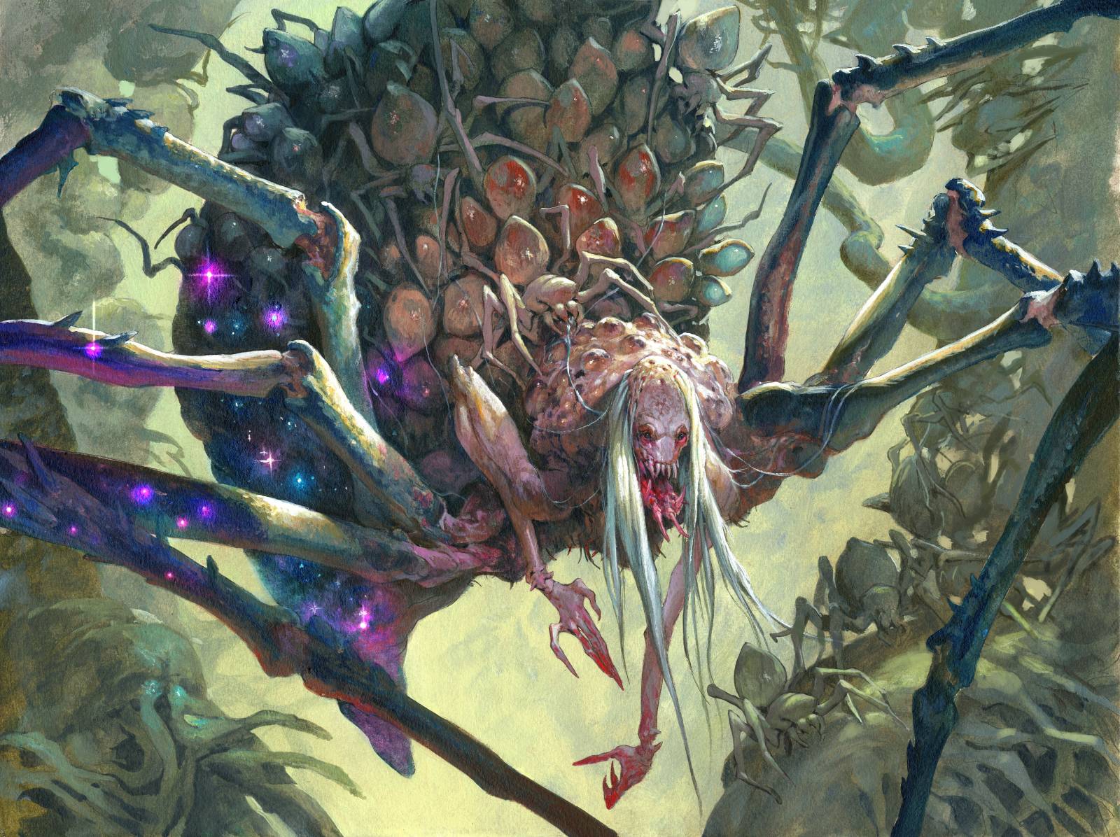
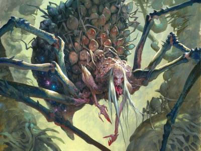
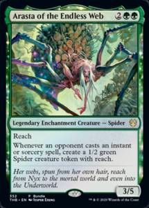
I was very happy when I got the assignment for Arasta of the Endless Web. The art description was cool, but the reason for my happiness was that it was supposed to be cross and evil. I almost never get those images. Normally I am asked to do bulky beasts, cute critters or character portraits. Those images fit well with my colorful style and cartoonie lines. But that means I never get the chance to do nasty and really evil paintings…Until now.
So with that in mind I started on the sketch. ” I am gonna make this bitch ugly as hell”.
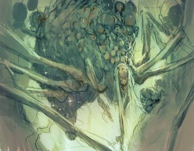
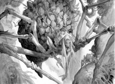
I had a wonderful concept to go by, from the styleguide for Theros Beyond Death, and the image I had in my head was very clear: Bulky body, humanoid hands and torso, a face almost like a human crone but with the proportions distorted and the legs coming out towards us in foreshortening. All this I sketched out pretty quickly and added some green tone and value and send it of for approval.
What I think is important when doing a Legendary character is that it has that special extra, that sense of epic grandness, that tells us its a unique character. With this one I tried to capture that in the size of her body and the way she caries herself.
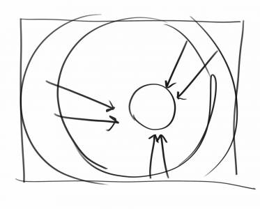
In all simplicity, this is my sketch composition. There is no doubt as to where I want you to take notice.
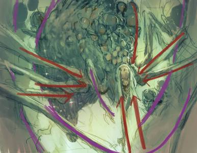
What works for me in the composition is all the legs and the hair acting as arrow lines ( red ones ) pointing towards the face. The secondary elements, like the tree trunks and the body shape and the right arm, acts as framing lines ( purple ones ). They cut off areas of the painting as being less important and strengthen the focal point.
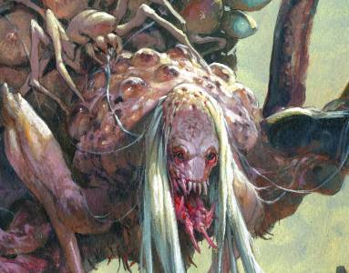
After the sketch got approved I transferred it to a board and added all the details. I tried to make the lower part of the jaw look like mandibles that can move separately rather than just a human jawbone. My biggest concern with the image was that the level of details in the body parts and the young spiders clinging to her back would make for a too busy image and that it would be impossible to read at card size. So I decided to use a spotlight-like light source that would throw shadow onto the body but leave her top head and the shoulder part in light and cloud the rest in darkness.
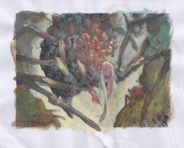
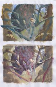
The color comps choices was very limited to begin with. The whole setting of Theros, where the scene takes place, was inspired by ancient Greece. So everything had too be sun drenched and well lit. Not very suitable for a creepy spider queen. On the other hand I love to paint sunlight and bounce light so I thought the dabbled light under the trees would do fine for me. I tried first a very green palette, because the frame on the card is green. There was a lot of sky blue and warm trees in the background. I did not like it much cos the figure would be a dark cold silhouette against a light warm background. It did not help the idea of putting the character in focus. Remember she is very very Legendary and no one puts baby in the corner. Next take was a more purple one ( my favorite color ) with a very dry brown/yellow background. I like it and would have went that way had the card been a white card with a white frame. I took a bit of the dabbled light from the purple comp and made a third one where I clouded the background in misty greenish and used green and brown tones for the trees and body. The spiders in the sunlight would be reddish and match her skin tone, Notice that I already here chose the cold part of her face skin tone that would establish the head being in shadow and would create a temperature contrast to the yellowish direct sunlight.
I have not much to say about the painting process. I more or less followed my color comp only adjusting slightly towards a colder green in the shadow areas to match the cold tone in her skin. I was grinning happily when painting her face because I thought that I had really hit an evil ugly wipe.
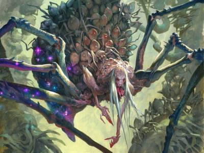
After I send in the final my art director Dawn Murrin asked if I could make the starlight in her shadow area more visible ( it is a common thing in Theros to have starlight visible in your shadows if you feel enchanted ) and add some more spider children in the background. Both things were not readable at all in card size. So I went back in digitally and added some more glow and painted some more spiders in the background. The small one underneath her hair is actually a copy of the one on her back. The rest is just tree trunk turned into spider bodies.
The best part of this illustration was sending it in and getting a response from Dawn just saying ” Gross , Jesper”. Then I knew I had hit it just right.
Lastly; If you do not have to, there is no reason to look up pictures on the internet of Water bugs with eggs. Perhaps the ugliest insect in the world, and they creep me out.




INSANEEEE Man now im hungry for more creepiness from you , the detailed texture on the Back and the Jaw designs and entire portrait is menacing! also is that spiderling giving her a hair makeover!!! if so what a sick idea…. new Wallpaper for sure!!
also you colour palettes keep improving as you get more muted/desaturated and play around with enhancing colour through selecting area to splash colour in….. sorry nerding out.
a hair makeover with WEB!
Really creepy looking, congrats on a job well done.
You over do yourself every time man!! Awesome.
I really hope that one day you will be able to take some process fotos, 1 hour in, 3 hours in, this is how it looks when the masking film is removed etc. Please, please, pretty please with sugar and acrylics on top.
Another fantastic piece.
I just love this!