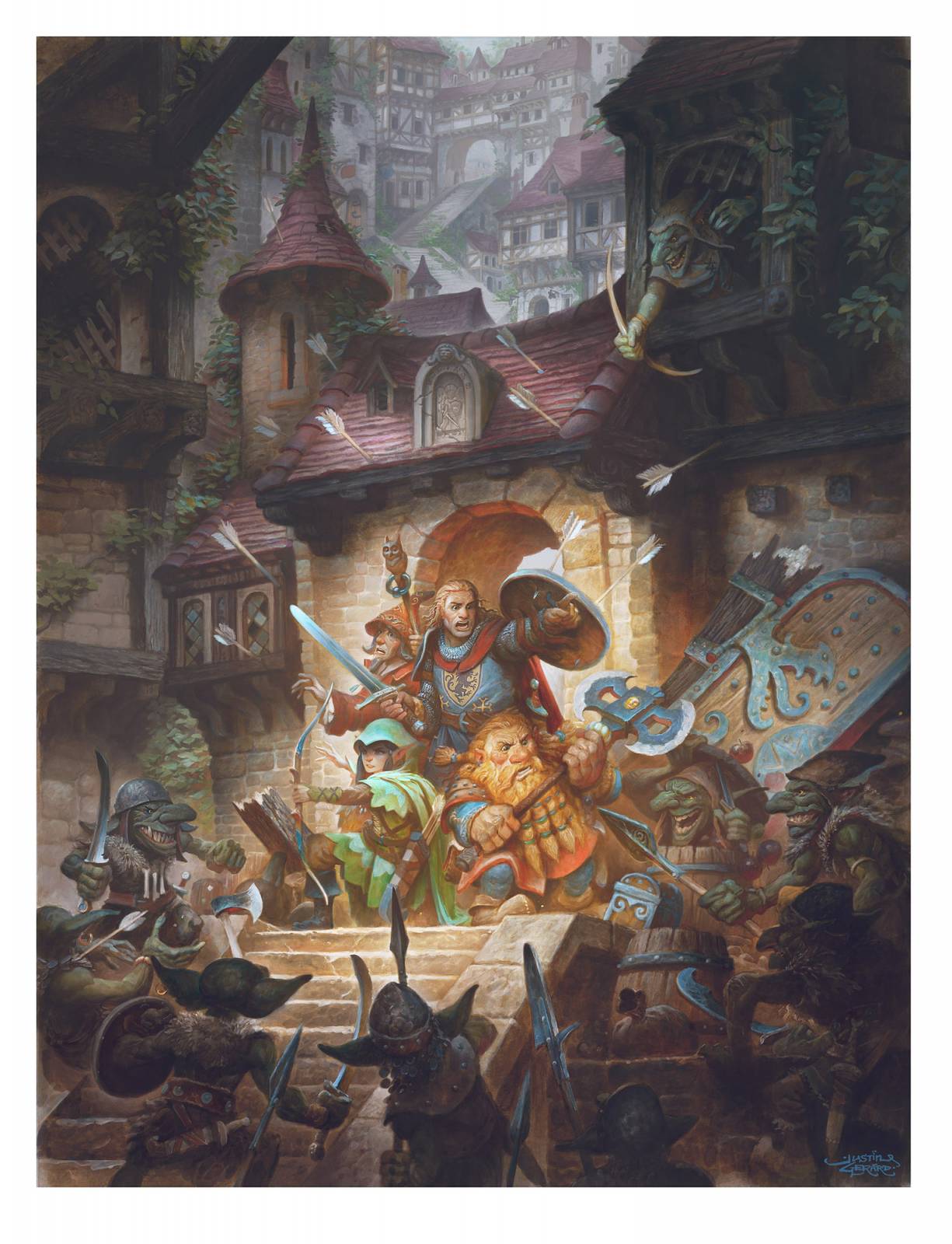
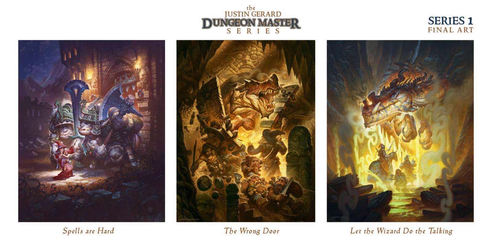
 I’ve started a new collection of illustrations for the new year called The Dungeon Master Series. This project consists of 12 images dedicated to classic RPG moments gone suddenly, terribly wrong. It is built upon some previously established images of mine from previous years and the goal is larger print set (and possible calendar) dedicated to the theme.
Today, I’d like to share with you some of the development from the most recent image, Goblin Ambush!
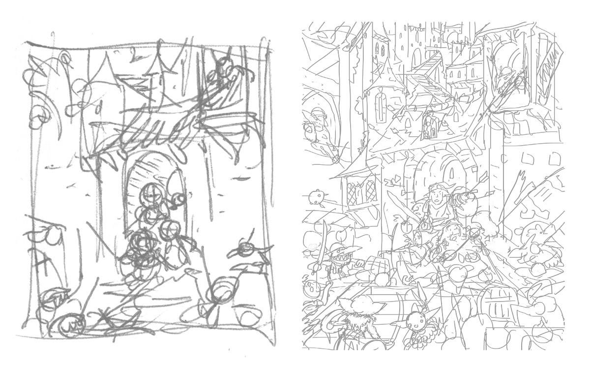
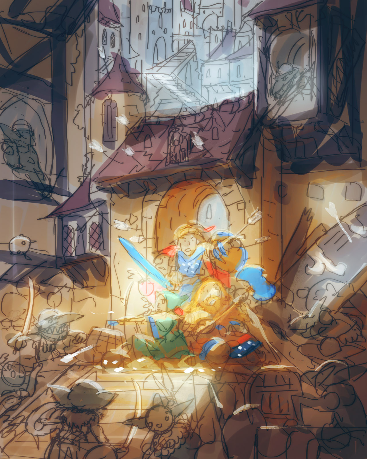
Digital Color Comp
I don’t spend too long in the early thumbnailing and comp phase, even though in truth, it is one of my absolute favorite parts of any painting. It’s when all the most fun discovery occurs and while the temptation is to stay here forever, that is precisely the reason I need to rush it. At this phase I want to get all of my ideas down as fast as possible while all of them are still fresh in my mind. If you get bogged down in shading, you may forget all the little moments that inspired you to draw this in the first place. So I want to capture all the action of the scene as fast as possible, and I don’t spend any longer than is absolutely necessary on any details or shading.
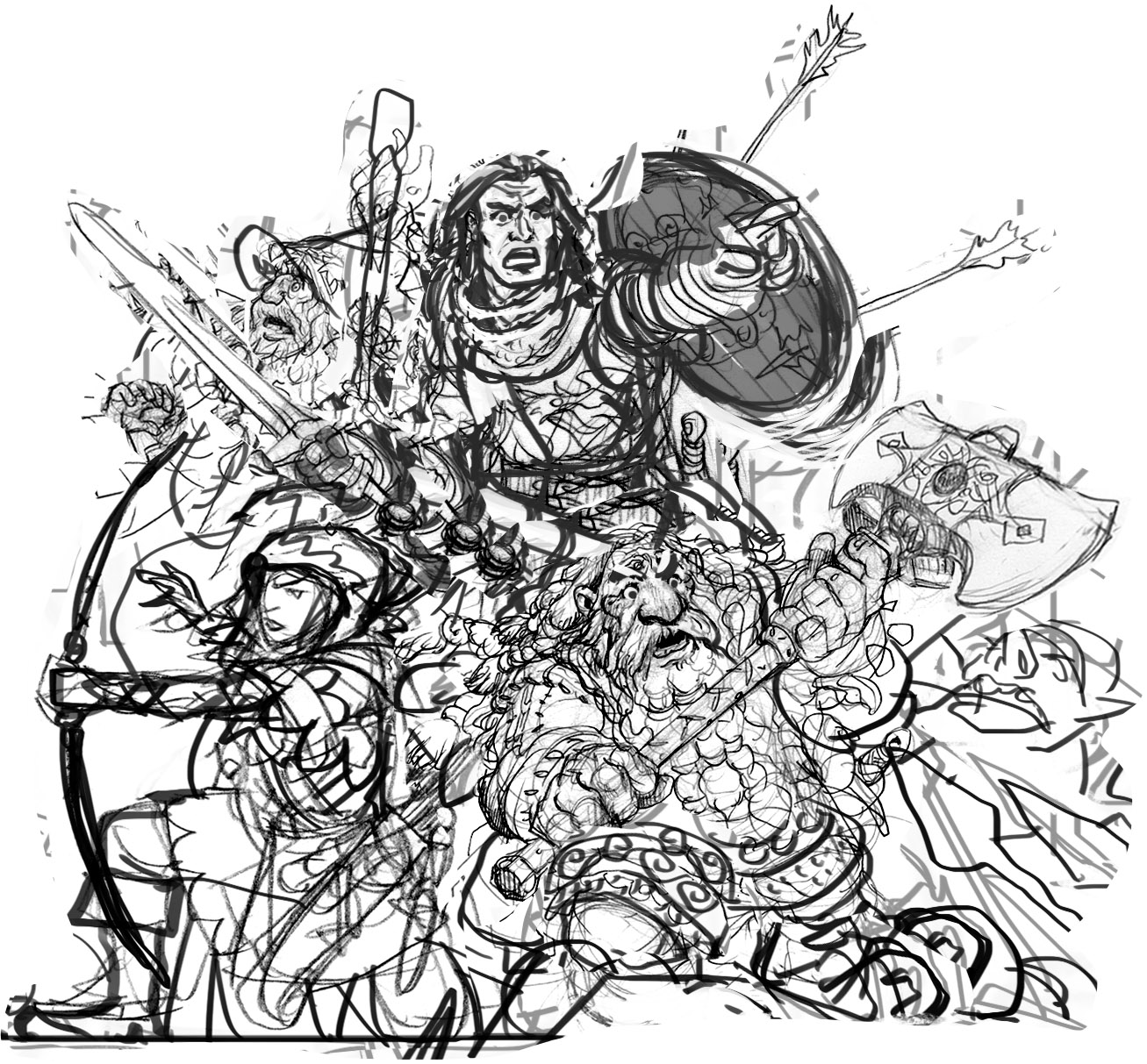
The Ugly Stage Comp
As the image progresses towards completion I spiral further and further out into both madness and slower, more intense rendering.
But there is a place between these two worlds; the one, a world of mad, chaotic creation, and the other, a world of methodical, organized rendering and completion. In between lies something truly horrific: The Ugly Stage. It is my least favorite part of any painting. It is where all of the hard work that goes into wrestling a thumbnail into a finished illustration is buried, often tucked away out of sight. The reworks, redraws, edits, the scrapped doodles. Usually, we illustrators don’t like for people to see all those skeletons under the floorboards, but well, here is the one from this image. And it is a real nightmare. (You won’t tell anyone, right? My friend, Mr. Tommygun would really like to keep this between us…) Once this horrible and tedious stage is taken care of, I can feel confident that the rest of the image is going to work out.
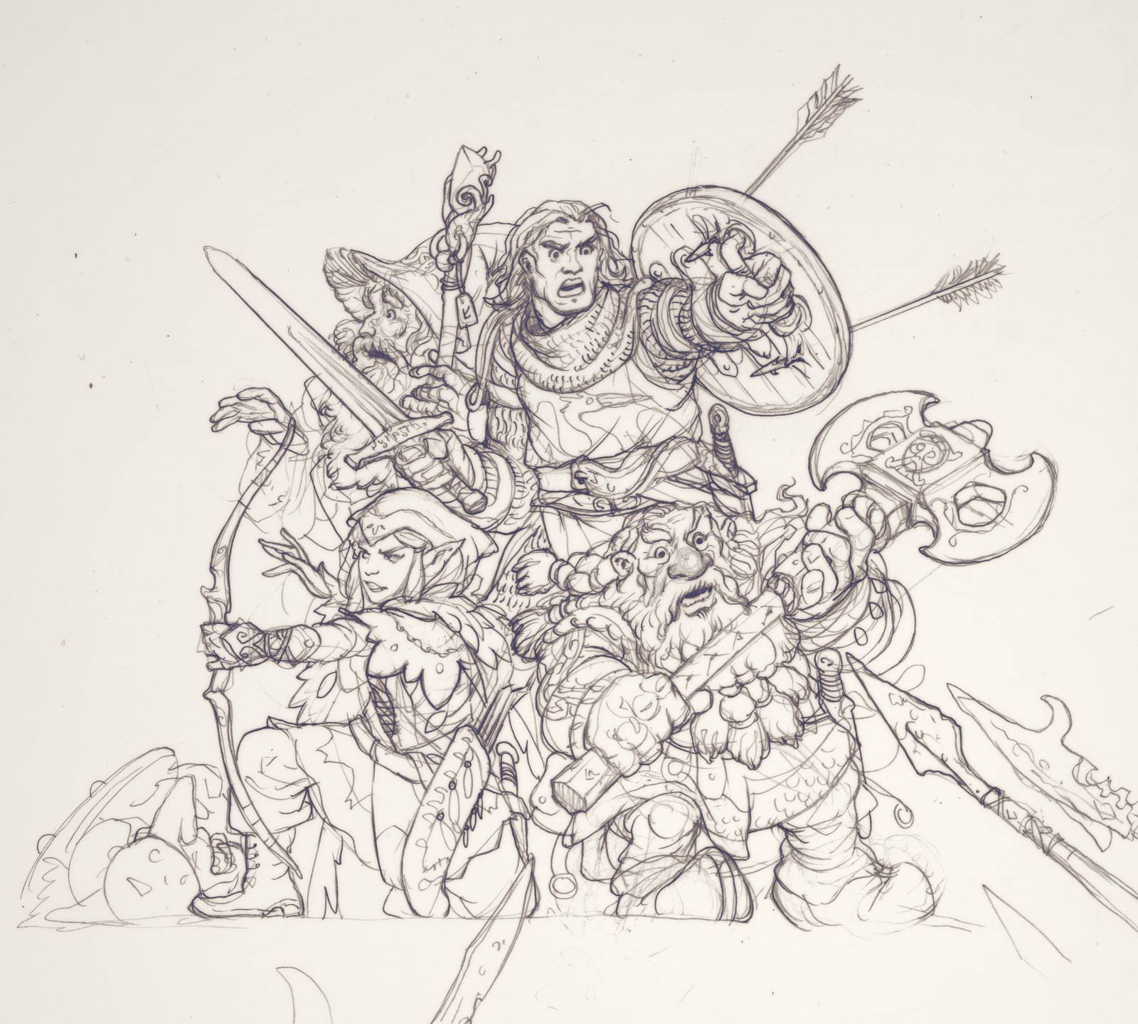
Clean it Up! Tight Line Drawing over Ugly Stage Comp
With the ugly stage out of the way, I produce a clean line drawing on smooth bristol using 2H and HB leads in a .5mm mechanical pencil. With all the guess-work taken care of in the previous stage I can make a drawing that is far more proportional and refined. This is particularly the case when you are working primarily from imagination, and have no photo reference to appeal to for help.
Since the drawing is only meant to capture the shapes and design, I don’t focus too much on rendering and shading yet. Those will come in the color phase and since I have a reasonably solid color comp, I don’t have to worry too much about figuring out where my lighting is coming from and where the shadows should be.
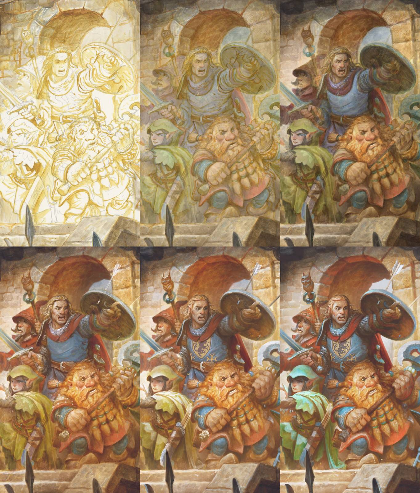
Step-by-Step Color Process
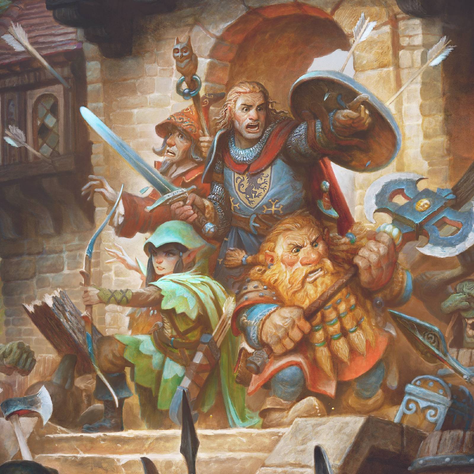
For the color work I first establish a warm “drawing” in watercolor over my graphite drawing. This warms up the lines and adds shadows. I then begin to slowly work in colors in washes until I have achieved the final saturation and value that I am after. I add in acrylic white for some highlights and opaque passages. I blend this right into the paint in some areas when I need a more natural looking transition. I am using non-staining watercolor paints and working on hot press, so this allows much of the intense colors to be re-activated and pushed around with the acrylic white. Finally, I scan in the image and add some details and refinement using Photoshop.
Thanks for joining me for this entry in the Dungeon Master Series. I look forward to sharing more with you soon!





Wow! This sounds (and looks) like a great project Justin. I would love to see a calendar from you. I’m afraid my work never really takes that step into organised, methodical rendering. Which is not to say that I don’t do lots of drawings but to my eye it always seems to stay in the ugly stage. Of course because I really only jump into the work about once a year (right around Halloween) this is somewhat to be expected. Thanks for the look at this. Skeletons under the floorboards? So do you ever hear “the beating of his hideous heart”? 😉 I’m excited about your new project. Can’t wait to see more.
Thanks Aaron! I like “the beating of his hideous heart” … I’ll have to use that one next time!
Don’t thank me. Thank Edgar Allan Poe.
Another winner from the chosen one!
haha Thanks Scruffy!
I love Justin’s work so much, thanks for the inspiration.
How can I identify non-staining from staining watercolors at the moment of purchase? Didn’t know this existed.
Hi Sebastian, Some manufacturer’s will post the attributes of all their colors in a PDF on their site. Others you kind of just have to try out by trial and error. Daniel Smith and Winsor Newton both offer really good charts on which of their colors are staining/non-staining and other things like opaque vs transparent and lightfastness. I started to assemble my current palette of colors using those as a rough guide.
I love the first illustration of the classic four D&D character archetypes busting through the door facing an army of kobolds with arrows all over the place ( they must aim badly as the stormtroopers, eh? ). This piece’s color tonality reminds me greatly of Easley’s work on the hardcover of the classic D&D’s Dungeoneer’s Survival Guide ( 1st edition ) which I have and most of the images hearken back to the 80s flavor, for some reason, in this era I grew up in. Man, I miss playing the game being a DM in the early 1990s, though. But I really love how you broke down the process with the pencils and then proceed on with traditional paint media until digital refinement. It’s fascinating because I was told the old school method in the late 80s to mid 1990s until some art students in my class starting doing some work on Photoshop with a Wacom which when I started having visions of what’s to come within the next ten years.
Thanks Adam! Those old school style illustrations are still some of my favorite as well! Maybe it’s just a bit of nostalgia, but It had a great vibe and I miss it! This series is a love letter to those games I played as kid.
Oops. I meant Goblins, not kobolds.
I admire your illustrations! Thank you for sharing the process of your work, it is very exciting. Greetings from distant Siberia))I admire your illustrations! Thank you for sharing the process of your work, it is very exciting. Greetings from distant Siberia))
Awesome work Justin, always following with whatever you are working on and your way of doing each piece. Trying
to get somewhere with my own work and ideas. I do bunches of sketches but not complete thumbnails as to
get down on paper the complete idea and image that’s going on in my head. Just difficult with as many sketches
I have accumulated over the years and streaming ideas running thru my head to concentrate on one and get lost with all the others. Trying to resolve this problem.