Sanford “Sandy” Kossin is one of the best. You may not remember him as he stopped working professionally some years back, preferring instead to draw from the live model to keep his formidable drawing skills sharp. Selfishly, I never agreed with that. I wanted more and more from him. I wanted to keep running into his work on paperback covers or Boy’s Life, like I had as a kid.
Sandy hit his stride through the 60’s and 70’s, working for major corporations, major magazines, major movies, and about every major project that appeared over those years. He was hot and in high demand.
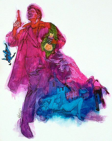
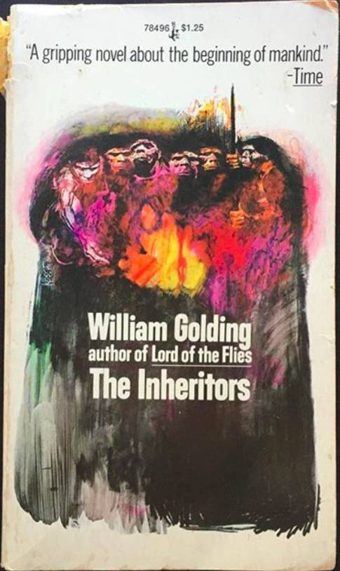
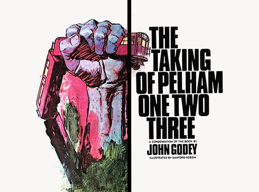
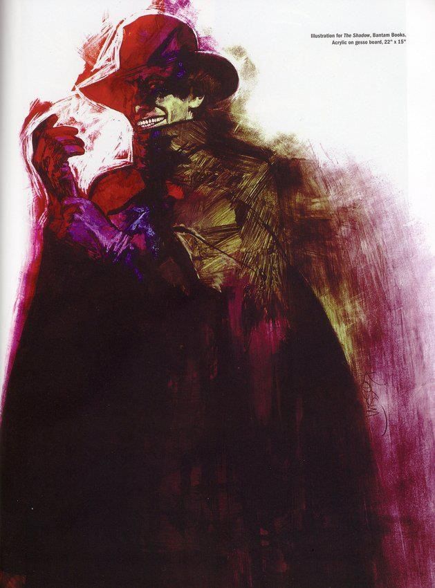
Many paperback publishers then enjoyed using covers of a white background with a splash of colorful illustration enticing the potential reader to pick it up. Sandy’s work was especially suited for this approach. He loved working with bright, vivid colors under a bold drawing, usually in ink or brush, or some kind of manipulated tool.
He knew the value of a simple line or gesture with a tool that left an expressive, sometimes primitive mark. You can see his thinking through the instruments he used. Even with a carved popsicle stick, you can feel the joy that he must’ve felt laying down those lines because the range of thick vs thin, jagged vs smooth, or curly cue vs pedestrian quality to the line work communicated his temperament. As an artist, one can feel his pen touch the board, and then feel when he abruptly changed tack to scratch or pull and challenge the tool itself.
Acrylics were fresh on the market in the early sixty’s and illustrators were keen to push its limits. Sandy was formidable in his search to combine and contrast and mix and shift, sweep, stroke, chisel, rub, and smear his way into new expressions. He experimented vigorously with new and old materials. Some illustrators at the time combined Dr. Martin’s Dyes with acrylics and sometimes gouache to brighten the pigments even further. Sandy was in the lead of that thinking.
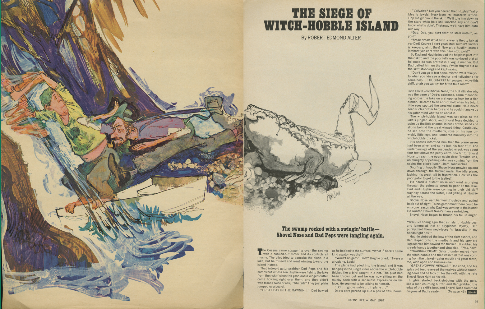
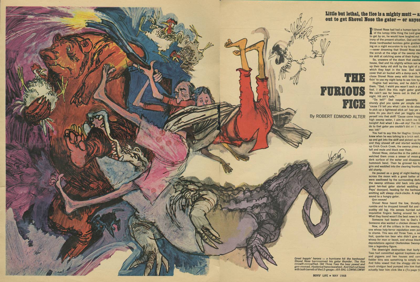
And it wasn’t just in the technical side that he drove his career. Sandy was interested in a wide range of subject matter and imagery. The man could cartoon and exaggerate form masterfully. His cartoons have wonderful, playful, with exaggerated shapes, and an incredible range of character. He would combine his technical mainstream prowess with his character work and create spreads for Boy’s Life that utilized both b/w with color for the same piece of art. I didn’t realize at the time how much that delighted me as a kid and budding artist; before I knew what an illustrator even was.
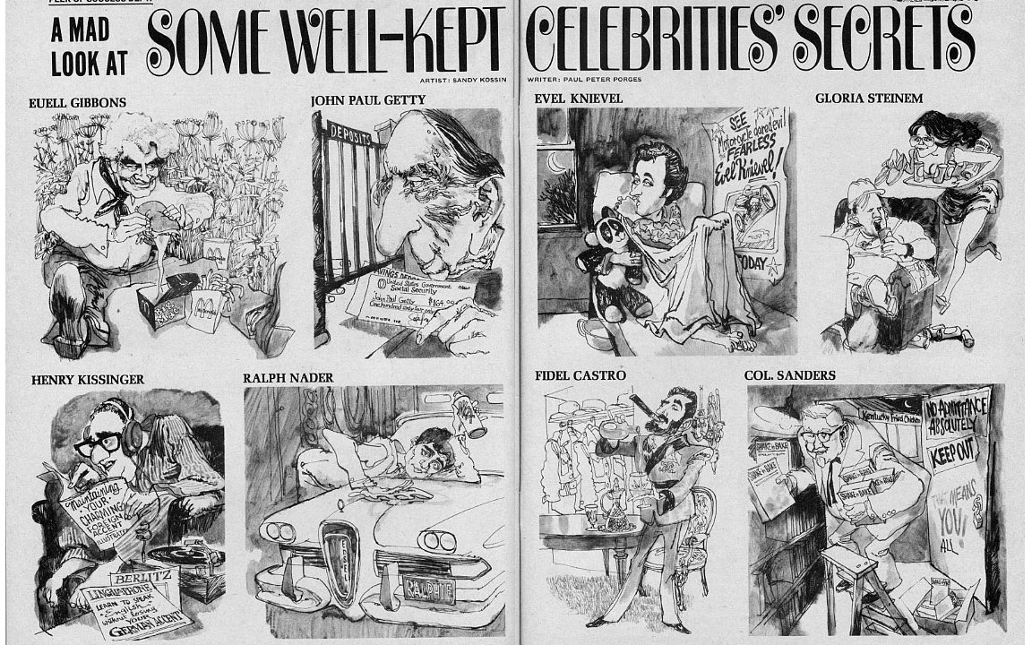
He stretched and pushed his drawing and wasn’t a one-note painter. You might not realize that the guy you just saw cartooning for MAD Magazine was the same guy who did the edgy, painterly cover for The Last Temptation of Christ.
His love of line and range of interests influenced my own work. To this day I see no reason to isolate myself to one genre or one approach. I want to play in it all, and have been lucky enough to be able to push those boundaries and work in all areas of illustration. Sandy inspired me to find my expression in every arena.
We have plans to get together at the Society of Illustrators again for another lunch, trade industry secrets, and discuss with tongue in cheek the state of the art. I wouldn’t miss the opportunity to laugh and learn from him.
…..
One doesn’t stop learning in this business. There are no finite skills. No learning is complete for a visual artist; illustration still lives despite the so-called visionaries who announce its demise consistently.
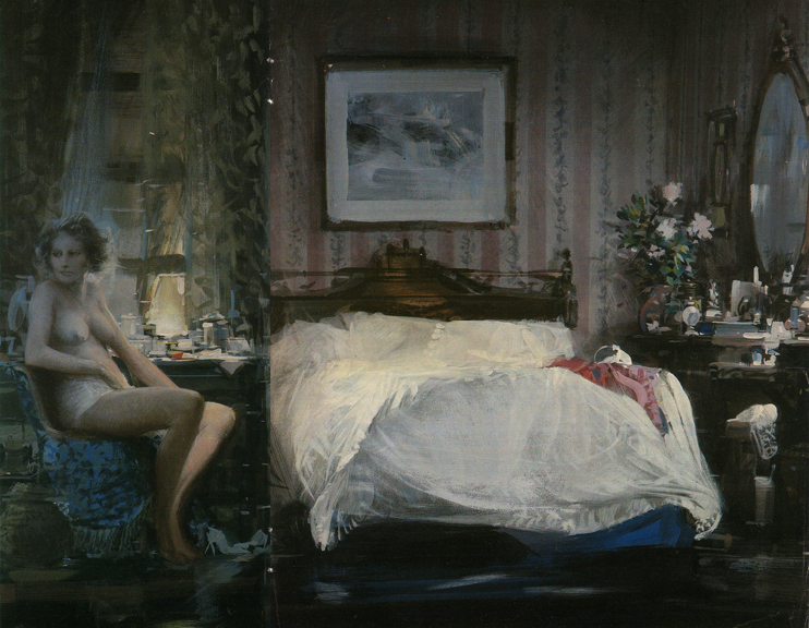
 The four paintings above are Sandy’s well known series done for LIFE Magazine about the Bay of Pigs incident.
Don’t miss the opportunity to study Sandy’s work. You’ll discover a superb drawer that painted with line. The images will work into you; you’ll recognize the human curiosity of mark-making that touches the protohuman in all of us.
Don’t miss the opportunity to connect with generations of painters ahead of you either. There’s great information and experience to learn from. After all, we are a small community in a vast world; a family of image-makers.
…..
Here’s an essay I wrote about Sandy for his induction to the Hall of Fame at the NY Society of Illustrators. It’s a clear and classic example of how one builds a career. I think you’ll get a feel for the man himself. He’s so much like all of us.






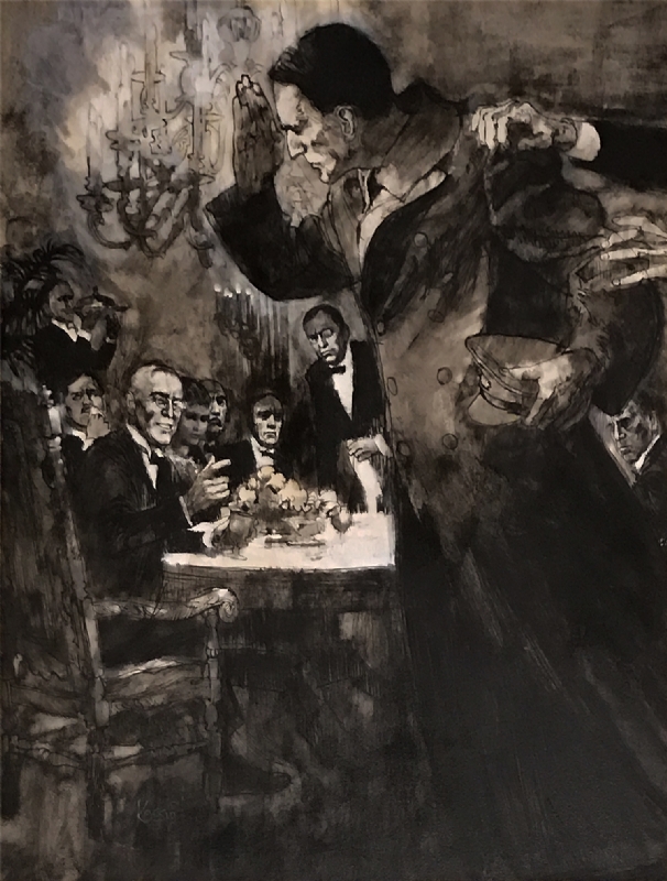

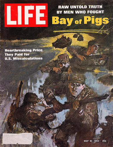
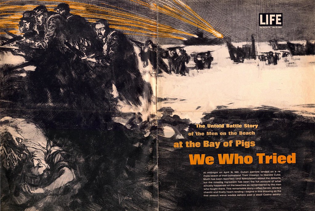
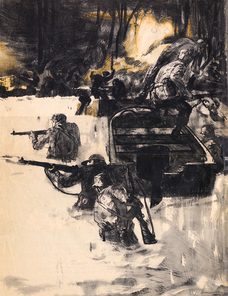
 The four paintings above are Sandy’s well known series done for LIFE Magazine about the Bay of Pigs incident.



That’s a real shame. I loved his work although I had no idea about the Mad magazine stuff. Amazingly versatile!
Sandy applied himself to any and every assignment. As the decades proceed, all of these styles will return in some form or another. Sandy was working during a time of illustration that expressed illustrators with a fantastic sense of design and composition. We don’t see that as much now because the art schools HATED illustration well into the late 90’s.
They seem to be embracing it now because the new set of artists are demanding to know what it takes to draw cartoons, comic work, concepts for film and especially gaming. The soothsayers, pundits, and critiques missed the renaissance and revival of serious illustration which includes all of those arenas mentioned.
They always do. They have no passion for building something from nothing.
Sorry…writing too fast! In the comment above, I meant to say that because the art schools were so averse to even including illustration in their curriculum, generations of artists were not taught to use basic design and composition skills to create curiosity and excitement in a piece.
I was one of those that missed that education. So I had to teach myself. When I did, I went straight to looking at guys like Sandy, David Grove, Sargent, Mark English, Bernie Fuchs, Forbes, Rockwell, Leyenedecker, Tepper, Scheaffer, Cornwell, Wyeth, and so many others. The illustrative painters of the 50s, 60s, and 70s had design chops and composition skills that they applied to everything.
They’ll come back because those skills can’t be ignored. they refuse to go away and there will be scores of artists who return to them. I work hard everyday to push that appeal in my own work, and it has become joyful. If you want your work to shine above the pack of stick-the-subject-in-the-middle painters…STUDY THESE GUYS.
Don’t keep looking at just the art of today.
I didn’t know that Sandy had passed. Another giant gone. I vividly remember his illustrations for BOY’S LIFE, his movie poster for HANG ‘EM HIGH, and, of course that series of THE SHADOW paperback covers: his skills as an illustrator, as a narrative artist, were second to none. Thanks for this post, Greg.
Hey Greg,
Thanks so much for your great review of Sandy Kossin’s career!! I had him as a professor at Pratt in the 80’s and I couldn’t believe he was teaching us, in our sophomore year! I remember him saying “if you can get the shapes of things right, you are halfway there, and it will look real!” He is a master of structure in his drawing and I was very fortunate to have him as a professor. Great sense of humor, always smiling and never had a bad thing to say about any artist. He was the best! RIP Sandy!
– Jim
Well, folks, as sometimes happens in the world of illustration, people bounce back. I just received word from Sandy’s grandson that he’s ALIVE and WELL!
Apparently, I was given bad intell. Can you say, EMBARRASSING?
Even so, this is GREAT news for me today. I’ll be able to have that lunch with Sandy after all! I’ll edit this post very soon.
Sorry, Everyone!
Good news is never embarrassing! Besides, it gave us an opportunity to revisit Sandy’s influential work: always a plus!
I also found a lengthy post from a few years back about Sandy on Drew Friedman’s blog. Check it out:
http://drewfriedman.blogspot.com/2011/06/sandy-kossin-realistically-funny.html
Great Post thanks for the link
Thank you Greg!
Inspiring work and great words of wisdom, especially on the idea of experimenting with different styles and ideas as ok. In fact, embrace the diverse styles, it forces you to be better, by kearning new things!
A painter myself, i find it hard to stick to one style, refuse to be pigeonholed. Will most definitely look at sandys work in more detail and of course, yours. Love your polar bears. !!!!
As for art schools and illustration, its so true, as I was going to study it but was being told that it was a dying medium. The same peolpe keep saying the book industry was going away too. Hah.
Greg, Great article. I just finish a book about Bay of Pigs and been trying to get in contact with Sandy. I don’t know if you could give me some information of his whereabout. Thank you very much for the article.
An attendum to the repost of Greg’s 2020 article: Sandy Kossin passed away in 2023.