Humans are basically face-reading machines; it’s something we’re all uncannily good at and that we train at throughout our lives. We’re just naturally interested in faces, which gives them a unique gravity in picture-making. When illustrating the human figure, we have to appreciate that no matter how we’ve painted the body, the entire mood of that body is at the mercy of the head and face we paint to go with it. A smile completely changes the feeling of an action pose. Sometimes that’s what we want, but sometimes it’s not, and subtler derivations of this principle can really wreak havoc on our pictures if we aren’t aware of them.
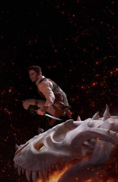
Just turning up the corner of a mouth can take a pose from “sneaky and serious,” to “cool and confident mischief-making.” The Thousand Deaths of Ardor Benn, Tommy Arnold.
Ideally, we take this issue into consideration before we even begin to paint, as a part of our design – we’re always trying to “hack” the human mind by using what we know about it to guide it through our pictures. Considering the effect faces can have, the first thing to decide is if a face even belongs in the piece at all. I tend to think of this as a dichotomy: “faces vs. bodies.”
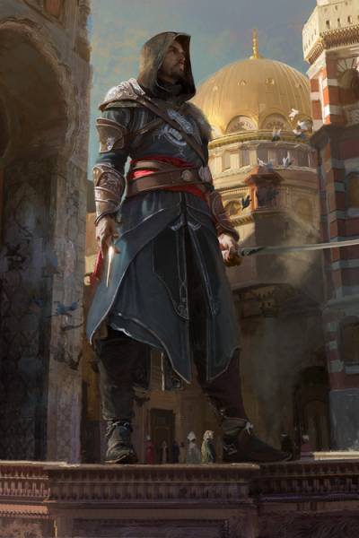
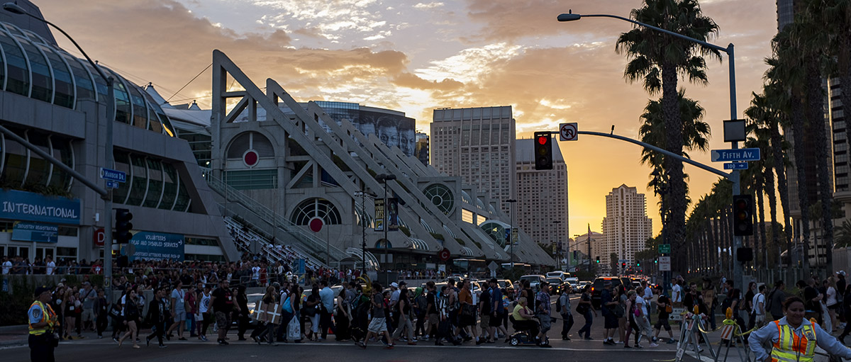
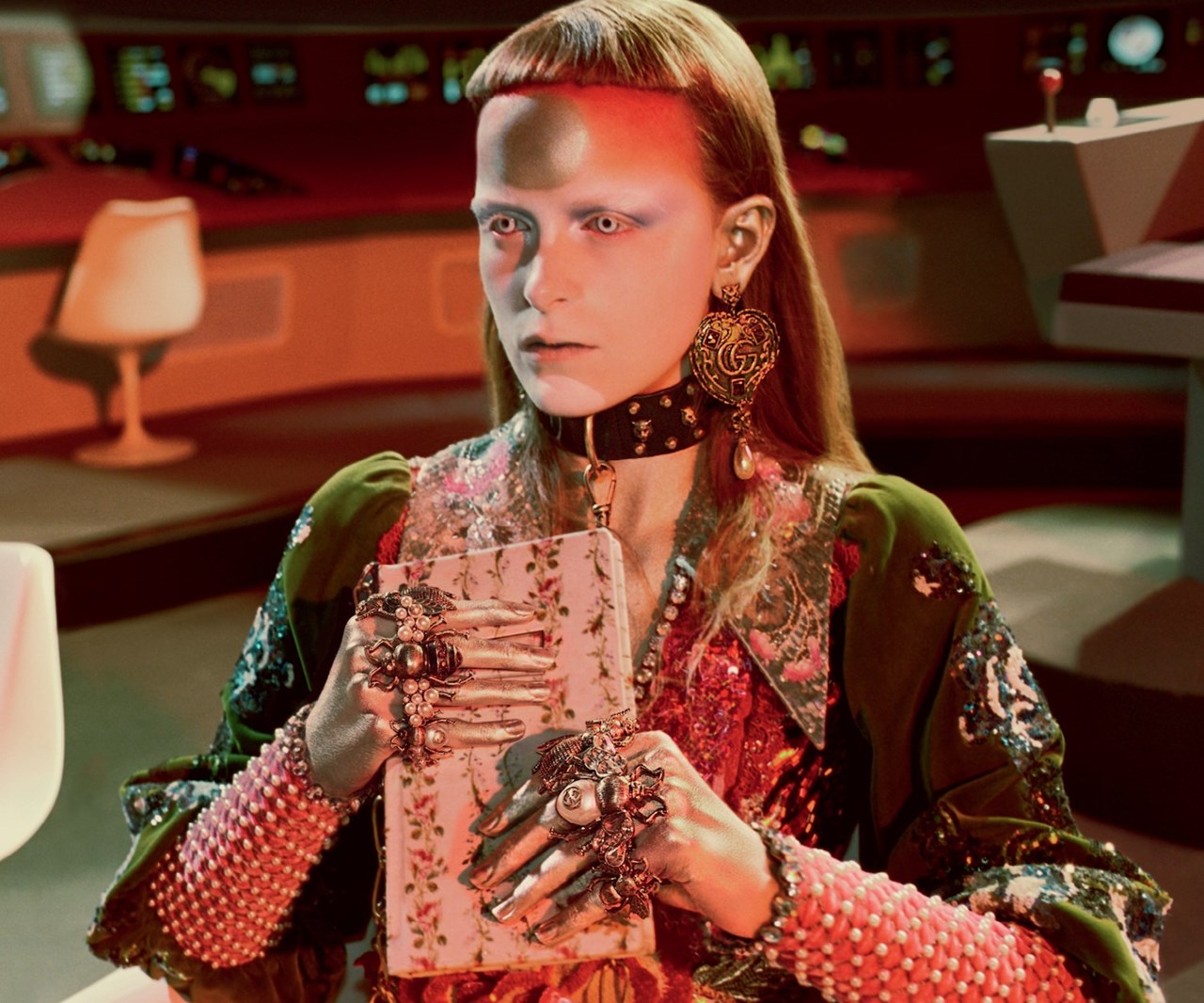
In each piece that concerns a human figure, we’re making a choice between the face and the body: which one will best serve our purpose? Faces are just so strong – if they get their hooks in the viewer the rest of the painting all becomes an extension of that face, and makes the piece “a portrait,” in the classical sense of the term. The golden light on the buildings behind the figure, the way the clouds or the crowd move, the details on the buildings – everything is now related to a portrait of a person, and supports the vision of that person the artist is trying to convey.
Conversely, the artist can withhold the face from the viewer, and force them to take their interest and their appreciation from another place. The body and its harmony with other elements can now dominate.
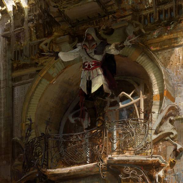
Same subject, same artist – but by withholding the face in the second shot, Craig creates an entirely different sort of piece. This isn’t a painting of a character, it’s a painting of an action, a moment. The architectural arch doesn’t say something about Ezio, it accentuates and suggests the motion of the arms as they’ve risen upwards. And look how little is needed to obfuscate the face! So often, just taking away the eyes or casting the face into shadow will do the thing. We have to manage faces carefully, and with intent. Sometimes a flat blorp of color is a better face than a painted one.
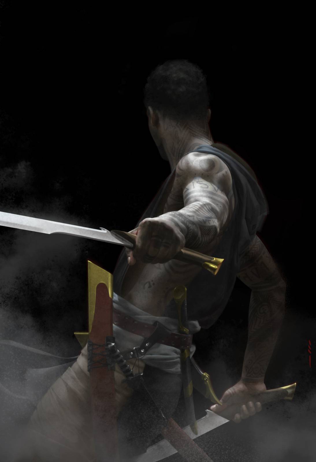
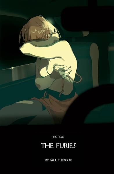
The less we see of the face, the more the body is able to communicate and contribute. Here the vulnerability, pain and anguish all come through the body; a face literally portraying the emotions could do no better – and would probably feel garish. Choosing the body over the face made this haunting and expressive picture possible.
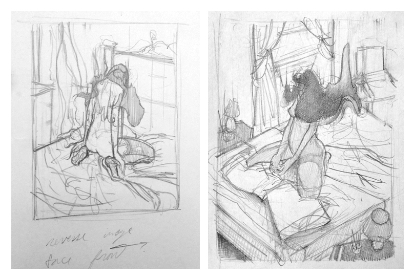
We can train ourselves to think in this way as we look at pictures, but also as we draw the figure. When the model takes their pose, ask yourself if the better drawing would be of the face, or of the body, and minimize the other. We don’t have to “get it all,” just as in our illustrations we don’t have to paint it all. We only want to feature the things that serve our intent; so let’s practice good picture-making habits even as we practice our drawing craft.
Before long you’ll be making these choices instinctively, and you won’t think about this simple dichotomy much anymore; that’s how we want all good painting thoughts to become. Nevertheless, this question about “faces vs. bodies” will be there to help when a painting gets into trouble, when you need encouragement to rub out a face, or crop off the eyes, or slam a giant face right in the middle and say “this is what the painting’s about; I don’t need to show the body.”




Thank you soo much for this article! Although in some level i “already knew” that, it was amazing to read about and realize how much this is lacking on my process. I always end up doing the same mistake of trying to put everything in my illustration and end up with a mess of information. Now i will try to be much more carefull about this in my next work. Thank you! =)
That’s actually super fascinating. It explains why very stylized things like comics and anime can get away with omitting a face altogether for the sake of conveying a particular emotion. Great stuff 😀
Another great advice, thanks Tommy.
Amazing reminder, Now every time I draw a face on something I ask myself this question!