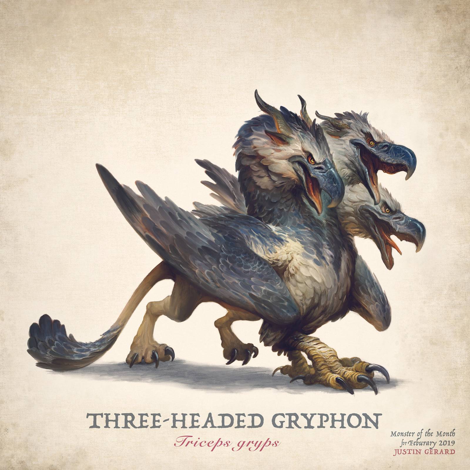
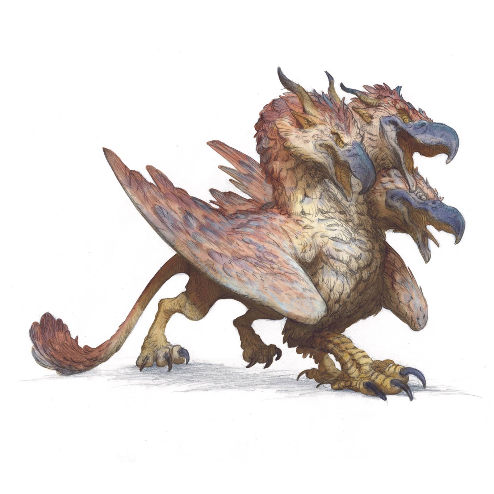
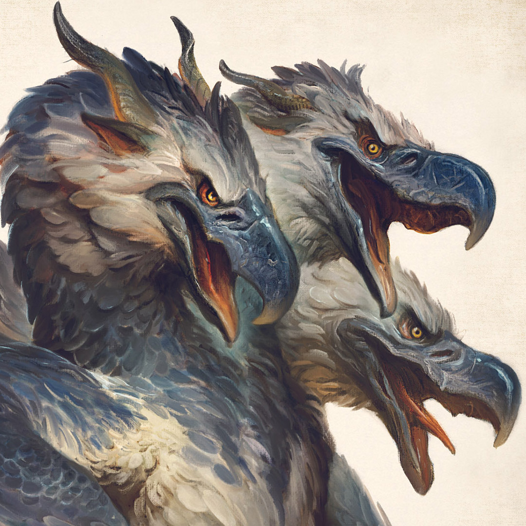
Today I’d like to share some process shots from a mythological monster I painted recently, The Three-Headed Gryphon. (As if they weren’t scary enough with only one head…) As with my other monsters, I draw them traditionally in pencil, then color them digitally in Photoshop. My goal is to finish them in 5 hours total. Will we do it??
Before we begin: If you’d like to see what tools I am using for this piece, I have (finally) posted a materials list on my website! It shows the exact pencils and papers used for this demo.
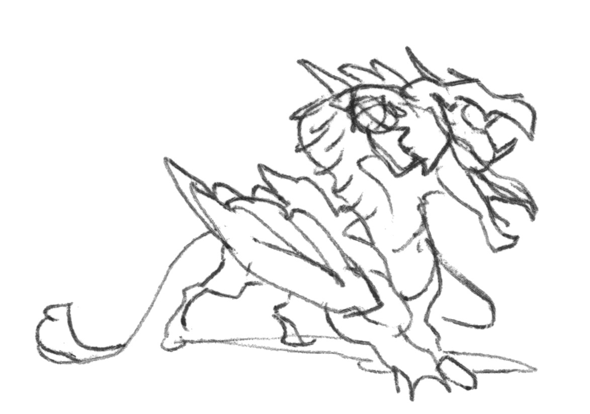
This monster began, like all of my monsters, as just a tiny little scribble in a sketchbook:
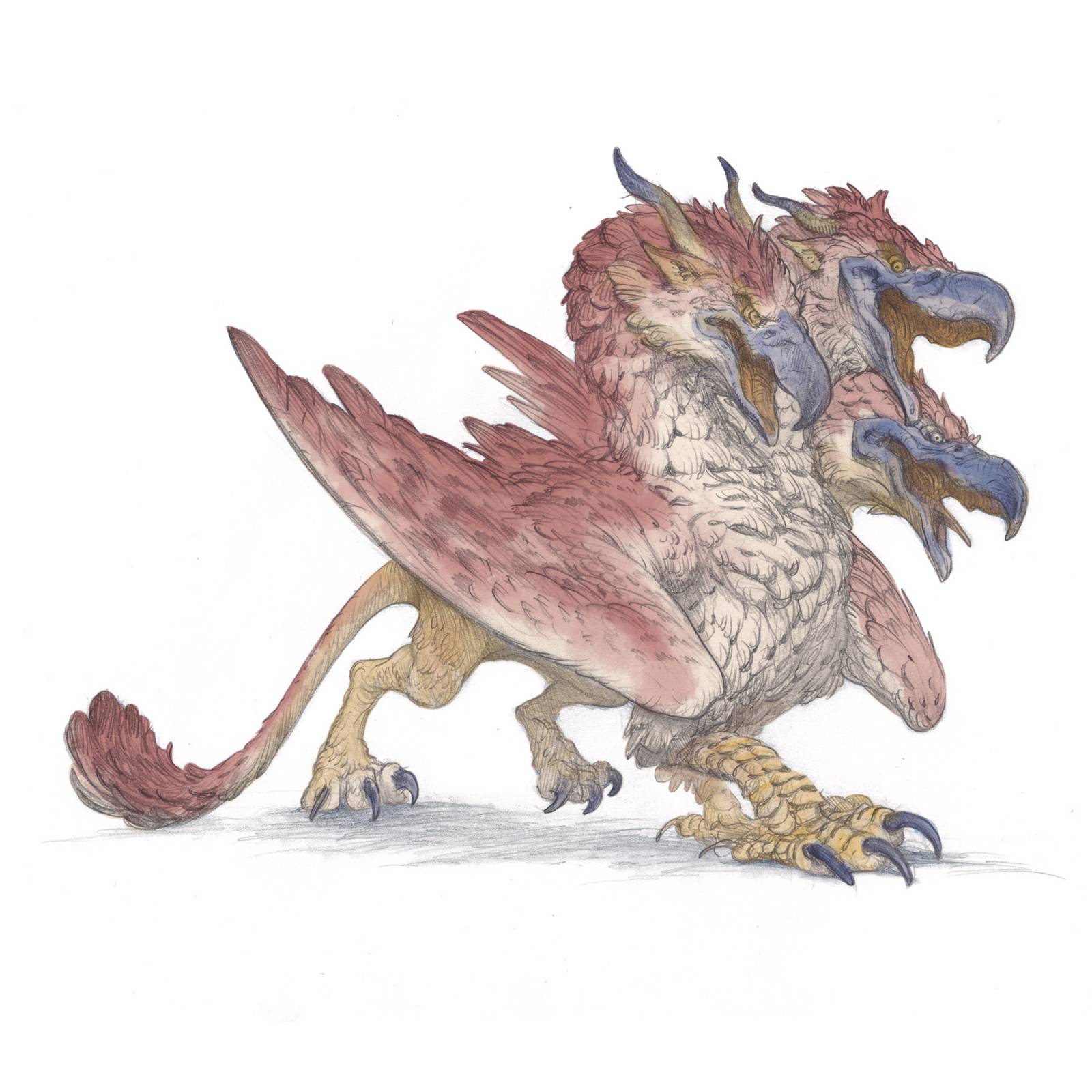
From there he was printed out and transferred (with a lightpad) onto a sheet of Strathmore Bristol at a larger size (8″x10″ inches). I do a clean drawing over this transfer, trying to keep my work to only lines, textures and shadows, and very few half-tones. I find too much smudging and shading interferes with digital color for me. Before I scan it in, I go around the image with an eraser stick and clean up any smudges, artifacts, or stray lines. I also punch up any areas that might could do with some lighting. (Such as on the tips of the beaks.)
Tight drawing. Pencil on bristol paper.
Once I have completed my tight drawing, I scan it in and bring it into Photoshop. I place it into a standard layout so that I know that it will fit correctly within the final proportions, size and color profile that I would like.
Now in Photoshop, I set my drawing layer to the ‘multiply’ mode. This way the lines of my drawing will remain, but all the colors that are painted below it will show through. Below my drawing layer, I create a new normal layer and label it ‘color’.
I now do a basic flat fill of the local colors of my monster, reds and tans and yellows. Nothing fancy or even precise. I just need some basic information to get started. I may even change the colors later as I get to know this monster better! I plan on using more painterly brushwork, so I don’t need to get too hung up on making sure I am coloring inside of every little line.
Shadow Color Lay-In
Next, I add in the shadows over the colors using some soft brushes. Now this part is very important. I need to really nail down my light sources here, otherwise I will find myself really struggling with the image as I paint it, and the final image will be all over the map. Since this is daylight lighting, I am keeping my shadows a warm neutral tone and my lighting to a blueish neutral tone.
Semi-transparent layers
Once my colors and shadows have been established I now create a normal layer over top of my drawing. On this layer I use 50% opacity brushes to slowly start building up my forms and adding details. It is still quite messy, but as I keep applying the brushwork, it gets sharper and sharper. You can see I have also begun to drift away from my initial reds and into more blues as the wings just feel better to me this way. I don’t bother reworking the colors underneath. A little complementary color underneath can make colors sing.
As I paint these semi-transparent layers I use brushes with a little bit of texture built into them to make sure that the image doesn’t get too plastic and smooth looking as I work. (A problem you often encounter with digital painting.)
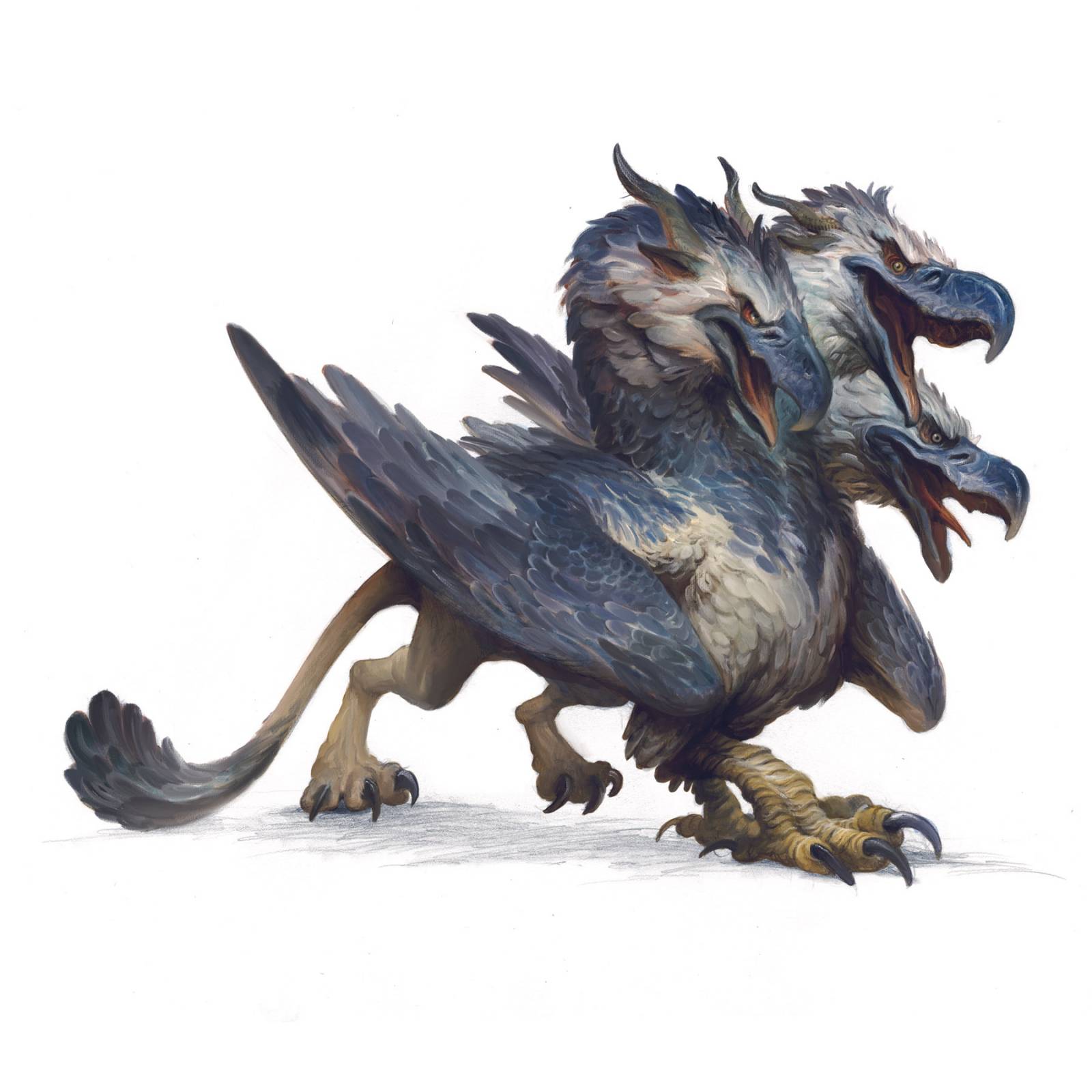
As I progress I use more and more opaque brushes to paint in the details and shapes. I also begin to use mixer and smudge brushes as needed to even out any overly harsh passages and to add subtlety to my value transitions.
At this point I also take a moment to shrink the head of one of the gryphons. This ability to make size and proportion adjustments on the fly is one of my very favorite parts of working digital. If it were a traditional painting it would have taken me a very long time to pull everything back, and I likely would have just skipped it. But since it is an easy fix here I went ahead and made the adjustment.
As I get closer and closer to the final, I use progressively smaller and smaller brushes, until I am essentially back to something the size of my pencil line, to add sharp details to the figure. To add sharp highlights, such as those on the beaks, I use a small, very opaque brush on a layer set to ‘screen’ mode.
Finally, I go all around the figure cleaning up the edges and erasing out stray marks and artifacts so that it is clean and presentable. Add the text and we are done!
Final Thoughts: Even though this is not a method of working I use very often I had a lot of fun with it. I tend to prefer to do all of my painting on top of my drawing. But this method of adding your initial colors underneath the drawing is a nice little trick that is both fast and effective, especially when working in a time crunch. As I mentioned at the beginning, I had been aiming for 5 hours on this one, but got in at 7, (An extra hour per head?) which is still pretty good. I think it would have likely been around 10 if I had worked in my normal manner of working multiply into color dodge into screen into color.
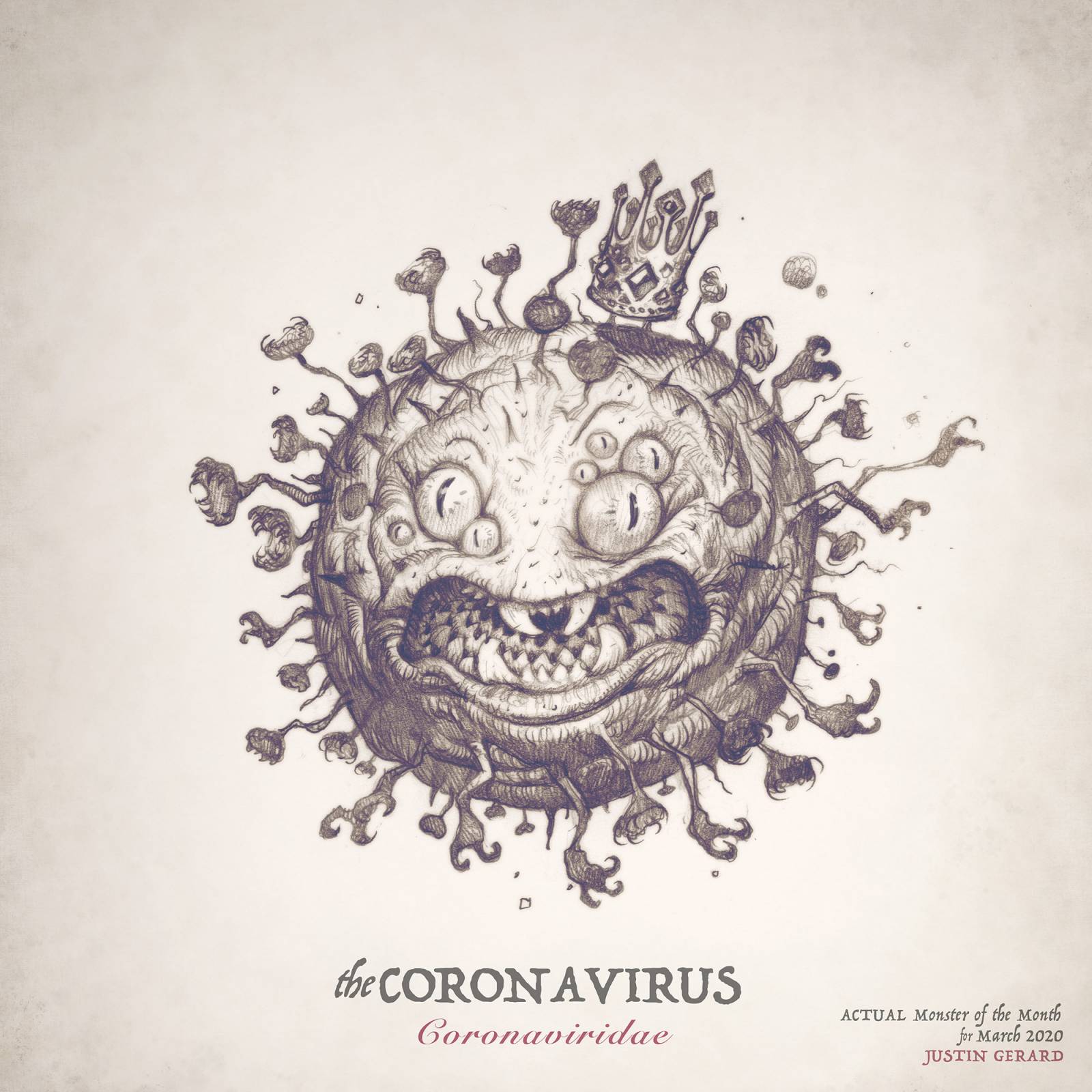
In closing, I will leave you with this: Wash your hands. Stay vigilant, stay safe. There is a real life monster outside this month…




Love the colors and the personality on this guy.
Hey thanks Calvin!
Nice piece, and very sculptural in look. Have you thought of turning it into a sculpture?
Not yet, but I have been working with sculptors on some of the other monsters I’ve done. So it is possible that we might tackle it at some point. If I ever could find the time I would love to take a stab at something like this in clay. I find working with clay so relaxing.
This is wonderful Justin. I especially love the distinct textures you created from the soft feathers to the hard beaks with their scratches and scars.
Thank you Mark!
I’ve had the close-up crop image open on my monitor for awhile now; I just can’t stop looking at it. This one came out really good!
Hey well thank you Bre!
Great work…Question…you did the shadow layer on the same layer as the initial color layer?
Hey Matt, No I made another layer over top for that. (You could do it right on the same layer, but it’s just a bad habit of mine.I tend to make waaaaay too many layers….)
Love this post, inspiring, great work! xx
Fantastic! Thanks for this article.
Woah Justin! That’s a real beauty. Love the different textures and craggy beaks. Those heads have so much character!
Justin, thanks for sharing your art creation process. Very formidable creature (GRYPHON)!
I love it Justin. Any chance that your recent monster art will get collected in your next sketchbook? These are terrific. The thought occured to me that each head might be a bit more battle scarred because they probably fight over scraps.
And any poor, unfortunate things they/it happened to catch would be torn to scarps. So sorry to miss you and Annie in KC this year. Here’s hoping for next spring.