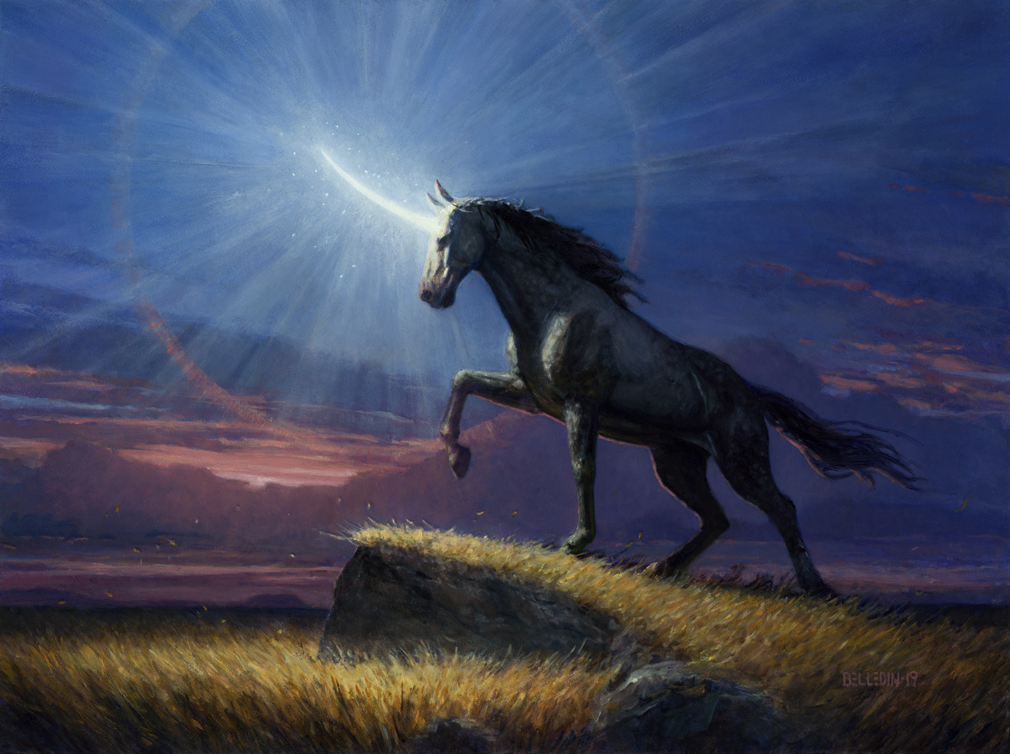
After twenty years of working in the fantasy genre, the inevitable finally happened: last year, I was asked to paint a unicorn.
As I’ve said before, one of the benefits of this job is that I end up being asked to paint things that I would never assign to myself. Overall, I think that’s a good thing as I’m essentially being paid to broaden my horizons. However, there’s a potential downside to this aspect of the job, as well, and that is that I’m not always enthusiastic about the things I’m asked to paint—precisely because they’re not the kind of thing I would assign to myself.
An excellent argument could be made that part of the job is finding a reason to be interested in any given job—regardless of whether or not one’s “thing.” Usually, that is something I endeavor to do. However, I confess that I was less than enthusiastic about painting a unicorn. I’m not really a unicorn guy, honestly. At least, I don’t think I am. Plus, most of what makes up a unicorn is a horse. And horses are hard.
Of course, I’ve never really thought of myself as a dragon guy, either, and yet at this point I’ve painted quite a few of them. As my wife is fond of saying, sometimes the only way out is through, and so I rolled up my sleeves and went to work.
The assignment called for the unicorn in question to be standing on a bluff or in a grassy field at dusk, its horn ablaze with brilliant white light, keeping the shadows at bay. Clearly this was no average unicorn.
Off the bat, my thinking wasn’t about composition or lighting. My thought was on what the unicorn even looked like. I confess that I am a bit of a traditionalist with these things. I like my unicorns to look…like unicorns. It’s a horse. With a horn. I didn’t feel any need to get too far from that basic design. I’m not knocking anyone else for really pushing the boundaries of unicorn-dom, but I just wasn’t going to be the guy to turn a giraffe or antelope into a unicorn, or blend together a lot of other animals along with a horse and come up with something really outside the box. So I was definitely going to come at this with a horse-based mentality.
With that in mind, I started to jot down some thumbnail sketches. The brightly lit horn made certain compositions less appealing to me. A frontal or 3/4 view meant that keeping the horse shape clear and focused would be more difficult since a lot of the front-facing planes would be blown out by the bright light (at least that’s how I saw it in my head). So, I decided on something approaching more of a side-view that leaned on the horse silhouette against the dusk sky and a strong pose to sell the unicorn’s power (you know, beyond the brightly glowing horn).
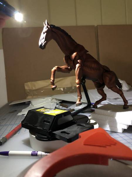
Once I’d settled on a thumbnail, I took a posable horse model I have, lit it accordingly and took my reference.
I really liked the graphic shapes the stark light created. They’d need to be adjusted to fit a horse’s actual anatomy of course, but I think the model provided a good start.
Along with the above image, I added to my selection of reference some images of horses I have in books and some more I found on the internet. Those resources in hand, I put this pencil sketch together:
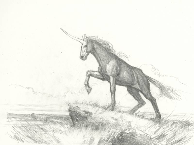
Why such a detailed pencil sketch? This is kind of unusual for me. Mostly I did this to suss out the horse’s anatomy up front so I wasn’t groping for it as I painted. I think I figure these things out more precisely in pencil, and I tend to leave a lot of details to insinuated scribble when sketching digitally. Obviously, the more problems I can solve in pencil, the better, and a lot of the headaches I tend to have as I work are due to a lack of problem solving at this stage.
As I sketched, I sort of stumbled upon the added gag of having the grass blowing away from a central point (that being the unicorn’s horn) as a means of further illustrating the impact the horn’s light is having on the environment. I wasn’t sure that was clear, and I also wanted to nail down the piece’s value structure, so I decided to do a digital pass before handing the sketch in for clarity.
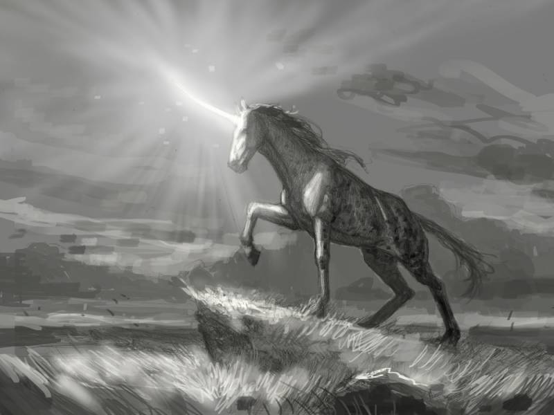
With the digital additions, I think I solved most of the issues I was potentially going to be dealing with, save color palette. But even there, I had a strong notion of where I was headed.
The above image was approved and I was off to paint.
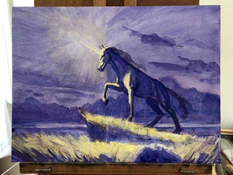
After transferring the sketch to the board using a digital projector, I quickly slapped down some paint to start to block in the relative values.
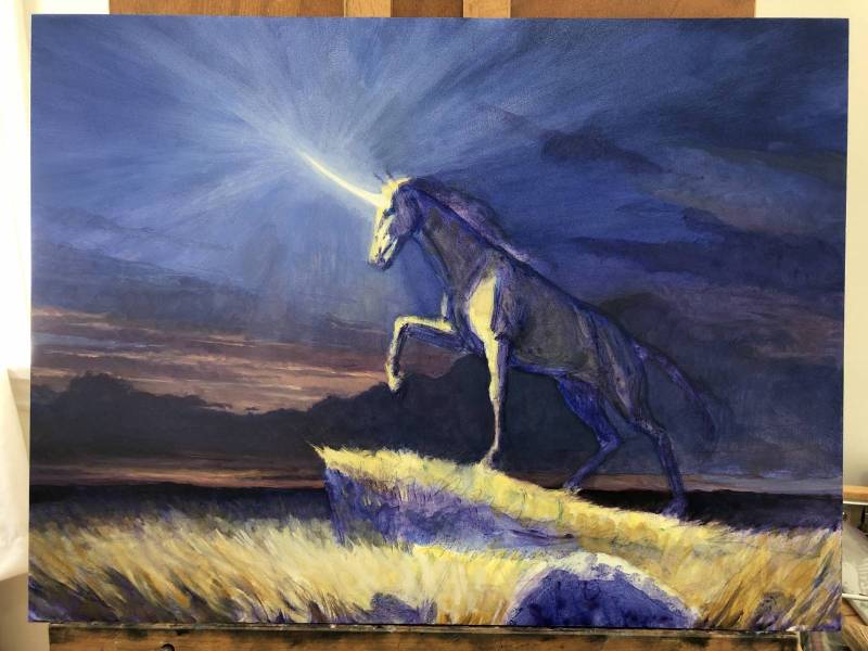
Pretty quickly thereafter, I started nailing down the background (and a little bit of the foreground).
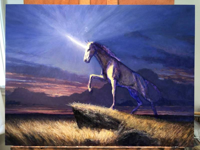
A bit further along here with very little done on the unicorn itself. But I’m starting to work on getting the light rays built up.
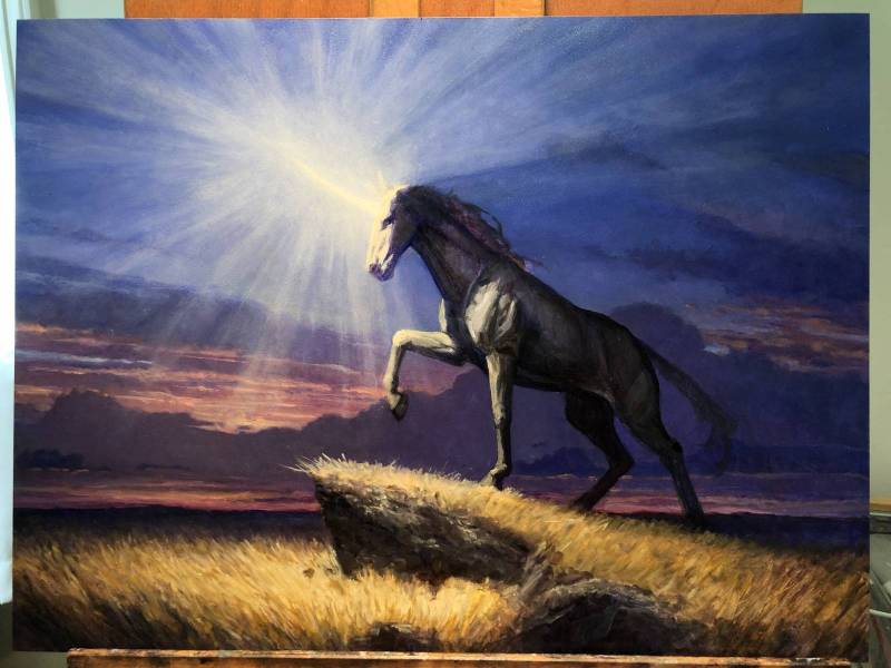
Finally, I started to block in the unicorn itself and continued layering in the rays of light (which were accomplished by multiple layers of thinned paint glazed over the piece, painted both from the center out and from the outside in. These were then blended thoroughly with blending brushes and a finger.
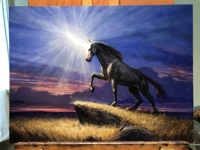
At this point the unicorn was starting to come together. I did begin to worry, however, that the silhouette was starting to get a bit lost against the sky behind. So, I took this image and started to tweak it in Photoshop to explore ways of dealing with it.
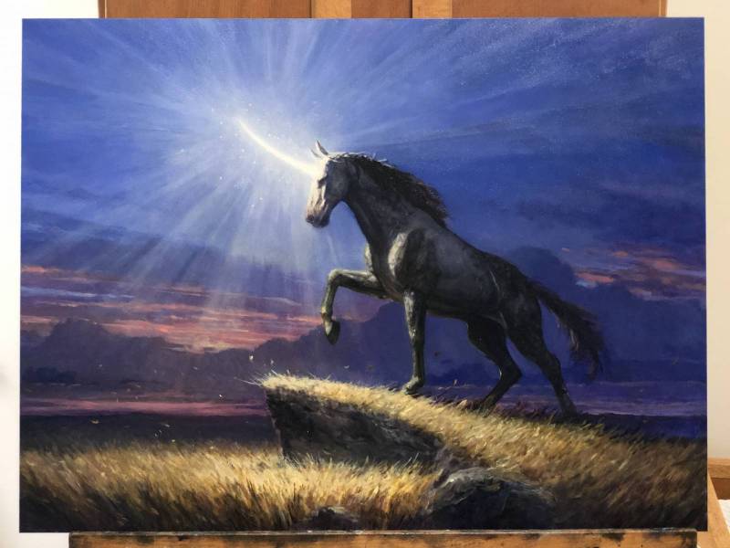
My solution ended up being to just lighten the dark cloud layer that runs along the horizon and comes up behind the unicorn. It’s an extremely subtle change, but made quite a difference in my mind. Still, I wasn’t completely in love with where the piece was at. It needed something more…
Once again, I pulled the above image into Photoshop to explore my options. Furthermore, I consulted a couple of my fellow illustrators for their input, as well. Eventually I settled on a plan of attack and implemented some subtle changes as I completed the piece.

Sometimes the joy of a thing is found in the doing rather than the thing itself. I think I can safely say that’s how I feel about this piece. To reiterate, I don’t hate unicorns, they’re just not the kind of thing I’m moved to paint given the choice. At the same time, this piece turned out to be a heck of a lot of fun to work on. That I’m actually pleased with where it landed makes the experience all the better to me.
Unfortunately, I feel I’ve not been consistently successful at finding something about each assignment to get excited about as I did in the making of this piece. And sometimes the stuff I do find exciting about a piece ends up being art directed out because of necessary changes. It’s all part of the show, however, and each new assignment represents a new opportunity.



Great image Steve!
Thanks, Donato. I really appreciate that!
I love this painting! Thanks for sharing it Steve. Really inspiring. I love how you took it wiht the Unicorns, somtimes low fantasy can be more relatable to the human experience than high fantasy.
Thanks, Sebastian. I think the impact high or low fantasy has on a person probably depends a lot on the person. I’m personally not deeply steeped in the fantasy genre (despite working in it for 20 years), so I think low fantasy tends to be more relatable to me, but I’m always open to borrowing from one or the other as necessary. Given the option though, I really like grounded and more familiar stuff.
Man, the addition of the lens flare MAKES the piece. Really good call, late in the game.
Thanks! It’s weird, right? Sometimes it’s the littlest, subtlest thing that pulls an entire piece together.
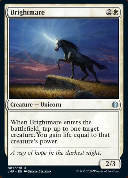
Thanks for a cool article! Really makes for a beautiful card.