Sometimes when we watch movies there’s too much sensory input to take in. I’ve gone to movies where I came out without a whisper of what the story was. Couldn’t tell you much about it. I’d watched too much of the production values and lost the story thread. I studied costumes, settings, makeup, acting, lighting, camera angles and movement.
Science fiction films are especially fascinating and lately the immersion is so remarkable I almost don’t need a story. Blade Runner was like that for me.
I hated the movie when I first saw it. That deadpan voiceover, the perpetual night skies, the simple characters…all of it whooshed by me like a police hover car. The eyeballs, the gas flares, the perpetual rain. It was too much. I thought it was the director’s attempt to impress the audience.
But I did like many of the effects, so as an artist I went back to appreciate the camera wizardry and study the production values once more.
That’s when it hit me—on second viewing. The world opened up and I actually listened and watched with a clear mind. It’s like listening to an album for the first time and everything seems awkward and misguided, until that second or third listen and then, WHAM! it hits you altogether.
All the film’s subtleties seemed to flow and build with a rhythm that combined the detective novels of the past with a gritty future. I’d noticed Ridley Scott’s brilliant lighting on the first watch, but this time I could study it while taking in the story. Each shot was a lesson in visual mastery that I’ve not stopped looking at and learning from since. The characters that at first seemed flat were now nuanced and vital. Simple, yet rich.
I’ve seen the film countless times now and it didn’t take long before that lifeless voiceover became a favorite aspect of the story. I love voiceovers. I love the extra dimension they add to the character and the story, and also the sense of time passage. A voiceover can combine the past and present, while setting up events to come.
I love the hints Scott put into the entire film that fleshes out the world but doesn’t explain. Touches like the graffiti-smeared payphone, the suggestion of the incredible strength of the replicants, and the power of Deckard’s gun. I swear that thing must be shooting missiles.
When I first started out in freelance life, I walked my portfolio around Hollywood showing my portfolio of paintings. I’d painted my own version of the movie poster for Blade Runner and several other films, including Alien and my own poster idea for DUNE that had yet to be made. (it may be the reason I was hired sometime later to paint the original poster for David Lynch’s DUNE, which was never used. In fact, I painted two of them. They show up from time to time on eBay.)
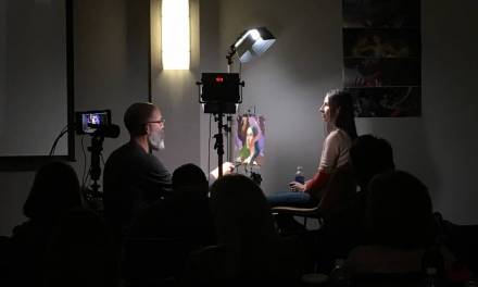
I do live demos for my online classes with SmArt School each semester and portraits are especially instructive because they are pertinent to training and contain all the shapes, forms, values, and edges a painter needs to understand to build bigger images.
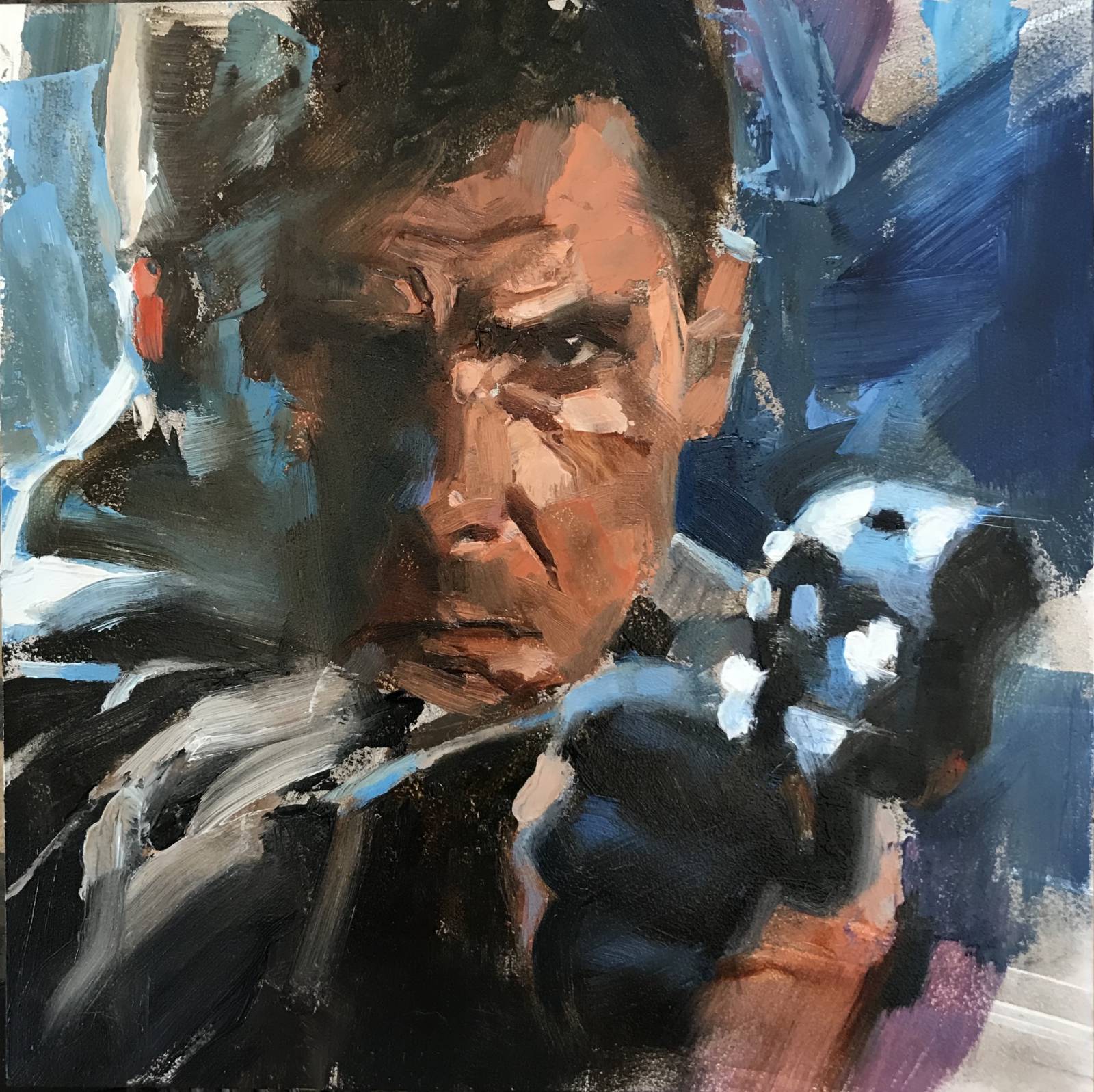
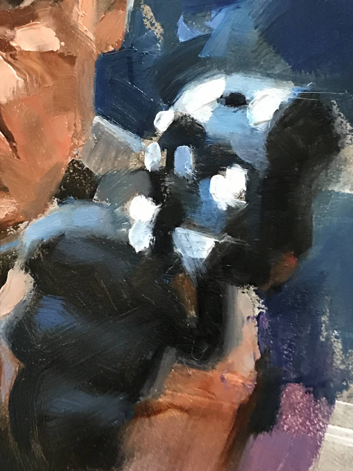
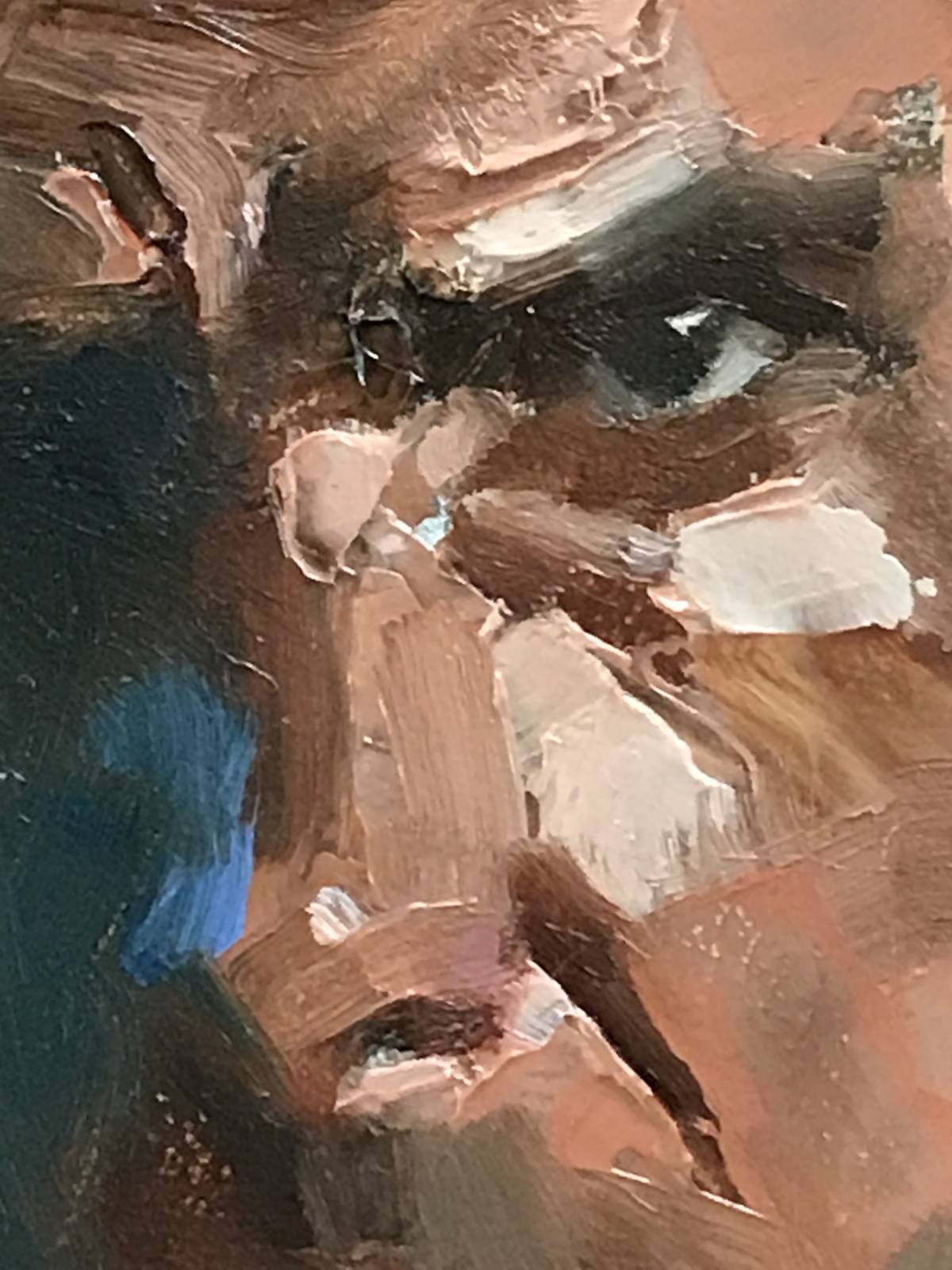
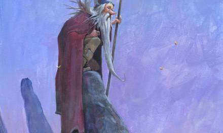
The time lapse painting, below, of Harrison Ford as Deckard is an example of what I show in my classes. I challenged myself on this one to capture his likeness on a 5×5” Gessobord panel with a palette knife and brush. It’s insanity to paint this small with a thin steel blade, but it allows me to discover shapes and forms I might never create. And talk about edges. One must be 100% focused and aware during the painting session to be able to control pigment with a lack of control.
This gives the piece life beyond the reference. This pushes the painting beyond a reproduction of a film frame. Ultimately, you want the audience to remember the painting before the photography.
It’s a Zen-like experience to paint without thinking of the action of painting. The strokes must be direct and simple, yet define information. Put pigment down and leave it. Accept the gesture and move on.
There is richness in simplicity.



Beautiful job Greg, it’s always relaxing to let your thoughts go and just let the paint, palette knives, and brushes take over and do their magic.
Happy to see how Blade Runner is still influencing artists to experiment with the breathtaking scenery and colors of the film!
Another inspiring post Greg. Best line “life beyond the reference.” Very important to remember it’s about creating art and not a recreation of the photo. Glad you shared the video. BUT….How can you tease that you made a Dune poster and not post some jpegs! Google turned up nothing! Hope things are good.
Beautiful!!
Painting I find going through the ugly stages the hardest part of the process.
But looking at you in these demo timelapses it’s that you also go through those ugly stages with such confidence and the finished pieces look so genuinely great.
It’s inspiring to see you pain
This was just what I needed to see. The shapes and edges are amazing. Throwing out fussy blending and transitions was liberating. Very nice demo.
Thanks, All!
Brian: I plan to do some more from the film. Scott’s lighting is too good to resist painting those wonderful colors!
Matt: LoL! I would’ve shown something but I only have a large 8×10 transparency of the piece and can’t access my scanner at the moment. Perhaps someday soon. Spoiler: they’re not so good.
Christof: be patient, my friend. It looks ugly because you’re looking at the paint and not at the potential. The potential of where you’re GOING with the paint. I try to keep in mind where the pigment will end up; along the way, I accept or reject what’s already down by wanting to render a part or leave it loose. Stay with it!
And… did you mean to type “your” or “paint” in that last line? Lol!
Thanks the compliments, rasmus and Tom! Alla Prima is direct. Once down, twice studied.
Well spoken Greg
I was extremely satisfied with my experience at studycorgi.com for an assignment I recently submitted, as the paper was brilliantly written and customer service was unsurpassed. Based on this positive encounter, I would definitely recommend studycorgi to others!