Not too long ago, I was asked to paint the cover for the sixth novel in Patricia Briggs‘ bestselling Alpha & Omega series, ‘Wild Sign’.
One of the hardest parts of designing a cover is trying to figure out the right mood and look for that specific book. Is it going to be an action piece? An epic world shot? A romantic embrace? There are so many options available for a good story, which usually contains a little of each of these elements. So the real challenge an illustrator often faces is distilling the whole book down to a single “flavor”, and then trying to capture that flavor in a single image. Sometimes that’s really hard to do. Fortunately, that wasn’t the case here. Because I also painted the other covers in this series, and the overall look was already established, I was able to jump right into the project with surprisingly little trouble, despite the lack of manuscript.
Yup, you heard right… no manuscript. Typically with a cover assignment, the Art Director will pass along a ‘cover brief’ (which outlines what they are looking for), and a manuscript (which is usually in an unfinished state). But the interesting thing is, the more successful a book is expected to be, the less information the artist often times gets. Because this series is a New York Times Bestseller, the publisher actually begins advertising the book to retailers really far in advance. So far in advance, in fact, that they sometimes need the art before the book is even written. They also need the cover art early so they can manufacture point-of-purchase displays and the like, all of which need to be ready before the book’s release.
So what is an artist to do? Well, in this case I’m really lucky and I get to call the Author and talk it out. Because I have worked on Patricia Briggs’ covers for over 16 years now, the Publisher feels comfortable enough to let me talk to the Author directly and hash out the specifics. When a publisher is involved, direct Author/Artist interaction like is something that is usually frowned upon professionally. After all, we have Editors and Art Directors for a good reason. But these covers are truly team efforts, and the people at Ace Books know everyone has the book’s best interest in mind. So I call Patricia Briggs, and she basically tells me a little bedtime story over the phone. She lets me know what the characters will be up to, who the mysterious villain will be, what drama will ensue, and so on. We discuss the major themes of the story, and important narrative beats that might make for an intriguing cover. Once I know what the story is about, I finally begin sketching the concepts that I will present to Publisher.
The first step in designing the new cover in a series, is to look at all the previous covers. You’d be surprised at just how important this is! A good series needs to have a consistent look without being too repetitive. For instance, if the previous cover was red, well, this one needs to be a different color. If the main character was facing left before, then I probably need to make them look to the right… and so on. Sometimes the previous images in the series end up making a LOT of the compositional decisions for me… arguably even more than the specific story itself!
The title of the book also make a lot of decisions for me as well. It sounds silly to say, but if the book is called “Wild Sign”, well, there kind of needs to be something either wild, or a literal sign, on the cover somewhere. Otherwise, it just doesn’t make sense to a casual viewer.
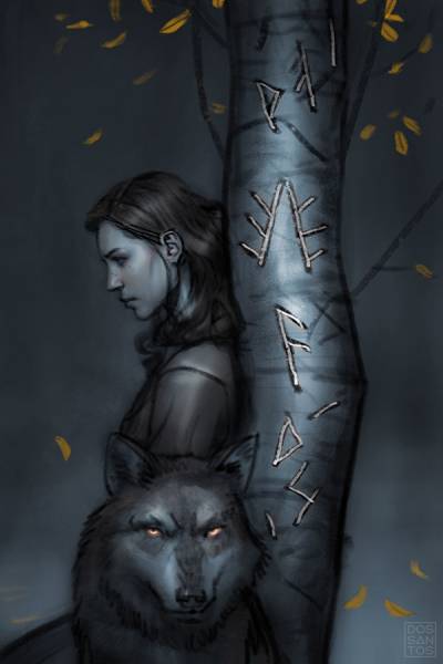
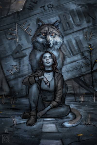
I often times think of the titles of books as miniature poems, particularly with Patricia Briggs’ covers, whose titles are always 2 abstract words. I try to think how these two words can signify a theme in the story, and then build a picture around that. In this particular instance, I thought the “Sign” could be runic symbols, and I could make them appear a little “Wild” if they were carved roughly, or even spray painted, onto something. (I know… DEEP, right?)
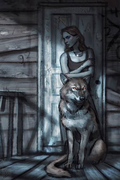
There is actually some significance to the specific runes and signage in my sketches, but I don’t want to ruin any aspects of the story, so you’ll just have to wait to read the book to know what they are.
Above are the five sketches I submitted to the Publisher for their consideration. If this was a new series, I probably would’ve offered a more dramatic range of options. But because I already know the look the client is looking for, I primarily gave them a selection of different poses and environments to chose from, rather than wildly different concepts.
The Art Director presented the sketches to her team, and they decided we would go with Sketch #3 (the side view) with just one small revision… that I change the heroine’s head from a profile view, to something looking slightly more at the viewer. Easy peasy.
Once I have sketch approval, I need to figure out how to refine it further into something that would make an attractive painting. Until this point, the sketching has been done primarily from my imagination so that I don’t hinder my creativity by getting bogged down with notions of “right” and “wrong” when I’m trying to draw something interesting. But if I want to paint it at my usual level of detail and realism, that definitely takes reference.
The reference I gather is a combination of things I find online, and photos I take myself. I don’t own wolf (unfortunately), so those photos I definitely need to find online. But the rest is stuff I photographed myself. The biggest challenge was the heroine, Anna. The model I have always used for that character now lives in a different state than I do. So rather than change models, I sorted through old photoshoots I did with her from previous covers, and tried to find an existing headshot that would suit my needs. I then photographed my wife in the correct body pose, and simply combined the two to create a new character. Even things like the wolf and tree are combinations of small elements from multiple photographs.
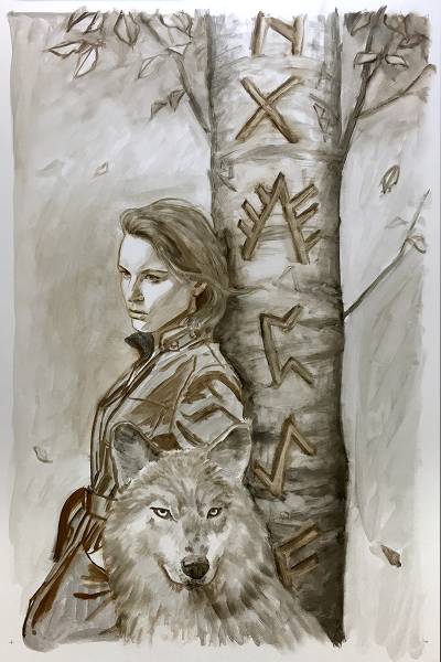
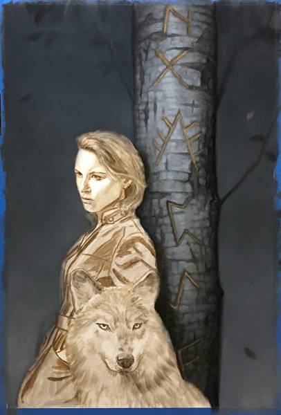
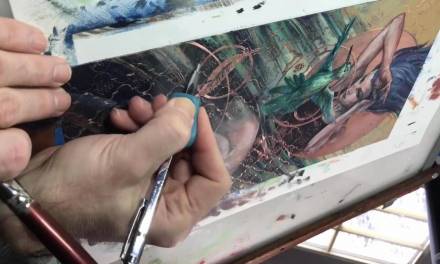
With good reference in hand, I begin the actual painting process. Typically, I would start with a very detailed pencil drawing as there are a lot of benefits to having a tight underdrawing to work on top of. But there are also pitfalls there too. One of those pitfalls, for me, is when I draw in pencil I have a tendency to over-render. So instead, I opted to do my underdrawing in oil paint this time. This allowed me to be a little looser, and encouraged me to keep my edges a LOT softer than is my usual habit. The soft edges really aid in achieving a strong sense of mood and realism.
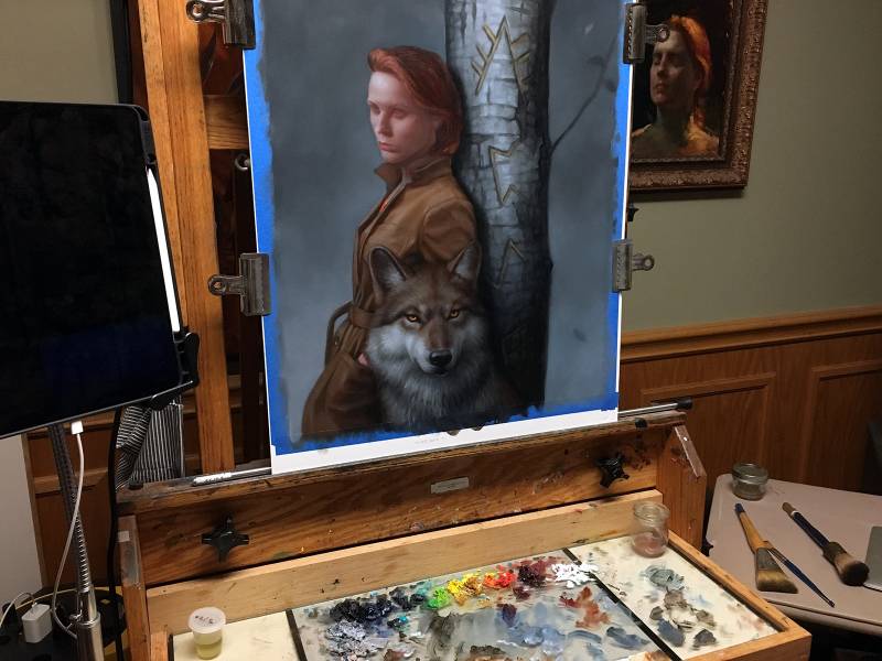
Once the underdrawing is fully dry, I begin the first coat of real paint. I always start with the backgrounds of my paintings, which is a pretty traditional approach. Starting in the background has two main benefits…
Firstly, backgrounds tend to be very soft, which means a lot of blending, and as a result, messy edges. I don’t want to have to worry about messing up a delicate face, so I get all the big, messy stuff out of the way first, and then clean it up later when I’m being more detailed.
The second reason is color relativity. White is a very tricky color to work on top of. You may think you’re mixing the right color, and it may indeed look right, but once you get the entire painting filled in, and the white of the board is finally gone, you can see how the colors truly relate to one another, and 9 times out of 10… you aren’t even close!
So rather than paint a whole face, only to realize I painted it all too dark, or too red, I paint the background first, as it’s a LOT easier to correct the color of a sky than it is a face. Only after everything else is filled in, and can I get a truly accurate idea of the colors I’m mixing, will I paint the face.
This painting actually took quite a few passes to complete. It’s a much subtler palette than I often work in, and so I wanted to get the colors just right.
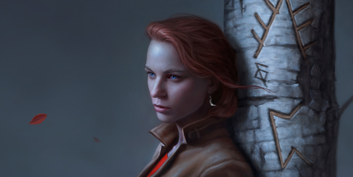
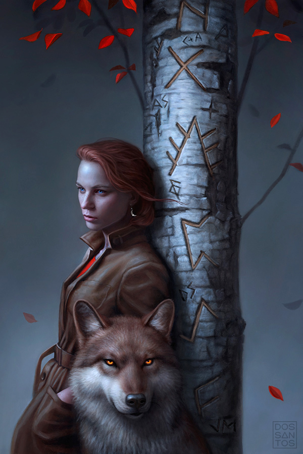
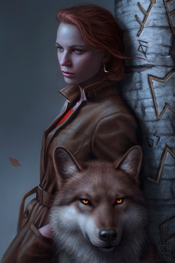
Once I am done, and the painting has had a few days to fully dry, I give it a fresh coat of varnish and take a high-resolution photograph it. I then usually spend a day tweaking things in Photoshop to fix any mistakes I see, and make sure my print file is as color accurate as can be. I then email my client the scan of the final painting, which you can see below.
At this point, the client reviews the final art and lets me know if there are any changes they may need. In this case, they all loved it, and it was approved without any revisions.
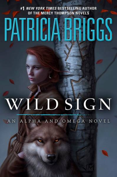
The Art Director then goes about designing the type and creating the final cover. Often times the Art Director will make small changes to the painting for a better cover design. In this case, after adding the type, they decided to add a few more leaves to help balance out the composition. Below you can see the final cover as it will appear on the shelves!
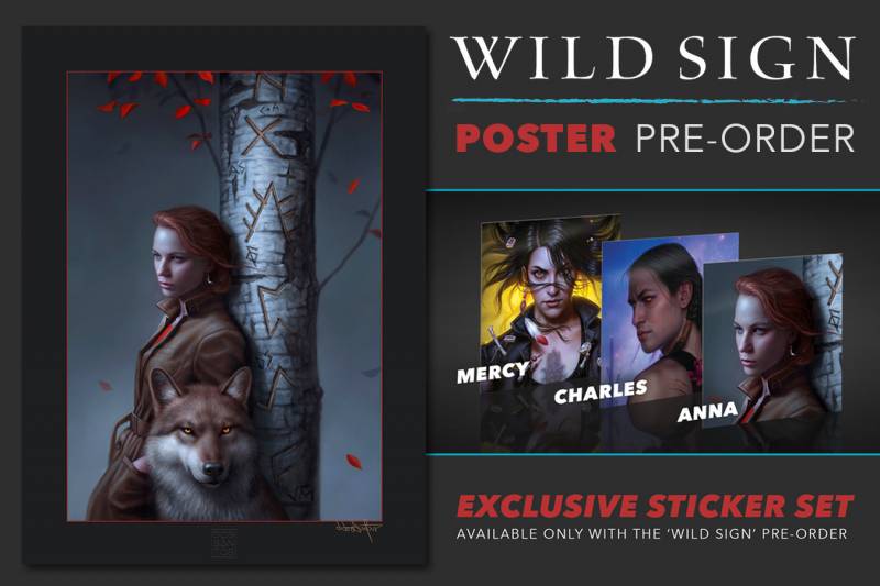
If you like this image, or are a fan of this series, you can pre-order a beautiful 18×24 poster of this painting, embossed and signed by the me, by clicking right here:
https://www.dandossantos.com/store/wild-sign-poster-pre-order
‘Wild Sign’, by Patricia Briggs, will be available from Ace Books in March 2021. You can pre-order a copy, signed by the author, from ‘The Signed Page’ right here:
https://signedpage.com/product/wild-sign-by-patricia-briggs/






Gorgeous art and very nice article! Thank you for sharing.
“… and 9 times out of 10… you aren’t even close!” – yeah, this. So much of this.
A fun to read article Dan. Thanks
Beautiful cover portrait Dan!