Whether for itself or as part of a painting, drawing is not a passive undertaking. No matter what information you depend on from reference, life, memory or the work of other artists who inspire you, what shows up on the page or canvas or display has to come from YOU and only YOU. The answer was inside you all along… or something like that.
If you haven’t already, I encourage you to read my previous MC piece You Can’t Draw Because You’re Doing It Wrong, to transport your head from the humdrum world of reality to mystical and magical wonderland of drawing, two-dimensional images magically become a three-dimensional world to be experienced by your audience (but you won’t bother, which is fine, because that’s less competition for the rest of us ?).
So here’s the nutshell version: A convincing drawing is not a snapshot of a 3d reality—it is its own reality where you, the artist, have used 2d shapes to create an illusion of form in the viewer’s mind. In the eye it is all 2d. The 3d part comes from the brain, from its interpretation of the 2d elements presented to it on your retina. (I use “shape” for two-dimensional things, and “form” for three-dimensional things. A circle is a shape, a sphere is a form.)
But before we get to how 2d makes 3d, let’s see how 1d makes 2d:
I say this series of dots is a line. If you are thinking and not seeing you might say it isn’t (and, wait, don’t tell me—your favorite Star Trek character is Spock, right?). For making art we must talk about how humans see, in which case there is most definitely a line—even though I did not draw a line (and I didn’t even draw the dots in any particular order).
You can’t not see the line, even though you simultaneously know it’s not there. You have no control over this aspect of your visual apparatus, and neither do your viewers.
Now let’s flip this around: Just as we must not think something isn’t there, even though we can see it, we also must not think something is there when in fact we are not seeing it.
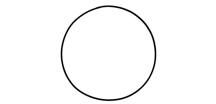
Maybe you say the above drawing could be a sphere. I say it isn’t—because while a circle might be considered some kind of accurate two-dimensional imprint of a sphere, if there is only this single circular shape then there is no illusion of form, and therefore it is not a sphere. It is not a sphere until you, the artist, inflate it into one.
The circle demonstrates that accuracy does not produce form—not at all. Accuracy produces only accuracy. Sure, to draw a sphere, a perfect circle is likely part of the equation—but when you confuse this with creating form you make a critical error (don’t worry, it happens a lot—we are all struggling along the same path).
So while you’re fiddling with anatomical correctness, proper proportion and perspective, these fundamental realities of human perception are smacking that primitive brain of yours, and your viewers (and me) over the head with a baseball bat.*
*The fact that (most?) brains do not “have heads”, but rather reside in heads, shall not undermine the power of the metaphor.
Finally, just as dots arranged a certain way present themselves as a line, so do lines arranged a certain way present themselves as shapes (you’re not going to claim these shapes don’t actually exist, are you? I thought we’d been through that).
Shapes can also be made with value / color. And shapes arranged in a certain way, we will see, present themselves as form.
Overlap: the mother of visual perception
Well that sounded weird…
But anyway… overlap is the single most important factor in how we perceive form in space. It is essentially impossible for any other factor to override it (though sometimes it is absent, and other factors must take over).
This idea of a hierarchy to visual interpretation is important. Because when I say, for example, that color and perspective are at the bottom of that hierarchy, it’s not saying they don’t matter, it’s saying that other things matter so much more, that if you don’t get them right your puny correct perspective will be meaningless.
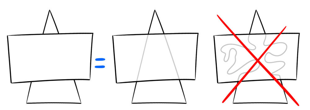
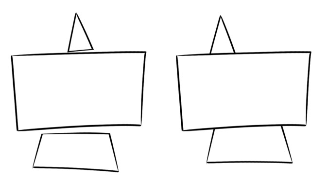
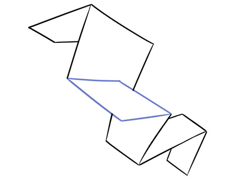
By drawing the three shapes on the left you are actually drawing what’s shown in the center—a rectangle on top of a triangle. Two things that aren’t really there, in three dimensions that aren’t really there.
You might claim that you could be drawing the setup on the right—but you are NOT, because that is NOT what the viewer will see.
What the viewer sees is an illusion you’ve created (hopefully intentionally), and THAT is what drawing is.
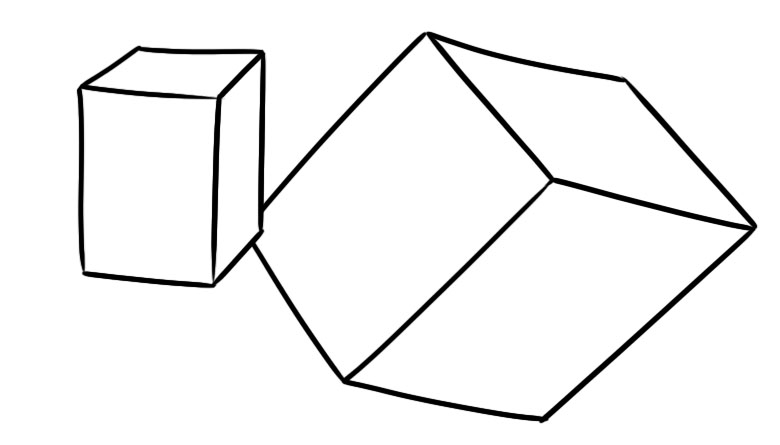
Which block is closer? Answer: neither. I have not created a drawing with one thing that is closer than the other. But here I have:
Yes, this is stupidly simple. But look. LOOK how that massive cube is effortlessly pushed around in space by means of minute changes. That’s power!
We (humans) want to see overlap. As such it is a fairly resilient illusion in drawing. Absolute perfection is not required. But the illusion can be weakened or destroyed at a certain point.
It’s trivially easy to observe these principles “in the lab”. But they can be easily overlooked in our actual pictures, as we struggle to stay staying on model, create the illusion of light, maintain accurate anatomy, etc. Dedicated “lab” practice will bolster your form-building skills to the point where they seamlessly integrate with other aspects of your process.
Shapiness
In the real world surfaces transform visually, in predictable ways, depending on their orientation to you. In picture-world we reverse engineer this by employing certain kinds of shapes to do certain things. Really it comes down to one thing: is the surface perpendicular to your view (“flat”) vs. parallel (“on edge”) vs. somewhere in between. That’s all.
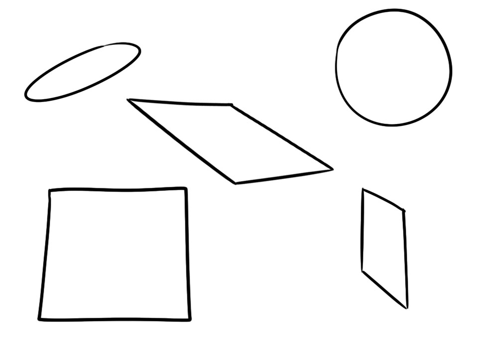
Shapes whose widths and heights are mostly equal (circles, squares) or which have mostly right angles (rectangles) tend to be interpreted as flat. Shapes that are more like trapezoids or parallelograms tend to be interpreted as… not flat, though their precise orientation is ambiguous.
But we can give that “ambiguous but tends to not be flat” trapezoid (in the center, for example) a specific orientation by relating other shapes to it. When we employ overlap as well the illusion is overwhelming:
Creating spacial orientation with shape relationships.Or we could invoke M.C. Escher:
This ability to flip shapes and therefore forms around is key to creating a strong and convincing illusion of form in your art, whether your style is realistic, cartoony, or whatever beautiful nameless thing I’m sure you have or will come up with.
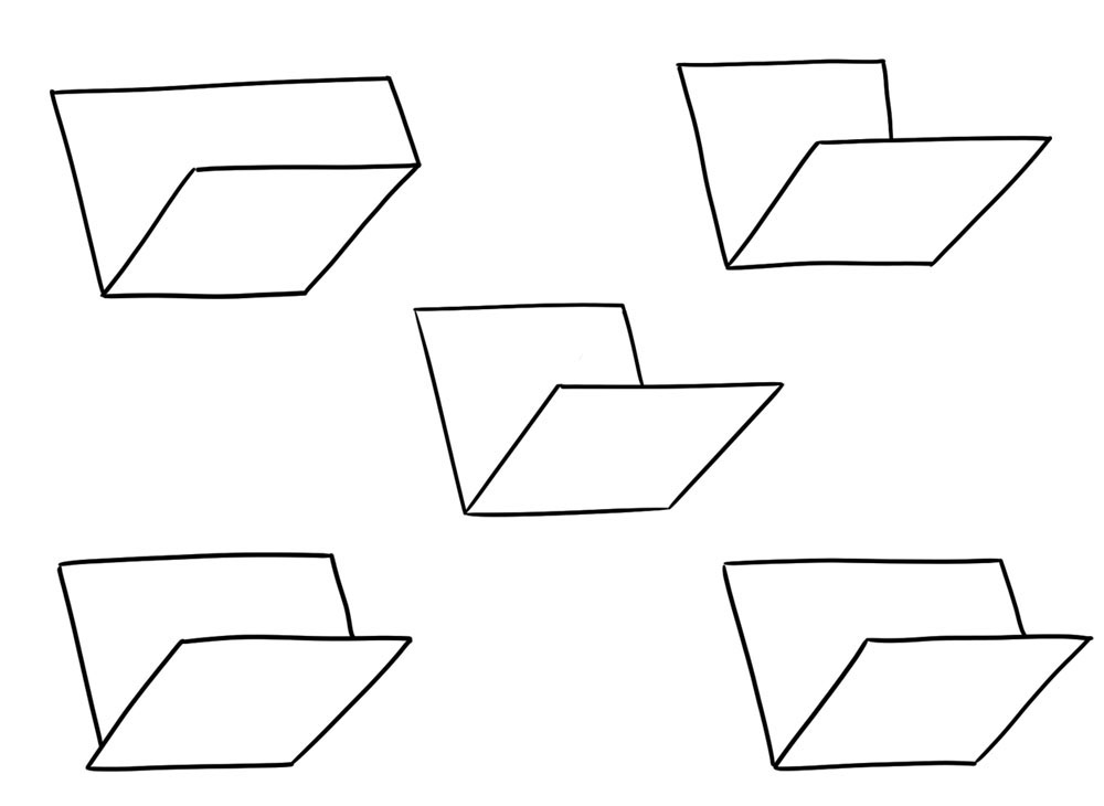
It’s easy to test how certain relationships create form, and others don’t. A simple AI might see all these drawings as similar but different from one another. None would be particularly special.
But you, taco human, see the one in the center as making more sense than the others (in some cases a lot more). Because you have access to, and can’t escape from, that big (though, again, I must emphasize prim-a-tive) brain of yours.
Surface
Shape elements that “sit upon” a form convey to us what that form is. Applying this process the other way around is a powerful form-creating tool.
Generally speaking, the more surface elements the clearer the form. Conversely, conveying surface form with just a few shapes can be very elegant and enormously gratifying to the viewer.
To make form, these shapes don’t need any explanation. They don’t need to represent anything. But in a realistic painting, they almost certainly must be explained as something. It’s up to you, the artist, to figure out how to satisfy both of these requirements. But don’t mistakenly believe that the explanation creates the form. They are two different things.
Notice that as the surface elements near the edge of the form their shapes become more like those trapezoids we saw earlier. Close to the center they are more like the squares and rectangles. Because the edge is exactly where the form becomes perpendicular to the picture plane, while the middle of the form is where it is FLAT on the picture plane.
This tells us where to employ which kinds of shapes, and also that those near the edge are more important. Flatness is the default for a picture plane. We don’t need to emphasize those areas. And the edge contains more form surface area per unit of 2d picture area than the middle does.
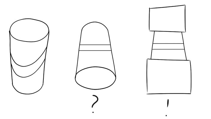
Beginners and non-artists think the only requirement is that surface elements conform to the underlying form, when in fact artists employ surface elements to create form. Six / half dozen, right? WRONG. The difference becomes critical when the actual correct surface element (say, this elliptical canister label), viewed from a certain angle, works against the intended form:
Solution… Don’t draw this label from this angle unless you have to! If you have to, use other tools to deliver the form (though this will be tough). THIS is the hard part, and no rulebook or perspective tool or 3d modeling software is going to help you—because there’s nothing wrong with it.
When you realize that the “answer” coming from reality is actually DEAD WRONG for your picture, and therefore YOU must come up with something, then you’ll see that all art is a performance, a self-portrait, an autobiography.
LIGHT / SHADOW SURFACE ELEMENTS
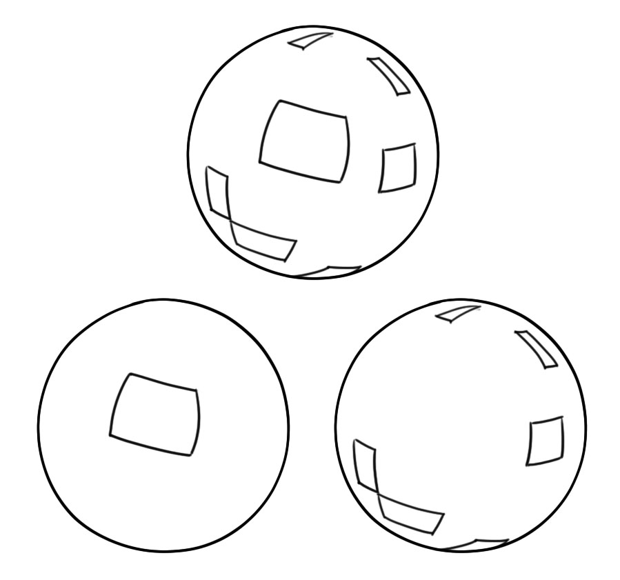
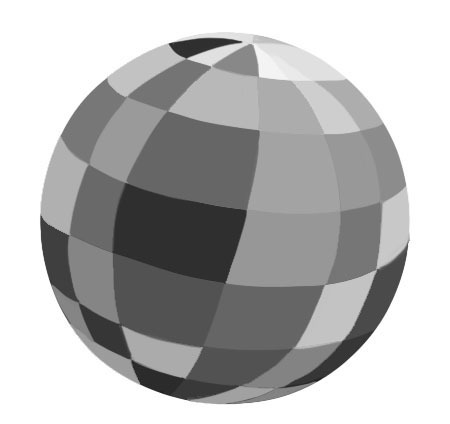
This picture uses randomly distributed values to create shapes that inflate the sphere:
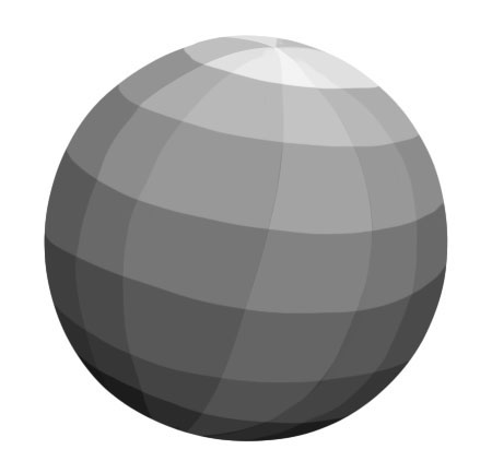
If we retain the form-producing shapes, but rearrange them in a certain way, then we also get the illusion of light:
There is a relationship between the illusion of light and the illusion of form, but if you don’t understand the separate factors that contribute to each, one or the other may be weak, but you won’t see that, because the other is strong.
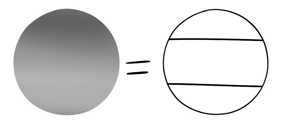
For example, this circle with soft shading begins to have some illusion of light:
But its form is weak, because the underlying shapes of the gradient are something like what’s shown on the right—not “wrong” but not strong form (which, where I come from, would actually rhyme).
Beginners often get so absorbed in soft shading they fail to see the shapes they are making. Note that I am deliberately not being super accurate with any of these drawings. This is to show what kinds of things are very important, and what kinds of things are less important or unimportant in creating the illusion of form.
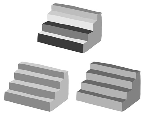
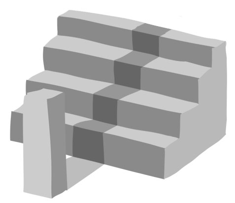
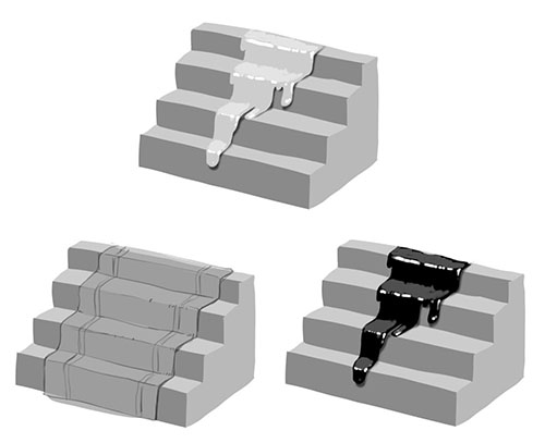
Here’s a staircase using arbitrarily distributed values, then values arranged according to lighting schemes:
And now a cast shadow:
The shadow reveals something of the identity of the caster, if it is a familiar thing, but nothing of its form. On the other hand, it reveals everything about the receiving form, the current home of the shadow (I mean, hey, do you want to be seen as the person you are now, or where you came from? Give your cast shadows the same respect).
The way a cast shadow wraps itself over the receiving form, the form we are looking at is what makes us see that form. In fact, the shadow caster may be unknown, out of view, or a collection of dozens of indecipherable things (like young you).
All that matters is that the shapes of the surface elements all consistently deform in a certain way, and therefore appear to sit on a single not-directly-visible form, and thereby create that form. What matters are the shapes placed on the stairs, not how you explain them.
Train yourself to see the difference between the illusion of FORM, the illusion of REALISM, and the depiction of IDENTIFIABLE THINGS. This requires special effort, because understanding the illusion of form is not something you can grasp by passively observing reality. It’s like a sixth sense artists acquire from living in the realm of 2d, of drawing actively.
All these images are “correct” and explainable by a real world setup:
But if that shadow is not curved the right way the cylinder will not curve (especially when you don’t have the end ellipses to rely on). You, the representational artist, need to find a solution that serves this requirement and is also explainable, whether that means moving the light source or just doggone faking it. Validity is not a magic wand. The magic wand is freely manipulating things like shadows to give you shapes that create form. You are allowed to make stuff up—in fact, that’s what this art thing is all about!
REFLECTIONS
As with cast shadows, reflections are much more useful for telling us about the form holding the reflection than the thing being reflected. Typically even in fairly shiny surfaces we see shapes that are not immediately decipherable as particular reflected forms.
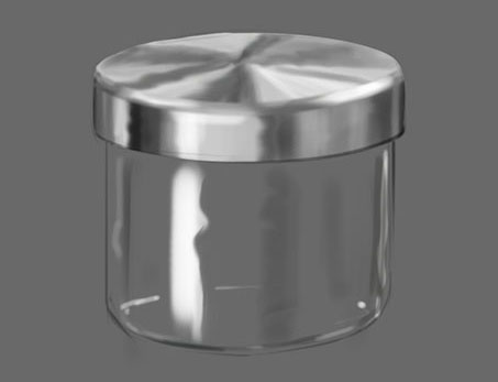
This is a jar from my bathroom, with a brushed metal lid. The values in this painting are randomly distributed (by me), but the shape relationships are not. It’s the same as the “disco ball” above (get the connection?).
In the real world each of these values would be a reflection of a specific thing. And if that thing were in the painting, and close to the jar, I would match them up. But that is only to ensure consistency and realism, not to create form. If they didn’t match up the jar would still have form, but it would look like it was pasted in from another picture.
TEXTURE
“Texture” usually refers to a series of forms so small we don’t perceive them as individual forms, for example, grains of sand on a piece of sandpaper, or the weave of fabric. As with other surface elements, they tell us a lot about the form they “live on” (flipped around-we use texture to create form).
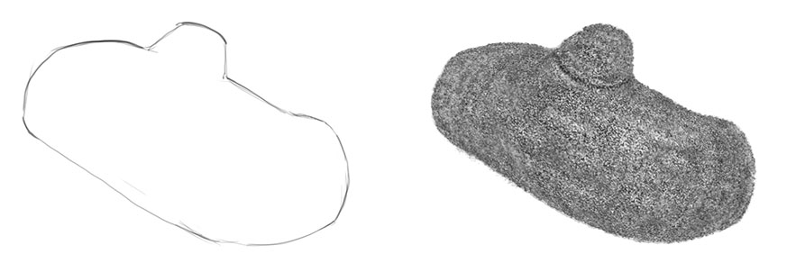
Here’s a shape that is ambiguous in terms of form, with texture added to inflate it. The form of this thing is not really strong, but that’s because all factors other than texture have been removed.
The commonality of shape deformation of surface elements is what we perceive as the form itself.
We always depict “real” surface things in a way that produces form, but other times we freely employ surface elements to make form, and then explain them as representations of real things so you don’t notice. If you only copy you will be doing neither.
Symmetry
The perception of bilateral symmetry (left and right sides mirror images of one another) allows us to ignore duplicate information, or use information from one half to fill in the blanks of the other:
This is identical to the “hidden triangle” shown at the start of the post—except it’s not! Because here we are using a completely separate, different, unattached and otherwise unrelated shape to see the missing part of another.
If the form does not present a symmetrical 2d image, then we are seeing two identical forms from different angles. I say “identical” because the fact that they are flipped is subordinated by our visual system. This is the magic power of symmetry perception.
Once we are “locked in” to the fact that we’re seeing two identical forms, we start adding information that is not really there (sound familiar?).
It’s hard to isolate the effect of symmetry on form, because it is one of the least powerful. In fact it is hard to create examples where no other information other than symmetry is present in the section of form on display.
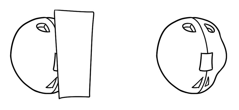
The first image appears as a simple ovoid surface. But when it’s revealed to be symmetrical, with a bump on the right side, a similar bump starts to appear on the left, where there wasn’t one before. It’s subtle, but given that there is no other information in this stark ink drawing, the effect is noteworthy.
In this image, whether we see a bump or a hole on the right side depends on what form we see on the left side, and the symmetry cues:
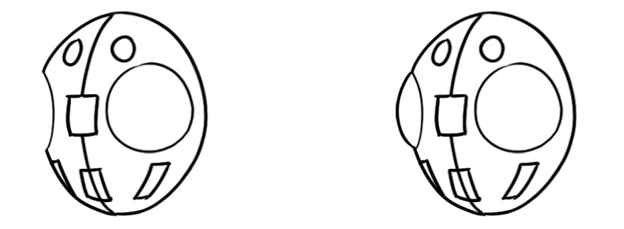
A hole or a hill? One thing can be both at the same time (like the home of Mr. Baggins, for example).
Because it’s hard to isolate, effect of symmetry is often unappreciated by artists in its own right. Yet a lot of drawing problems stem from symmetry problems.
To understand the power of symmetry, rather than drawing head or face or nose or mouth from a certain angle, think of it like you are drawing two mirrored things from different angles. If you can’t do this it’s because you don’t really understand the form. That’s good news! Because you just discovered why you can’t draw heads any way other than front and profile views. Even if your two halves are not drawn super accurately, they will likely have more form if you think this way.
ENGINEERING FORM
“Engineering”… such an emotionless concept… But this part of picture making is the least emotional! For some it is very intuitive. If not, don’t worry—it is the most learnable.
When observing a form in order to create a convincing picture of it, make an effort to understand why you are perceiving this or that particular form (not this or that particular thing). The principles outlined above may help clarify for you why you are seeing what you are seeing, or why you are not seeing it in your work. Because this general topic is entirely about seeing.
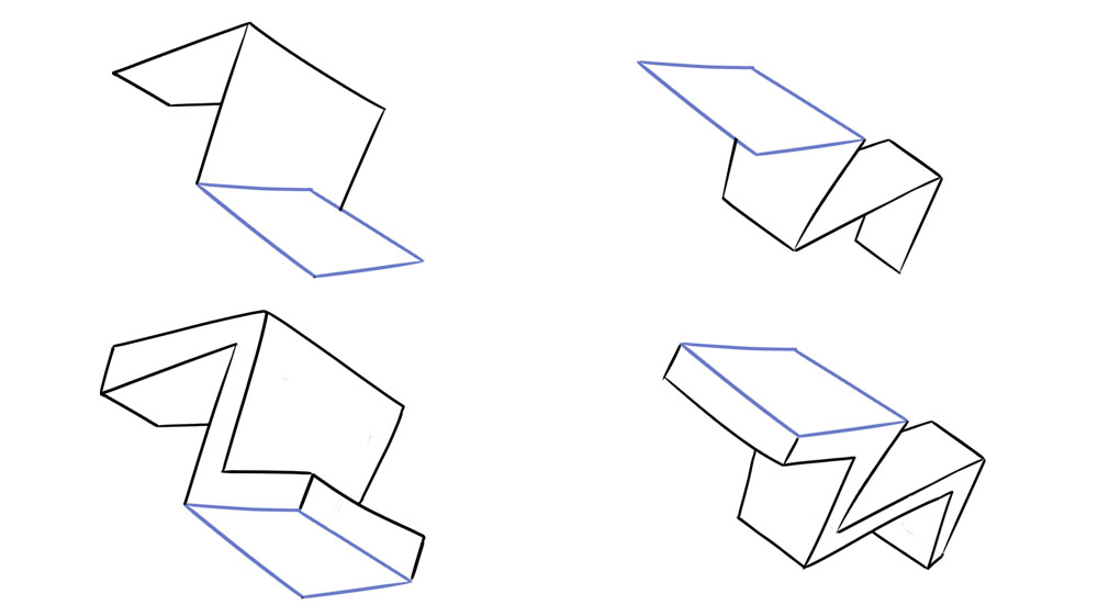
One way to develop this “second sight” is to exercise in the pure language of drawing. Just playing with shapes to create and manipulate form, paying careful attention to when you break the illusion, and figuring out why. Break it on purpose, then bring it back a different way, for example.
Create forms that are clear, but meaningless. Unidentifiable as things. You may have some idea of a thing in mind, to get you going. But it is just an inspiration. Eventually you will find that this in fact characterizes what artmaking is.
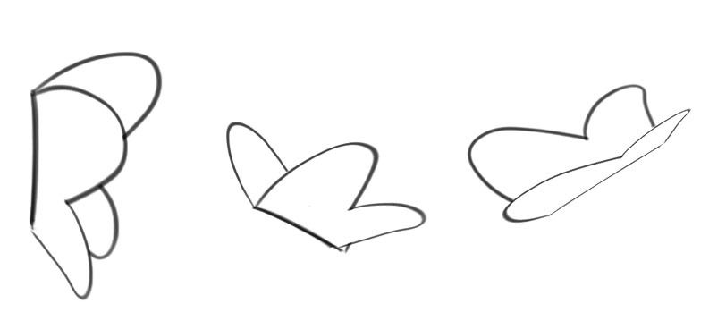
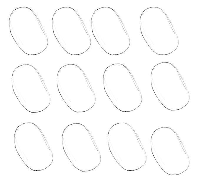
Any random shape, like this…
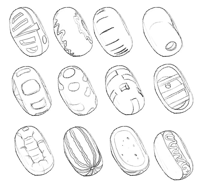
Can be inflated in to a countless number of forms:
Some of these are specific things, others are not. Soon this form language will become just as natural as speaking your native language. It CAN BE your (other) native language!
Then the ongoing challenge for all of us is figuring out where to extract and / or apply these when staring at a rich and beautiful reference photo or model or trying to tease out an imagined image. Uniting what you are trying to say with strong design and convincing form is the challenge of the realistic artist.
These principles seem so simple—and they are. The problem is we get distracted by all the obvious superficial stuff that the driving, primal forces that are the power behind the show go unappreciated (you know, like the bass player).
All that effort and struggle to be precise and to capture everything you see and think, and it doesn’t work! It’s like trying to throw a key into a keyhole from ten feet away. You struggle for precise aim and steadiness, which you will never achieve, when you have the much more effective and simple option of walking right up to the door and opening it because it’s not even locked!
To create the illusion of form in space we employ whatever tools we need, regardless of the subject. That’s drawing like you mean it.
This does not undermine your ability to do hyper-realistic work, or to work tightly from photos or models, do cartoony work, or deliberately flat work. On the contrary, it enables you to do whatever you want much more effectively, expressively, exceptionally, extraordinarily, ecstatically, enthusiastically, extravagantly, eclectically, egregiously (I guess), elaborately, efficiently, energetically—whatever kind of -ly you want!










Thanks Chris. I really loved this. You’ve presented this in a way that’s really easy to follow.
Glad you liked!
Really great follow up to your previous article! This one was less of a headache and brought everything into focus. I can see why the head scratcher had to come first though. I feel like cheering that when studying other people’s drawings and attempting the exercise you had suggested of drawing abstract organic shapes with nothing but line and finding form in them, overlap was the first thing I started to notice.
This article also very nicely articulates why sometimes, even if something is true to the reference, it still looks or feels “wrong”. When I got that particular critique in the past it left me frustrated. While I wanted to agree that “if it looks wrong it’s wrong, even if it matches the reference” I didn’t understand how or why it was wrong and therefore didn’t know when or how to deviate from my reference and make my own drawing decisions. This really helps make that more clear. Thank you for the wonderful article!
Good for you! When you strip away all other variables and are forced to build form with only abstract tools, you hit upon the big one. The subtler point that I keep trying to drill home is that to make a strong form drawing it’s not enough to simply adhere to the principle that when one thing overlaps another it of course appears to be closer, and to look for cases of this in your reference / model–it’s that you can and must invoke this all-powerful form-creating tool to create space (like when I added that square between the two blocks). Artists seem afraid to do this. But the ability to know when you need it comes from first seeing when the space is weak or ambiguous. That’s why it is like a sixth sense and not something that comes from observing and/or copying reality.
To your second point, I have been planning to put together a post that shows real world situations that “go wrong” so to speak. Meaning “don’t draw it this way or your drawing will fail.” I notice them all the time, but I only started taking pics ofthem recently, so I don’t have a good enough collection yet.
Thank you so much for your article, I hope you continue to post! You and Tommy Arnold are quickly becoming my new favorite contributors on this sight (except for Greg Manchess, of course, who is the greatest of all time 🙂
Wonderful post again, great thought process, well explained.
I will, thanks, and Greg is the best! Tommy too! I’ve gotten such a warm welcome from the Muddy Colors crew… oh, wait, no I didn’t, the slackers.
I really enjoyed this article and found it enlightening. Thanks for the article
Thanks for reading! Let me know if there are any particular issues you think I might be able to help with in future posts.
Great article! This little text transports more information that some books on drawing get across.
Cool, feel free to note any issues you might want me to cover in future posts.
A good companion to your original post, which really spoke to me in a lot of ways. It zeroed in on the raw atoms of what makes some of my favorite artists so spectacular, specifically Moebius, who’s drawings have inspired me through the years; his compositional and form-making intelligence always seemed so mysterious and extraordinarily heightened to me, but in light of your posts, I’m starting to see how he might’ve gotten to that level of virtuosity.
Excellent! Keep pushing, keep asking questions (to yourself… and me if you want) and don’t accept dogmatic answers without proof.
Very interesting. As I’m a self taught artist such things are like revelations. It helps to think better when drawing.
Yes! It is like another sense you develop over time, and anyone can do it.
I loved this, especially about the need to edit reality in order to communicate form. It reminds me of theater stage combat vs. cagefighting/mixed martial arts. A lot of real fights are boring to the average theater viewer, because it looks like a couple of guys rolling around on the floor, and they just wanna see some cool looking action. Instead, movies will script action scenes to be back and forth, filled with flashy moves that don’t happen much in real fights. So kind of like you’re saying, they edit reality in order to make a more entertaining, easily understood scene
Peter, that is SUCH a good analogy. This thing we call “realism” (in painting) and which is basically the default for live action non-CGI movies, is NOT THE SAME AS “REALITY”. Art is a thing we make. And when we put it out there the AUDIENCE expects that you are telling them something, not just showing them something they can go look at themselves.
Side note: if you watch super old movies the un-choreographed fight scenes are hysterically ineffective.
Thank you very much for this Chris, its a breakthrough for me.
대전출장마사지로 쉽고 간편하게 집에서 경험해볼 수 있습니다.