If you don`t know I will have to confess now: I play Magic the gathering. I play it a lot. I play and think about magic way way too much. I try to explain to my surroundings that it is a matter of research and that I need these new cards for inspiration, but truth is; I need them for magic decks. I play a format in Magic called Commander. The biggest channel on YouTube for that kind of play is called The Command Zone. I have been following the channel for years and love the content and insight they provide and put out there. As you can imagine I was super thrilled and excited to get the chance to paint a playmat for the Command Zone. ( Now; I make it sound like they asked me out of the blue, but to be honest I contacted Jimmy and Josh, the 2 hosts and told them I would do anything to be on their show and be a part of the fantastic program they create)
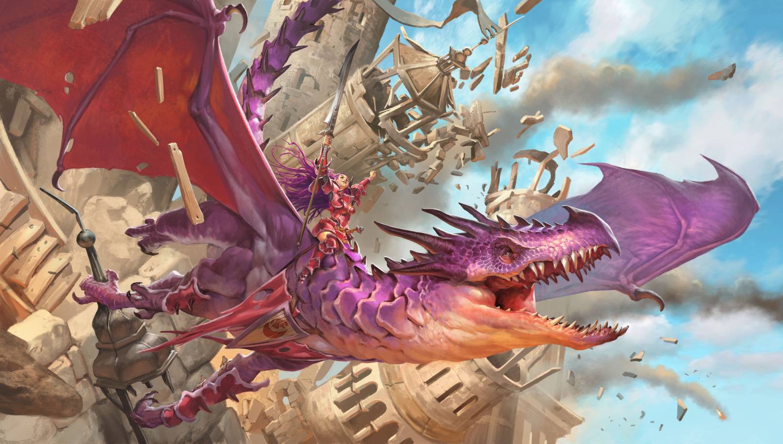
The idea that Josh came up with was to try and capture the feeling you get when you have cast a huge destructive spell and possibly blown up the entire game for everyone else. An idea was for a dragon to smash a whole city. The rider on the back of the dragon is You, the player of the big spell.
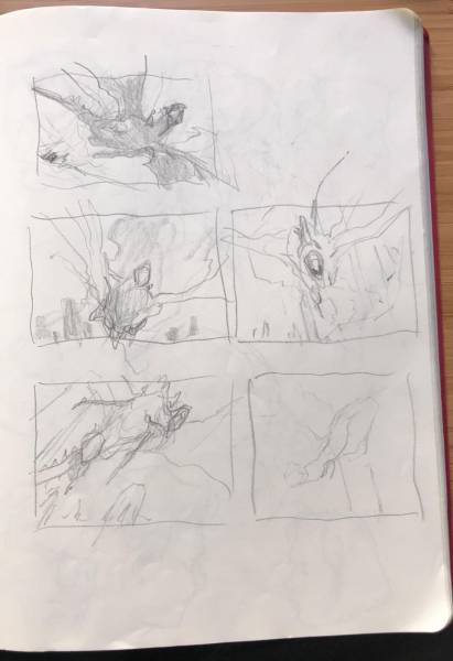
I fleshed out a couple of angles and we decided to do something that is coming out towards us rather than one of those seen from down below in the city. With this project I had the opportunity to do a full digital painting rather than an acrylic one. There was 2 reasons why I did that: First: I wanted to try and do a full scene illustration on my Cintiq. Up until this image i had only done maybe a couple of illustrations digitally and mostly used my computer for concept art and not for final art. Secondly: I knew I was going to have a lot of details in a huge widescreen image and the boards I had to paint on was simply too small, so in order for me to paint it traditionally I would have to paint on paper and I recently had a bad experience with the masking film on the paper, where i tore a part of the painting, so I couldn’t face that right away again.
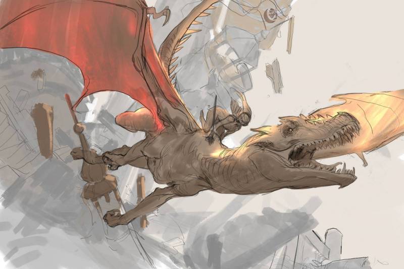
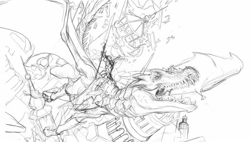
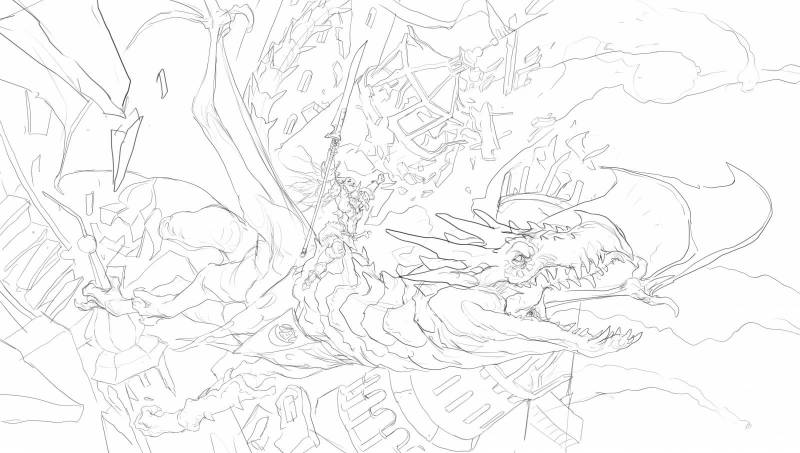
I tried to find an angle for the dragon body that had as much foreshortening as possible. The tail and the turn of the head I used to show the direction of the movement. When I draw dragons i think of a huge bird: the way a heavy eagle seem to hang with a heavy body from the joints of the wings: I try to imagine how it would feel to fly and how my arms would dangle somewhat slack but on the same time following the moment through the air. It is one of the most difficult things to draw the flying movement, but thinking of birds, helps me a lot. When creating the face and the wings I used some ref of bats and dinosaurs. The smashing buildings was a challenge. as with the dragons I tried to think of them as Lego bricks in order for me to simplify the shapes in my mind. In this stage the important part for me was to place the busy elements in the background so that the silhouette of the dragon was clear. I added the tower tip to the dragons claw to make sure you would see that the destruction belonged to the creature and to avoid the reading to be that they were fleeing a city about to fall. That also made me take a second look at the rider. the way she was kneeling riding the dragon looked too much like fleeing, too much like sneaking and hiding. I needed something else. A pose that would make her look like she was victorious and in control of the destruction: Also I would like her to be in charged and not just tagging a long for the ride.
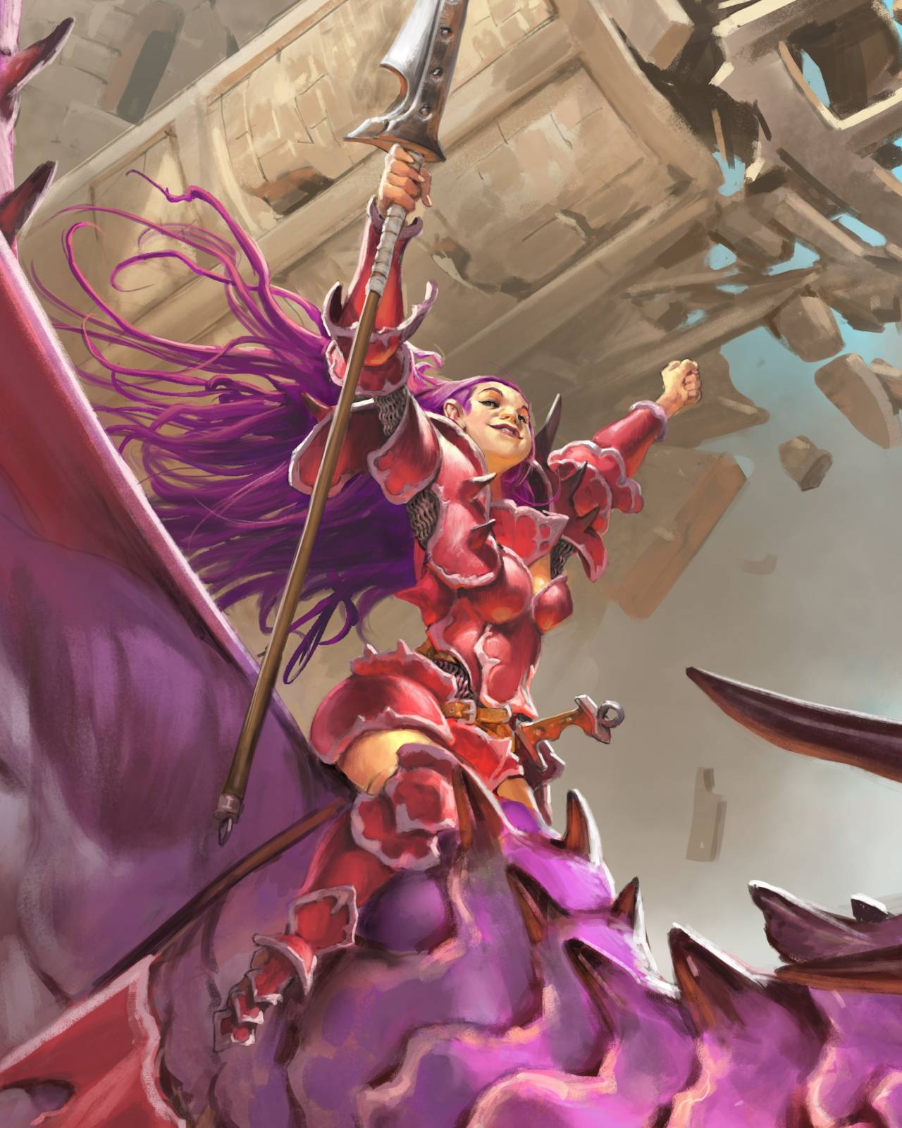
So I grabbed a spear from my studio and shook it at the air trying to get a feeling of the way I would sit shouting at the wind after my dragon smashed my enemies. I changed the pose and also tried to make a female fighter with a more bulky body and a less babe-model face than we are used to seeing.
I refined the sketch in to a more clear line art and started painting in colors.
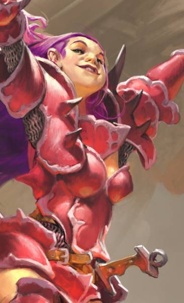
The reason for the palette was that I wanted the mood of a clear and bright light ordinary day in fantasy land. I started from a clear blue sky and a brightly colored purple ans pink dragon. That kind of dictated the city color. Since I needed something that would not draw attention away from the figure and something that would be a contrast to the cloud and sky, I ended up with a warm sand like color. This way I have a cold background, warm middle ground, and a somewhat cold figure. this way of dividing the color palette up in sections makes it easier to read a busy composition I think. When I had finished the dragon and moved on to the rider I decided that she would have armor parts build from dragon scales: Perhaps even her own dragon. Scales and plates it had sheared during growth that she would use for protection, It lead me to think of her as a kind of cosplay and I dyed her hair in the same color as her steed. It shows their relationship and makes it impossible to read the image as if she was attacking the dragon from its back. For her expression I used my own smiling face and gave her a wide nose and a self confident smirk. The warm bounce light on her chin and underside of the nose is reflection from the red armor. Same bounce light I added on the boob section of the armor and shoulder plates.
After the figures I went back and forth in the background constantly balancing the single stones and debree in the crashing buildings and trying to paint them detailed without them being taking too much attention. the danger would be for me to zoom in and render everything extremely detailed: I fear that would have hurt the clear reading of the whole image. The last thing i added was the flying boards in front of the wing to show that they were still in the midst of it, stuff flying around them but not covering up too much of the cool dragon i painted. The sticks and board was all I needed for that.
The mat is available only for a limited time via the Command Zone kickstarter.
Also; if you want to see me play some Commander against the 2 hosts and the dangerous Ashlen Rose take a look here.




Thanks for sharing again Jesper, And congrats for winning on the episode 🙂 what a deck.
Great work, on the mat art and in the Commander Battle. I watched the match and that just looked like a lot of fun.
Love this, Jesper. The tower grip is such a great move! I’m always fascinated to see your digital solutions and how you bring across your acrylic techniques.
I remember at that workshop several years back, other artists came to be taught by you – but some of them came to be taught by you AND to play against you in Magic. 😀
What a great piece and great post, Jesper. Thanks for sharing.
Love the gleeful expression on the rider’s face! As well as the egregiously cheerful colors.
Brilliant as always Jesper
Super crazy art, and its awesome to see you broadening your skill set and painting fully digital. So cool! Thrasios, Tymna for the win