Sunday Skills: the weekly (ish, and I’m sure you’ve noticed that it’s Monday) article about the little ideas in art that can have a big impact.
RULES, Part 2
Yesterday as a part of my ongoing Sunday Skills article I introduced some ideas about the temporary nature of all rules. This article will pick up exactly where that one left off. So now you’ve read it? Great!
–
I want to discuss a relatively useless rule here today, as a hyperbolic example that can point out the limitations of all rules.
On the podcast I once mentioned a simple guideline for avoiding Value issues, something like “when composing with value, try to avoid Holes.” Because this came across as a rule, it spawned an entire ecosystem of questions based around Holes, and soon I realized I would have to try and not phrase things in quite that way. As people tried to avoid creating Holes, they caused a number of other, larger issues, and overlooked useful solutions they might otherwise have accepted – not a great resumé for a rule. BUT, the confusion about Holes became a great example of how rules are only made to be broken (or abandoned).
In the language of Value, what’s a “Hole,” anyways?
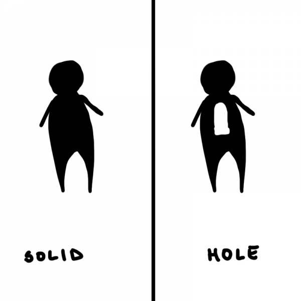
A Hole is a piece of critical information that’s painted in the value key of the background. The drawing on the left doesn’t contain any Holes; we’re pretty sure what this is (even if it’s boring), and the solid silhouette all hangs together. We understand the left-hand drawing quickly and easily, and the only question we’re left with is why it’s drawn so badly. It’s drawn that way because artistic principles need to be assessed in complete isolation and undeniable simplicity to prevent confusion, and also because I’m lazy, so shush.
The right-hand drawing, on the other hand, is a bit more confusing at first, and slows us down. We have to figure this out. It’s a sweet jetpack, by the way! Right, don’t you see it?? And some people may read it as a jetpack, eventually. Others will see this as a literal, key-hole shaped Hole in the figure’s body at first, as if the figure has been shot through the chest with a huge lazer-beam, and now we can see the background of the piece shining through the spot where their rib-cage used to be. This might seem silly, and you might think “oh, I’d never do that,” but as pieces get more complex this happens without our noticing all the time.
Whether your viewer eventually sees what you want them to or not (and basically anyone who bothers will – humans are smart), the problem is the delay. This payoff of “it’s a jetpack” isn’t worth the time the viewer’s mind has to spend on it. We could render the piece more to make it clear, but that’s a crap fix because at a guttural level, the brain still stutter-steps over this meaningless information instead of being able to absorb it cleanly and instantly. What we need to do is something both easier and more powerful; we need to adjust the design. If I want to show that blob-man is wearing a jetpack, without punching a hole in him, I can just rotate him.
Voila. Without any more rendering or any more specific drawing, we’ve fixed the problem with the power of design. From this one experience we could use inductive reasoning to form the rule: “Don’t allow Holes in your value structure. Holes are bad.” And in some circumstances that might help you for a time, and let you avoid a specific, costly mistake you’d been making. But let me show you why that would be a bad rule to hang on to for very long:
Right, Cate Blachett’s entire body is a Hole! And that visual play is part of what makes this piece so thrilling. So maybe “Don’t make Holes” isn’t a very good rule, after all. This is that moment we talked about yesterday, the moment where you happily throw away your rule in favor of a larger, more complex truth. Maybe we over-simplified when we said “Holes are bad.” Maybe a better rule could be something like: “abstract value patterning slows the read of information, while silhouette-based value groupings accelerate read and impact.” And again, that will be right for a time…until it’s not. But we’re not there yet.
Now, this might all seem very obvious as it’s been described here, but you’d be surprised how many dearly-held and ubiquitous painting “rules” become rubbish as you advance. For literally every artistic rule, there is a fabulous piece of art that directly contradicts it, and even seems to shine the brighter for it. So are rules useless? No, they’re essential starting points.
Rules are like training wheels: they hold you up, but cling to them too long and you’ll never really learn how to ride.


You may also know Coles Phillips, who was a Golden Age artist who also worked with “holes” in his figures for visual impact and novelty–famous for his “Fadeaway Girls” that came together with clever Gestalt.
Phillips is a Baller.