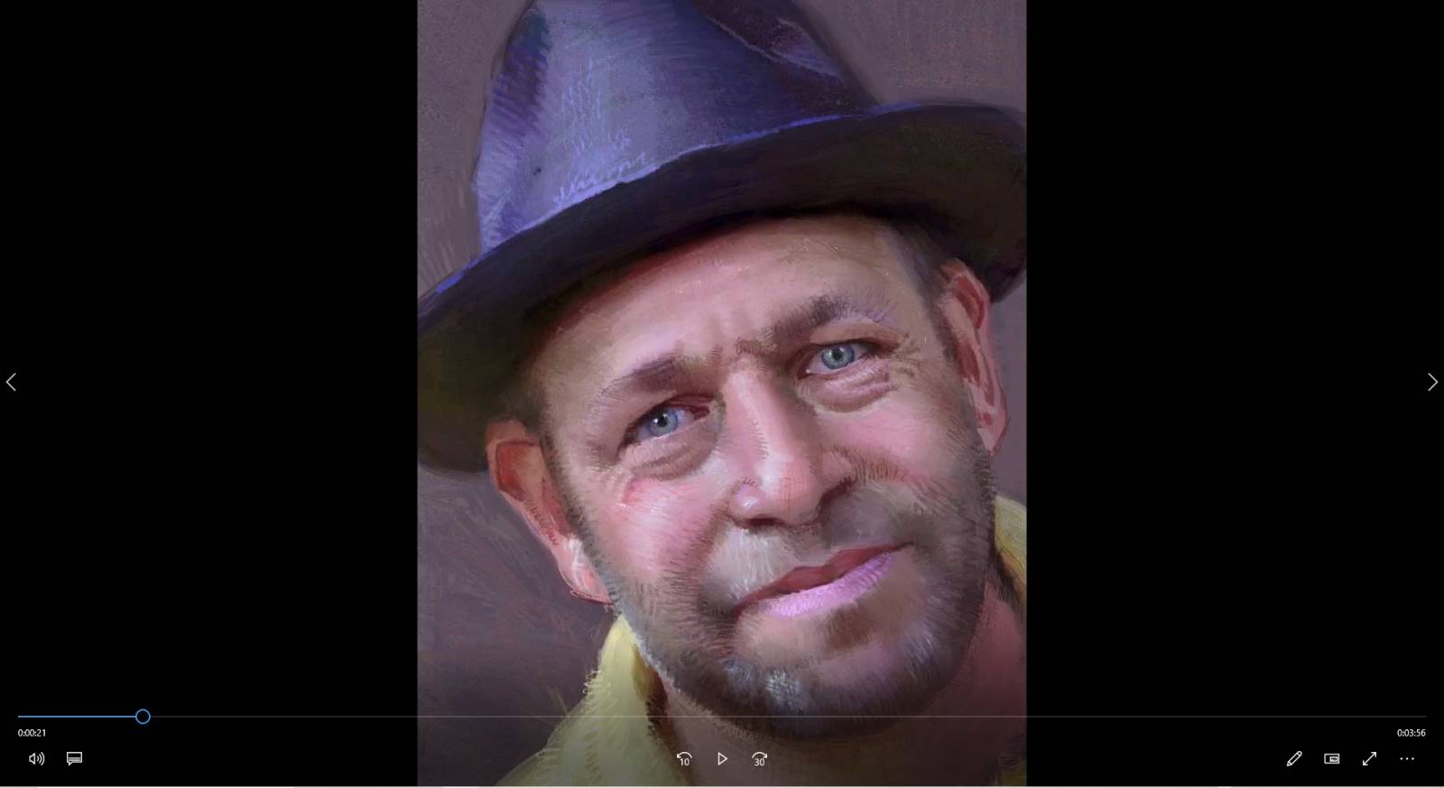
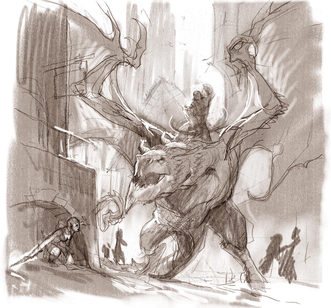
Ron Lemen is an illustrator/painter, educator, and designer.
Ron's career first took off in the Action Sports Industry working as a board graphic illustrator, layout artist, logo and product designer. From there he turned to sequential story telling as well as doing book covers, interior illustrations and the newly emerging market of concept design. During this time he went back to train, found and graduated from the Atelier System. He was also mentored by Sebastian Capella, Spanish portrait virtuoso.
Ron has been a concept designer and art director in the video game and film industry for 15 years with dozens of clients including Harmony Gold, Amazon, Sony, Activision, Ubi Soft, Mattel and more. Now freelancing full-time, his clients include Upper Deck, Dragon lance, White Wolf, Time Warner, Wizards of the Coast, Image Comics, Birdhouse Projects, Ride Snowboards, Disney, and more.
In addition to illustrating and Portrait Painting, Ron has been an art instructor for nearly 25 years, teaching for X-Train, LAAFA, CGMA, Gnomon, Studio 2nd Street, Park Blvd Studios, Sony, The Art Department, and Rev Art Academy.


oh my gosh, finally I learn the color ideas.this tutorial is awesome sir. In the future try to 1 and 2 hours length video DVD sir.it would be helpful for me sir.
possibly….:) thank you.
Thank you for the great video, color is a subject I’ll never get tired of learning about.
One subject I would like to hear about is saturation (chroma) in regards to light and shadow. From what I observed, shadows seem to usually be more saturated than light areas on an object, and doing the opposite can sometimes lead to muddy colors (ha!).
But that doesn’t seem to always be the case, so how do you approach this when you paint from imagination? Do you usually keep your shadows more saturated, or does it depend on the situation and style you’re going for ?
Another interesting subject would be subsurface scattering in different types of semi transparent materials , not only skin, and the resulting color depending on the color of the object and the color of the light.
Thank you for taking the time to work on these educational videos !
Thank you for the idea, in short, muddy is due to common mixtures or similar in both the lights and shadows which optically causes visual issues discerning one from the other. This is a good subject to discuss and thank you for the idea.
Thank you for your concise answer, I look forward to next episode 🙂
Very usefull, thanks for sharing 🙂
thank you, have a good weekend.
Thank you Ron!
Another great video full of wealth of information. To be honest, I love all your posts and video materials that you have created. Can’t wait for more.
Congrats! You’ve won a FREE VIDEO. Check your email for details.
WOW! what an incredible video. Beautifully constructed and edited, and packed with info. In awe. 🐒
Hey, thanks for the video!
This was much better than I expected. Not that I thought it was going to be bad. And, I never heard of the formulas on colors.
Ron Lemen full 10 week color theory tutorial.
https://artschoolvideos.com/course/color-theory-1/
Ron Lemen has a great full 10 week color theory tutorial.It helped me out a lot with my understanding of color
https://artschoolvideos.com/course/color-theory-1/