I knew very little about any illustrators before I decided to try to become one. It was the early 1980s, when there was no internet, Instagram, or any other convenient way to get a good idea of the kind of work that was being done, other than looking around at the visual culture. But there was one great resource for illustrators at that time – The Society of Illustrators annuals. These coffee-table books chronicled the work that was accepted into the annual show held in New York at the Society. Then, as now, thousands of entries were sifted down to a few hundred examples of what the jurors collectively determined were the best work of the year.
Back then, I looked for used copies of past annuals and I studied them with far greater intensity than I ever applied to a book. like my fellow art students, I wore the annuals down – especially the ones that were published during my first years as an illustrator. These annuals were one of the only ways to know anything about what seemed to be the “big-time” illustration world, as opposed to the regional illustration practiced by my teachers. It’s hard to explain how much impact these books had on me…even though, at first, to me, they may as have well have come from another planet.
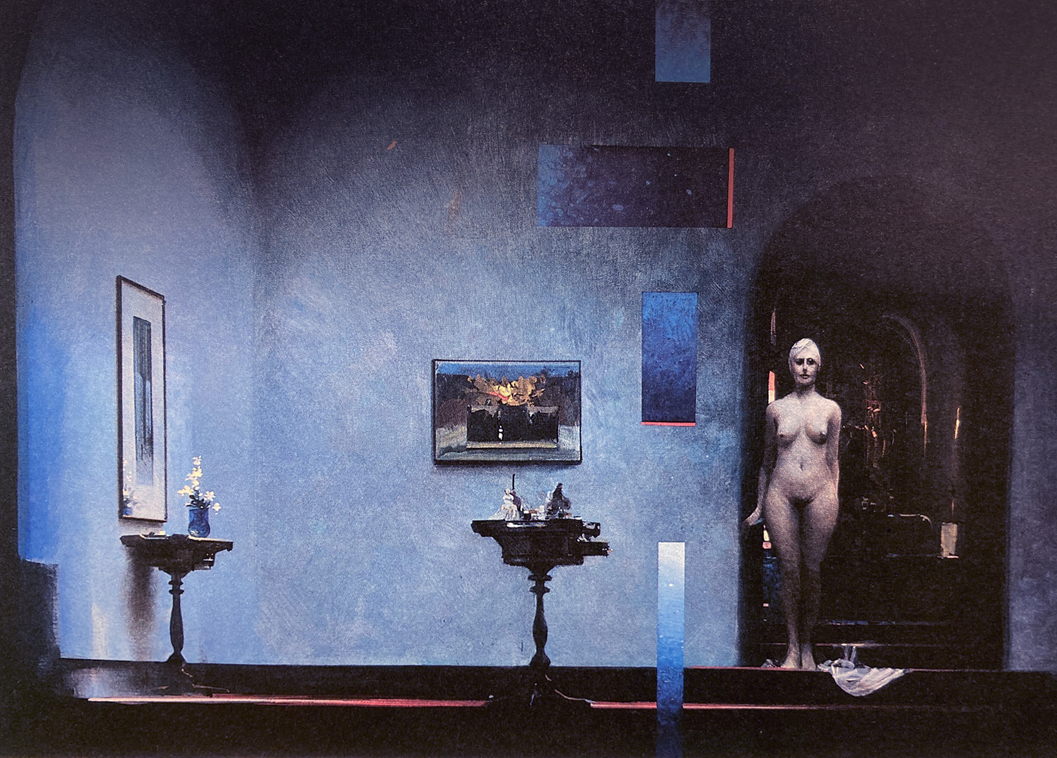
Some artists used the annuals to show their personal work- This is by John Berkey, Better known for his dynamic science fiction paintings.
At first I didn’t know any of these illustrators, had very little idea about them or how they worked…I just know it was something I wanted to be a part of.
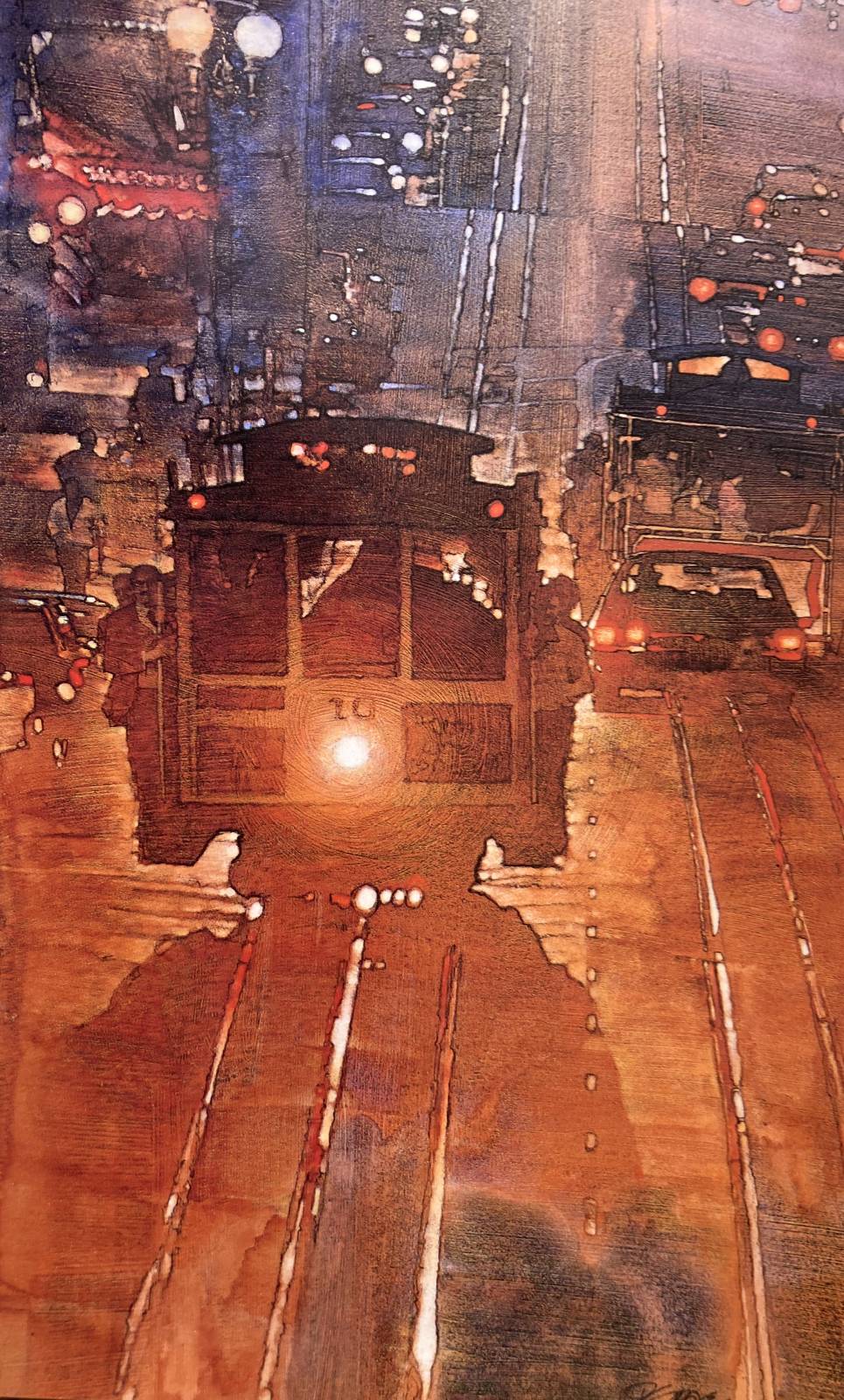
David Grove was the first local artist I met who actually had work in the annuals. The year 1983, from which all the images in this article were published, coincided with two developments that began to broaden the illustration landscape and made it possible for illustrators outside of New York to get a foothold outside of their local market- the introduction of the fax machine, and a relieble overnight delivery service- Federal Express.

Doug Johnson. He was one of the few illustrators I had heard of before I wanted to become one myself.
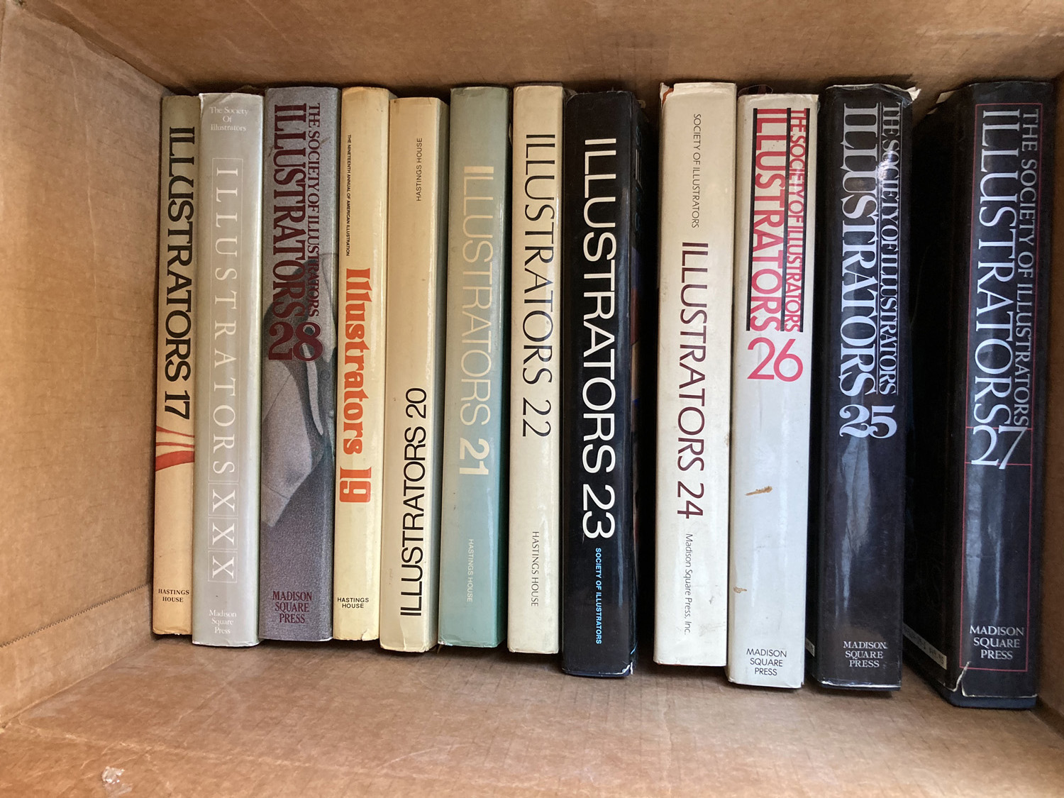
Over the years I managed to accumulate most of the annuals published by the society since 1980. Recently I was given another set of the annuals – three cardboard boxes full-by one of my former teachers, a retired illustrator who requested that I pass them onto someone else if I didn’t want them.
Some of the work in the annual represented mainstream publishing- an example by the great Bob McGinnis from 1983.
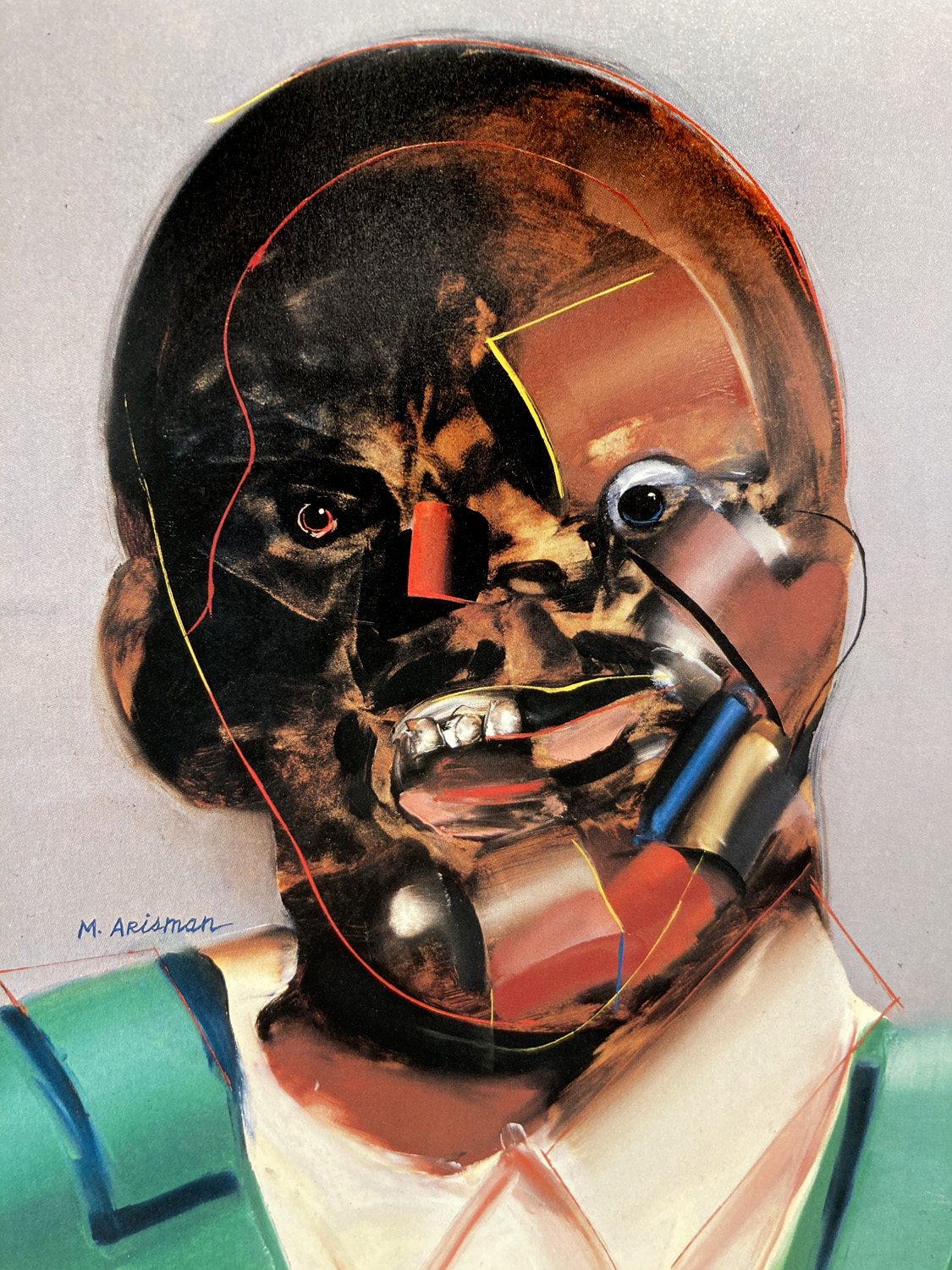
There were also illustrators like Marshall Arisman, who seemed to be doing work with staggering impact that was way out of the mainstream . I knew there was some sort of upheaval happening.
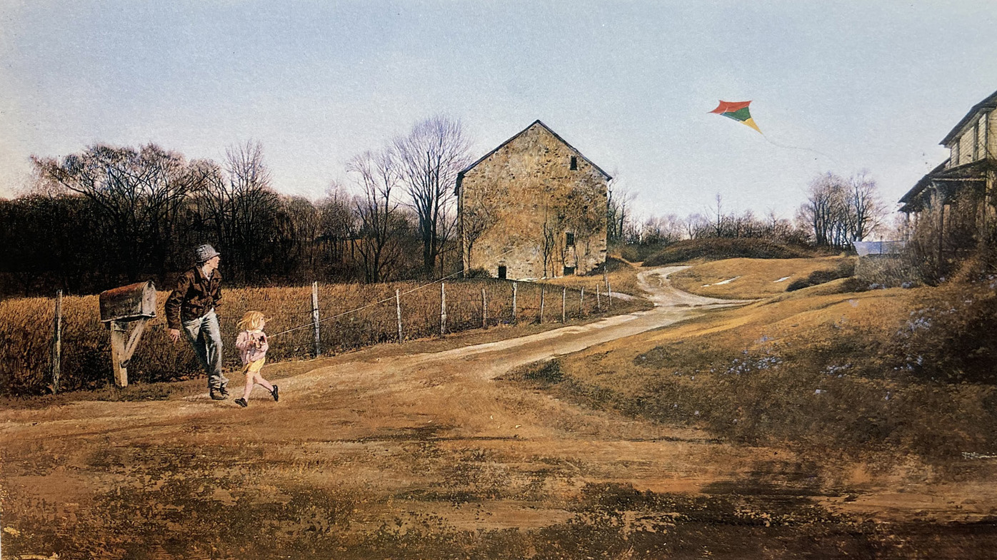
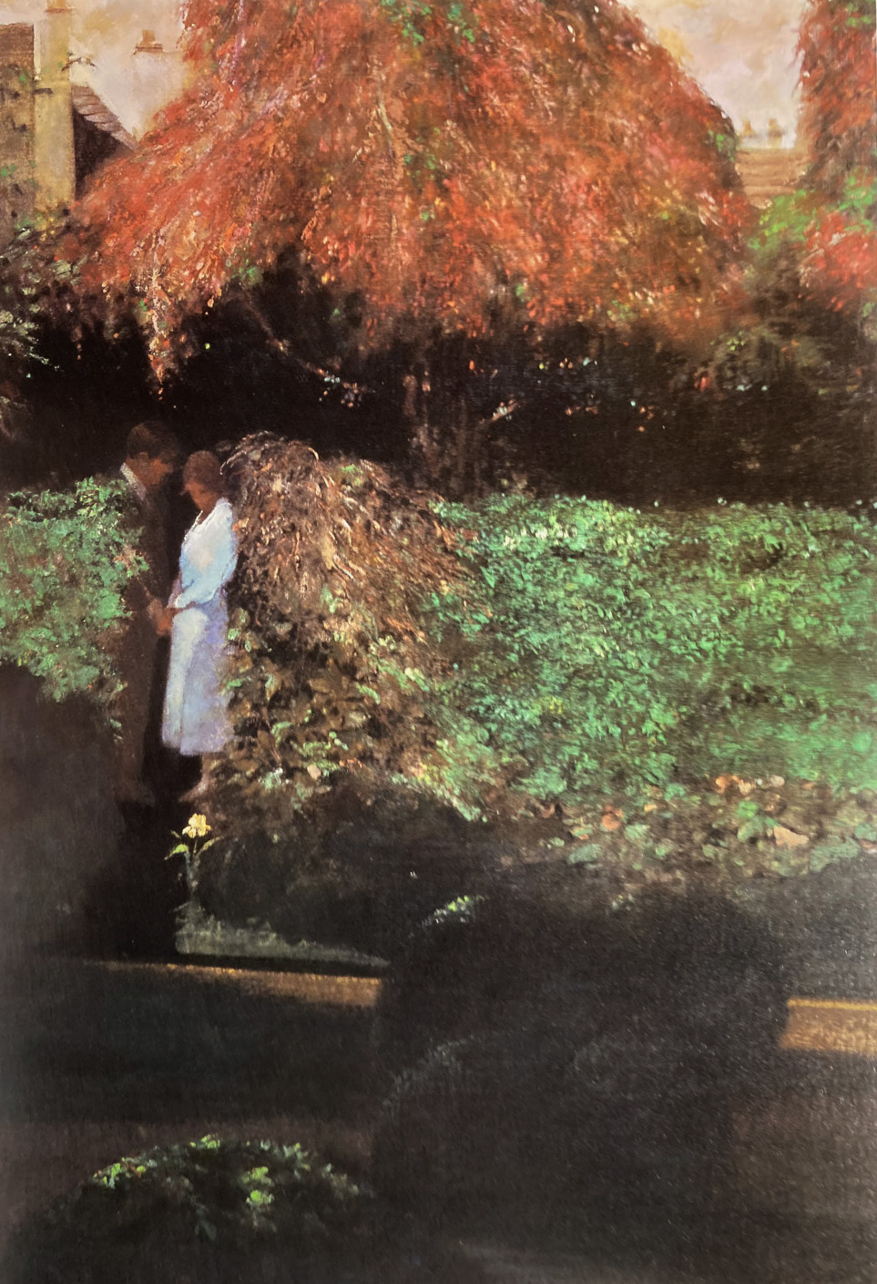
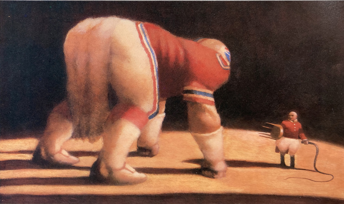
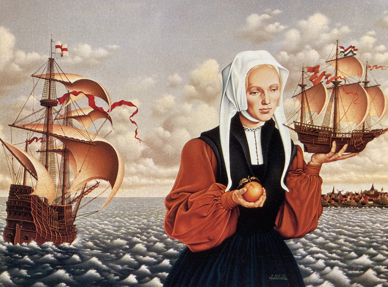
Because I already have my own copies, I passed these books onto two former students who are out in the world, getting started and doing great work. They were just here today to collect them. Before they picked them up, I pulled one of the annuals out of the box and was transported back to 1983. This was the first year the annual was printed in color. I thought I would share a few of the pieces that impacted me from that book. All the pieces in this article came from Illustrators 25, the annual that chronicled the work from the 1983 show. They represent a handful of over 500 pieces selected for the annual.
Illustrators 25 was the first Society show I attended- the first time I saw originals.
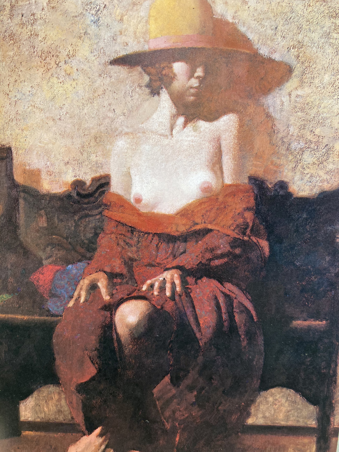
The great Mark English. Seeing his originals in the show taught me a lot- he never did more than was needed to achieve the effect he wanted. His paintings looked far simpler in person. And they were big.
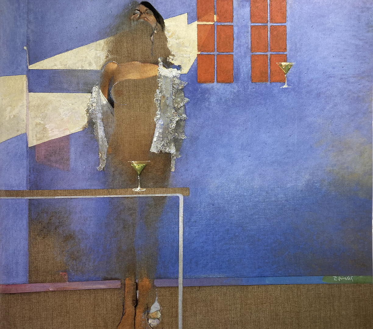
One illustrator who knocked me out was Robert Heindel. He seemed to be trying to push the envelope all the time on what illustrators could do.
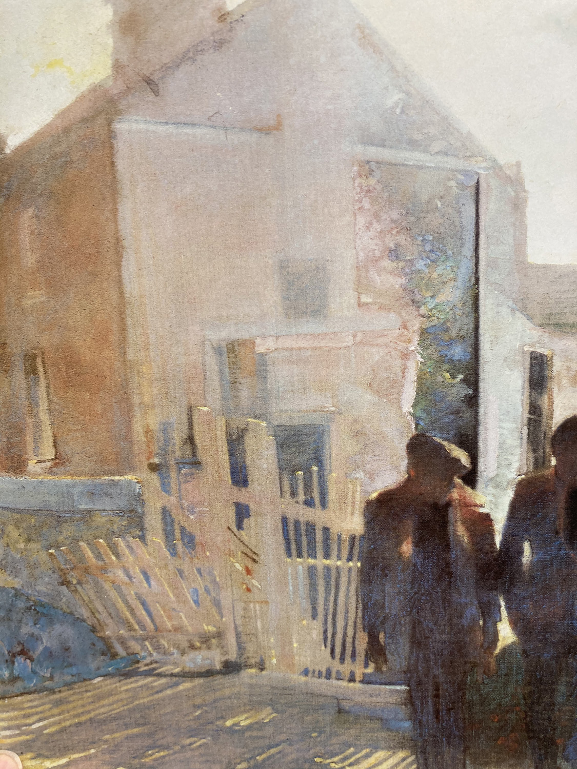
Hiendel’s work seemed to be a fusion of influences especially Francis Bacon, and old- school NC Wyeth type painting.
I was also to learn that my personal taste did not always run parallel to the jurors. Over time as my own taste and experiences evolved, i saw some of the work in a different light.
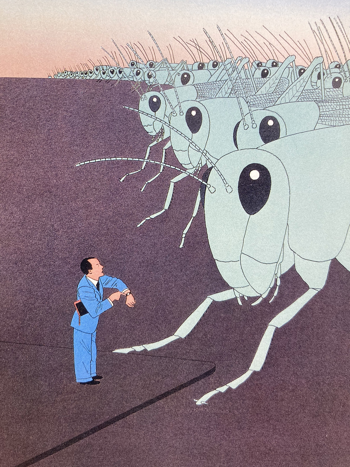
The conceptual and graphic work of Guy Billout looked fresh in 1983 – and it still does today. I think his influence of illustrators who came later may be underappreciated.
Many of the great illustrators in these older annuals have no online presence. If you don’t have these books, keep your eyes peeled- it may seem to be an albatross to own printed books in the 21st century, but for me these books will always be a portal into a dream – a dream that came true.
Looking back at these books, one thing is painfully clear- women artists were not even close to being equally represented in these older annuals. The lack of women in these books seems a bit glaring from the perspective of today .
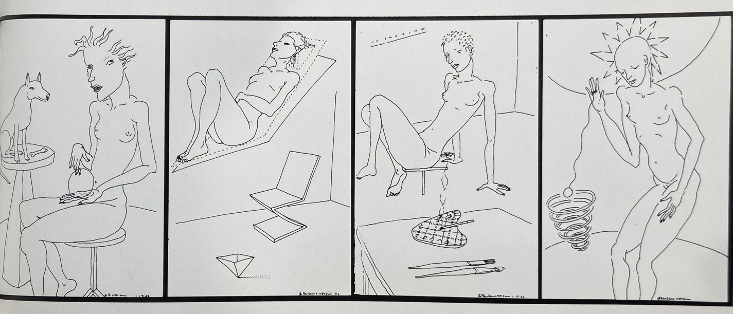
This is the work of Barbara Nessim, who was a pioneer of digital illustration- She was one of the few women whose work is in illustrators 25, There is no getting around the fact: Women were under-represented in these old annuals. In recent years, the society has undergone some fairly radical changes for the better. Barbara Nessim was inducted into the Illustrators Hall of Fame this summer.
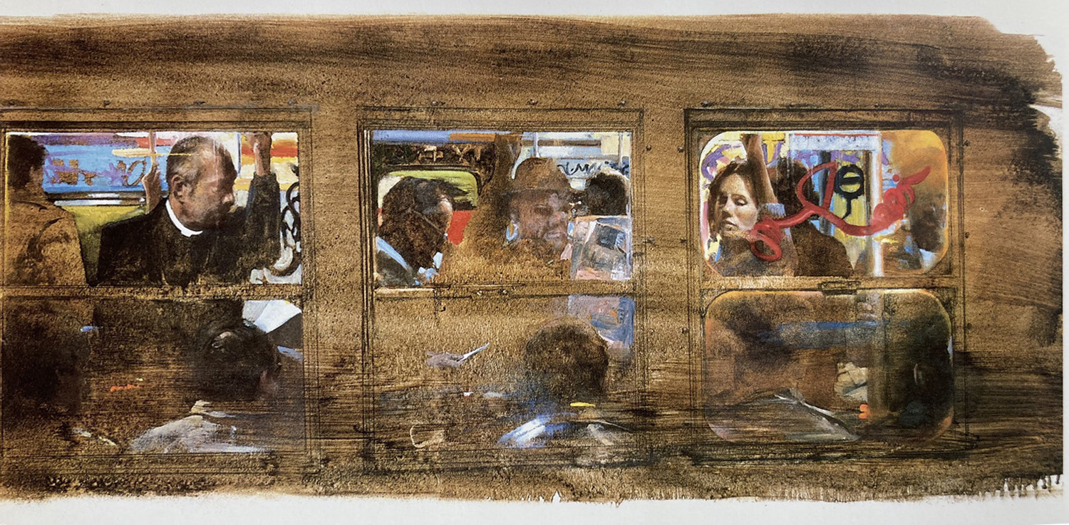
When I saw the original of this piece by Herb Tauss, it knocked me out – at the show, and in the book. I can’t tell you how many hours i spent looking at this piacture. He was able to capture a moment that anyone who has ever been in the subway has experienced. It was my favorite piece in that show.
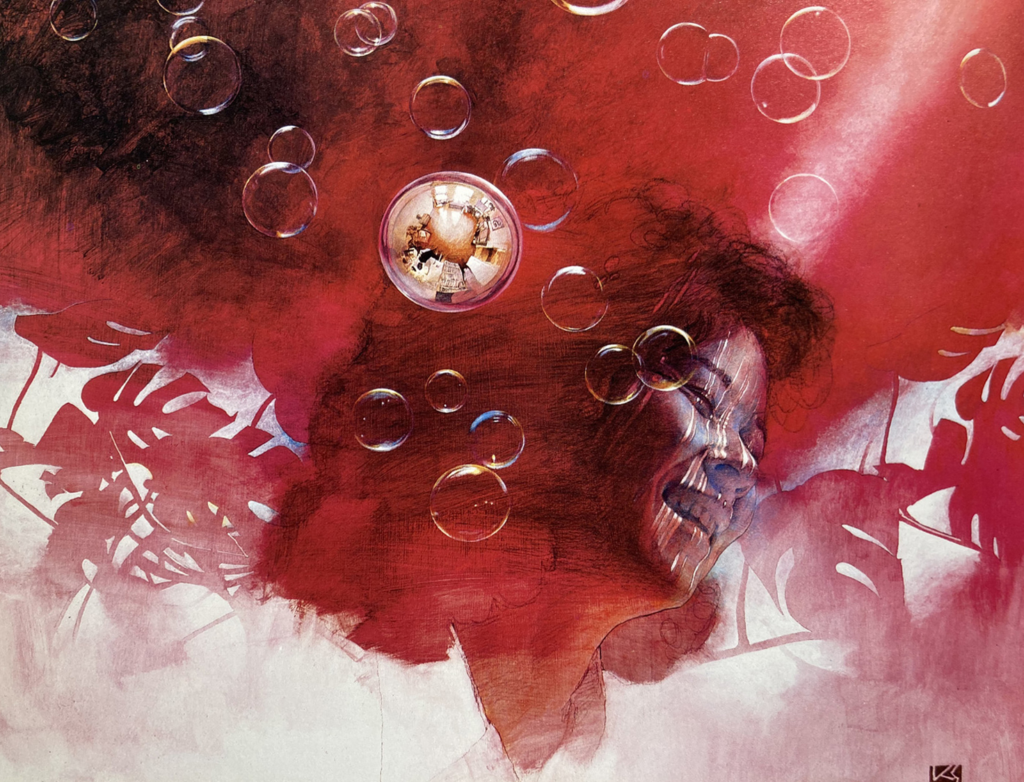
Kazu Sano and I were both in the show for the first time that year. We went together to New York to see the show and to meet art directors. This is one of several pieces that Kazu had accepted that first year.
Keep in mind that these are just a few of the 500 images in this one book- there have been 37 more annuals published since that year- each one filled with great work, the dreams of countless illustrators brought to life.
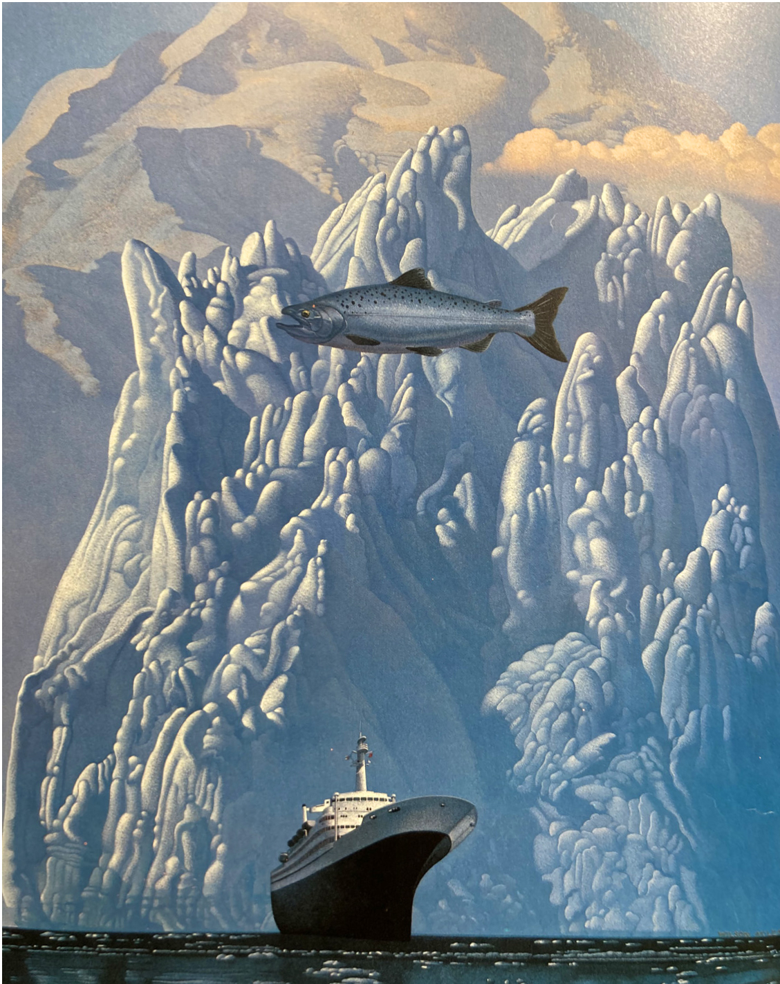
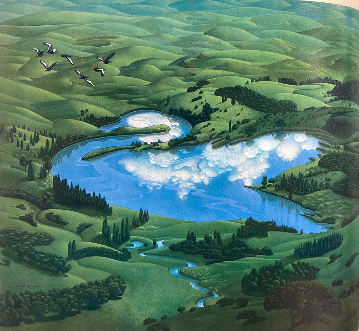
Wilson McLean. Last but certainly not the least, his huge and beautifully rendered paintings were incredible surreal interpretations made for commencial applications, pushing as far as he could go. He had many works in the show every year for many, many years, and every one was a knockout.
This year the Society of Illustrators will publish Illustrators Annual 63. Today, the Society, the juries as well as the work they select, represent a far wider diversity of artists working for a much wider spectrum of applications than they did back in 1983. (competition from other annuals such as Spectrum and American Illustration certainly pushed the Society to evolve.) Under it’s current leadership, The Society of illustrators has worked to expanded their definition of illustration while upholding their mission to keep a record of the best work in a given year. They are an important institution, doing important work to preserve and promote a wide range of illustrators and types of illustration. They deserve the support of all of us in the field.







Hallmark, thanks to V.P. of Creative George Parker, was a financial sponsor of the SoI for awhile; when I started in the 1970s (as a lowly Artist 1) the Illustrators Annuals were always held up to us as something to aspire to be included in. Every year the Hallmark Creative Library would send out a notice that they were taking orders for the new Illustrators and there was a lot of excitement in the building when they finally arrived. Some of my favorite art ever is featured in this post: thanks, Robert!
SI Annuals were definitely a huge part of my journey.
I can’t tell you how much I love this post, Robert. My long time teacher had nearly every SoI annual ever, and I discovered these very images at a really pivotal point in my youth. It definitely guided my artistic path, even a decade later.
Awesome post Robert! The Society of Illustrators has been a big part of my life. Thank you for sharing.
Hi John, I noticed in that annual that you had one of your own pieces in the book right next to one by your father. That must have been a unique thrill!