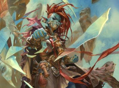
 I play Magic the gathering. I play a lot of Magic. I do not think there has been a day the last five years where I have not had a deck in my hands trying to tune it to perfection. I lay plans and strategies while bike riding to my studio. All in all, lots of Magic on my mind.
In the format I am playing called Commander, a legendary creature is really important. Its the General for your deck and the character the whole strategy evolves around. So every time I get an art assignment for a legendary card my excitement shoots through the roof. This specific card is AMAZINGLY good. And I couldn’t be more happy to finally build a deck around my own card art that can actually kick some ass at the table. Let me introduce you to Obeka, Crude Chronologist.
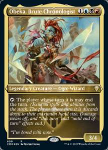
When giving the assignment I knew something was up and that the card might be potentially good. The description called for a female Ogre Wizard punching time…uhhhhhh what?
Smashing time or punching a whole in time, something like that. I imagine that ogre wizards have a less subtle way of using magic than waving a wand. So they use forceful gestures.
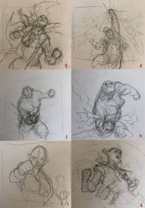
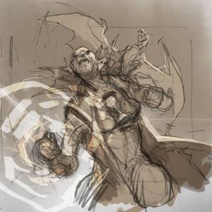
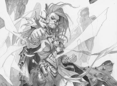
I started sketching to see if I could find a striking pose, so to speak, that would make it a dynamic painting. I start with thumbs until I feel I hit something I can use. Then most of the time I just refine the thumb and that’s it. I will not start fine sketching until the idea is approved. As you can see in my thumb 1- 6 I was trying to nail the throwing a punch pose and the attitude of an ogre wizard. And I did not quite like any of them. My problem was that they were either focused too much on the actual punching gesture or too little. In my mind I was very deliberate around painting cool portraits. Since it’s a legendary character we need to see her in full figure with an emotional connection.
A cool character portrait so to speak, but the more I was angling at the punching pose the less I was able to make her look cool. # 2 I think is the one that might be showing the time punch the best, but the character the least. # 3 and 4 I think they were great poses with the face clear, but they seemed masculine. I liked # 1 a lot. My son came up with the idea that she should have an hourglass around the neck as a kind of medallion to represent time. And in order for me to make her look wizardry I gave her a dragon familiar. # 5 had something too because it would give me the best opportunity to show her face and make us connect to the character. And the foreshortening of the fist and arm i quite liked too. I tried to compile the features I liked into a sketch and ended up with 2 choices. My art director Andrew Valas asked me to go with the one with the foreshortening fist but to lose the dragon familiar. 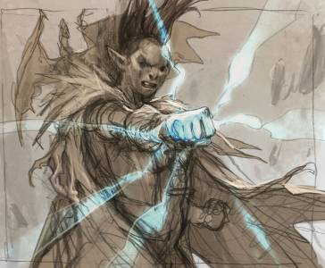
I wanted the painting to be colorful and chose red for her hair to get a good contrast to her green skin. Instead of painting all her skin green I like to make a color difference like this sand color on her chin and cheeks and palms. It resembles most animal colorations and just seems more natural than a simple color tone all over. It adds interest and I think especially in the clenched fist it makes the reading of the fingers and hand better. I went with full daylight and lots of warm bounce light.
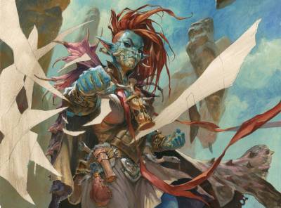
version without the mirror shards glued in
My way of solving the “time” visual, I chose a bunch of shards as if she was shattering reality. I had this cool idea that I was going to paint in different faces of her as a kid as an old Ogre woman and I even contemplated painting in a huge egg to show the time reversed for the dragon cape. But, when I had finished all the of the image around the shards, I realized that it would be a completely messy and unreadable image if i did that: Already it had a very colorful outlook and there was no way one would be able to clearly see and even less understand if I painted a 3 year old ogre kid in one shard and an old ogre in another. The idea was fine but reality something else. So, I had to do something more simple, something that would stay within the palette and that would keep the image readable. So I copied a bunch of elements from around the image into the shards in photoshop. I printed the shards out and glued them unto the painting adding some more strokes of acrylics on top,
I am not sure I solved the “time” punching well enough. To me it kind of looks like she is smashing a mirror. But with the character portrait I did all right – and that was the main thing for me. If I ever get a chance to paint this girl again I will give her Time Magic a bigger scene.





Thank you as always for sharing with us you’re thought process and preliminary work Jesper!
I’m curious, since you’re a fan of magic and play it a lot, does having your art on the cards ever pull you out of the game or make you not use a card because you’re later dissatisfied with the art? I struggle with this (I cringe looking at anything I make.) which ultimately led to my choice to abandon working on projects that I’d love to have my name on but I’d rather experience it as a fan than the maker who knows all the flaws. How do you balance your suspension of disbelief with staying critical about your work to make the best product possible?
Ps. Thank you for uploading that twitch video on muddy colors from a previous post! Any device I use makes twitch lag like crazy. Its nice to finally have a voice to go with your writing that I’ve been reading for so many years!
amazed to see your lovely content.