Here’s another piece I did both as an exercise to further my gouache experience and as a gift to my wife (who already knows about it, so I guess it’s not much of a surprise). This time around I decided to paint a portrait of our dog, Cooper. Nothing too complex or deep, but still a lot of fun and yet still challenging at times.
Anyway, it started with a sketch. This sketch:
 A little about our dog:
Cooper is a rescued shih tzu mix, who we got three and a half years ago. He’s mostly white, but over time some very subtle light beige coloration has become apparent in various areas of his head and body. This slight pigmentation isn’t exactly organized into clear spots, either. His fir just kind of transitions between colors in certain areas with no clear edge. Also, despite a lot of effort on our part, he has dark tear stains on his face. Weirdly, these stains kind of suit him somehow. They kind of telegraph that, while being a fluffy, white(ish) dog, he’s generally a bit of a needy mess.
Though he’s a pretty small dog, he often avails himself of the use of our respective laps whenever possible and thus we get to see him at or just below eye level constantly. And that view was something I was eager to capture. And so that was the inspiration for the sketch above.
Before I moved onto the painting, I contemplated putting big, billowy clouds behind him and/or giving him a floating crown of some of his favorite treats, but I ended up abandoning those notions as they didn’t quite feel right to me. Thus, it became a bit more pared down.
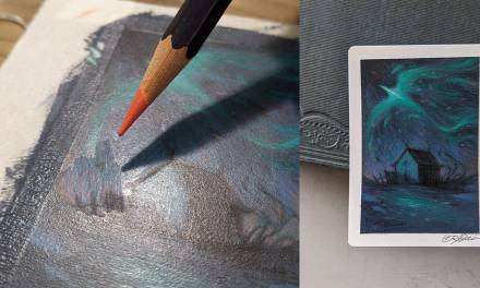
I took the above sketch, projected it onto my surface and made adjustments here and there to get the proportions a bit more right. And then I started laying basic colors down transparently. This was done on hot press watercolor paper, by the way, and I traced a digital projection of the sketch using a watercolor pencil.
Though my initial pass was transparent, it was still a bit darker than I’d initially planned to go. Still, with gouache’s ability to be used opaquely, it’s something I could dial back a bit if I found it necessary. In reality, though, I knew where the darkest darks were going to be, so I still had a ways to go in building up the value and even the initial pass was relatively timid.
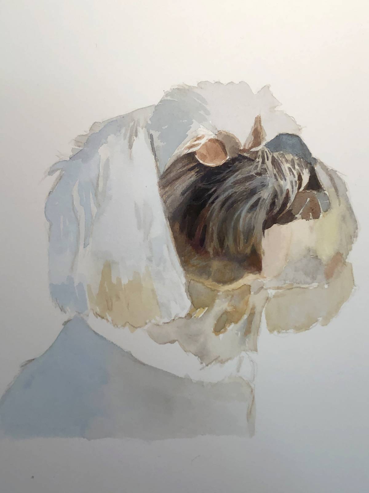 Indeed, the first thing I did after that initial first pass was to hone in on the darkest darks. As I did so, I tried to refine detail as I went.
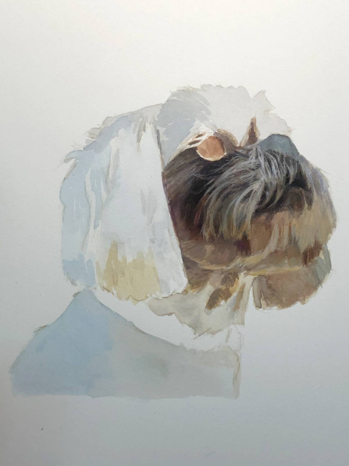 In addition to working on the dark values, I was also trying to determine how intense to go with the rich yellows and oranges seen in the reflected light on the underside of his chin and in his neck. While he is (mostly) a white dog, on the whole I’d say that his coat is comprised of warm whites. Even in cool lighting, there are a lot of subtle yellows clearly visible in his fur. Thus, when he’s in any situation where theres warm reflected light in the shadows of his fur, those colors really pop and sing. However, I was concerned that the relative intensity of the colors might be a little to0 powerful compared to the rest of the piece. So I pushed them a bit more toward neutral, thinking that I could liven them up a bit down the road if necessary.
This decision is counter to my normal way of thinking on color however. Generally speaking, I find it better to start with a color that is too intense and then kill it later if need be. That way, color intensity can be better preserved if that’s what’s called for. I went the opposite route in this instance, because I knew that I was never going to want a pure yellow or orange in those spaces. Adding more pure colors on top later would liven those areas for sure, but they’d still remain fairly subdued and would harmonize better both with what I planned for the piece as a whole, and with my color sensibilities in general. By this point, I was confident enough with where I was going that I just started bringing more and more area sto a level of completion that was pretty close to where I wanted to end up.
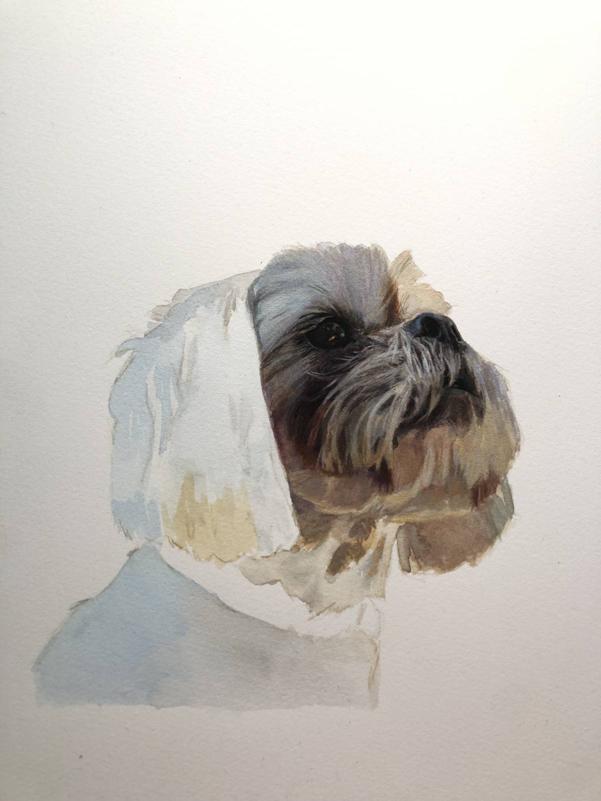 Then suddenly, at this point, I felt like I probably should start defining more of the remaining areas rather than just finishing area after area. I probably waited too long, in fact, as the rest of the piece (which is admittedly VERY simple), might (definitely) have an affect on the areas I was busy trying to complete. So, I went ahead and did just that.
 Throwing thin color and value down, mapping it all out. Bringing it all one step closer to where I wanted it to go.
 A goal I had for myself was to make an attempt at a relatively smooth value transition in the background. This is a difficult thing to accomplish in gouache and I felt it worth attempting the challenge. Despite a good amount of time invested and a lot of effort, I realized that I was not up to the challenge. There was no way I was going to pull that transition off how I saw it in my head.
So, I decided that I needed to find a way to disguise my lack of ability. How I decided to accomplish that was to double down on the brushwork in the background and make it a feature not a bug. In doing so, I ended up vastly improving the piece (at least in my opinion).
I worked on the background until I was satisfied, then went about finishing the ear and torso. The last step in this piece was working on and manipulating the edges of Cooper’s silhouette
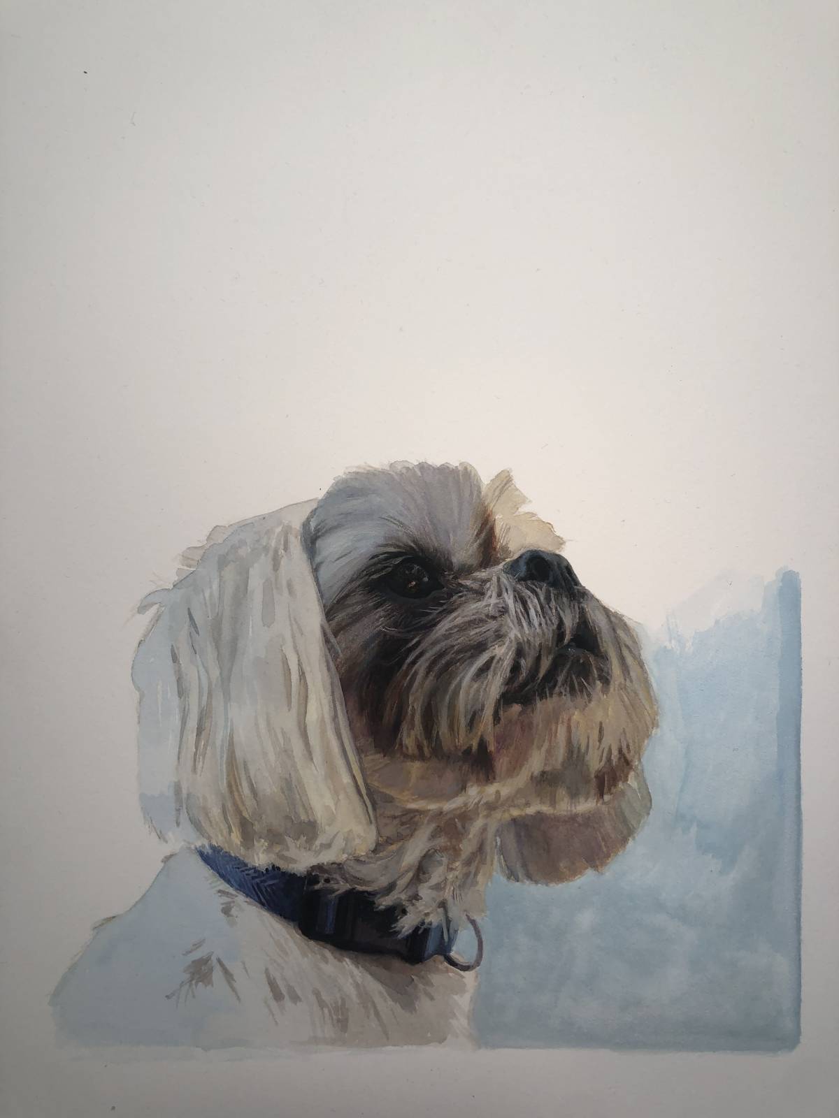
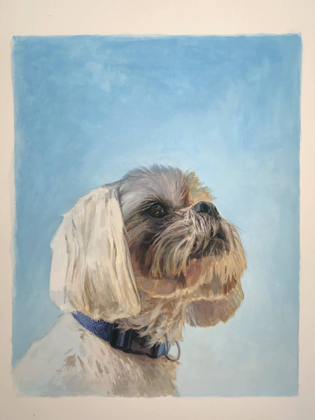
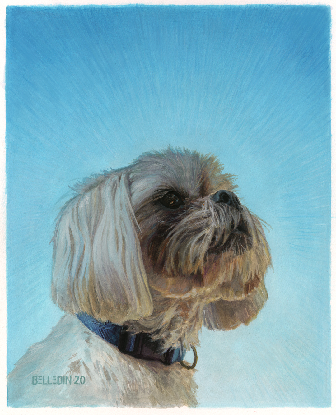 Here’s Cooper in his finished state. The piece measures approximately eight inches wide by ten inches tall.
A funny thing I realized along the way in painting this piece was that the similarities between gouache and oils are such that my approach to each is incredibly similar. Where my approaches differ is that I tend to feel more comfortable with letting transparent layers exist and even show through in the gouache, whereas I tend to bring oils to a more consistent level of opacity. But even that isn’t something I universally do. For some reason, I tend to be a lot more relaxed about transparent layers when I use oils on canvas. Not really sure why that is. Perhaps it’s something to do with the texture of the canvas and the way oil paint sits in that texture. Regardless it’s definitely one of my (many) quirks. I wonder if my relative lack of hangups with gouache contributes to my relative speed and confidence in working in them. Probably.
Whatever.
Anyway, as I said above, this piece was both an exercise and a gift. While I don’t tend to hang a ton of my own work in the house, this piece will likely be an exception. It’s also probably my favorite pet portrait I’ve ever done (and I’ve done a fair few). I suspect, though, that this won’t be the last time I paint Cooper, because it was too fun not to do again.
Hopefully, somewhere in this process of this piece there’ve been some nuggets of interest or something to consider. At the very least, I hope it’s been at least somewhat entertaining. Regardless, I won’t be back until after the New Year and I wish everyone reading this a safe, happy, and healthy one. Take care everybody!
Thank you for this post! I love the painting and got alot out of reading about your process.
Had great time reading through this post. I love pet portraits, regularly sketching my two dogs. They are hard to get down on paper, moving a lot, though sometimes I think they pose for me.