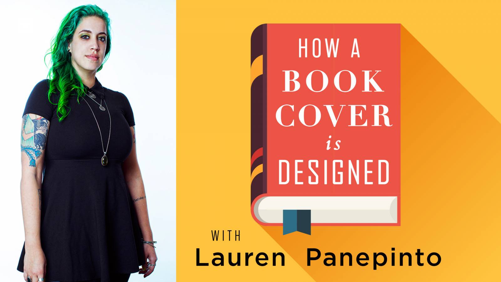
If you’re a patron of Muddy Colors on Patreon you get notified of all the wonderful videos Dan has been coordinating with contributors and guests here. There’s been some fabulous demos and talks with some of the best illustrators in SFF art. As the resident Art Director and Graphic Designer, my work is not quite as easy to demo as a time-lapse painting, so when Dan started talking to me about recording a video to help support this site, I knew it would have to be a hybrid of seminar/class, a demo, and a conversation. I think there’s so much of the book cover process that is pretty opaque to artists even if they illustrate book covers, so I wanted to share as much of the process as possible. I also wanted to show you what the design portion of the book cover looks like, since we usually focus on illustration on Muddy Colors. So I drafted Dan into service as my conversation partner, since he knows so much about the process from the artist side, and together we made a 190 minute video for everyone who’s ever wanted to know how a book cover really gets made.
If you’re a Patron you already have access to the video, but if you aren’t, you can rent or buy it now via the Muddy Colors Gumroad page.
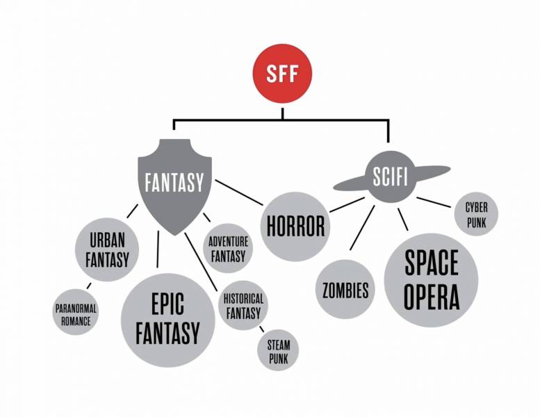
The video is broken up into 2 main parts. First is a seminar (with graphics!) where I walk you through the structure of an Art Department in Publishing, what everyone’s jobs are, how a manuscript is acquired by Editorial, how it is briefed to the Art Department, how we decide whether it’s going to be an illustration, a photograph, or design-forward or type based cover. We talk a lot about the gauntlet a cover must go through to get approved, who does the approving, what benefits that brings to the process, and how that cover is then turned into a physical book in a store. We talk about budgets, cover effects, genre checkpoints, and everything in between.
Second we transition into a design demo. We pick a classic SFF book, Brave New World by Aldous Huxley, and I take you through the entire process a designer would go through if they were working on a design completely in-house, using stock imagery and typography. We talk about where to find imagery, the subconscious messages typography lends to your work, and how to make sure a cover design is legible in tiny web size and catching the eye of the right audience.
So pretty much, you could read every article I’ve ever written here about book covers in the many (7? 8?) years I’ve been writing for this site and stitch them together, or you could watch a 190 min video. I know what I’d choose!
This video is good for:
- Illustrators who want to get hired to make art for book covers
- Designers who want to work in book publishing
- Authors who want to self-publish & will need to hire illustrators & artists to make covers for them, or design their own
- Authors who want to be traditionally published and want to understand the cover process in an Art Department
- Illustrators who want to add some design skills to their self-promo pieces and websites
- Fans of all of the above
- Folks who want to support this site and all the incredible content it produces
Hope you enjoy the video! If you get a chance to watch it definitely come back and leave a comment below. If there’s any other videos you’d love to have me add, let us know too!







Thanks Dan and Lauren, this was great!