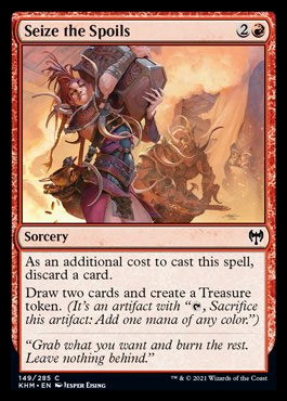
The Magic set of Kaldheim takes place in a world inspired by Norse Mythologi. This card illustration: “Seize the Spoils” is a classic plunder situation, like most people know from Viking stories. They come they burn and grab what they can and escapes in boats. Fair to say that my ancestors was takers.
This illustration posed a huge bunch of difficulty for me. I had to create a scene of pillaging with people grapping stuff, burning and taking away treasure, but without the focus of the figures. In Magic there are cards that shows figure portraits and the card represents a creature and there are cards that represent an action or a spell. In this case it was a card representing an action, so the focus wouldn’t be on the figures and it should definitely not look like a figure portrait.
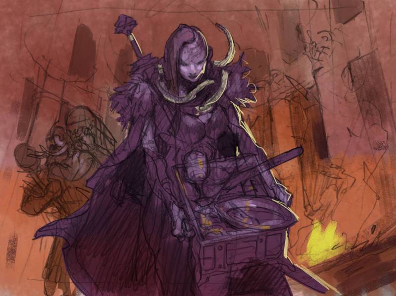
I created sketch number 1 and came up with a solution that I would paint the figure cold purple in front of a warm background of a flame lit hall. that way i was hoping the focus would be less so on the Viking girl. My art Director Cynthia Shepheard came back to me and asked if I could decentralize the figure so it did not look so much like a figure portrait? “Damn Jesper”, I said to myself. ” You knew it and yet stepped right into it anyway”. With that comment in mind I realized that I had to start over. I needed a composition that did not have one figure in center and I needed a more clear action than in the first sketch.
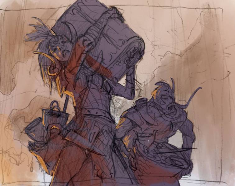
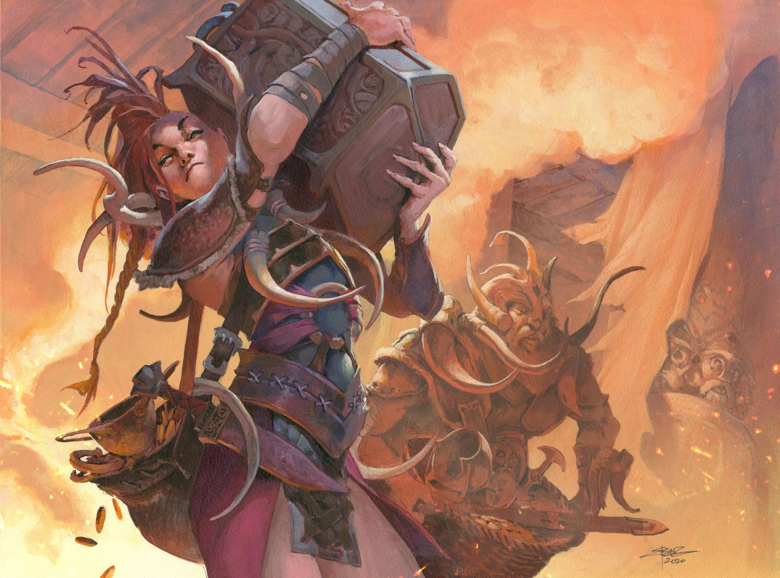
My sketch number 2 was focused much more on a heavy chest being lifted and had the Viking girl off to the side. I had a friend take a photo of me acting out the pose and used that to get the pose right. This I was happy with and I kept the idea of a cold figure against a warm background.
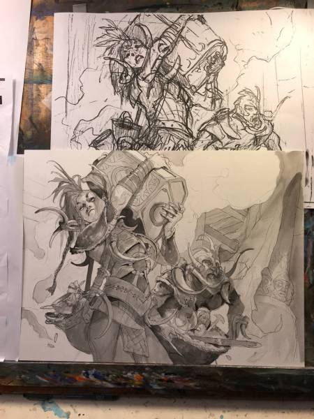
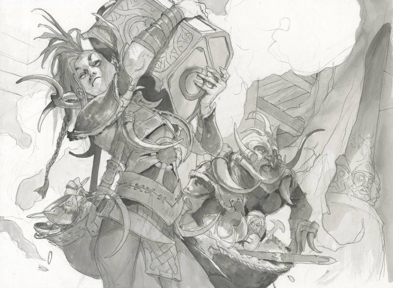
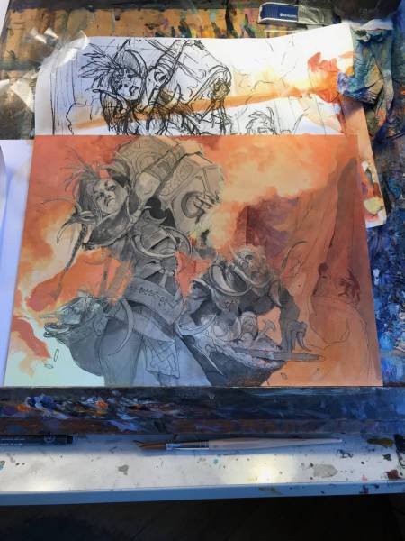
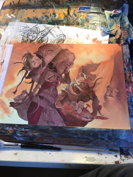
The next steps are a full drawing on water color board and then ink it so i can see through the washes and payers of acrylic. I do a full black and white version first that has all the main values. This layer is visible trough all the softer tones and layers so i can use the values I establish here all through the painting process. I mask out the figures and finish the background before peeling away the frisket film. Then I work with the darkest tones first, using my black and white tones from the inking stage and colorizing them with washes of color. Slowly I work myself up to lighter tones and build up the light.
With a painting like this, that has a very divided composition – one part being cold and one part being warm – I try to soften it up a bit. Notice a bit of purple worked into the darkest areas of the background. And a but in the rafters in the ceiling: That temperature contrast makes it a lot more interesting and less flat compared to if I had only used yellow and orange in the background. Same with the figure; I couldn’t resist a bit of direct light onto her face to capture the shadow from the chest and a hint of light on the tusk around her neck. It works well to break up the e division of element like that, pulling a bit of the background color into the foreground and visa versa. Also in playing with light and shadows like this, having elements like the chest casting shadows onto the face and the tusks create an illusion of this being real. Observing light in photos or even creating super-sculpy models to observe light, helps tremendously when trying to “sell” a scene.




So funny you tell what Cynthia told you 🤣🤣🤣
Loving seeing your process with Magic illustrations. And quite a library.