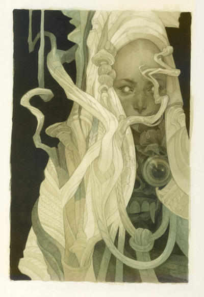
Most of my work – whether it’s Magic the Gathering, or my own playing card art – is meant to be narrative rather than emotive. For this piece, I wanted to play with something a little more abstract – an image that conveyed a mood, rather than a story. The e.e. cummings poem below, staple of wedding ceremonies everywhere, is usually read as a romantic one, but I’ve always sensed more sinister meanings: carrying fears, old wounds, personal failings, and inner demons.
i carry your heart with me(i carry it in
my heart)i am never without it(anywhere
i go you go,my dear;and whatever is done
by only me is your doing,my darling)
—e.e. cummings
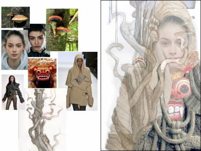
I’ve been looking at a lot of Sergio Toppi and Gustav Klimt lately – I really love how both these artists use pattern, and the way they flatten forms in interesting ways to create graphic shapes and striking compositions. With their brand of well-constructed randomness in mind, I’m composing a rough image from bits and pieces of found reference (below) – including one of my own sketches of a tree that I’ve always liked, but never had a chance to incorporate into a finished illustration.
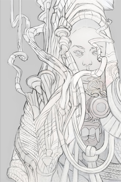
Now, I have to reconcile what *I* see in this assemblage into a clear drawing. Every eye will see something different when looking at an abstract mess (think of Rorscharch blots) – so a rote tracing can never capture exactly what’s exciting to me about the comp I’ve put together. To allow for as much tweaking and experimentation as possible, I do this stage in Photoshop – working directly over the reference comp on a new layer.
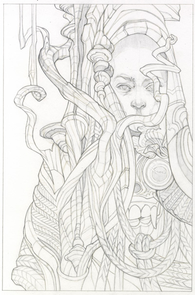
I do my final pencil drawing over a low-opacity printout of this digital lineart on Bristol. While I could also have chosen to start my painting right over a print of the rougher digital sketch, I want my focus during the painting process to be on the color (not something that comes naturally to me) rather than the drawing – so having everything completely resolved will save me some distraction as I go forward.
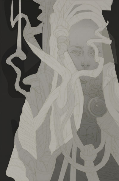
Similarly, I want my values pre-determined to eliminate any guesswork; I know I want to have a light figure with a dark core and dark background, but there’s still a lot of room for play in how the midtones are arranged throughout that light figure. A digital mockup of these smaller value decisions gives me something to refer to as I work.
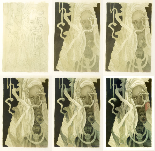
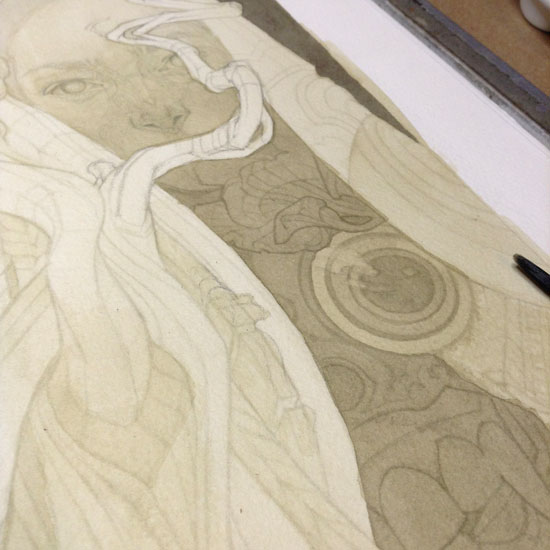
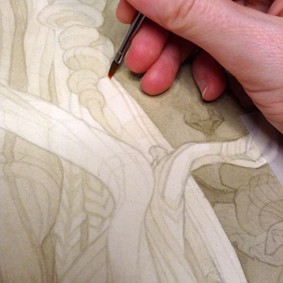
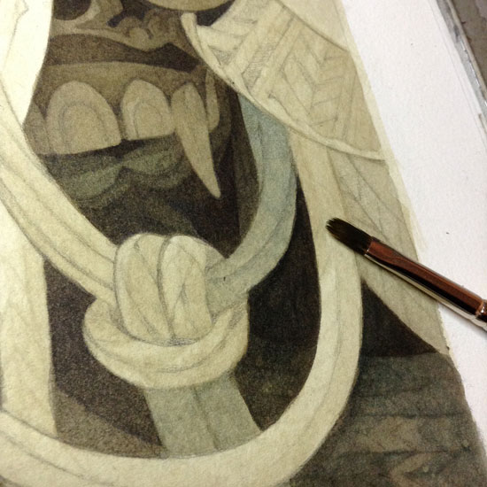
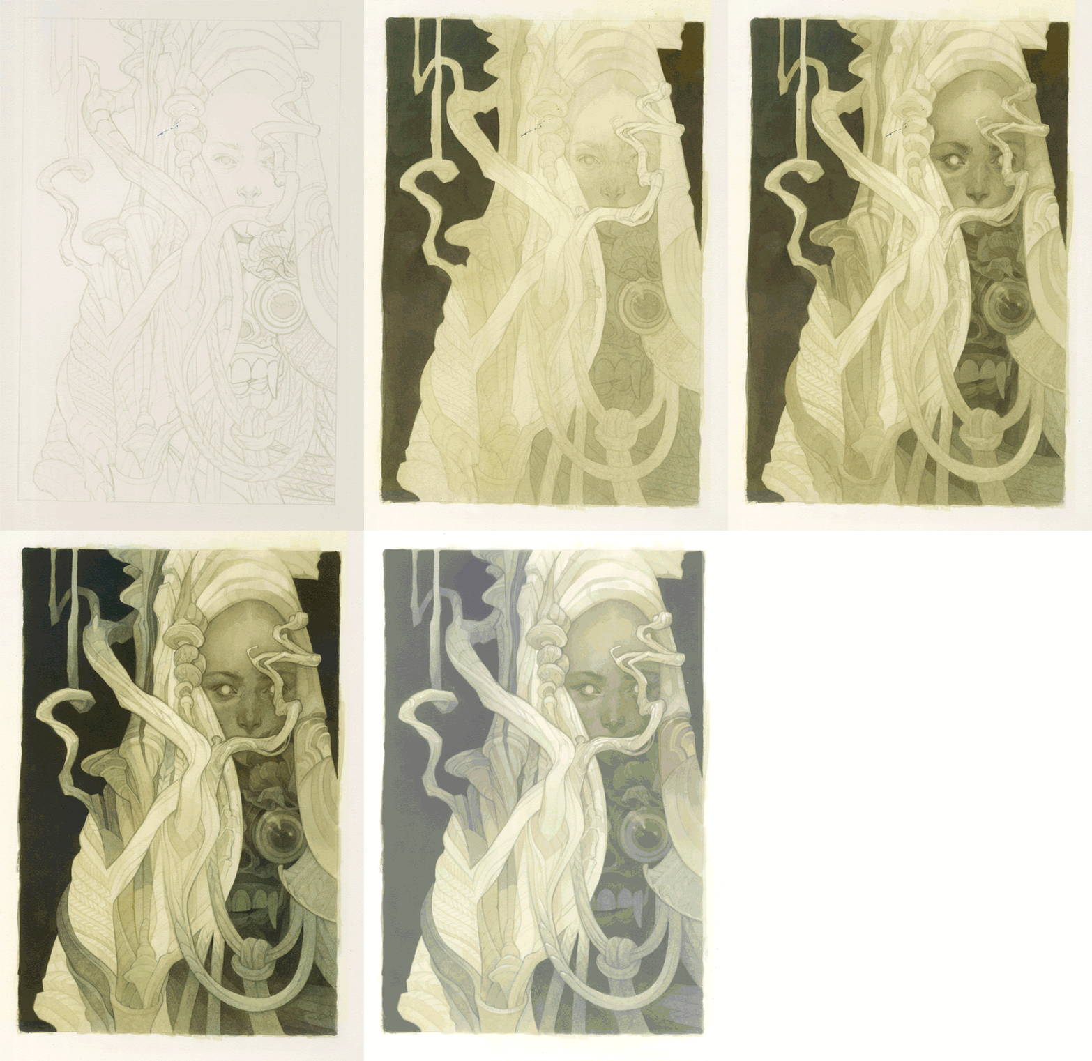
Working over a low-opacity print of my pencil drawing on wet-stretched watercolor paper, I start my painting with diluted fluid acrylic paint. I apply a thin allover wash, then use a slightly stronger wash over all but the lightest areas, beginning to separate the dark and light values according to my digital mockup. I’ve also made some small adjustments to the drawing (tweaking the shape for the branch that crosses the face) in pencil.
In the darker areas, I start building up the values using my original greenish acrylic wash with a tiny bit more black added in…
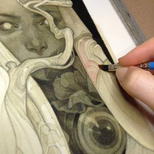
…along with a light retracing of the printed lineart using a very diluted version of the greenish wash.
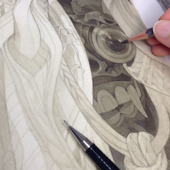
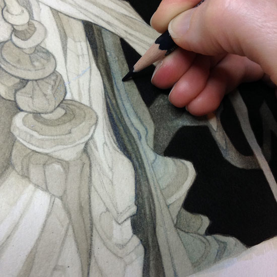
With the values mostly established in inks, I switch to pencil – using an HB mechanical pencil and a light hand to emphasize the lines of the sketch, and a Blackwing pencil for heavier rendering in the dark areas.
At this point, I still want to take my values a bit darker; but, I don’t want to risk disturbing the layers of pencil and thin washes I’ve put down so far. Using a small spray bottle, I apply a few thin coats of diluted matte medium to seal my progress so far.
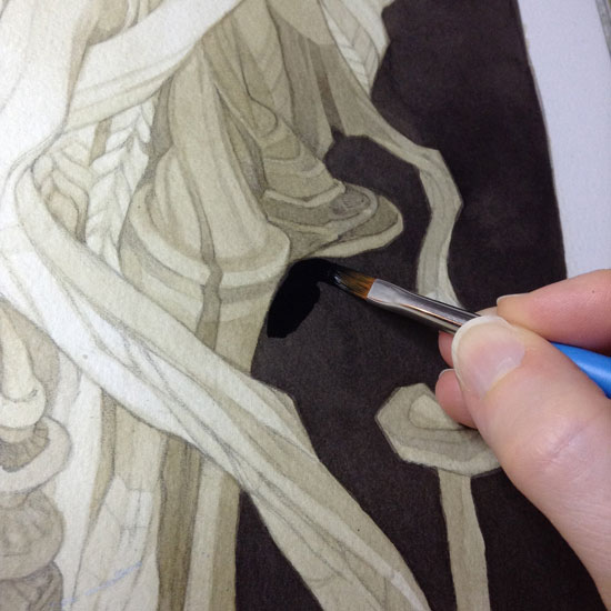
I notice that my “black” background is just a few shades off from 100% black, and go over it with some undiluted acrylic to make sure I have a solid frame of reference for the rest of my final values.
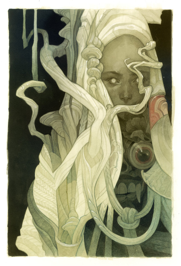
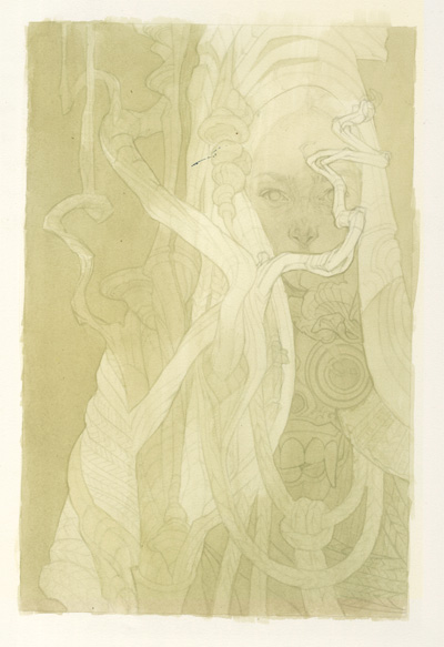
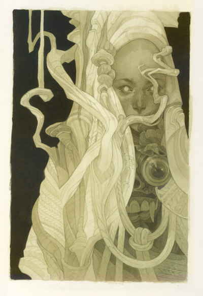
Below, here’s what the piece looks like at this point: I’ve laid in all the detail I want to, and the value structure is about 80% there. Alongside the new, pure black background, though, it still feels a little washed out, and the monochrome color scheme feels rather flat and dull.
I’ll be fixing that with acrylic glazes. Here I’m adding in two elements – color, and a darker step on the value scale – at the same time with a thin glaze of dark teal acrylic (a mix of Transparent Phthalo Blue and black, thinned to wash consistency with matte medium and a little bit of water).
I really like the depth that this adds to the piece, and that little bit of color variation somehow makes the whole thing feel a little more solid.
I feel like some of the lineart needs to be pushed further to match the more fleshed-out appearance that the colored glazes give the piece. In the areas that I’ve tinted and darkened, I go in with an indigo blue Col-Erase pencil to retrace some of the lines.
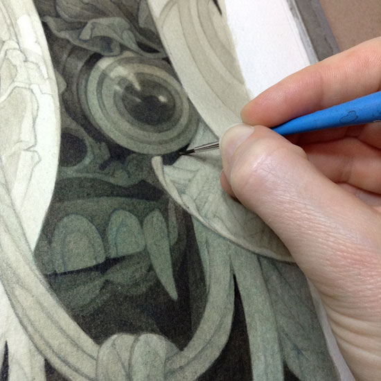
To keep these new dark areas from feeling too flat, I add a little bit of extra depth with some pure black acrylic, painted in extremely small touches into shadowy corner and edges within the darkest parts of the painting.
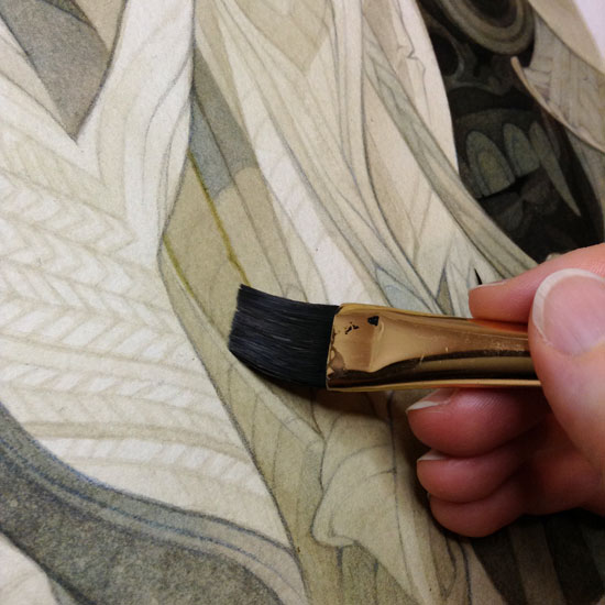
To add even more variety to the composition and a little more intensity to the overall color scheme, I paint some very thin washes of brighter yellow over the branching forms at lower left…
…and a tiny triangle of bright pink — an idea borrowed from my original photo comp, where an accidental artifact of whatever photo I’d cut and pasted while assembling things added an unexpected touch of contrast.
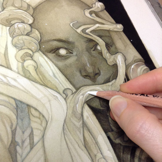
Finally, I work in some small touches of white charcoal for highlights and additional texture.
The best part: the process gif, making it look easy. Also, a shameless plug for my Patreon, which enables occasional process experiments like this one along with regular write-ups of my playing card art.



Fantastic work Wylie! I love having the thought narrative and long look at the production processes.
Love your process. I can see that Toppi inspiration in this piece, love it. Are you familiar with the work of Quique Alcatena? Is an argentinian artist that has a really Toppi vibe too.
Dang GIFs are always so good at art. Smashing post, cheers!
Fantastic article on an amazing piece! Thanks for sharing.
Since you switched from inks to acrylics, plus using layers of matte medium, do you sometimes miss having the absorbency of the paper?
I love your work! I have always been curious: how do you print on watercolor paper? Do you have a special printer? Do you print it at a print shop?
This is fucking amazing.