As a figurative instructor, I am constantly looking for new ways to engage students and have them look at the model – and the world – in new ways. Last week, I covered my shadow mapping technique which explored using just a pen and a black marker to block in high contrast figures. For this post, I’d like to introduce a new medium that I’ve been bringing into figure classes with great success: cut paper!
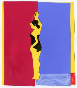
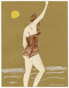
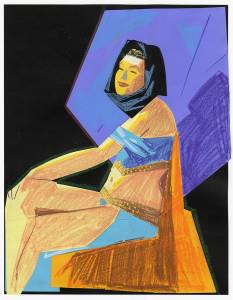
I created the above piece in 5 minutes from a live costumed model. Could these be considered cut paper gestures?? I used cut paper, pastel, colored pencil, and marker. The following pieces were created in the same fashion:
The idea came from this video collab between the legendary Josh Cochran and The New York Times. I remember the first time I saw it a few years back and just reeling from how dang free Josh seemed blasting through these fun, quick pieces that had undeniable graphic appeal. And then, feeling guilty for even considering setting aside my precious charcoal and Bargue idealogy, I set aside this approach as something that I might do “someday.” Fast forward to last semester as I was writing the syllabi for a new Senior-level figure class. I needed a way to emphasize shape and design. I remembered how Mark English and The Illustration Academy assigned the famous “Flat Assignment” the first week in order to emphasize simple shape design. They encouraged the use of cut paper. But could cut paper work in a upper level figure class with a pack of serious art students that had spent years studying Steve Huston and atelier techniques? I thought I’d give it a shot. You know what happened? Both times, the class commented that it was by far the most fun they had in a figure class in a long time. I worked alongside them, and I absolutely agree. Success!
The reason I think this was so well received is:
(1) It’s simply new. Figure classrooms are dominated by the repetition of charcoal and oil based traditions (for good reason). This broke up that necessary monotony a bit.
(2) It was incredibly fast and produced very appealing imagery. Dopamine hits all around.
(3) It felt more like play and less like work. These “gestures” were so fast that, after you knocked out a few, you began to come up with ideas on how to approach and sequence the media in fun new ways.
(4) The fast poses forces the artist to make fast decisions and to work a bit on instinct. The bluntness of scissors forces simpler shapes. Both of these things are very good practices!
From the ideological side, it emphasizes simple shape and value design, the possibilities of pattern and texture, and simple vs. complex. I particularly noted that it is a good litmus test for your creativity as a picture maker. How can you play with negative and positive shapes? Maybe go high key for one and low key for the next? How simple can this really go but still read? Just personally it might be fun to knock out a few of these from film stills just to supercharge creativity before a project.
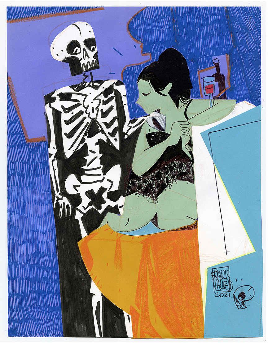
In addition to the 5 minute gestures, we explored one hour long poses. Here are my results:
For the second long pose, I rolled over the classroom model skeleton to “pose” with our model. It was hilarious watching her try and balance the skeleton hand on her shoulder as she settled into the pose.
If you’re interested in doing this at a figure session, here are a few notes to consider:
-A model wearing an interesting costume is a positive since it provides more shapes to react to. I’m sure it could work with nudes, but I haven’t done it personally.
-I picked up sheets of cheap colored card stock paper from Staples. It was fun grabbing random colors and trying to make them work.
-I used the “Disappearing Purple” Elmer’s glue stick.
-I recommend doing this on a flat table (compared to easels or horses) so you can spread your materials around your piece and scan your table for ideas as you work.
-Cutting the paper with scissors is the obvious way to make shapes, but tearing the paper creates different edges and thus introduces a new surface into the piece that can be really fun.
-The more you do, you might be tempted to draw more and cut out less. Fight that, and push yourself to cut out shapes instead of drawing them when possible. I think this encourages simplicity.
So that’s it. I look forward to playing with this approach more in the future. If you try it, let me know how it goes!?
__________________________
*Bonus*
Here are a few prior students of mine that have pursued cut paper as their primary media in their illustration practice. Watching them explore the medium surely inspired the above exercise!
Ashley Neagle
Nicholas Danish
Rebekah Start





This was / is a great idea… and it is pragmatic as well…