Here are a couple of lighting methods I use to help my outdoor concepts work better.
These work well on interiors also but interiors will probably be a later post. I’m sure there might be a name for this already but I’ve been calling it Broken Lighting in my head so I’ll do so here.
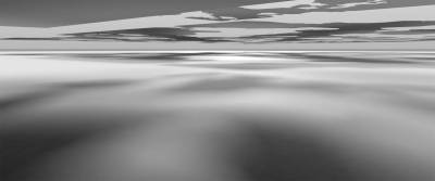
Here is a plane with the sunlight at high noon. There might be a project where this is what the scene calls for but for now let’s change this and use light to create depth and space.
In this image I added a cucoloris, sometimes called a kook, to simulate cloud cover. It’s that ugly looking thing I’d have to probably paint out in the sky at the top of frame. In film they use kooks on sets to break up the lighting to look like a canopy of leaves, or clouds and they even have moving kooks that can simulate a surface of water above the set to create underwater caustics. With the addition of this we have a more interesting picture by introducing the contrast and depth of the broken light in the second image.
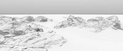
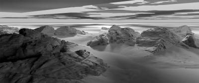
Here is the same process with some rocky hills. Noon lighting, bland and even.
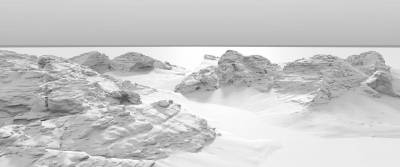
For the next image I rotated the sun just slightly enough to make the rocks backlit turning them into a more graphic shape and silhouette. If you don’t have an idea what to do with your lighting in an outdoor painting, backlighting is almost always a good choice. It’s the standard in film. So much so, that when not present a movie can start to look and feel like old daytime tv.
Now I added the cloud cucoloris in and you can see that the dark and light graphic repetition creates a lot more depth and interest. I have also added a lighting flag in the foreground.
On sets, flags usually look like fabric on a frame, kind of like a …flag. They are used to partially block the light. In this image you can see the large plane in the upper left that I put added to make the foreground really dark.
Another example using the same methods. Here is our bland, noon lighting again.
A more backlit version. Backlighting can of course create longer shadows which in turn means more interesting light and shadow shapes.
Now the cucoloris is added making sure the foreground is dark which is another common device used in cinematography. Dark foregrounds are a great way to compositionally frame the action or interest that’s in the middle ground or background.
I added a little atmosphere in this last one just to create more of a graphic shape of the woman and little girl. Atmosphere enhances the graphic shapes, silhouettes and depth in an image. More than likely, when further painting this image I would punch up the woman/girl graphic and also darken the foreground.
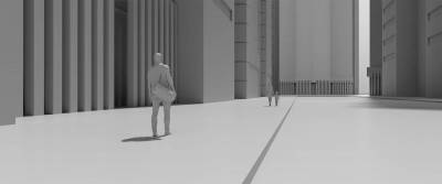
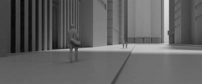
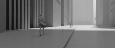
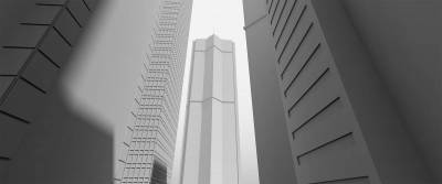
Here is a very wide angle lens view of a skyscraper. The shadows of the other buildings are making a nice dark foreground.
In this next image I have added a gradation to the skyscraper. Gradations create an illusion of real light and its fall off. If you look at the way the masters painted chiaroscuro it’s the same idea but this is on a much larger scale. Gradations also help to enhance the feeling of distance as if this building is so big the sun can’t shine on it evenly from top to bottom.
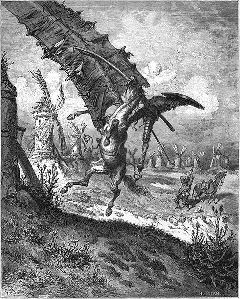
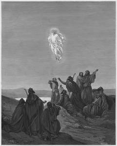
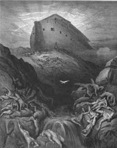
Here are some artistic examples from Gustavo Doré who was a master of lighting like this.
Dark foreground either made by the giant windmill or a cloud shadow. Either way it’s dramatic and has a lot of depth.
This next one I love because it shows what we can get away with as artists. Not a cloud in the sky but a nice dark, shadowy, foreground nonetheless. Also note the use of graphic contrast, dark, light, dark, light, dark, light etc off to the distance to create a sense of depth.
In this last image there is a real dramatic use of broken lighting where Doré used soft breaks in the clouds to illuminate the areas of interest.
There is so much more to lighting but I thought I’d start by sharing these. Let me know what you think in the comments. Also please comment if there are any other topics you want me to cover.









Nice! What software are you using for the digital “test shots?”
I mostly use Modo. Anyone new to it I would recommend Blender.
Now I start to understand why my scenes look boring. Thank you for explanation and please continue.
Excellent article!
G. Dore truly was a master of staged lighting. His pieces are full of artistic license, setting up the scene precisely as he wanted it, but there is still a fundamental knowledge of how light and atmosphere works.
We are taught to look for dark/light contrast and use it, but often we are not taught how to create it if it isn’t present in our reference.
Thanks for sharing!
Thanks for sharing this post.