The art brief for this piece was pretty simple. I was asked to paint a leonin (lion person) wielding magic in Magic’s latest setting of Strixhaven (which is also the name of the university of magic in this particular plane). The aesthetic of the swirling magic, the uniform and the setting were all meant to be based on that of the Silverquill college, which meant there’d be a lot of black, a lot of white, and a lot of ink-themed nods throughout the design. In addition to the leonin and the magic he was wielding, two inklings (sort of impish, impish conjured familiars) needed to be included behind him, guarding the leonin spellcaster and being strengthened by him. Fun!
So, I opened up Photoshop and dug in to sketches. It wasn’t long before I arrived at this sketch:
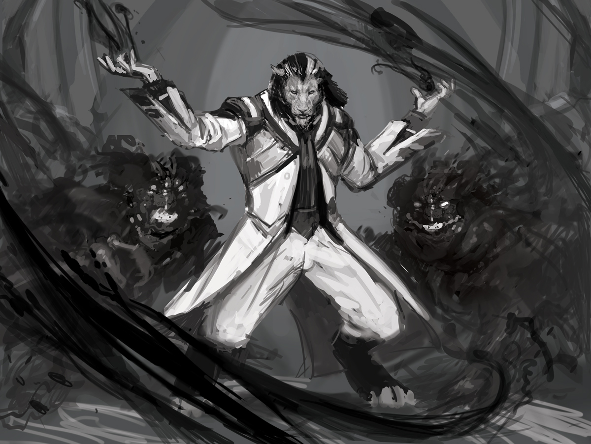 Before I got to this point, however, I had to make some changes to the piece. Initially, I had the leonin wearing black, but then I realized he was meant to be a white-aligned creature (always read and reread your assignments—I usually do, but for some reason overlooked that important detail). Now, I personally, don’t love the notion that all black-aligned things need to wear black, all white aligned things need to wear white, all green aligned things need to wear green, etc. It’s a weird notion to me and it’s potentially very limiting. But this isn’t about me or my preferences. This is about works best for Magic: the Gathering, and Magic generally leans in the direction of clothing color indicating alignment—not 100% of the time, but enough where I feel it necessary to consider it in pretty much every case (even those cases where there is no styleguide and it’s entirely up to me).
So why was it important to switch to white clothes in this case? Well, with the black inklings in the background and the black swirling magic, I think the piece really needed some visual nod to the fact that the leonin is white-aligned. Having virtually everything be black or dark gray just didn’t convey that. So I switched his clothes to white, which had the added benefit of setting his figure apart from the magic and the background. I mean, who doesn’t like visual clarity?!
Anyway, I submitted the above, and the fine folks at Wizards liked it. But they wanted changes—pretty minor ones too. What changes? Well, they didn’t want the magic to be just black inky swirls. They wanted there to be white, glowy swirls, too.
Not a problem. Well…not a big problem, anyway.
While they didn’t ask to see a revised sketch, I did one up and submitted it anyway. Why pester my Art Director like that? While I admit that submitting an unsolicited revision may risk some degree of annoyance for the AD who is guiding my (and many, many other) piece(es) along, I feel the risk is worth it. Resubmitting makes certain that both the AD and I are on the same page about what the finish is going to be. I appreciate the level of trust they have in me that they allow me to tweak the work as necessary without showing it to them again before the finish, I really do. But I’ve guessed wrong or misinterpreted requested changes in the past and it’s resulted in a lot of headaches. So, in short, I’d rather they be a little irked at the start of the process because of an extra sketch round than really angry later on when they get a finished piece that falls short of their expectations.
This abundance of caution resulted in the second sketch below:
 Of course, even this second sketch failed to include quite enough white, glowy magic, but based on the feedback, it was clear that I was heading in the right direction and I felt comfortable enough to head to the finish.
The revisions were….quick and dirty. I did not take my time. Astute viewers will notice that this lack of consideration resulted in a bit of a value issue with the piece. Don’t get me wrong, there are probably a bunch of other things wrong with the sketch, but value is a glaring issue. See, the white, glowy magic is a light source, the gleaming, white uniform is not. If that’s the case, then why is the uniform the brightest thing in the image? Shouldn’t the white, glowy magic actually…glow? Yes. And fortunately I did notice this shortcoming and made notes to correct it and then addressed it when I went to paint.
Mostly.
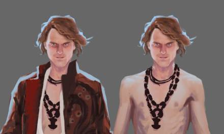
Anyway, here’s a bit of reference I shot post thumbnail, pre-sketch:
 Embarrassing, right? The jacket is cool, though. In fact, that jacket is WAY cooler than I deserve. So is that skull and crossbones pillow. The carpet spray and the fireplace are about the right level of cool for me, though.
Regardless, I had some other reference I leaned on, but I did keep coming back to the above picture (and a few others that are now on a hard drive that is in storage awaiting a cross-country move) throughout the painting process.
Speaking of which, on to the painting…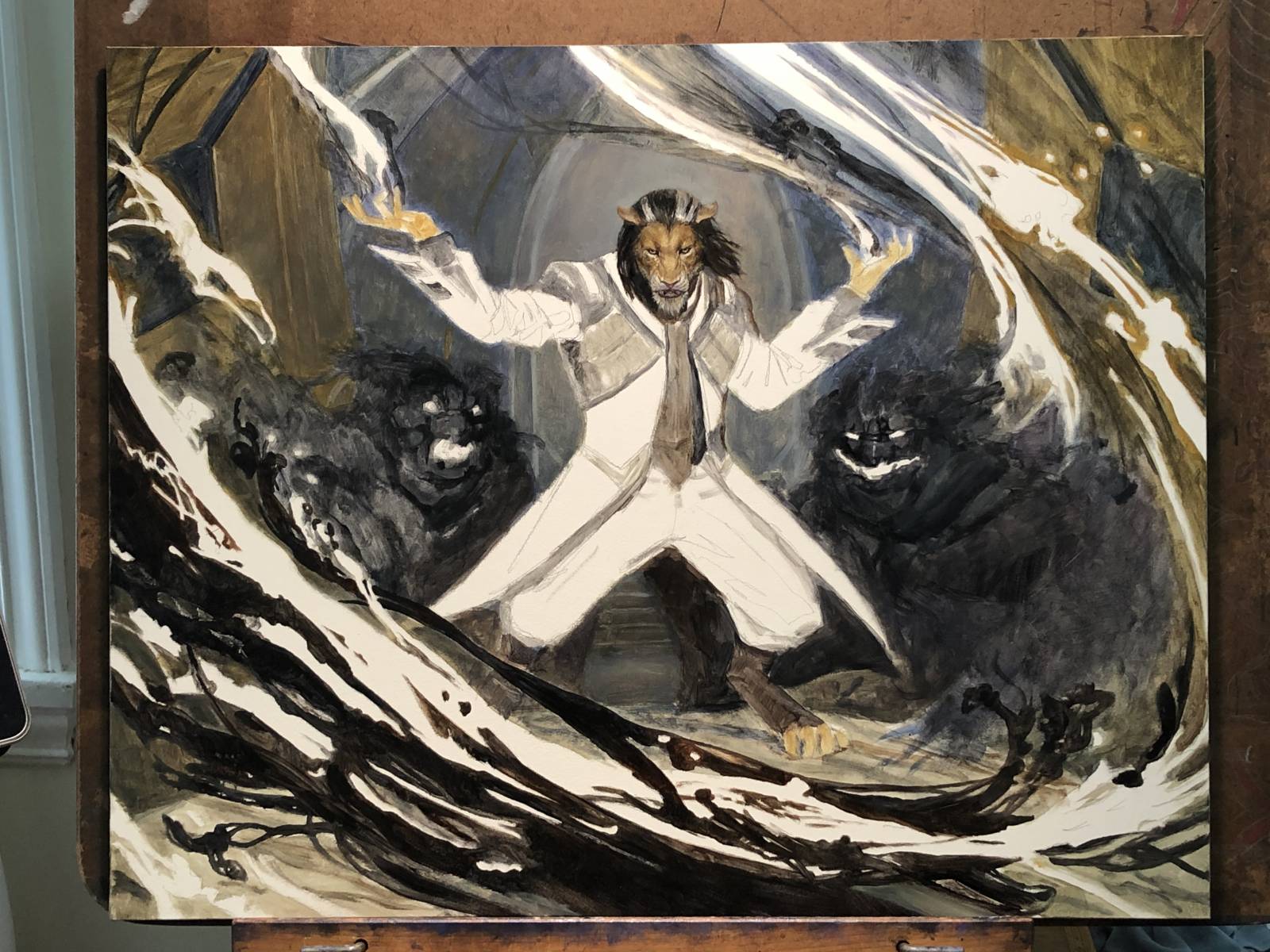 This was my first quick pass. I started by painting the heck out of the leonin’s face and then sort of blocked in everything else around it. My plan was to keep the whites and light grays thin—basically glazing them back at first. This is primarily for practical reasons as white paint tends to dry very slowly and if I kept it thin, I’d have a fighting chance of not constantly dragging my hand through wet paint as I worked. So, I left those areas bare initially and just painted around them.
The leonin’s head aside, I took a bit of extra time to flesh out the inklings and the the inky magic shapes as I didn’t lose them as the painting developed. I generally don’t develop so many details so early on, but I felt pretty confident about those things. They felt like anchors I could use to solidify the piece with and then develop everything else around them…if that makes any sense.
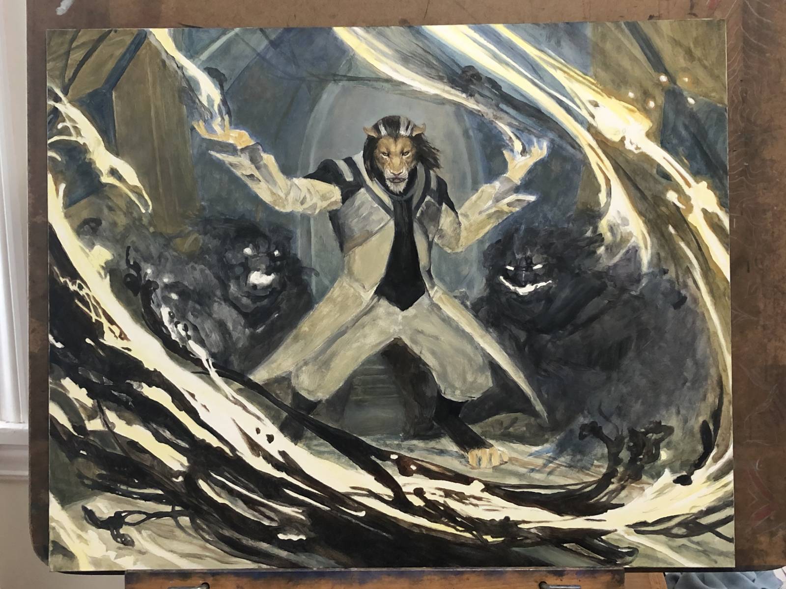 Here’s a bit into my second pass. As you can see, I knocked back the leonin’s uniform and began to inject a bit of color into the glowy, white magic. My palette at this point was extremely limited and I began to feel self-conscious about how muddy and monochrome it was beginning to feel. Rather than muck about with paint in a vain hope to stumble into a solution, I decided to take the above shot, import it into Photoshop and do some terrible paint-overs to see if I could make any of it work.
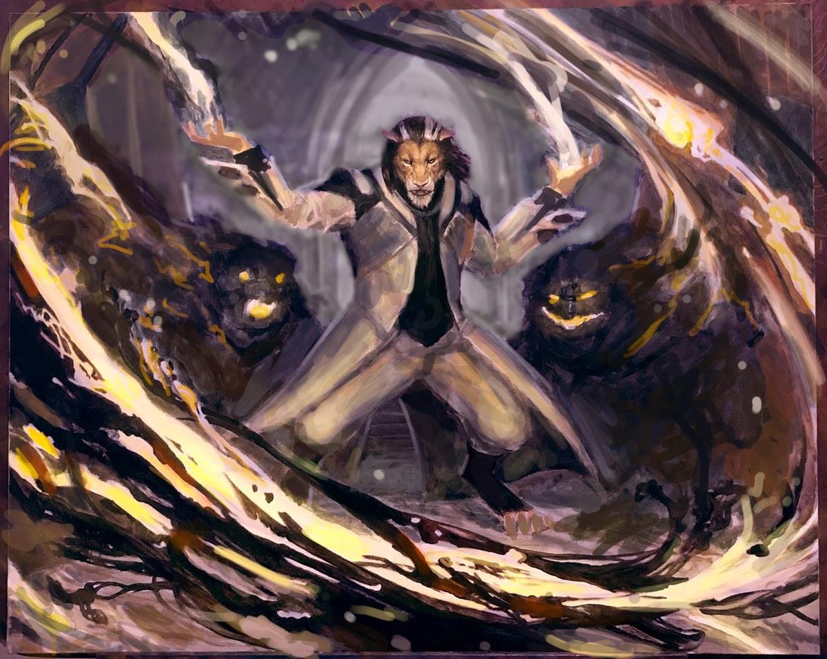 What I landed on was the above image….which is not good. But it was an important step in figuring out what next steps I might take. This digital paint-over did not solve all the problems, nor does it accurately portray where I landed, but it’s also not that far off. What it did do, was give me enough of an idea of where to take the piece that I could more confidently move forward.
Having that extra bit of confidence meant that I was about to pick up serious steam.
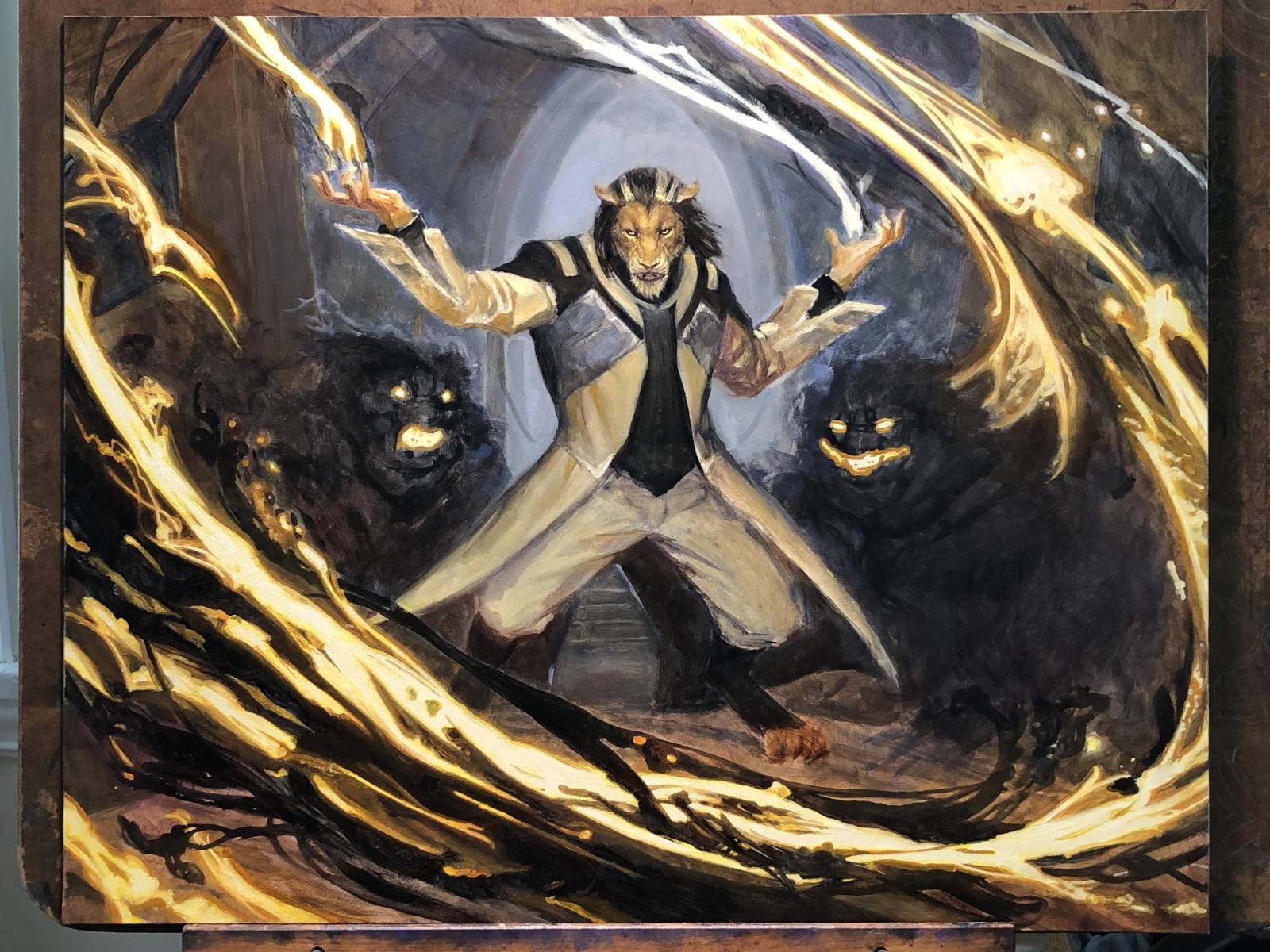 This next shot makes it feel like I missed some process shots. But I didn’t. This really does represent the leap the piece took after that digital paint-over. Colors started to get worked in throughout and the whole piece started to come together a bit better.
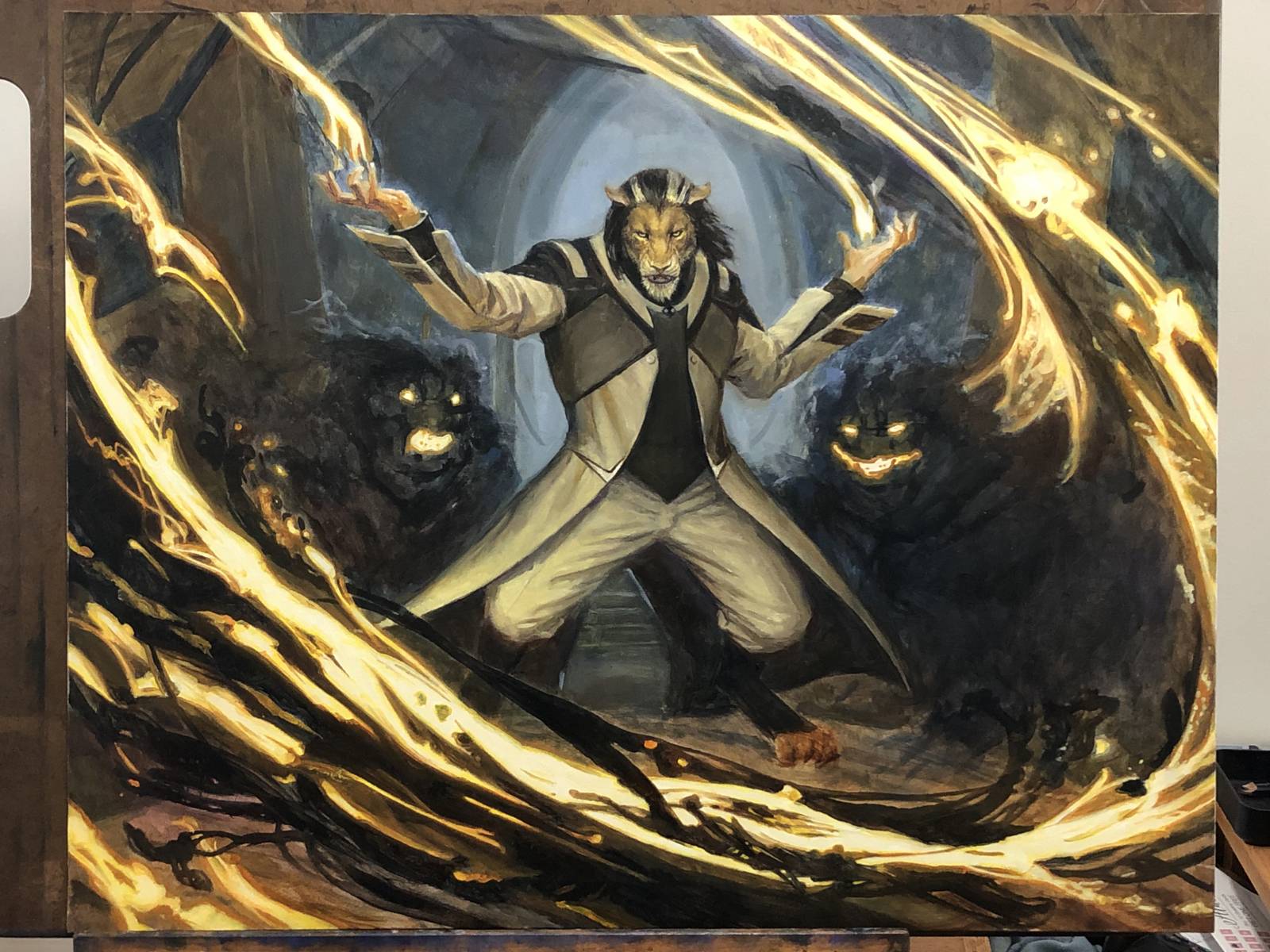 At this point in the piece, all the big stuff is all locked in and it’s really just about refining and finishing, pushing and pulling. There’s basically nothing left to invent, and no real mysteries remaining. Sure, I might realize that this thing is a bit wonky or that thing is getting lost, but we’re past the point of major changes…at least on this piece. I’ve had pieces that I’ve drastically altered in the closing day or two of the process But this wasn’t one of them.
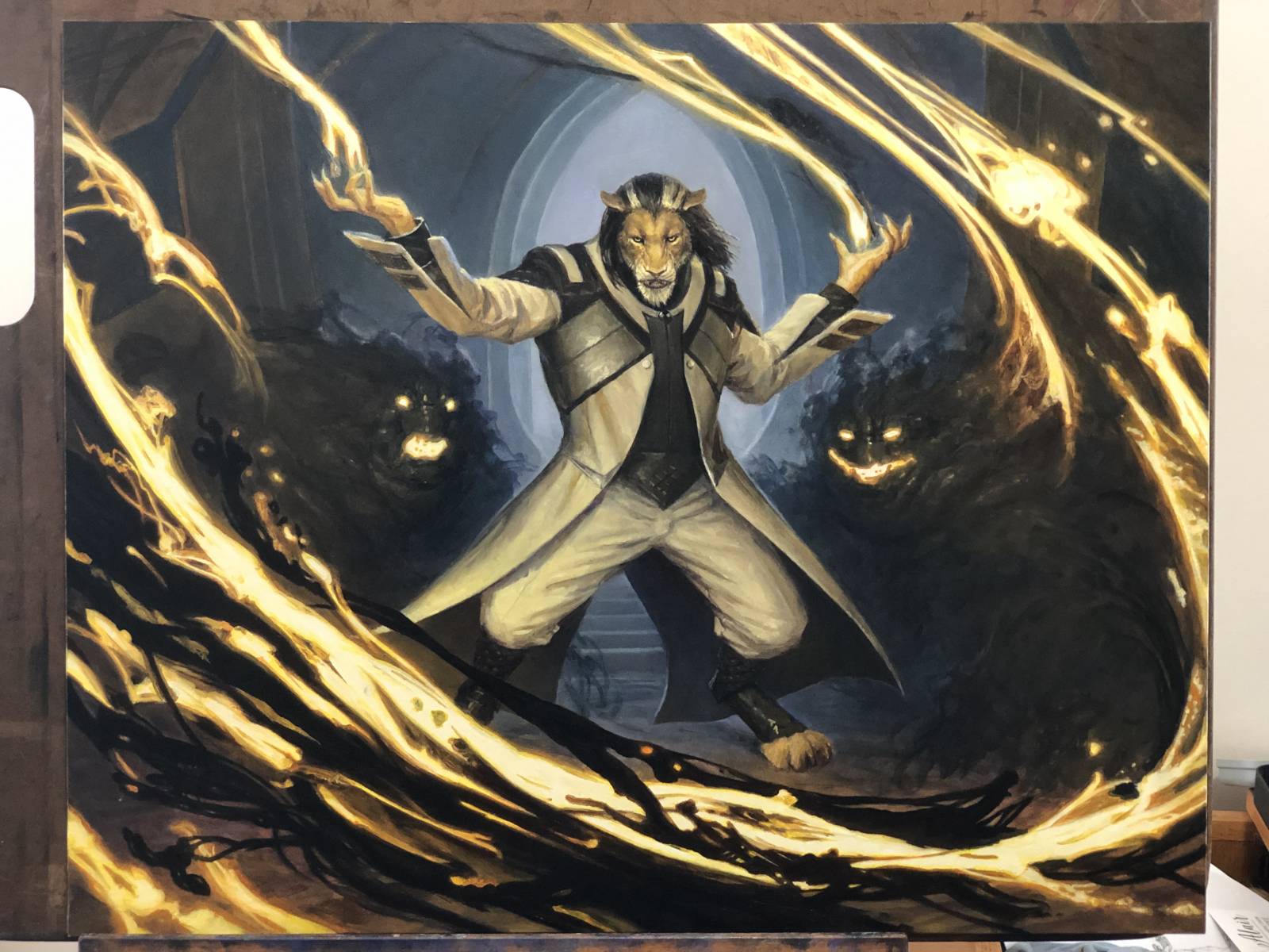 Pretty close to done at this point. In fact, it’s not a far cry from where it landed:
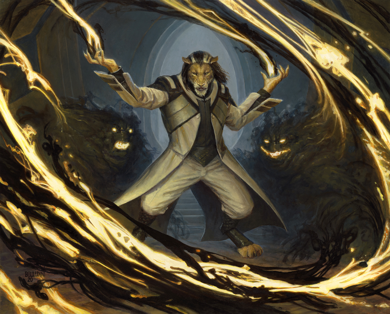 The finished piece measures twenty inches wide by sixteen inches tall and is oil on gessoed hardboard. It was art directed by Taylor Ingvarsson.
A couple of notes about this piece:
First off, the vibrant yellows in the glowy, white magic were a tough call. Most of that type of magic in the styleguide was a purer white. I took a gamble in going the more colorful route purely with the intention of keeping the piece from getting to drab. But I knew that it would be an easy task to desaturate the whites digitally later on, so it made sense to just go after a level of vibrance that made me happy. Since no one ever complained, I guess the fine folks at Wizard were happy with it too.
Second, value control in the blacks was a big challenge here. I don’t often use black paint, but I did in this case (Ivory Black) as it allowed me a bit broader a value range. The darkest blacks are in the swirls of the magic sweeping across the foreground. Everything behind it never gets darker than “blacks” that Paynes Gray can provide (which value-wise feels around 85-90%). But in all reality, many of those other blacks are mixed from browns or blues (or both), and I was always careful to keep them from getting too deep.
Also, with the darkest blacks and brightest whites practically next to one another in the foreground, I knew I ran the risk of distracting from the central figure. An argument could be made that I should have saved the darkest blacks for the figure, and reduced the contrast of the foreground magic to combat any distraction, but I’d counter that then one runs the risk of flattening out the space as a result. Regardless, while I don’t think I ever completely overcame the distraction of that foreground contrast, I do feel that the composition manages to keep the focus mostly in check and brings the eye to where it needs to go.
Your mileage may vary on this, of course, but I’m pretty content with how it landed.

Damn! I can feel the struggle in my bones while reading this. I love how your process always ends with amazing pieces after struggling, even such an accomplishes illustrator like you.
Loving that final piece, respect, such a challenge value wise, can’t imagine tackling that.
On reflection I don’t think the bright magic is a negative. Rather, it frames the figure and forces me to actually *pay attention* in order to see the figure more clearly. Because of this I actually focus more on the leonine than I otherwise would.