The last few articles I have been sharing some tips on world building. These tips are in reference to building a project from the ground up, your own project, or a collaborative that has no initial point of reference to work from other than your own imagination and anything you call inspiration to help get you started.
If I haven’t already mentioned it, I am sharing with you shards of the current project I am working on which is a grand scale world building event in itself, and requires a lot of work on my part to populate it with believable, and likeable content. There is enough within this project that requires plenty of preproduction design that I can use as noteworthy examples for MC articles for years to come, a relief since finding subject matter to write about can sometimes feel like brain surgery underwater in the dark with no lights on.
World building, even on a small scale requires referencing and research, brainstorming, and more brainstorming until the right elements fall into place. I have to admit, I have been working on this world for quite some time, so there is not as much internal freaking out when trying to make it feel “alive” or believable. If starting with a blank slate and no initial background to help you develop your world, it can feel extremely intimidating and, “where the Fuches” do I start?
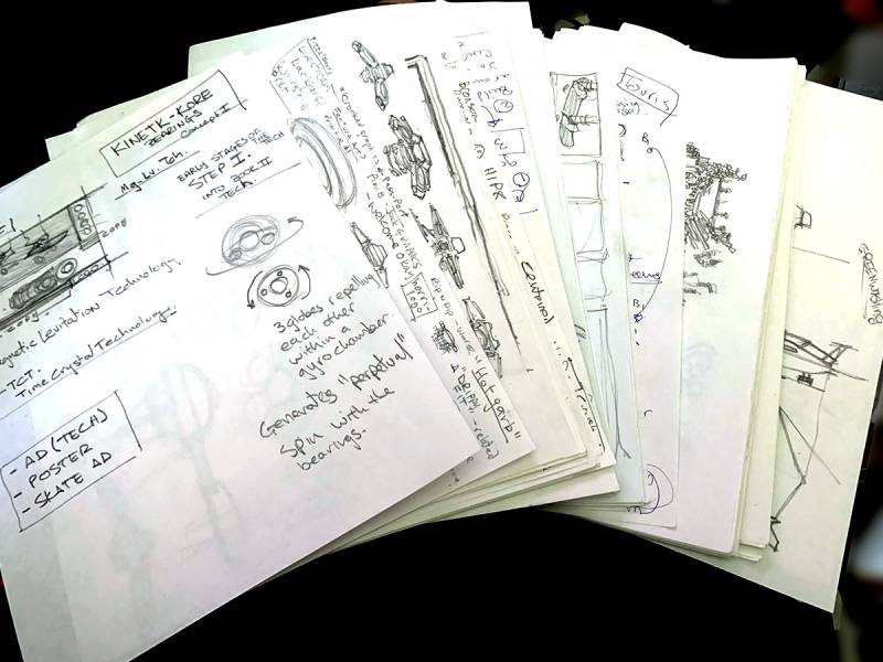
 Where do I start? I start with brainstorming for several days at a time, generating enough ideas to parse through before focusing too much on one particular thing. Doing this often will help you learn to “think creatively” more frequently. This is an exercise I cannot recommend enough. Not only does it help you get over the fear of the blank page, but it also helps you learn to tie esoteric concepts together through some common thread they might happen to share that you will see at that moment.
I am building a Sci-Fi story arc that begins rooted in what feels like contemporary now, so I am in luck in that I have the here and now to help me with the first book and its initial aesthetics. However, as the story progresses into the future I will have nothing to work from other than blind luck, or a strong base that I build from this first book in the project, a comprehensive, rooted base that can be later expanded upon. This is known as “sequential/generational design”, a timeline of how you and your writer(s) perceive the evolution of a design to advance through its lifespan.
I am injecting a lot of DIY and new world technology to an already existing marketplace within this world I am bringing to life. In the skateboarding community, many of these technological leaps end up clowned upon, harmful(painful) to the rider, or just stupid from a lack of understanding of the core industry and those involved in the skate culture. I know the ramifications of designing something “gimmicky” which is keeping me “in the lane” while I am designing, helping me decide out of the many ideas generated, which is worth evolving.
 Ideation, iterations, creation, generation of these ideas takes a lot of motivation and energy. I recommend doing your creative search in the morning when the day is fresh and all the usual fugglies of life have not entered into your short term memory space. We all have a different time in the day that we are creative, figure out what part of the day that is for you and capitalize on it. Do not look back, just scribble those ideas until you have exhausted everything you have in you.
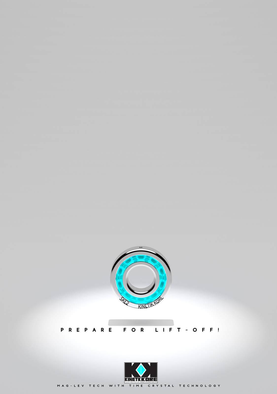
For this article, I am sharing a company that I have designed that has designed a new type ball bearing type for skateboarding. In designing them, I have generated a company name, logo, corporate logo, advert, iMac like poster advertisement for stores, a few skate mag ads, and a shop talk ad which is used as the examples for this article.
Why go to such lengths when this stuff will be seen, maybe 1/30th of the story? I am looking for enough to keep the reader immersed in this universe for as long as I can. It might be a “comic” at the end of the day, but I don’t see it that way. I believe in it enough that I want you to get lost in it, this world of potential ideas, anecdotes and solutions of sorts. I am using the skills I have been given and trying not to fall short of cheapening the experience I would like you to have in this imagined joyride.
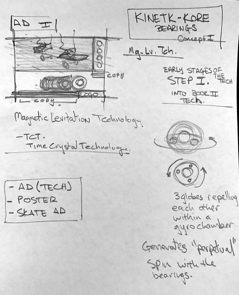
The example I am using is a ball bearing company, inventing a magnetic technology that can keep a bearing spinning for what seems like “forever”, a perpetual spin. This is the first step into what will eventually be fully developed mag-lev designs for my sequels that are further out into the future of this story. This is the rough process I went through to design the final images.
FIRST: BRAINSTORM!
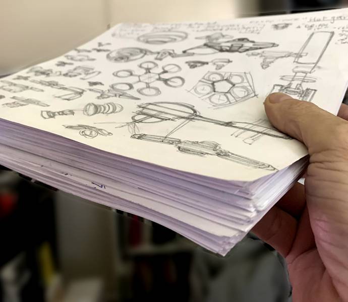
I generate a series of these 1 page concepts. I put as much information on the page regarding that one product until I can’t think of anything else to ad. As I do more of these designs in the same format, I will generally think of additional ideas that I can ad into what I have already done.
SECOND: Design the Corporate Identity
I went online and looked up many tech companies that do high tech machinery, getting familiar with a certain “corporate look and feel” that will help me get into the design when I brainstorm the ideas.
Once the is solidified, I use Illustrator to design the logos. I want these to be Vector art so I can scale them to whatever I need them for in the future. I will have them as posters, ads, stickers slapped on all sorts of surfaces, t shirts, etc. in this fictitious world.
THIRD: Design A Product Name and the Physical Design

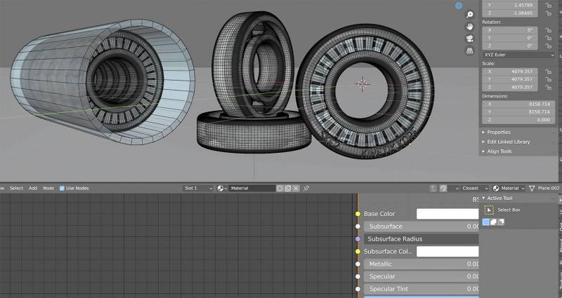
 Here are a couple wire frames of the 3D models I built and staged. These can be used for a base layer for a painting, reference for your image, or the image itself. I have chosen to use 3D in addition to the art I am making, combining them in the way that Japanese animation uses bits of realism in their backgrounds with their stylized hand drawn characters. I am intrigued with this technical juxtaposition in the art.
Having been in the sport since I was a kid, I have plenty of experience with bearings, new, broken, smashed, over oiled, broken from sand and dirt, and everything else in between. This gave me a bit of an advantage when designing the basic components. I do not envision the design being any bigger than they already are, so there is very little I need to do to reinvent the casing, the spacers, or any of the other components.
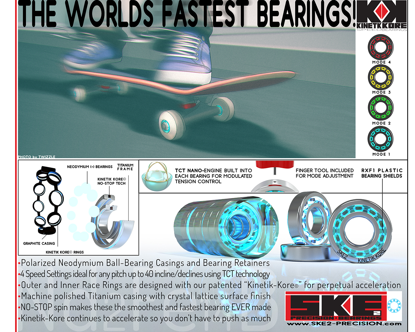
The biggest design aesthetic is the lit bearings. The rest is really too small to see which is why the corporate ad is needed for this project. The corporate ad does a fantastic job of explaining the product, where otherwise I would be using forced dialog to share the insights, backstory, or whatever is part of the story line, something I would rather not do at all.
Names are another story. I have to be in the right frame of mind to do well with generating names worth using. I will prime my head with a list of already existing companies so I can get an idea of the naming structure, when they use monograms, the iconography or glyph design, retro, modern, etc. I give myself at least several hours before I begin to sketch. If I start too soon I will be influenced by the immediate reference, an amateur mistake we can all make working too quickly from our real world studies. We have to let the mind wander, lose track of the path we just took, allow the experience to melt into the rest of our experiences before we will make “oops decisions”, or good ideas that we would not have previously thought of in our own creative discovery.
FOURTH: Design the Advertisement Layout(s)
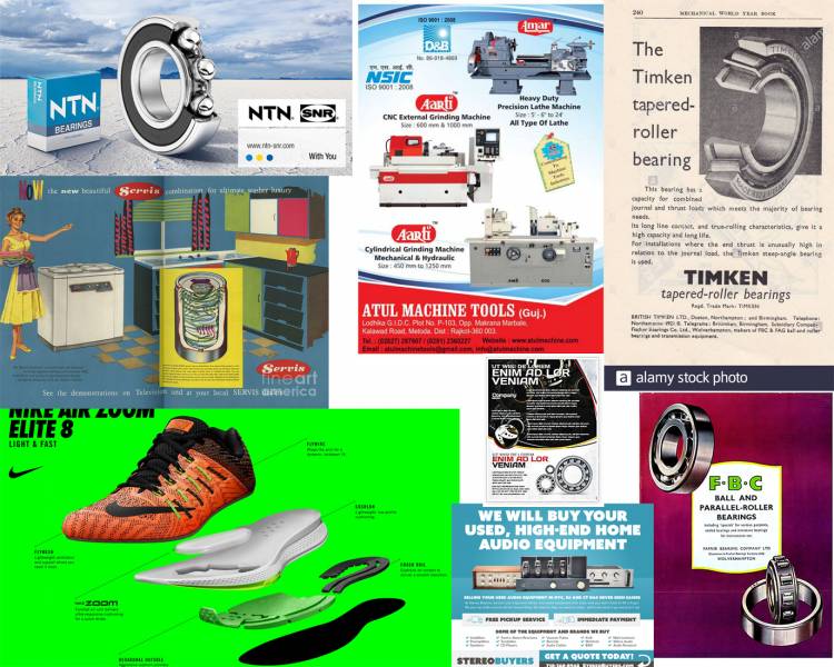
I saved a lot of contemporary corporate manufacturing ads, and was attracted to the more Euro design aesthetics. I also like exploded drawings as they spell everything out in detail, again without forcing it elsewhere in the storyline.
 The end result is a combination of a line drawing inked, Photoshop painting, 3D, and Illustrator files combined together to make this corporate advertisement as well as the POP poster art below. This is part of a fictitious sports magazine I am creating, the adverts are a part of the storyline.
FIFTH: Review and Move forward
When reviewing the design work you are going to include in your project, compare to the real world stuff you are mimicking. Does it feel correct next to the other designs of the same industry? What do you feel is missing, or what do you feel needs to be removed to help to make it feel more appropriate?
REMEMBER: AS MUCH AS YOU ILLUSTATE, YOU DESIGN. JUST BECAUSE YOU DON’T CONCIOUSLY FOCUS ON THE DESIGN DOES NOT MEAN YOU ARE NOT USING IT. ALL THE ACCESSORIES TO YOUR PAINTINGS MIGHT NOT FEEL GOOD TO YOU SINCE PAINTING IS THE THING YOU FOCUS ON, ETC. BUT YOU CAN DO IT. WE ALL CAN. WE JUST DON’T GO THERE ENOUGH TO FEEL LIKE WE CAN. YOU CAN.



That looks like an intense amount of detail Ron… Thanks for sharing how you design in believability into your world building.