Through the ages many artists have created their own 3D reference. Here are a few examples that I’ve found.
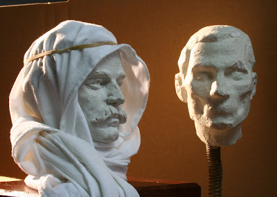
This first one is from a turn of the 20th century artist named Max Pietschmann. It is an extreme case of 3D reference but he used this sculpture to create an accurate and beautiful painting.
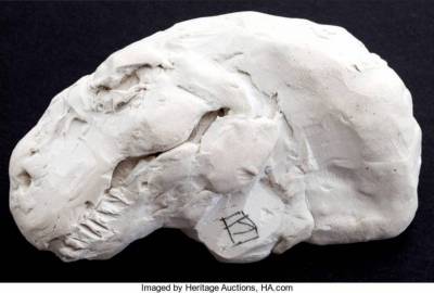
This next one is a little T-Rex sculpture done by Jeffrey Catherine Jones. I’m pretty sure I’ve seen this sculpture used in a few pieces.
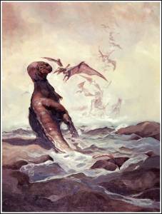
James Gurney has always been very gracious about sharing his sculptural process from his Dinotopia illustrations.
Two of my favorite reasons for using 3D or sculpture are a need for accurate lighting or a need for continuity over many illustrations that might include different angles and unique lighting situations. For example Disney has maquettes made of many of the characters so the animators always stay on model when drawing the different angles of a character.
For those of us who work fairly realistically there is one other reason I’ll mention. Are you ever working on a piece where you have everything popping? It’s all working? Except one little annoying area? You’ve repainted it 5 times now but it’s still annoying you? For whatever reason the drawing isn’t clicking and you could use another angle of attack. You’ve got great reference for your figures, drapery, props, and maybe even your architectural details. It’s that pesky monster, creature or robot that’s not quite right. You might have luck using 3D reference in situations like this.
Any 3D medium can work but I’ll focus on digital 3D because I use it so often in my current film work.
First of all there are plenty of free pieces of good software out there that are there to help. Zbrush core. ZBrushCoreMini :: 3D For All ZBrushCoreMini :: Free Your Creativity
And of course Blender. blender.org – Home of the Blender project – Free and Open 3D Creation Software
Both are very popular and have many tutorials on YouTube from which you can learn the ins and outs.
Here’s a rough sample of how I might use it for reference in an illustration.
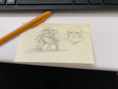
First I need a rough design of what the creature is. I have boxes full of post-it drawings from over the years. They’re mostly really hasty little drawings that just tell me what I need to know to get to the next step.
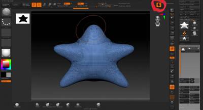
In ZBrush I almost always start with a plain sphere. I like the simplicity of this round lump because there’s nothing there to pin me down.
I hit the Sculptris button which adds topology wherever you work. In other words wherever you sculpt, pull or push on the model it adds more density to the digital clay. Here I pulled arms and legs out of the sphere. Right now I also have symmetry on, so whatever I do on one side shows up on the other.
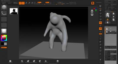
Since this design isn’t symmetrical I just sculpted it sort of freehand, if you will, with symmetry off.
This is what the topology currently looks like.
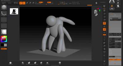
If you want to build it symmetrically here is a different way to do it. I’m calling this the Kenner method, after the action figures. Basically every limb gets its own sphere/object. So you’ll have a head, torso, two legs, two arms etc. and each is separate. This means you can pose them much easier just by rotating them…like an action figure. Here he is as a symmetrical figure which I can of course alter at anytime to make it asymmetrical.
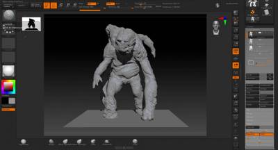
Here is the “finished” rock creature sculpt in ZBrush.
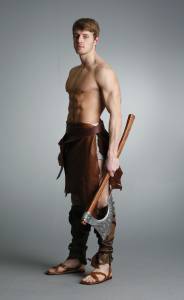
This is exhibit B, the reference photo for the figure. Photo credit Marcus Ranum, DeviantArt.
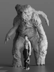
I’m now lighting my sculpt to match the figure reference. Best way to do this is to match the light and shadow on a head so I dropped in a standard digital human, which usually comes with most software packages. I move the light around until the light and shadow pattern matches. An even more accurate way to match lighting is by using the highlight position in the eyes, which because of their mirror like quality they’ll show you exactly where the lights in the reference are. (I didn’t bother to do that here.)
Rocky Creature Render with the cg figure.
Rocky Creature Render with the figure reference comped in photoshop.
Maybe for your illustration you’ll only need the head or the head and hands but either way you now you have accurate reference. And of course since this is just reference you can use any medium you want for the final illustration.









Wow…great post Christian! Thanks for the tip about using the highlights in the eyes.
Cheers Jared!