Welcome back to my series on Why You Need A Website. Since our last installment there was a day when Instagram & Facebook were down for over 6 hours, and, no, I swear I am not so powerful a witch that I caused it to make a point, but it proved my point nonetheless: trusting to social media sites instead of having a portfolio website you control is risky. It is also unprofessional. But you can go back and read that article to read all my reasons. Here, we’re moving ahead.
There is a part of building a website that I always hear artists complain about, ignore, lowball, and generally squirm away from: The About Page. It’s definitely a combination of hating selling yourself, general eye-rolling over high and snooty clichéd artist statements from the gallery world, and the fact that words are generally not a visual artist’s medium. Though, to be fair, authors and musicians are generally more comfortable with words, and I hear them complain about these pages just as much.
The thing is, you’re thinking about the About page all wrong.
Instead of focusing on WHO YOU ARE you should be focusing on WHAT YOU WANT.
An About page is not for you. It’s for clients, art directors, and fans. And you should think about your whole website (but especially an About page) from that POV. It’s an exercise in empathy. (And I’ve written a whole post on how empathy is the secret ingredient to your career if you want to go more in depth about that.) In short it’s about pretending to not be yourself clicking through your website, you should imagine you are the kinds of people who you want most to use your website and then tailor it for their POV. Think about an Art Director trying to pitch you to her publisher and editors for a cover. What does an AD need from your site? (a general sense of professionalism, an email address to contact you, the ability to save images and use in meetings) What does a fan want? (easy to use store, newsletter signup, easy to find social links) And so on.
An About page is setting your intentions and putting them out there in the world.
How you write your About page signals your priorities to the person reading it. If your priority is to get commissions, then you should talk front and center about illustrations for clients, who some stars on your client list have been, etc. If you care more about fine art then it should be about gallery work and self-directed themes and long term projects (you should probably look up fine art world artist statements and mirror the language style to match the part of the gallery world you’re interested in). If your site is aimed mostly to fans then the business end won’t be as important, and your About page will be more about your personal story and will try to connect with your desired fanbase. If you want to do more work in a certain field, or want to be known for a certain identity, cultural background, ability, hobby, or expertise then put it in your about page! I hear many artists complain about more clients not hiring diverse artists…but then those artists say nothing about their background in their About page and leave it to a client or AD to feel weird and creepy and try to figure out from google or social media if you are happy to represent a certain population or identity. The final word is always someone’s About page. If the identity or background or specialty is not there, then I have to doubt whether that artist wants to be known for that identity, even if I can guess from photos or social media that they belong to that identity. We’ve all had it drilled into our heads to not assume someone’s identity from photos, so don’t expect ADs or clients or even fans to feel comfortable doing that.
Note that if you are not comfortable being public about a certain identity, background, or even hobby, then no pressure! Keep it off your about page. This is about sharing what YOU want to be known as and hired for.
Here’s a handy checklist of what you can put on your About page:
- Identity: place of origin, culture of origin, gender identity, sexual orientation (if these pertain to your work and you want to be known as that identity)
- Training: Education, Ateliers, Mentorships, etc.
- Specialties: What kind of subjects do you love to work on? (portraits, landscapes, creatures, clowns, horse, castles, abstraction) What industries do you have experience in (concept art, gaming, film, books, children’s, comics, etc) Where do you live now? Where have you lived? (what places you have first hand knowledge of) What languages do you speak? What are your hobbies and special interests? (sports, chess, unicorns, musical taste, cooking, knitting, etc) Are you a parent? Do you have pets?
- Mediums: Traditional? Digital? Mixed media? People love knowing about your process, and it’s helpful to potential clients too.
- Achievements: awards, past clients, things you’re proud of
- What you most love working on: (this can be extrapolated from Specialties but you can also be really explicit about it)
- Contact Info: which can be it’s own page but also can be combined with an About page. Email. Social media links. If you have a big fanbase you can use a contact form BUT DO NOT EXPECT ART DIRECTORS OR GALLERIES TO USE IT. Also have your email. You can say “professional inquiries only via email” and most folks will follow directions.
- FAQs: Answer the same questions over and over again? Wouldn’t it be easier to just write it all down in a place folks can find and/or you can point them to?
- Name pronunciation & pronouns
- Newsletter signup
- Studio Tour (photos or video)
- Press: Links to interviews, podcasts, etc.
Here’s some solid About pages to look at:
(more formal)
(more casual)
(short but effective)
And remember:
—An About page can be as formal or casual as YOU want it to be. A good About page comes off as professional even if it shows your personality and sense of humor, even more so if it conveys a lot of info about you then is also creative. Feel weird being too personal and writing in first person? Then don’t! Hate writing about yourself in the 3rd person? Then don’t do it!
—A good About page can be short & sweet or long & detailed (but if it’s long put the most important info up top).
—It doesn’t need to have a photo but it’s nice to have a decent headshot for press, panels, cons, etc. If you really abhor the idea of showing your face, put a self portrait in instead. Or commission an art friend to do an illustration of you.
—Have a few friends read it and give you feedback — I recommend this mostly because almost all of the About pages people ask me to read aren’t complimentary enough! If you have trouble touting your accomplishments, get your friends to help!


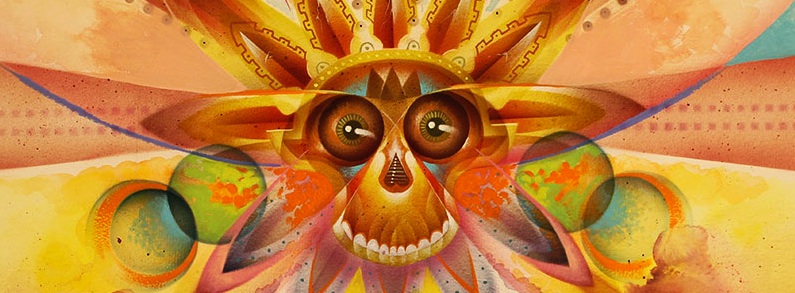

Victo Ngai: dry lists, at least customer list is impressive.
Winona Nelson: barely legible PINK picture as text.
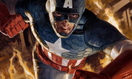
Manchess: much better.
Everyone has their taste, but this article is not about website design, it’s about different examples that get the job done for professional use. If you’d like to submit your About page, you can post it here.
I’m glad you mentioned the about page because if I could just give 1 piece of advice to all artists bios its this.
“Tell us where YOU want to be contacted.”
Example: “ To hire me contact me “here” and I am most active on “this site” if you want to say hi!”
I see all the time people put 5 different socials on their site but its not clear which one they’re active on. I hear some people have such backlogged emails that they never respond to any of them while some reply to all of them. Some ignore every comment they get on all their socials (to the point where I ask “why not disable comments?”) while some find them the most engaging. There’s some amazing artists I would love to contact but they have made it impossible that I’ve given up. I can’t tell if I’m just using a site they rarely use and haven’t seen my message or they’re just ignoring me and I don’t want to come off as a spammer. Make it as clear as possible on every site for your fans and clients on how to get of hold of you and you’ll both be happy and assume that any social is the first place they’ve heard of you.
Yes, contacting artists is a very real frustration for pro Art Directors. So many times an artist comes back to me 2 weeks after I have had to give the job to someone else.
Great and informative post as always. Thanks for being so generous with your knowledge.
My pleasure Willam, hope it helps!
the link to zelda devon’s about page is broken for me – it seems the url should end with about-copy