In Magic the Gathering there is a pile of cards that origin from the beginning of the game. Oldschool Cards are the cards printed between 1993-1994. One of those cards are Swords to Plowshares. The card removes a creature from the game, so to speak turning a creature from being dangerous to being not a threat anymore. Like smiths turning the swords into plows in peacetime. the old illustration on this card is so Iconic and burned into my mind that I had a hart time even imagining something else when I first got the assignment. But I started to form an image after the initial numbness of this responsibility. Andrew Vallas, my art art director was giving me an art description but also told me that he would love to see if I had different ideas, since he was very aware of how much I would love this card assignment.
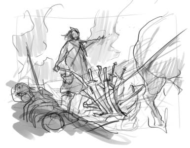
My first thought was to go very literal. I made sketch showing a farmer plowing the earth of a battle field. We see bones of dead soldiers and smoke and war on the one side of the plow and the other side is turning into peaceful farmland. The plow is made from bent and used swords. It wasn’t quite right, and perhaps too literal and not very epic or special.
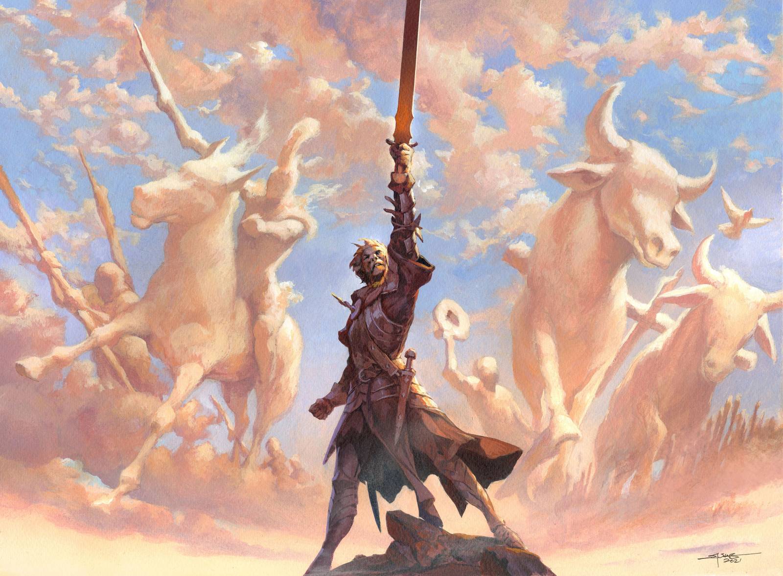
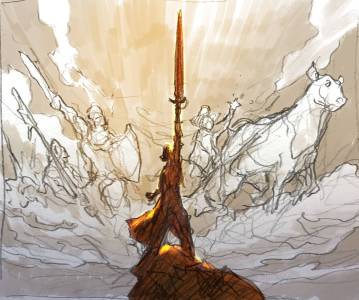
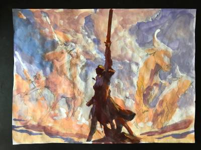
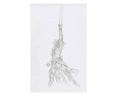
So I tried a more abstract idea. The original art description was asking for a sword slash splitting the image so that we have war on one side and peace on the other, but all my efforts at making it look right crashed. It just looked like a hand holding a sword and the focus was too much on the weapon. So my abstract idea was too zoom out and show an epic pose of a night holding the sword raised and thus creating a left side and a right side of the painting. I would then paint a super epic cloudscape with the clouds forming up soldiers and war on one side and a peaceful farmer sowing seeds on the other. I made a very very loose sketch and send it to Andrew to find out if he liked the idea? I was aware that this was something completely different than the original art description, but I thought it fit the card mechanic very well and luckily for me, he did too.
The difficult task was to avoid having the night become the central focus or the main figure. This was to be an abstract scene rather than a figure portrait. And the only way I could make sure if it was to make his features almost impossible too see and paint him in dark silhouette against a light background. No dabbled light or anything to show his expression or peak interest. So I focus in on an epic pose that would read clear in silhouette.
Next up was trying to make clouds that looked like figures but without too many details. And none of it could be really planed too carefully but would have to happen on the board while painting the layers. every time I did something too specific like holes for eyes or fingers or such I ended up painting them over. They looked like clay figures if they had too much details and lost the fluffiness.
What I think works best in this painting in the end is the clarity and how easy it is to read, mostly because of the value difference and the temperature difference of the sky color and the cloud color.




This article would be improved by including an image of the original Sword into Plowshares card.
I was not sure about the copyrights to do that. sorry
Certainly ok by me, should you want to add it. 😉
Articles use it in print all of the time.
The nod to the design of the original figure certainly made me smile.
JM
Great concept Jesper!