One of my latest assignments was from a trusted client of many, many years. I’ve worked with Random House over two decades creating paintings for the Louis L’Amour series of western novels. During that time I’ve met over sixty plus deadlines for the series.
But when the art director, Scott Biel, got the project to design the cover for a novel entitled, Kenobi, for the Essential Legends Collection, he thought of my work. Besides having shown I could handle multiple subjects, in varying landscapes, under different lighting conditions, I could also handle portraits. And tackle a deadline. In other words, Scott trusted me.
The book also has a bit of a rugged western setting, and since we’d just worked on a cover for a book in the Star Wars universe that got cancelled, he asked if I’d be interested.
I’ve been a fan of Star Wars since it first came out. It was a fresh angle on Flash Gordon for me, and I’d been a fan of that comic and tv show since I was a kid. I’ve since learned that George Lucas was also a fan and tried to get the rights to film his own version. When he found out that someone else had bought the rights, he moved on to his own idea of a space hero. Apparently, it worked out.
One of my favorite characters in Lucas’ franchise is Obi-Wan Kenobi, so when Scott asked if I’d be interested, it was a match. The book is Kenobi’s story, so Scott wanted a young Obi-Wan on the cover, as played by Ewan MacGregor.
Trust is earned, not given.
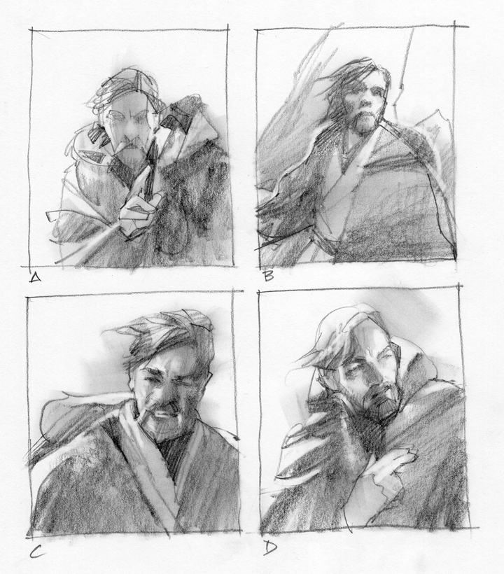
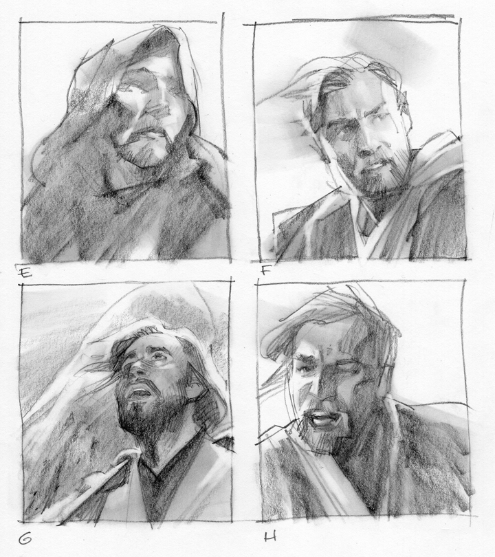
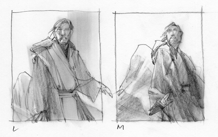
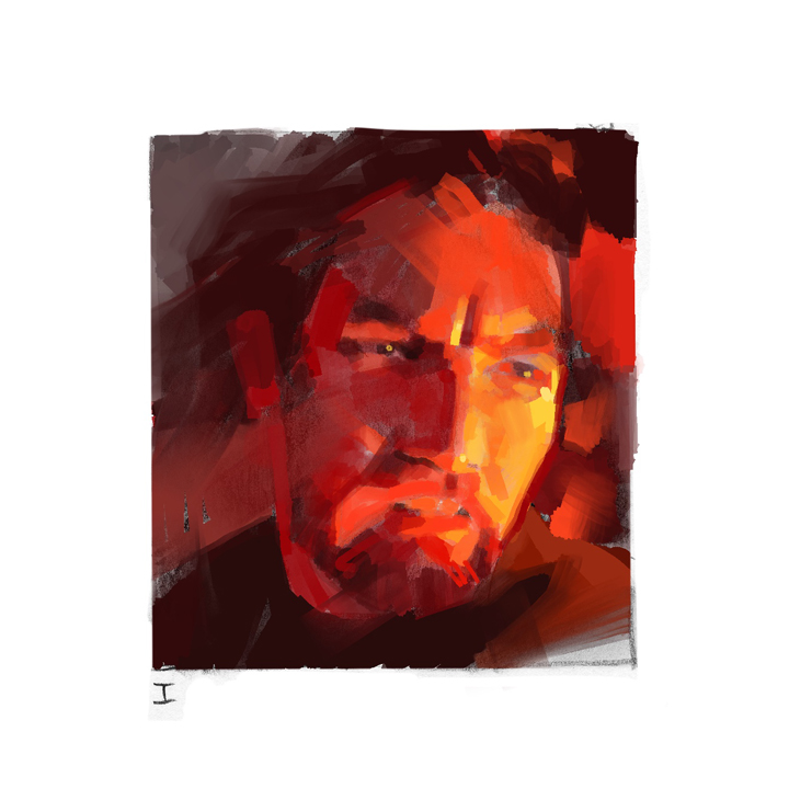
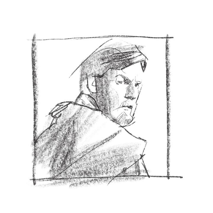
I started as always with very small thumbnail sketches. Then I moved to watching the movies and getting screen grabs. I always look for an angle and lighting conditions that will not only show a good likeness, but movement. A moment that projects the character and appears as if they are not posing.
There’s a subtle difference between a pose and a captured moment. A pose freezes a figure in place. A captured moment tends to project an action that just occurred or is about to occur. That creates curiosity that our brains love to study.
Looking through the fifty or so image captures, I made choices based on his likeness and motion, plus the lighting. I drew freely to design the cover thinking of the potential reader. What they might like to see.
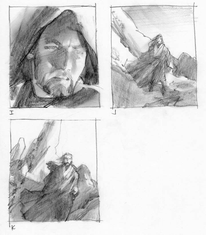
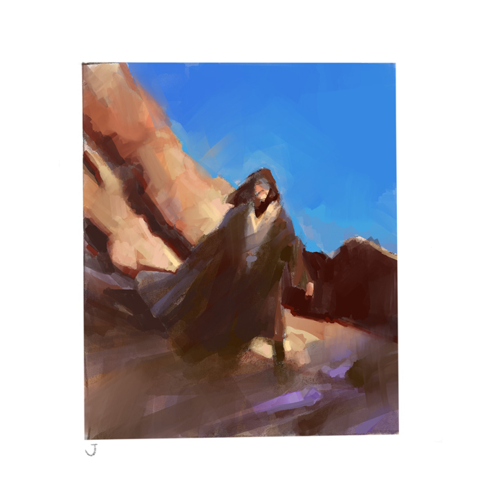
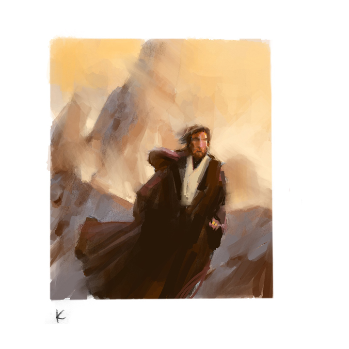
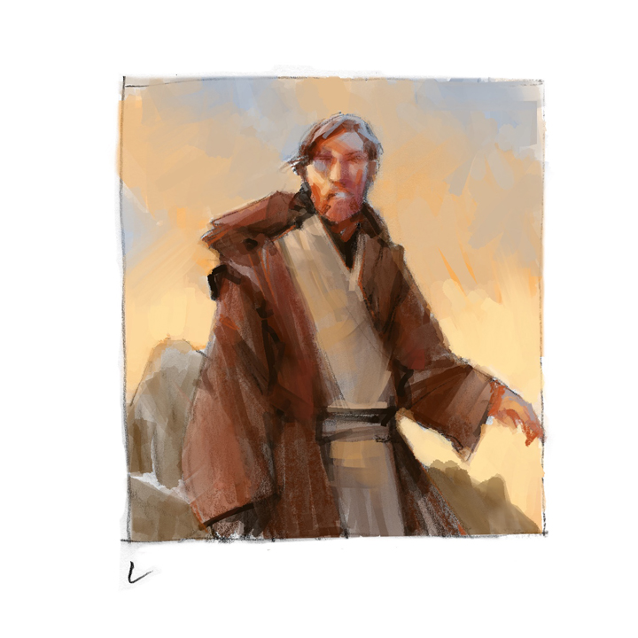
I sent Scott this set of thumbnails to show my thinking, which included a few full figure approaches in case he might be thinking in that direction. I can trust Scott to look over all the material and really study what he needs, balanced with the job requirements. My interests lie in working with an AD, not just for them. They have a job to do and I enjoy finding solutions together, as a team.
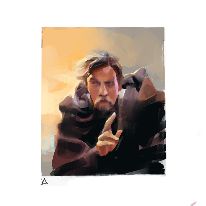
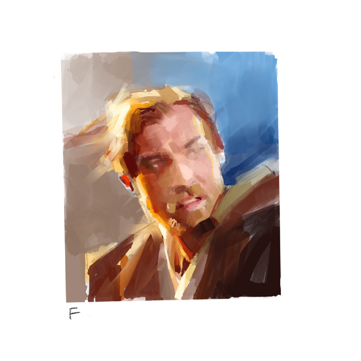
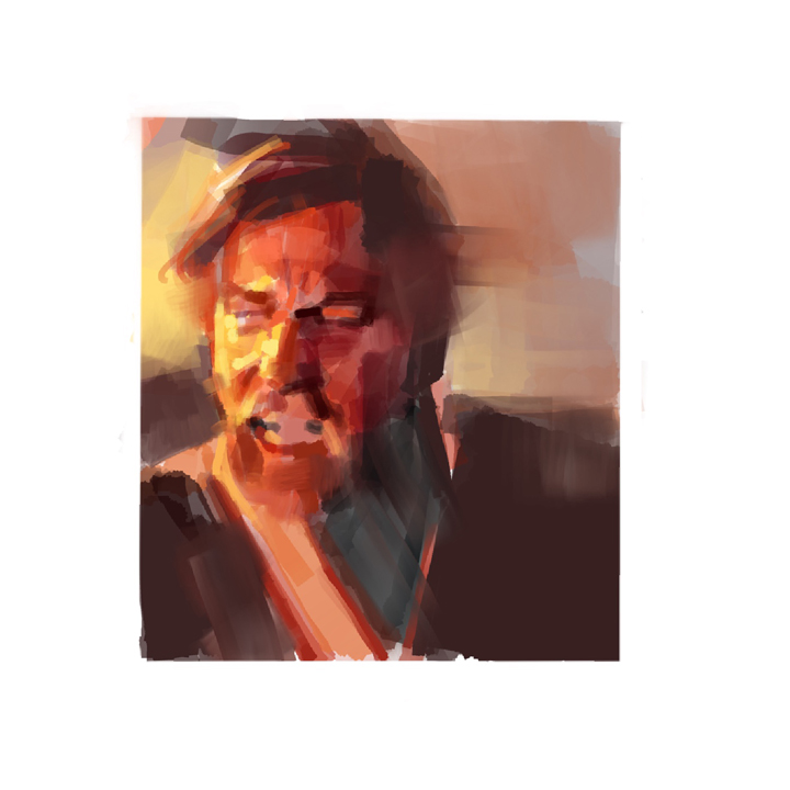
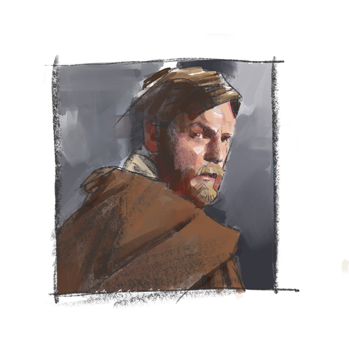
My next step was to put color into many of the sketches that I liked. I sent those along, too. We ruled out any sketches of the closeup shots with the hood because it reminded us more of Jesus than Kenobi.
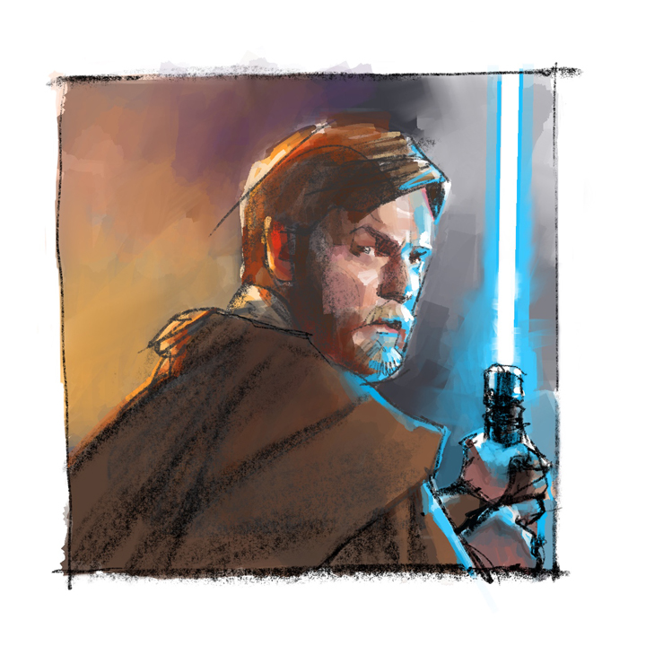
Just as I was about to send those off, I stumbled across a piece of reference of Ewan that struck me as a great moment for the character. I made a quick study in Procreate and sent it off to Scott. He liked it immediately so I included it with the other color studies.
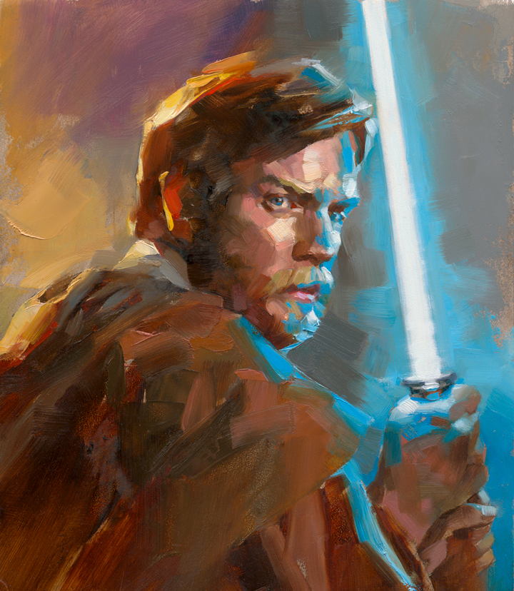
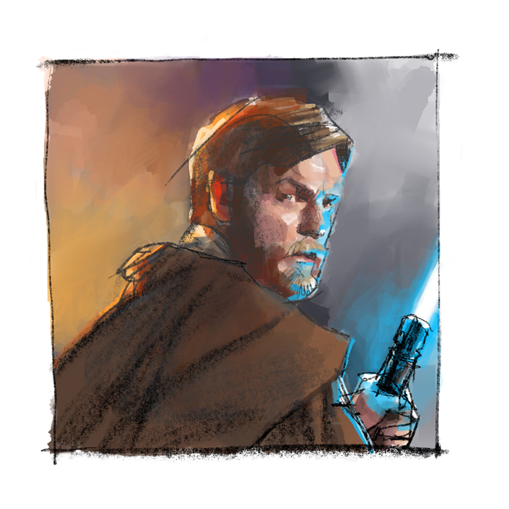
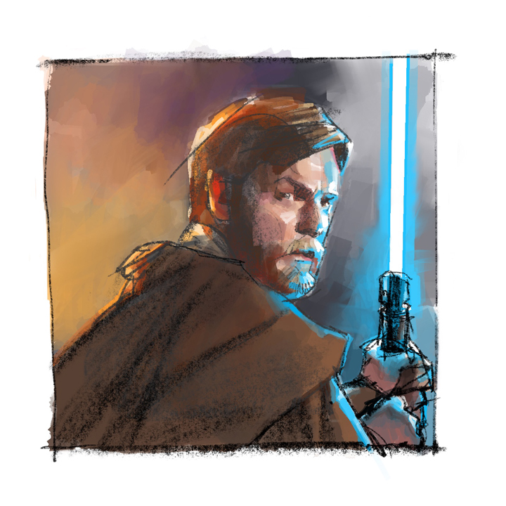
And that’s the one we went with. Scott wanted to give it a little extra, so we started working a lightsaber into the composition. You can see the variations here.
Once Scott approved the color and adjustments, (I had to choke up on the lightsaber a bit) I projected the color comp to an 8×10” Gessobord and lightly traced off a simple impression.
I worked in palette knife and brush to give the small painting a lot of texture and expression. I didn’t need to beat the idea of Kenobi over the head of the reader. They would know who it was and hopefully feel what I felt about the character.
Key impressions like that are what drives good work.
Trust is earned, not given. If you’re interested in doing portraits or doing book covers professionally, consider using your skills to work as a team with the AD. They remember the ones that are helpful and eager to solve problems. And they call back.
Kenobi, by John Jackson Miller, will be released in Spring of 2022.




Your Kenobi looks fantastic Greg, anyone of the thumbnails are cover worthy as well! 🙂
Thanks so much, Brian! I wanted to do about three or four of these potential designs. Heck, maybe I will! LOL! –G