On Muddy Colors we talk a lot about thumbnails (for example here and here and here) and we’re usually talking about “thumbnails” as a word for quick compositional sketches that artists use to plan out their artwork. It’s usually the first physical stage of a piece. That’s a critical stage – but it’s not the kind of thumbnail I’m talking about. I’m talking about a “thumbnail” that is a smaller representation of a larger thing, that you are enticed to look at more carefully. Now, that usage of thumbnail predates the digital age (think menus or tables of contents in magazines) but today thumbnails are almost always small digital versions of images that you need to click on to find out more about the thing it represents. It is how 99.9% of commerce through the internet happens.
(I kind of wish that word wasn’t interchangeable, but here we are.)
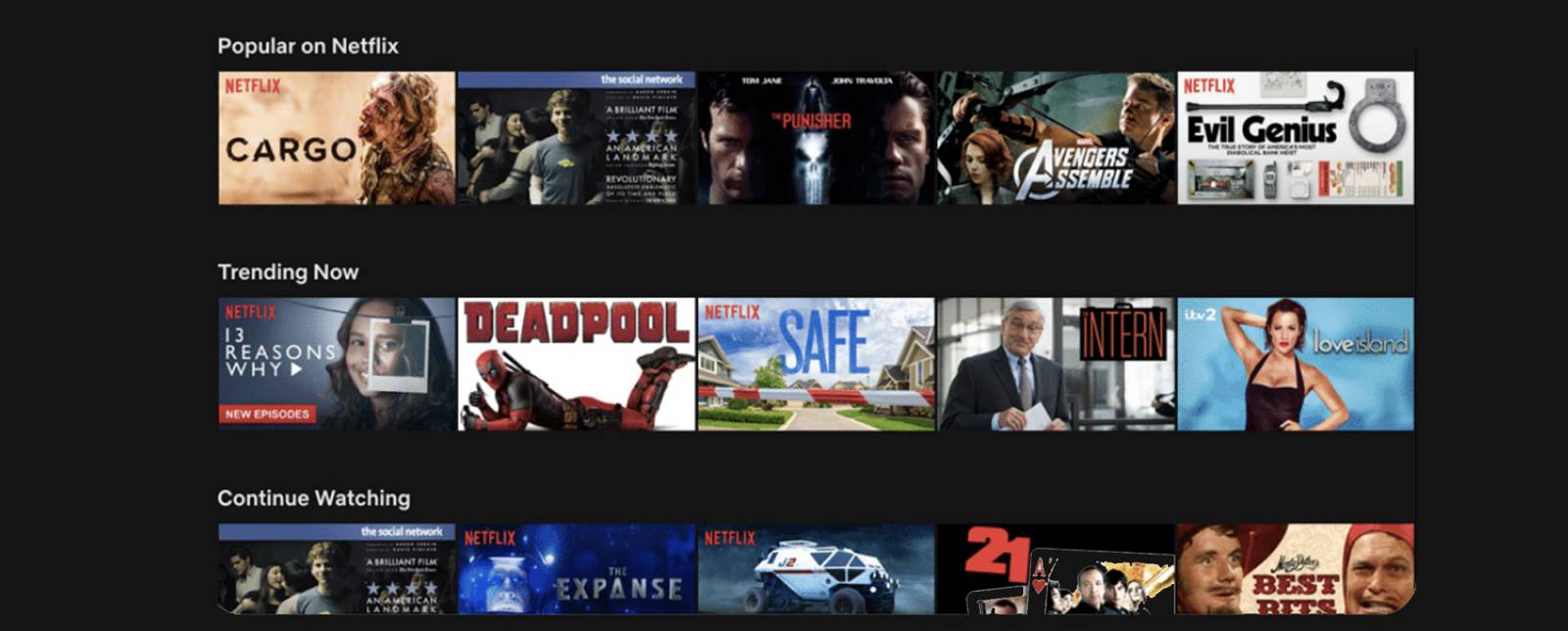
If you’re ever had a portfolio review with me, I probably either zoomed out on your piece (if you were showing me a website or work on a tablet or computer) or physically got further away from it or squinted at it. That’s me trying to judge it as a thumbnail-as-preview-image. Because people don’t stop and look at a thumbnail head on. They scan through a row of them, or a grid of them. In the pre-ecommerce days we used to judge book covers (and album covers and other packaging) for how well they’d catch a consumer’s eye as they’re scanning a shelf of life-size objects from a few feet away. Now we have to judge teeny tiny thumbnails on a screen that people are both scanning and scrolling past. Catching a viewer’s eye with a teeny image in a fraction of a second is a huge part of the book business now, and there’s a lot of data about how the human eye scans images to consider. Although focus groups and A/B testing is pretty rare in book publishing, we look to a few other industries who have spent a lot more money on this kind of research. Advertising agencies, historically, have done the most research & datelining on eye tracking and how the human eye reacts to certain colors, shapes, and effects, and there’s a lot of academic studies in psychology and neurology that study these topics as well. But I stumbled across a great thread about a new source of some pretty amazing thumbnail research: Netflix.
Before I go on to the data from Netflix, I want to point out why it’s important for artists to pay attention to this kind of thumbnail:
1 — If you’re going to work in book covers, know that your illustration has to be compelling in thumbnail size and know that we are going to be looking at it in all our meetings in all sizes.
2 – Although book covers are made (or broken) by their thumbnail, honestly most work you do is affected by how it thumbnails. Individual Magic: The Gathering cards are not sold by thumbnails – some cards are featured cards and they definitely have to catch someone’s eye in advertising – but most cards are only appreciated after the cards are bought, and you already have an interested audience. But Magic cards are actually thumbnails in their final print form – are they not meant to stand out on a table of many cards? And you might say fine art is not affected by how it thumbnails – or you could have made that case before the pandemic and for over a year most gallery work was sold online. Go download the Saatchi art app and see how based on thumbnails even the highest levels of the fine art world has become.
3 — Data about how a human eye processes images and what people are drawn to physiologically and demographically not only applies to books and albums and packaging, it also applies to people (Art Directors, fans) scrolling though images on social media, google searches, and on your portfolio site.
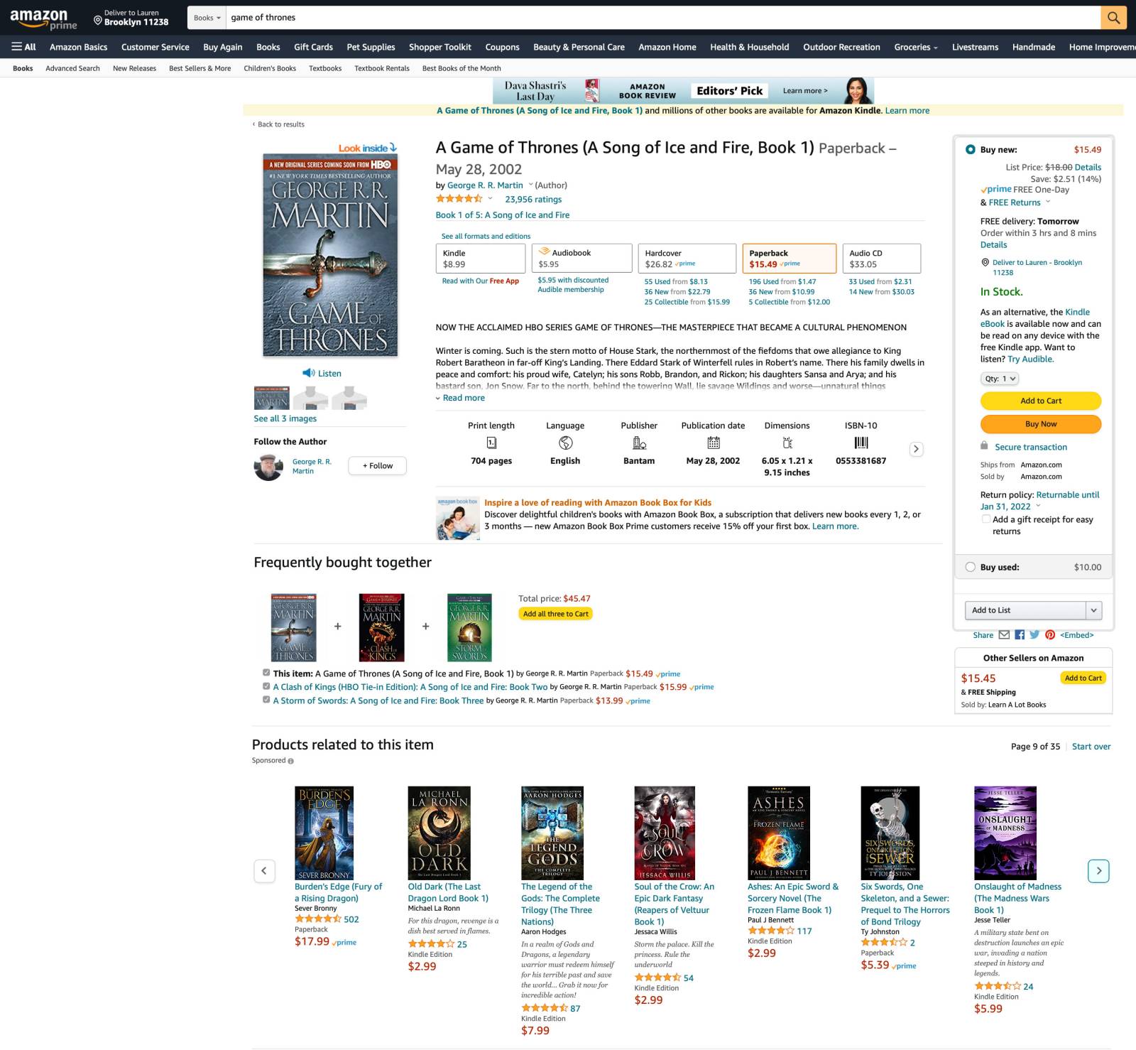
Here’s an example: Look at this screen shot of an amazon page:
Don’t bother looking at the main Game of Thrones thumbnail at the top – the battle has already been won by that thumbnail, you’re already looking for it. Look at the 3 George R. R. Martin thumbnails in “bought together” – which one jumps out at you more? Which one is (as we say in the biz) “stickier”? They’re so small that you can’t really see what’s going on and you can’t really read the type. Yet if you look quick, maybe squint a bit, you can see the silhouette of the sword in the first cover is most eye-catching. The strong interesting shape catches the eye. The next stickiest is the 3rd cover, due to the green and the shininess of the helmet, and the least sticky is the black one. The graphic just looks like a blob and the eye just skates past it.
Try again with the “Products related” row. Now don’t zoom in and don’t try too hard. Let your eyes unfocus a bit and scan through them as if you were casually browsing. Which stand out to you? Now there is science to this, but it’s also affected by personal preferences and abilities. If someone is colorblind, for example, colors won’t affect them the same. If you have a personal preference for certain items you can pick out unconsciously then those will stand out more to you than to other people. But in general I’d rate the 2nd cover as the most successful thumbnail here, with maybe the 4th and 5th as runner ups. The eye is drawn to the red, and the strong lighting behind the silhouette in the 4th cover, and the glowing color on the 5th works nicely. If you love purple your eye might be drawn to the last thumb, but the bottom is very muddy so your eye wants to skitter away from it. The least effective thumb is the 6th one – it really just dissolves to a blur of grays, none of which have interesting shapes. The first one would be a better thumb if the silhouette was lit more strongly and it had a little more color in it.
Each cover, and it’s thumbnail, are different and they’ll stand out for different reasons, but strong silhouettes, dramatic lighting, strong contrast, and bright color stand out in images. Big type helps as well. And if a cover is too complicated it all turns to mud at small sizes. Book cover design has been more affected by these thumbnail bars more than any other factor over the last 20 years. Covers have become simpler. Type has gotten bigger. Visual Hierarchy has always been critical to book covers, but now it makes or break a book and how it sells.
How do you apply this to your work? Look at as much of your work as possible in thumbs. If your website is set up that way, great. If you need to just drag all the images into a folder or image viewer and look at it in a grid, also fine. Now it’s hard to see your work with fresh eyes, but try. Get up and walk away from the screen as far as you can get and still get some visual information. Squint. Whatever you need to do. Then let your eyes relax and scan across the grid or rows. What catches your eye most? Where does your eye skitter over and not “stick” to anything? This is very important info you can take back to make the pieces better at any size. Again, the goal is not to be able to understand exactly what everything is in the piece, it’s a split-second test. Does your eye catch and want to look closer? Or does it scan past? What makes it catch? (Go back and read that Visual Hierarchy article.)
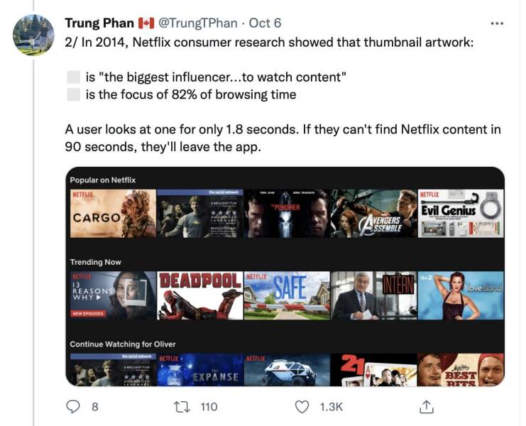
Ok, so on to the cool thread I found the other day, by Trung Phan, a tech journalist:
1/ Spoiler alert: humans are visual animals.
Our eyes move 3-4x per second to process information and we can analyze an image in as little as 13 milliseconds. pic.twitter.com/AAyc7PUPFa
— Trung Phan 🇨🇦 (@TrungTPhan) October 6, 2021
It’s nearly impossible to have multiple covers out at the same time for the same edition of the same book. It costs a lot more to print different covers on books and it’s impossible to have retailers show options of different covers and match the cover the buyer wants with the one shipping out of the warehouse. But with Netflix, they can have multiple thumbnails show to different demographics and regions and have them all point to the same video.
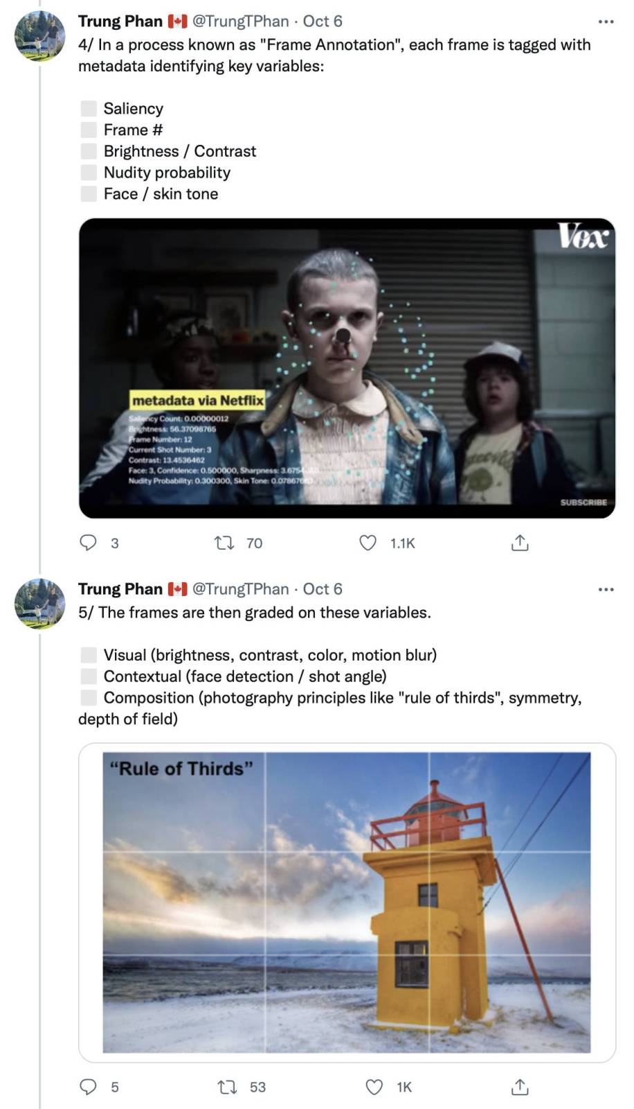
I’m going to skip around a bit, but definitely start at the top and read the whole thread it’s fascinating. Netflix has endless frames so it can use algorithms to pull out frames based on their composition, contrast, colors, etc. and make them into different thumbnails. We don’t have that much visual content in book covers, because we’re creating it all custom.
Yes they’re teaching algorithms the Rule of Thirds now and the Golden Ratio isn’t far behind. The robots are coming for us all.
Some findings are obvious and expected:
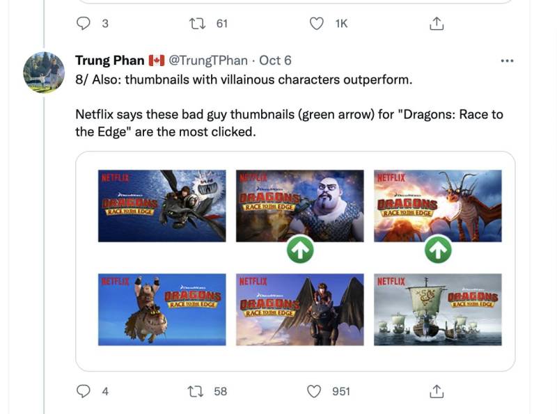
But some were surprising to me. I guess everyone loves a bad guy:
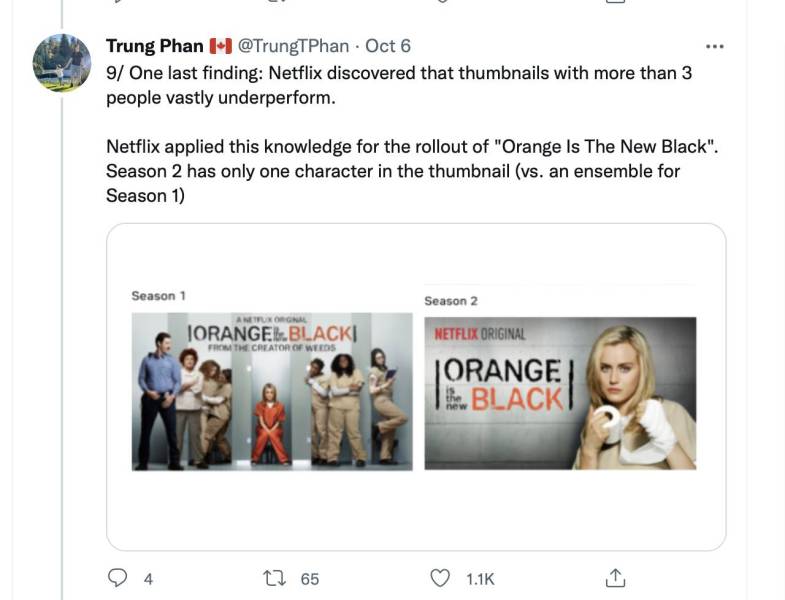
And some things back up what I’ve known about book covers for years:
It’s not that people don’t like multiple characters, it’s that it’s too much info for the brain to process at the speed your eye scans, and if too much info tries to stuff itself in then nothing gets in and your eye is already past it. Again, it’s all about controlling the Visual Hierarchy, and the more characters you have the harder that gets exponentially…which is why a master like Donato can get away with incredibly packed compositions and have it still feel ok, he’s a master at controlling the Visual Hierarchy, which dictates the viewer’s eye path.
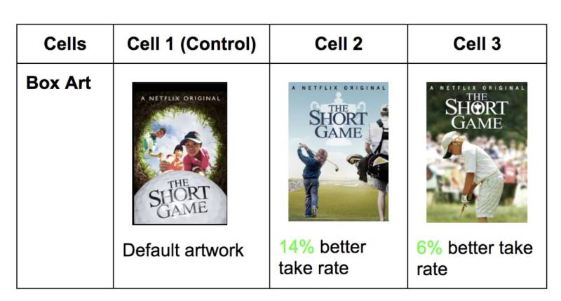
This stuff is worth it’s weight in gold to us designers, especially since we don’t get to do our own A/B testing that often:
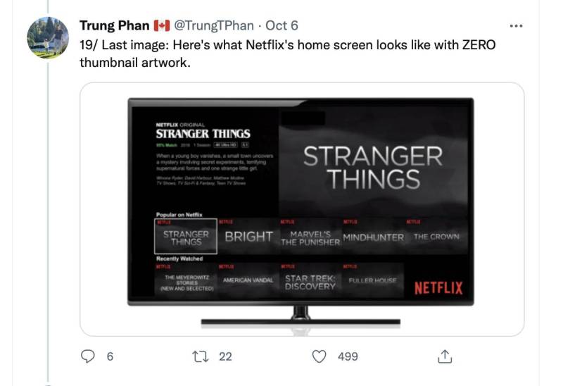
And remember, it’s not JUST about big type. If everything was big type no image then nothing would stand out. The art is key.
So remember, thumbnails are important at both ends of the process. And always remember to shrink your work down to thumbnail size and see how it reads to the eye before you call it finished.
Here’s some more info on this topic:
Vox: Why your Netflix Thumbnails Don’t Look Like Mine
Netflix: The Power of a Picture
Netflix: Selecting the Best Artwork Through A/B Testing
Now before we end, I know some folks are going to take this all from a negative POV and say altering your art to look good in a digital thumbnail is the same thing as trying to chase trends in art styles rather than finding your own voice. And I disagree. First of all, art is about communicating to other humans, and knowing more about what the human eye is drawn to is invaluable knowledge to have, no matter how you apply it. And second of all, it really just supports the same lessons about composition, color, contrast, lighting, etc. that every artist on here is also trying to pass on. This isn’t about chasing viewers eyes so much as it’s about making more effective pictures. And if it helps you grab an Art Director’s eye on your site, or a fan’s eye long enough to buy a print, then all the better.




What a great article! I’m going to share this with my Interactive Design students. Thanks, Lauren!
Enjoy!
Thanks Lauren for your interesting and informative article! The same applies for video game icons. Sometimes is tricky to create a picture that looks good and clear in such a small size.
Absolutely, it’s the same for any thumbnail, regardless of the industry.