Happy Holidays and almost Happy New Year. This year my post falls into “Dead Week” as some folks call it, the week between Christmas and New Year. Now even though not everyone has off of work, it’s certainly the time of year — really the only time of year left — that folks don’t expect anyone to be watching their emails, getting back to anyone as normal. I truly hope you have the opportunity to Rest, Relax, and Recover a bit. After 2 years of pandemic, we’re all burnt out physically, emotionally, and creatively.
Since I’m not too proud to say I am recovering from some serious burnout I am going to keep this post short, and give you a list of the Top Nine (No, not Top Ten. I’m contractually obligated to never do a top ten post or else Manchess will come for me) posts I reference back to constantly in portfolio reviews and conversations with artists. In the last month I got to do a bunch of portfolio reviews virtually since I wasn’t able to attend IlluXcon, so the list is very fresh in my mind. Here we go:
9 — How Does An Art Director Pick An Artist: Seriously, thinking about how the business on the other side of the commissioning process works in your chosen industry is the key to unlock getting hired. Know what problems the person hiring you is trying to solve, and help them solve them, and you’ll be asked back again and again.
8 — How to “Leave Room” for Type: I put “leave room” in quotes because you don’t actually. A good book cover illustration should look complete with and without type.
7 — Google-Fu and Reference Riddles: I love portfolio reviews over the computer. You know why? Because when an artist invariably says they can’t find something, I can find it in 30sec right in front of their eyes. I’m old, so I was taught to reference in physical libraries. Training in a “dumb” system teaches you to be creative in how you search. If you rely on “smart” systems like search engines to do all your thinking for you, you’re going to come up empty a lot more often, and always find the same things everyone else finds. Honing your ability to find out where to look for the info you need is the #1 non-art skill an artist can have.
6 — Center It, Or Why A Good Illustration Doesn’t Automatically Make A Good Book Cover: If you want to illustrate book covers, you need to start paying attention to what makes a book cover different from every other kind of illustration.
5 — The No-Stilettos Rule: When you’re making something sexy, it’s important to know the difference between objectified-sexy and sexy-with-agency. Each has its time and place. Make sure you know the difference and you’ll connect with viewers so much more strongly.
4 — Book Covers: Photo vs. Illustration vs. Design: Most illustrators have misconceptions about why a book cover (and many other kinds of visual media) are photo-based, design/type-based, or illustration-based. I have to correct a lot of them in reviews— Illustrations are the most expensive! (not true) Illustrations take longer! (not true) Photos are easiest! (not true). As an illustrator it’s crucial to know why folks need illustrations and what role you’re serving.
3 — Keep Screaming Into the Void: The hardest phase of an art career is getting your foot in the door. Hanging on through the silence and trusting that your work is getting out there and doing its job is crushing, but we’ve all gone through it. Hang on.
2 — How to Get What You Want: Know What You Want: I try to start every portfolio review with asking the artist what they want out of the time. This stumps at least 50% of the folks I talk to. If you don’t know what you want out of a review, chances are that you don’t know what you want out of your career either. The more gray and hazy the next year or two or three of your career is in your mind, the less chance you have of making progress. Artists usually have a hard time choosing short term goals because they want to do everything. Well, I’m not here to tell you that you can’t do everything — but you can’t do everything all at once right now. You have to prioritize. This post has an exercise to help.
1 — And Finally, the MOST FREQUENTLY REFERRED BACK TO POST OF MINE ON MUDDY COLORS IS……drum roll……VISUAL HIERARCHY. Seriously folks, I probably talk about this in every single portfolio review and every time an artist asks me to take a look at a piece for feedback. I am willing to bet you $100 that no matter where you are in your career, you could be thinking more consciously about your Visual Hierarchy. It’s so important that I picked that piece for my MC 10 Year Anniversary “Best of” post. It’s absolutely critical to book covers, and it’s going to make every piece of art you do more effective.
Now get back to resting, recovering, recharging, relaxing, recouping, etc. See you in 2022!
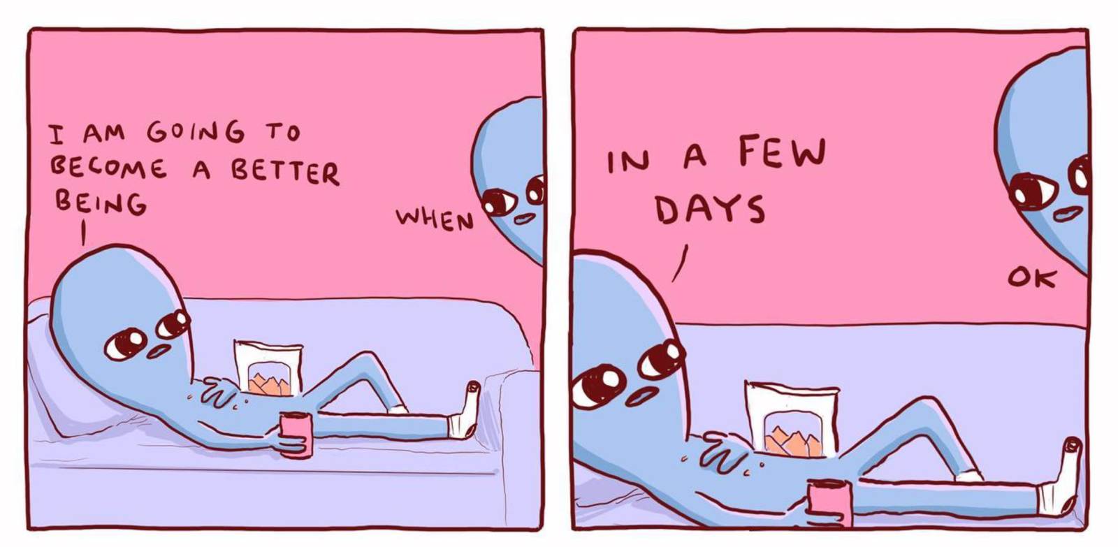
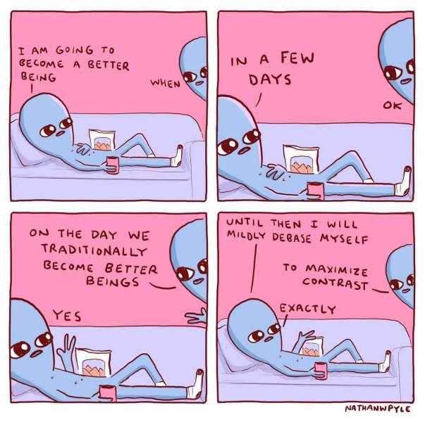
Comic by Nathan W Pyle


Oh, thank you for putting them all together in this article! It made my current re-read (and future re-re-(…)-reads) much easier.
Funnily, the “Screaming into the Void” article resonates with me differently now than it did a year ago… It’s a lot more hopeful and cathartic now. Maybe because I grew as an artist since then, maybe because I really need to scream right now, who knows ^^ but I’ll keep screaming.
Thanks again for writing these articles, they’re all very helpful!
Sometimes a good scream IS very cathartic!