Above: The opening spread for the article about Frank Frazetta in Vol. 1 of our Spectrum Fantastic Art Quarterly. Portrait by the great Greg Preston.
Publishing anything always involves plenty of numbers: how much does it cost, how many to print, how many fit in a box, how long will it take, how many pages, how many contributors, numbers, numbers, numbers: the bane of anyone who struggled with math (like me). And those numbers also include how much content—whether written or visual—will fit attractively on a printed page: when there’s a wealth of material to choose from, decisions have to be made as to what to include in the space you have, of what’s essential and, unfortunately, what has to go. It’s almost inevitable that some good stuff always winds up getting edited out—and that’s what happened with the feature about Frank Frazetta that’s included in the first volume of Cathy’s and my Spectrum magazine. As I told Frank’s granddaughter, Sara Frazetta, once I—and others—start writing about her grandparents (and you can’t write about Frank without writing about Ellie, too), once you start wanting to show this drawing or that painting, it’s hard to stop. Which is normally a good thing…except when you’ve only got so many pages available to tell a particular story.
Above: “I had a much better idea for the movie poster than the one they wanted,” Frazetta told me in an interview in 1998, “but you know how it goes. Everybody else always has an opinion. The final poster is ok, I suppose, but nothing special: there’s too much going on. That’s why I sold it.”
That was the problem I especially ran into when designing the section of the article which included James Gurney and Steven E. Gordon discussing their work on the Ralph Bakshi/Frank Frazetta 1983 animated film Fire and Ice. There were all kinds of sketches, cells, photos, and background paintings we could have shown, but only so much room to do so—at least do so and not make it look like a mess.
The movie opened to largely negative reviews (Gene Siskel in the Chicago Tribune gave the film two stars out of four and called it “attractive to look at, but its slow-moving, predictable story makes viewing it much like reading a comic book with pages made of lead”) and was a box office bomb, earning only $860,000 on a budget of $1.2million. However, over the years it has achieved a minor cult status and has a devoted and vocal fan following: I had shared a link to the movie here on MC late last year so anyone can watch it and make up their own minds.
Frazetta moved his family to California for a bit over a year while he collaborated with Bakshi: Frank loved Hollywood—as well as the studio-paid weekend golf trips to Palm Springs and Las Vegas—and for a time considered moving there permanently. Ellie, on the other hand, wasn’t particularly happy for a whole list of reasons and they returned to Pennsylvania when production concluded. Obviously, there are a lot of stories yet to be told about the experience and pictures yet to be published.
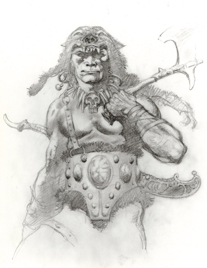
Above: One of Frazetta’s original character designs for Darkwolf.
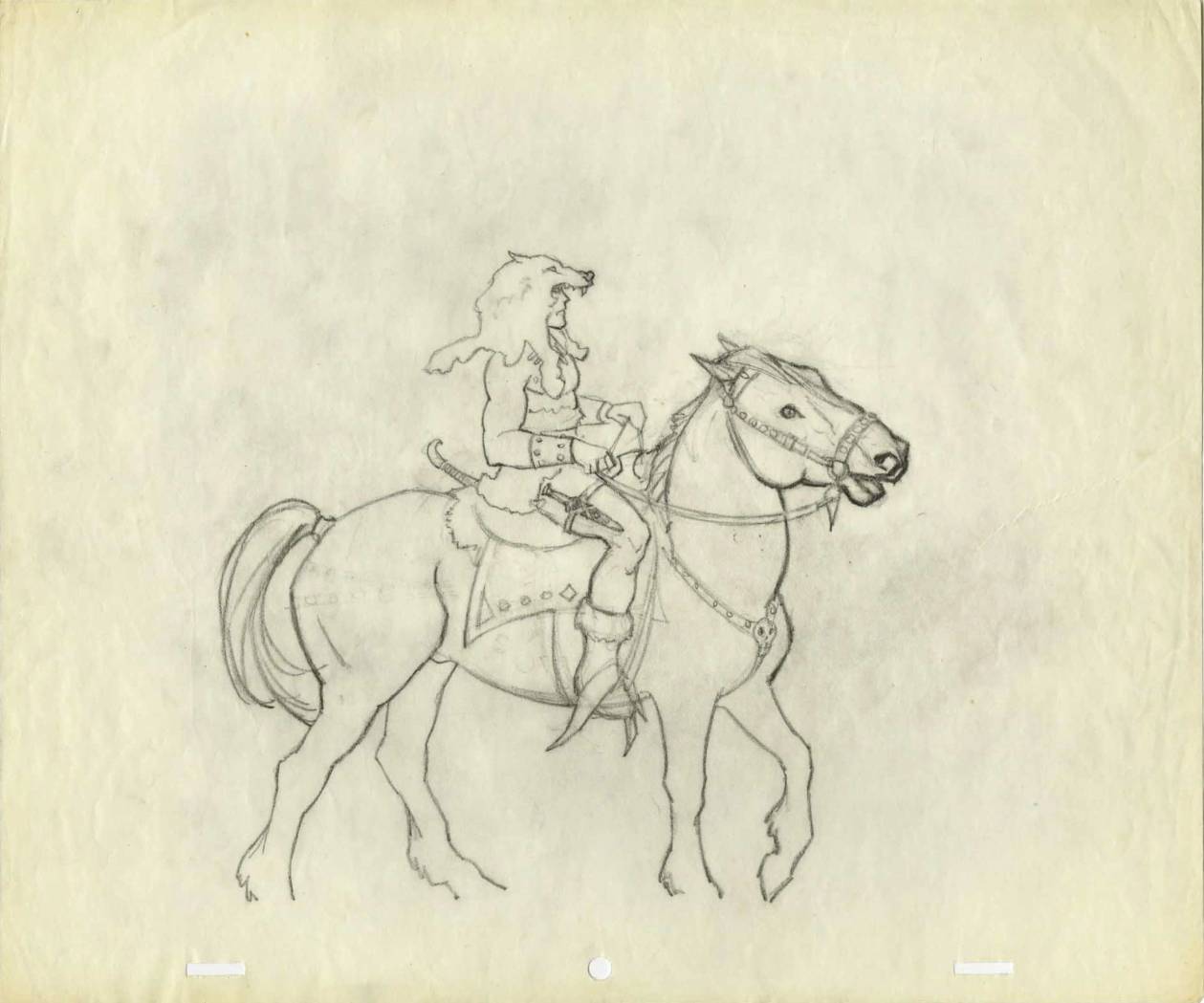
Anyway, at one point Steven writes in his essay about the concerns they were having with Frazetta’s headpiece for the film’s mysterious hero, Darkwolf, and explains how they eventually resolved the issue; we had a number of images to choose from to help illustrate the problem and solution, but, unfortunately, we only had room to run two of them. That’s life in publishing. Still, it gave me the subject for a Muddy Colors post this morning and the opportunity to share more art here—and who doesn’t like to look at more of Frank’s art? Oh, and it gives me a chance to remind everyone who is interested that copies of Spectrum Fantastic Art Quarterly Vol. 1 featuring the Frazetta article (and a whole bunch of other neat stuff) are currently available from Bud’s Art Books and Stuart Ng Books and will be soon from Dreamhaven Books.
Above and below: There were serious concerns that the wolf-head cowl Frazetta designed was going to be extremely difficult to animate and make look right in every scene.
Above: Three busts Frazetta sculpted to aid the animators after the problem of Darkwolf’s cowl was resolved.
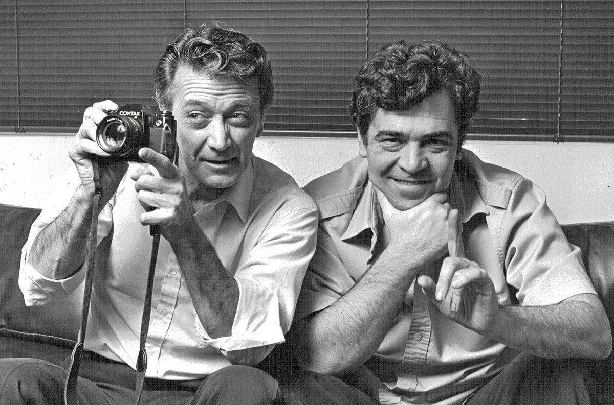
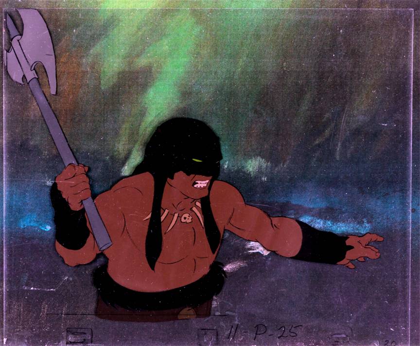
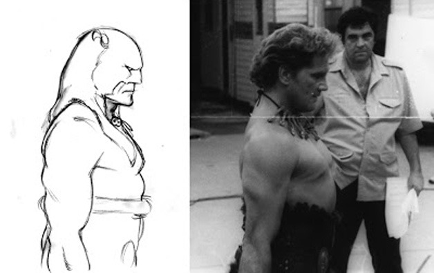
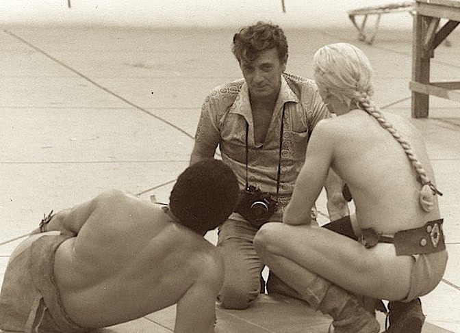
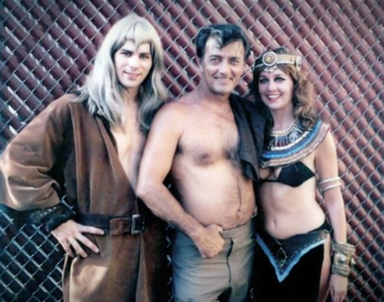
Above: A cell from the finished film featuring Darkwolf. Below: Photos of Frazetta, Bakshi, and the actors on set and behind the scenes.






I loved the art you chose to illustrate the Frazetta article. And the sketch here that Frank had in mind for the poster is terrific.. The film wasn’t much to watch. Maybe if they’d hired Karl Edward Wagner to write a script. But I suppose the money wasn’t there, and the target audience for that story probably wasn’t going to cartoon movies.
Thanks for the addendum to the article and another fix of Frazetta’s art and story. And best wishes on the Spectrum Quarterly. You’re off to a great start.