Hey everybody! I’m super excited to become a small part of the MC family. As many of you, I’ve been visiting the site on daily basis since its beginning, so i’m very happy and proud of being able to contribute.
 |
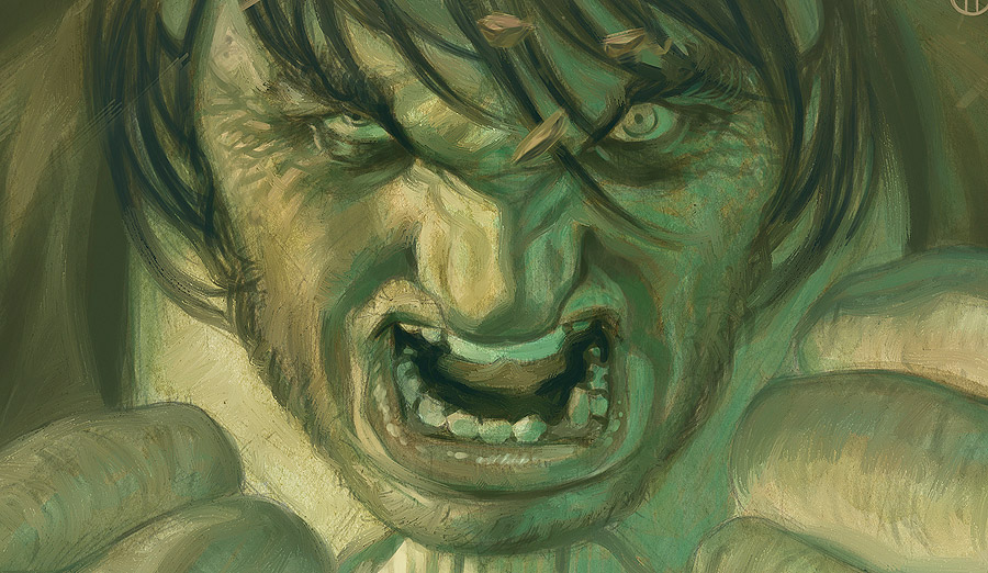
| This Meme sums up pretty well how I feel here at MC, among such amazing artists. |
In my first post, I’d like to share a method that has proven to be very effective for me to achieve a more organic and traditional feel in my digital paintings.
The truth is that, when it comes to traditional mediums, I’m not as skilled as I’d like to be. Given time – a lot of time – I might be able to come up with something decent (or barely decent). But even having time on my hands, I’m never able to control the final outcome.
Don’t get me wrong, I strongly believe that vertigo and uncertainty, in moderate amounts, are wonderful things, but having absolutely no control over what you’re doing is no good when you’re a pro working under a deadline.
Mixing traditional mediums with digital tools can be an efficient way to get the control and speed that comes with digital tools, and the texture and organic feel of traditional mediums. This is a method you can use, even if you aren’t a skilled traditional painter.
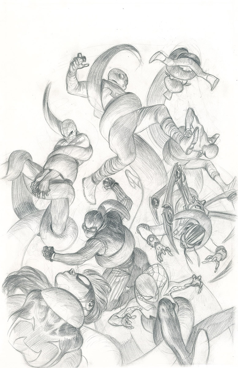 |
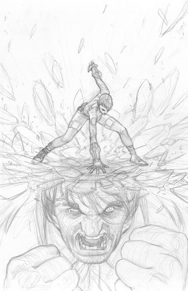
| Pencils for the cover of “Web Warriors” #4. Marvel Comics 2016. |
I usually start with a traditional pencil drawing. The size and type of paper tend to vary according to my needs, but I usually work with a 11″x17″ Bristol board.
Once I have the pencil ready and scanned, I print it out on a 9″x12″, 300 gm aquarelle paper. I’ve printed it on a smaller size here because I wanted to work fast, and I wasn’t looking for definition or detail at this stage.
Before I start painting (I’ll use acrylics), I apply a layer of acrylic gloss medium & varnish covering the whole sheet. The varnish creates a sort of thin plastic coat, impeding the paint from penetrating the paper completely, letting the paint flow freely and reacting in unexpected ways, which is part of the organic feel we’re looking at this point.
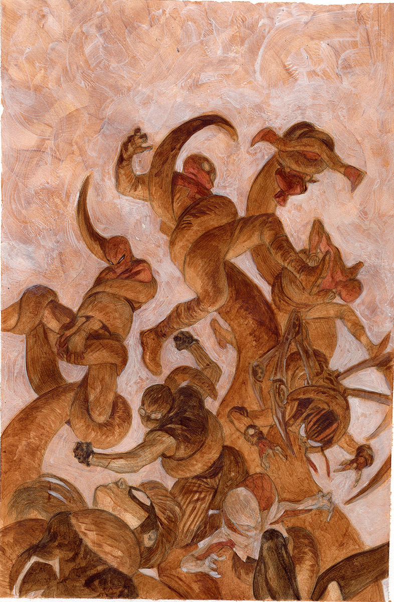 |
| It doesn’t matter how bad you’re with acrylics, this is a stage you can still handle. And it doesn’t matter how tight your deadline is, this is a step that can be done very fast. |
I’ve used a very old brush with hard bristle to apply the varnish (a cheap, dirty, old brush), so it can leave a texture that I can shape at will, but you can use all sort of different tools like a sponge, a crumpled piece of paper, etc, and get different textures.
For the painting, I’m using Acrylics. You don’t have to be picky with the brand here because it won’t be a final piece, and the coloring will be handled in Photoshop.
I’ll just loosely set the lighter and darker tones using just a few different tubes of paint. The whole point of this proccess is creating a sort of underlayer to work on top later in Photoshop. This is the stage where you bring the texture, the brush strokes, the chaos! Go wild, and don’t worry much about details, you’ll take care of that at the digital stage.
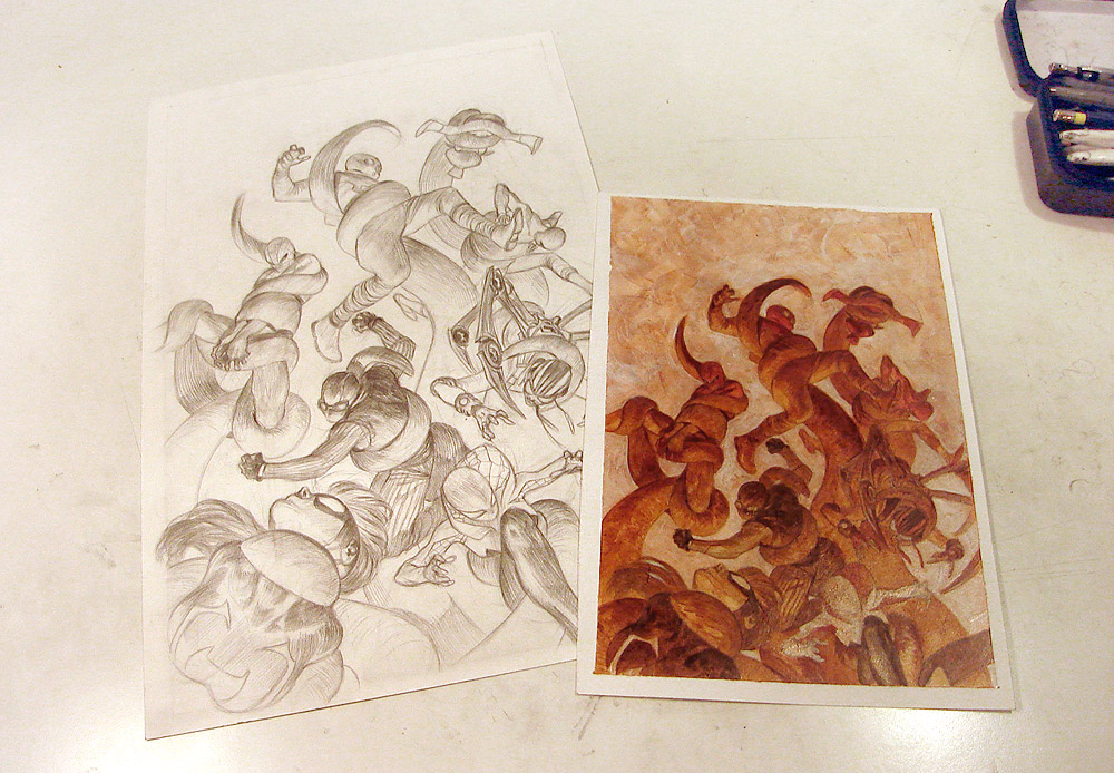 |
| Now that you have your painting done, we are ready to jump into the digital stage. |
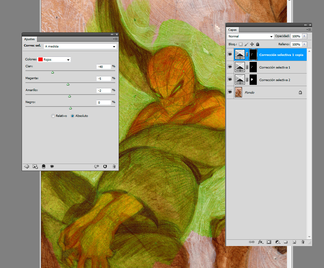
With tools like Hue/Saturation and Selective Colors, you can add adjustments layers and start building your color scheme. The painting will change dramatically, but the texture and brush strokes will remain.
Once you’re happy with your color scheme , you can start with the actual digital brush work: Adding accents of shadows, glazings , working on details, etc. Try to keep your layers semi transparent at first, so you won’t cover the textures, but feel confident to add some opaque accents here and there for the end, where it corresponds.
 |
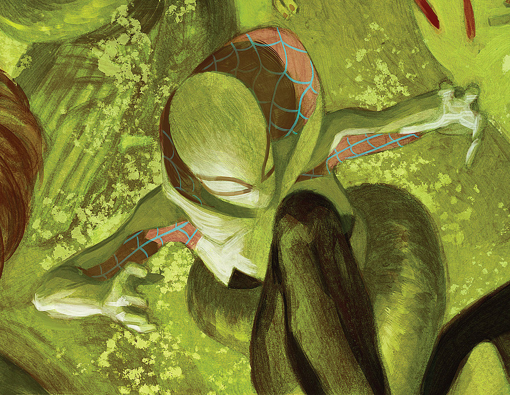
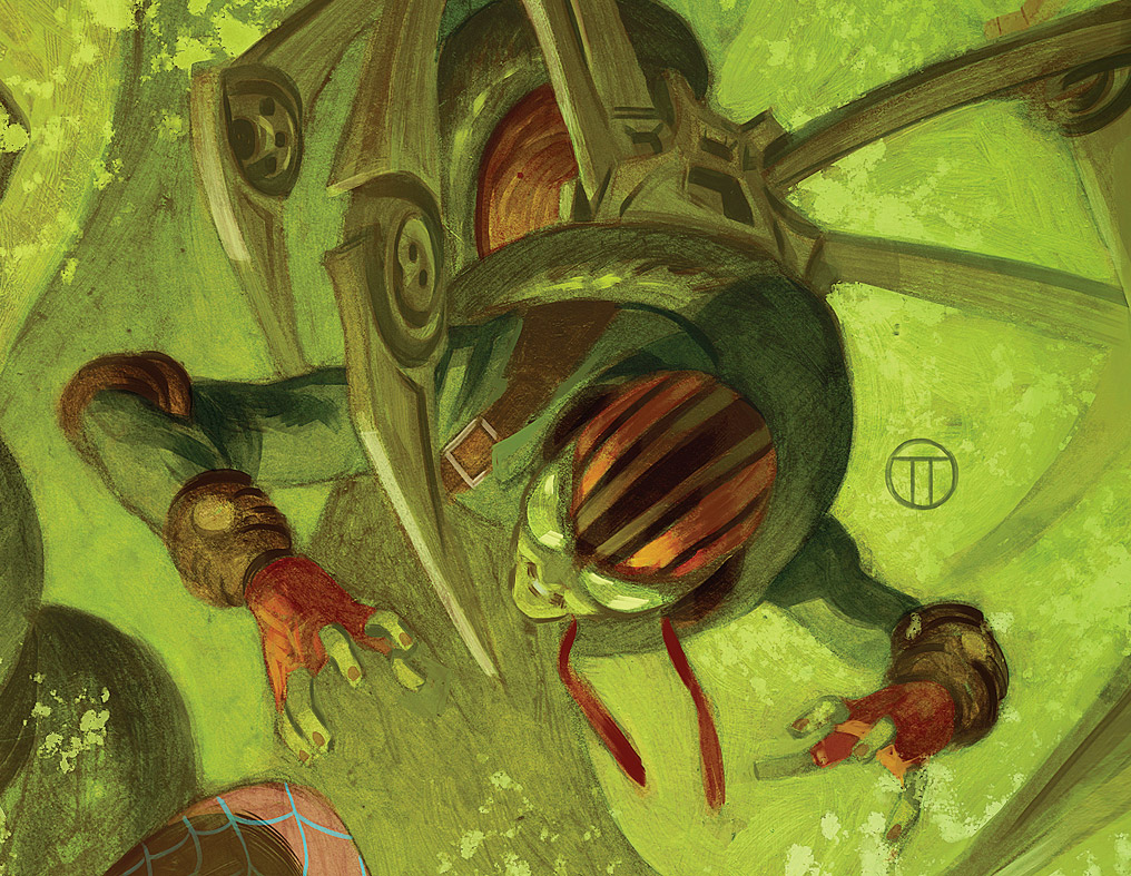
| “Web Warriors” #4. Marvel Comics 2016. |
It’s not about fooling anybody into thinking this is a traditional painting. It’s about bringing some organic elements to your digital work.
There’s a lot of great brushes out there, to get “painterly” results, but sometimes it’s easier to just paint something very basic and work from there.
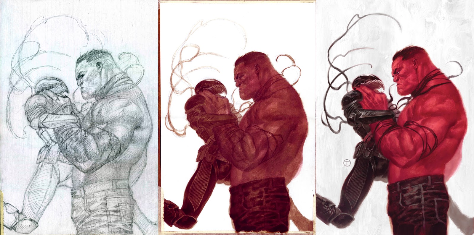 |
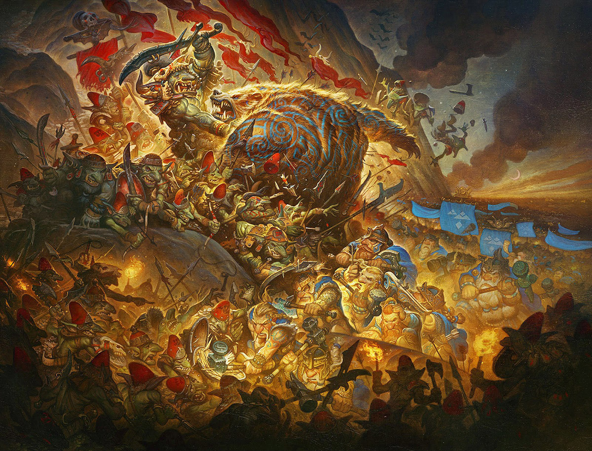
| Cover for “Thunderbolts” #2. Marvel Comics 2012. |
You can see the three steps in the image above: The pencil stage, to the left, the acrylic underlayer, in the middle, and the digital stage, to the right. Notice how the acrylic layer is very basic and raw and, still, was enough to give the digital work a nice organic feel.
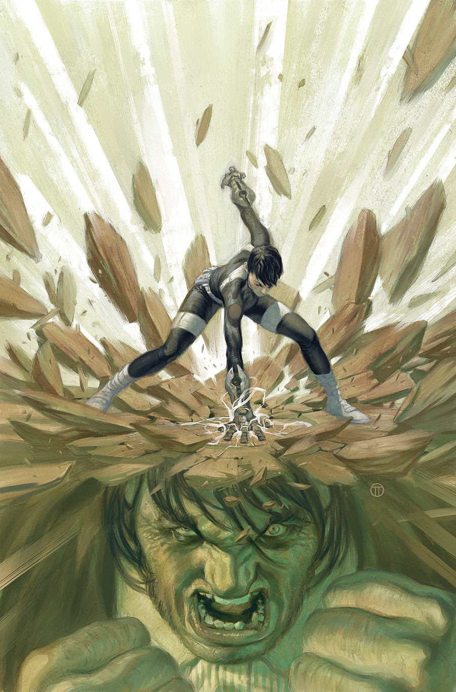 |
| Cover for “Agents of SHIELD” #7. Marvel Comics 2014. Digital and final step. |
Corel Painter offers a great tool called Blender. As indicated by the name, it allows you to blend the painting and mix the colors in a very efficient way. Like and advance version of the Smudge Tool in Photoshop. I use it very often, but have in mind that you need to have your layers flattened for a better result.
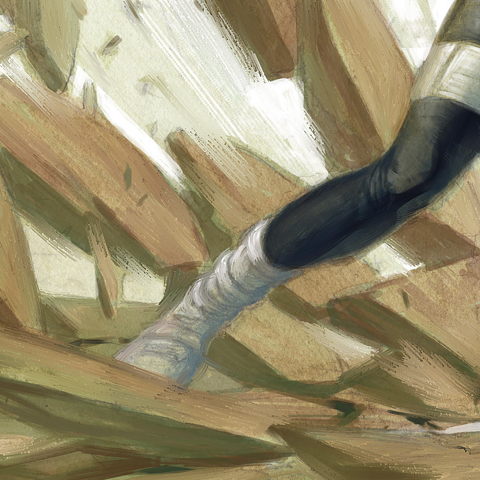 |
| In this detail you can see the result of mixing your edges with the Blender tool. |
Just a fast and loose layer of painting should work to get you some nice texture, but you can go as far as you want/can with your painting, before jumping into the digital stage.
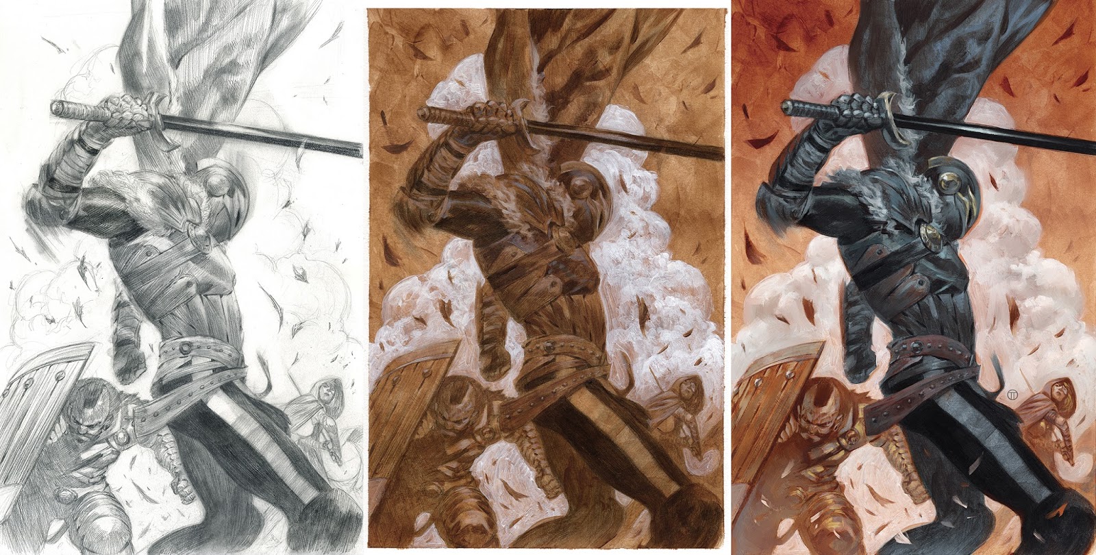 |
| Cover for “Black Knight” #4. Marvel Comics 2015. |
Last tip: You can emphasize the texture by using one of the Sharpen filters in Photoshop, during the process, or once the image is finished. I use it a lot. Have in mind that the printed work will probably look less sharp than what you see in the screen, so don’t be afraid to push it a bit. By using a mask, you can apply the Sharpen filter to specific areas, instead of the whole image.
Have fun!




Awesome tips!!! The results look amazing. Can't wait to try it out.
Great! Thank you for the insight into your working methods 🙂
Great demo about incorporating digital and analog painting tools. Analog artists should learn all the digital tools they can, and digital artists should know analog. There is a lot of cross-over and knowing photoshop can help your old painting skills and vice versa. For any oil painters that want to try direct digital painting in photoshop there some good tutorials out there (Robotpencil) and a lot of people (Matt Heath, many others on deviantart) have created digital brushes for photoshop to mimic oil brushes. My favorite is the “ultimate oil lush” brush from Kylebrush. If you control the variables on that it can simulate oil on canvas or paper quite well.
Great process post! welcome to the team!
Awesome stuff! When you paint the underpainting over the lines, do you just glaze or is there full opaque painting involved as well?
Fantastic first post; as someone who struggles with how to mix traditional and digital, I'm definitely going to try this out, thanks!
Welcome Julian! Off to a great start. Cool post, process and beautiful work!
Thanks, Lauren! i'm thrilled to be here 🙂
Thanks, Howard!
At first, is mostly glazing, but you can add opaque accents or keep building the painting as far as you feel comfortable.
I do agree, and I think it's very important for digital painters to have an understanding of the traditional mediums before start emulating them with digital tools. I'm using Kyle's brushes for a while now and they're excellent, but I always thought that the brushes are really the least important thing in the process.
Hey Julian! Killer post man. welcome aboard! 😀
What digital technique are you using to glaze, specifically? Multiply layer, or something else?
I'm considering creating a “finished” monochromatic painting, then adding color digitally. What would be the most seamless technique for that?
Hey, Nate,
I rarely use multiply, overlay, and such layers. I prefer using Adjustment Layers like Hue/Saturation and Selective Color.
Selective Color is one of my favorites, because it allows me to control the tones of the shadows/midtones and lights all separately. That's what I would recommend.
Hello, very interesting but I’m not sure I understand how you use Selective Color. You should make another tutorial on this 🙂
Great post. I’m looking forward to your future contributions.
Thank you for contributing Julian, lot’s a practical knowledge dispersed here. 🙂 Wonderful first post.
Great technique! I would like to know a bit more about how do you print on the watercolor paper. Any special printer? Thanks!
Great post. I’m looking forward to your future contributions.