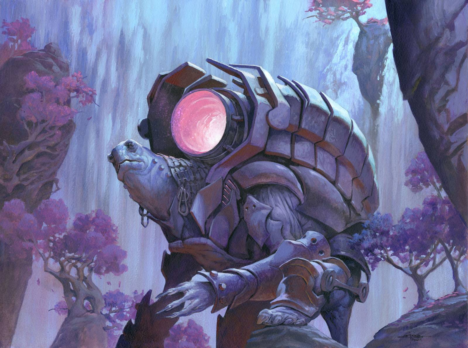
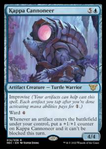
The Kappa Cannoneer is for the Magic the Gathering set Neon Dynasty, a futuristic Japanese inspired world. The assignment was for m to paint a Kappa but wearing an enormous cannon on the back built into his turtle shell.
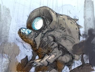
I Knew I wanted the canon barrel to glow to make it seem like a very dangerous thing. So I right away pictured the scene as a night scene. I had the idea of a waterfall and some cherry trees for the background and went for the first sketch I made.
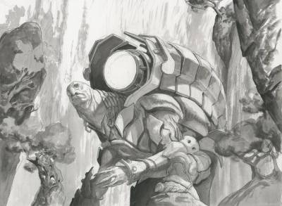
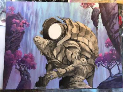
During the process of transferring the sketch to board I changed the overall design of the shell from being less of a shell and more like a harness. Also the robotic elements of his face was abandoned since they made him look less like a turtle and more like an undefined animal type. When I inked the drawing on the board – I always do that to makes sure I have a line to go by when I start covering it all up in washes of acrylic – the face looked worse than before the change from robot.
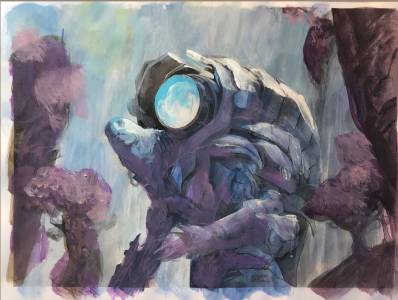
I made a mental not on changing the face completely and just went on to painting the background. I mask the figure out with airbrush film so I can work more freely in the background. Especially with the vertical lines in the waterfall I like to be able to pull long strokes and not care about painting around the figure.
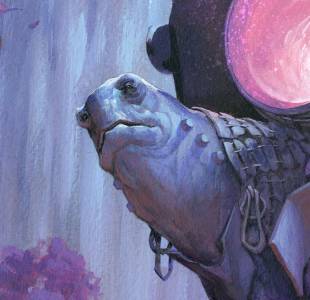
When I was painting I was a bit uncertain on my color comp. It felt like the water and the kappa was the same color, both of them blue and the trees and rocks purple/reddish, drawing too much attention. i somehow needed the figure to be anchored together with the foreground rather than the elements farthest away. So I saturated the whole background color more and made the decision to make the Kapp a heavier purple base rather than blue. The second after thought was that the color comp looked too monochromatic. I needed something to pop! The pink light from the canon was not too off in the color theme but still different enough that it draws plenty of attention. I kind of like how simple and monochromatic the color palette ended up being in this painting. It has a very subtle night scene feeling. The last thing I added to create a bit of interest and more sense of shape was the orange bounce light to the neck and armor parts pointing downwards. I took care not to change the value but only the temperature of the color. The shifts in cold and warm I find works very well especially in the metallic parts of the canon.


Thanks for sharing the process. I love the end result!