Mixed media is the use of any combination of materials. This first came onto the art scene in 1912 when cubists created collages (most recognized were Pablo Picasso and Georges Braque.) There are many mediums that “go well together.” For example, a painter might do their underpainting in acrylic paint, taking advantage of the fast-drying qualities and glaze or paint with oil paint on top. A favorite of many artists is acrylic paint with colored pencils on top and that’s the duo I want to talk about today.
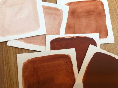
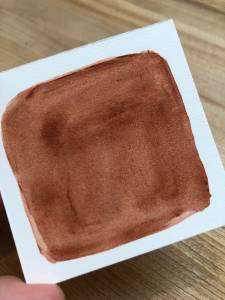
There is a subtle art of mixing these two mediums together. Acrylic paint is a petroleum-derived medium and its plastic quality is very apparent when you are working with it. Colored pencils are wax-based. As layers of paint are applied and built up, the colored pencil may adhere differently and sometimes not at all. To demonstrate this, I’ve laid out several swatches in burnt Sienna from thin, watered-down acrylic paint, to thick paint. I’m not using an emulsifier or any“extender” medium. If I were to use this it would create even more of a plastic feel and I would not be able to get as many layers of colored pencil if any.
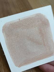
One of the beautiful things about working this way is that acrylic watered-down has tiny, speckles of sedimentation throughout. When creating realistic skin tones, this variation can add subtle variety that helps create a life-like look without much effort. Look at your skin, see the variation? When working in an abstracted or stylized manner this can add a texture to flat areas that can look gritty or aged. You can see this speckle in effect in a lot of illustrations in the 60s. In my first swatch, you can see this speckled quality.
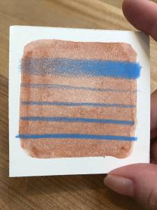
Laying on the colored pencil here felt like how paper usually feels under my Prisma color. I’ve created a gradient from a soft touch to a burnished feel.
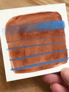
In the following swatch, I’ve added another layer of watered-down paint.
When working the burnished side of the gradient I’m moving in small circular motions. The heat from this can melt the wax. This laid on fairly effortlessly.
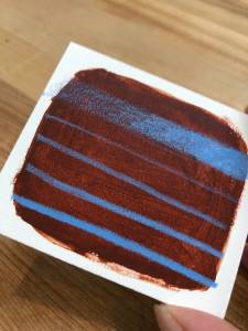
In the following layer of paint, there is a little more resistance. The texture of the pencil is becoming rougher and I have to compensate for my touch to get a smooth look. Looking at it from an angle you can see how hard I’m pressing and the wax is building up. A trick to get rid of this is to rub the burnished area with a tissue in a circular motion. Then, you may be able to apply more colored pencils on top.
Below shows you after rubbing some tissue. Removing that waxy shine.
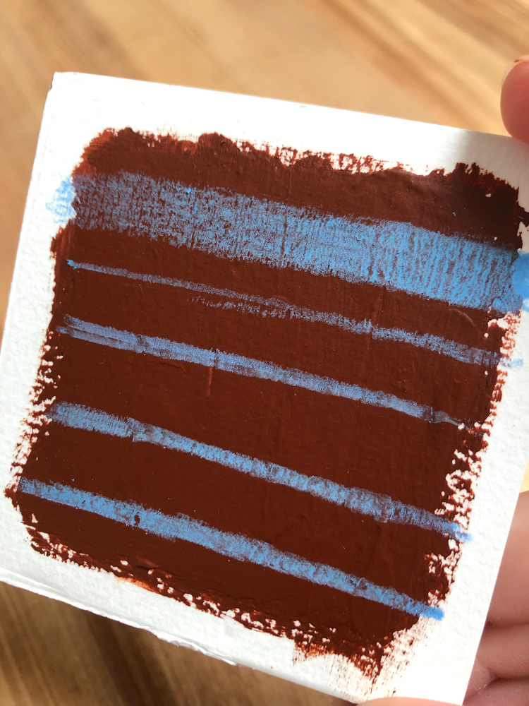
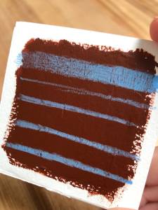
To give you a detailed understanding of how thick the paint is on my last swatch below, I can feel slight 3D ridges of paint where the brush strokes were used to apply the paint. The texture of the paint is easily seen and burnishing is limited. On the burnished side of the gradient, I’m pressing substantially harder than before but the strokes of paint still come through.
If you’ve applied too much paint and backed yourself in a corner but need to apply more colored pencil, there is a “trick” of sorts, apply a THIN layer of paint thinner, and the colored pencil will move like paint. But that’s an experiment for another time. While all the results successfully land prismas on the paint, the FEEL is very different. The texture that comes through with each swatch is important to note. I’ve found this can work for or against you when talking about the exposure in your piece.
Naturally, our eye sees less detail in shadow and more in the light. Many of us illustrated our images this way. But we can also create form by putting detail in the shadow and omitting it from the light. This creates that “blown out” sunny look. When using mixed media an excess of texture can hurt your form. So when you are layering and want less texture, use thinner paint in those areas. In some work, I’ve experimented with only using colored pencils in the highlights or keeping it to the shadow to control your texture. You can also try this by only using the colored pencils in the highlights (Or conversely, only using them in the shadow.) Using mixed media can create rich texture but to create a strong form we have to control it!




I love the idea of using mixed media, I just wish I had the foresight to know how and when to use it. Especially when theres many parts of the process that have points of no return and my own process is a “discovery” where I’ll repaint areas dozens of times. I remember also hearing that you could add baby oil to colored pencils to get a certain effect? But it just ruined the paper for me. I really envy those who can plan large paintings out with mixed media.
I especially find it hard to get a good clean shape of a high value color with acrylics or colored pencil, I find that sedimented, speckled quality to be unintentional focal points and distract from a clean read in my own pictures. I try adding white to add opacity but it desaturates the color as a consequence.
Hi Zach,
Your right, mixed media requires a lot of planning. Slowing down is an ongoing challenge for me! Controlling the texture is very important and this is why I mentioned at the end about knowing where our texture belongs, in your lights, or in your darks. There’s no wrong answer but you have to stick to one! Even more important is first and always controlling your values. I wonder if you might have some success going simple first with ink washes and pencil on top?
*Experiment*
Right?? I saw that and thought to myself ‘wow….embarassing🤦🏼♀️.’
I don’t understand whats so facepalm worthy about my comment or the logic of putting it down. These experiments are meant to help understand how to use the medium like how value scales test your value range and control (I was surprised to learn not all mediums get as dark as others.) or color mixing charts test what colors can be mixed from your paint.(like how the same blue name under a different brand will give you different shades of green when mixed with yellow.) If you can’t control your values in a value chart, how can you control them on such a complex subject like a face? If you don’t get the colors you expect when doing hue mix tests, it’ll never happen on a large scale painting. Likewise, if I couldn’t get my materials to work together to get a clean result on a simple experiment, then it wouldn’t work on a complex subject either. I experimented, I ran into problems, I made my comment… Where’s the controversy? Imagine if others had my issues and someone else had a solution and replied and everyone benefited. The lack of them wanting to do that now because the question was made fun of is the real facepalm if you ask me.
I think J. Barnes and Elesha are commenting the typo in the title, not about your post which is quite interesting.
Fortunately, Muddy Colors is a very civilized community, so *face palms* aren’t common.
Regarding Kirbi’s post I find it really helpful. It is quite interesting how both Vanessa Lemen and Kirbi are really brave testing new techniques and materials.
Oh man! I think your right, I had no idea! I’m so sorry 🙁
I’ve been given short responses to my questions before on other forums like “have you tried trying?” Or “ well, just practice more.” And even meaner ones that I won’t share that I thought thats what was going on here too. I showed it to a friend and we both thought it was directed to me so it really shows how computer illiterate I am.
Thank you for pointing that out to me. I really can’t say sorry enough, I’ll do my best to not let that happen again.