Working on the sketches is definitely one of my favorites steps in the creation of a cover. It’s also, I believe, the most important. As I love seeing other artists doodles and sketches, I thought of sharing some of mine, in the hope that others would enjoy it too. Plus, it’s a nice excuse to show some of those sketches that weren’t picked up and couldn’t see the light.
To me, it all starts with my beloved sketchbook. Whether a commercial assignment or a personal illustration, it always begins with a doodle.
I have taken the habit to sketch quite small, for two main reasons:
First, I need to let the ideas flow and not get stuck by technical aspects, and second, because if the composition works on a thumbnail, it will definitely work bigger.
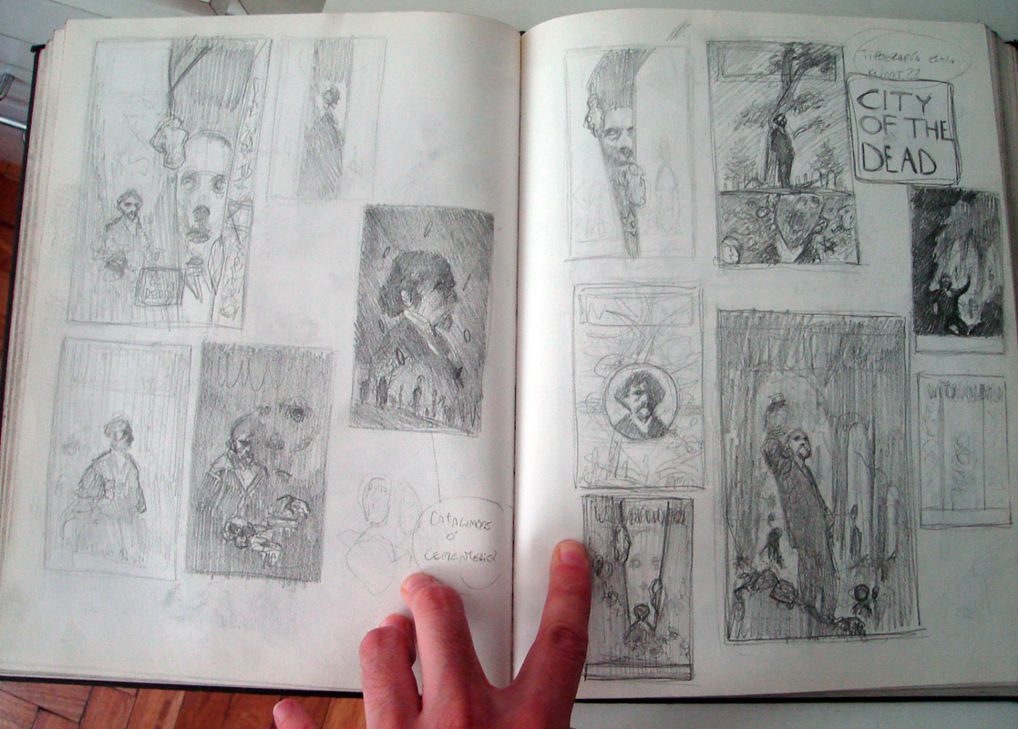 |
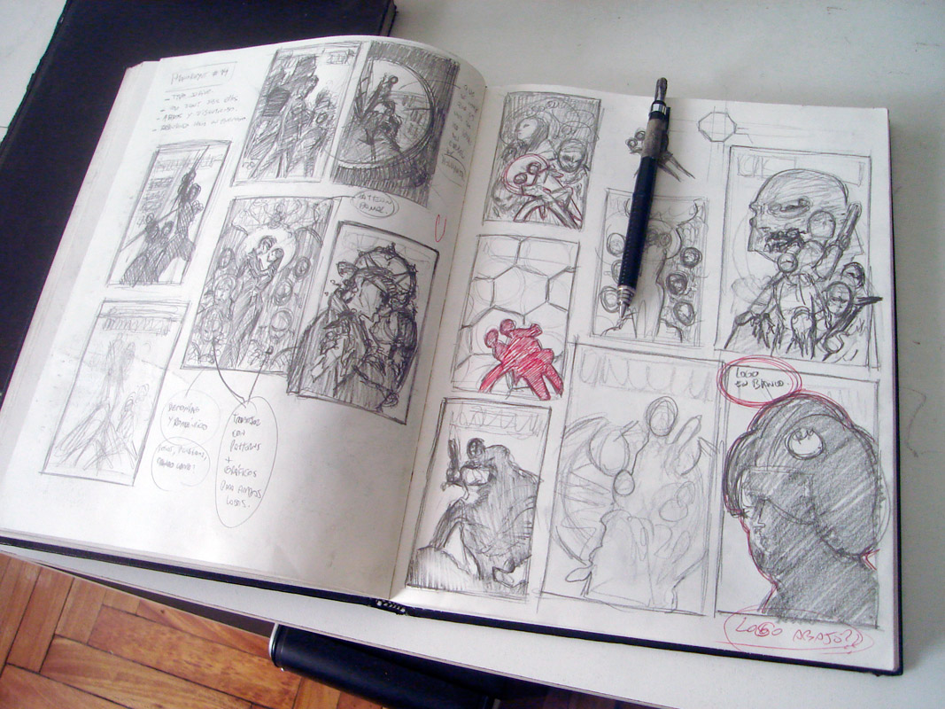
| Cover ideas for “Witchfinder: City of the Dead”. Dark Horse Comics. |
At this point, I don’t judge or repress any idea. Anything goes. Sometimes an overused idea can take a very interesting spin by changing just a tiny detail, but I’m only able to see it once I’m in front of all of my doodles. Sometimes the better idea is a mix of two or three others that didn’t work on their own. It works as a sort of dialogue: Once I put the ideas on paper, those ideas sparks new ones.
 |
|
Cover thumbnails for “Witchfinder: City of the Dead”. Dark Horse Comics.
|
 |
|
Cover thumbnails for “Witchfinder: City of the Dead”. Dark Horse Comics.
|
From all the ideas I sketch, I select only two or three and proceed to developing them in Photoshop, before sending them to the editor.
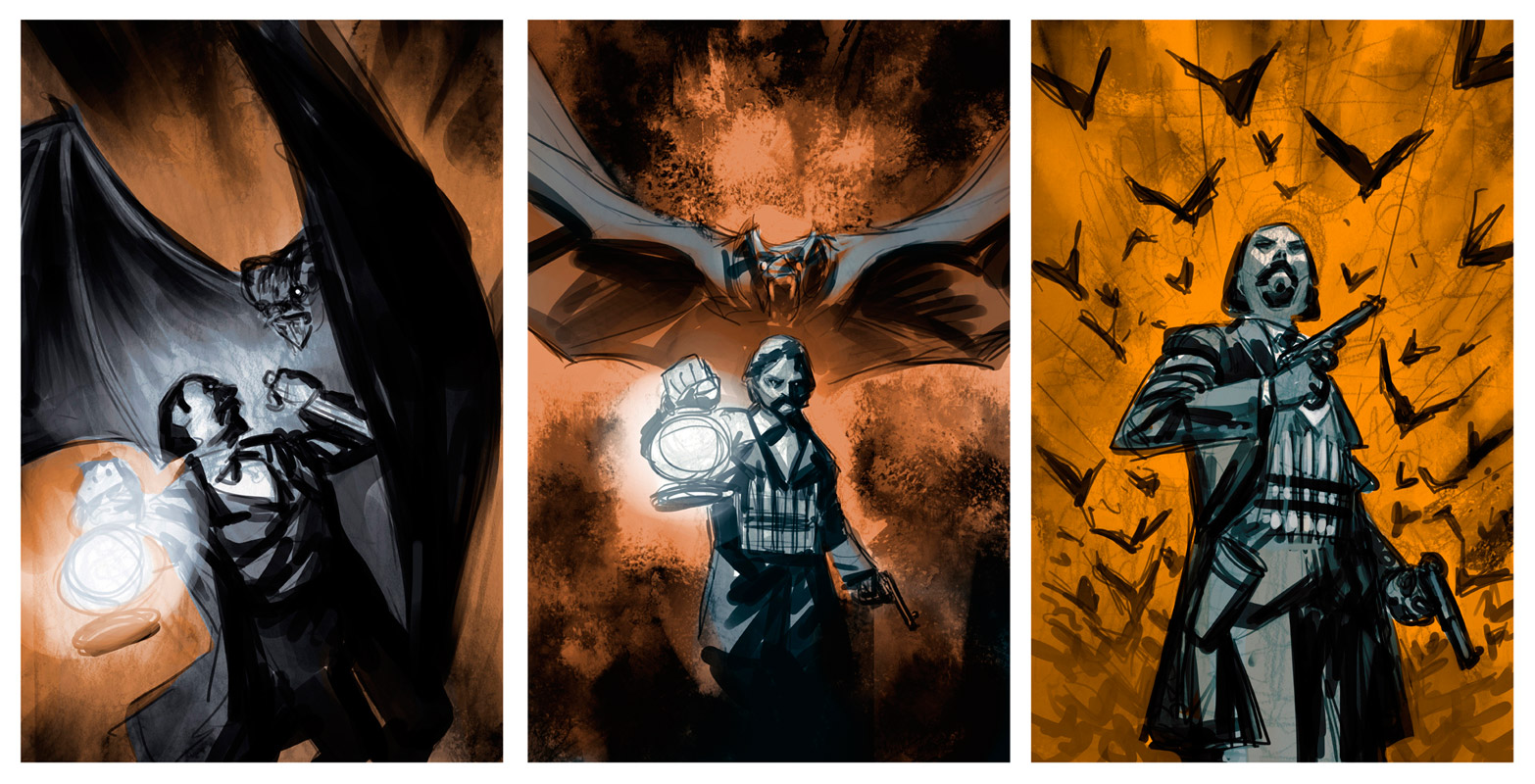 |
| Cover Sketches for “Witchfinder:City of the Dead”. Dark Horse Comics. |
At this stage I work the sketch on a cover template with the exact size of the final cover and, if possible, with the title on a separate layer, so I can know exactly which space is going to take up and how much is going to cover the image and where.
Look what happens when you don’t pay attention to the cover dress:
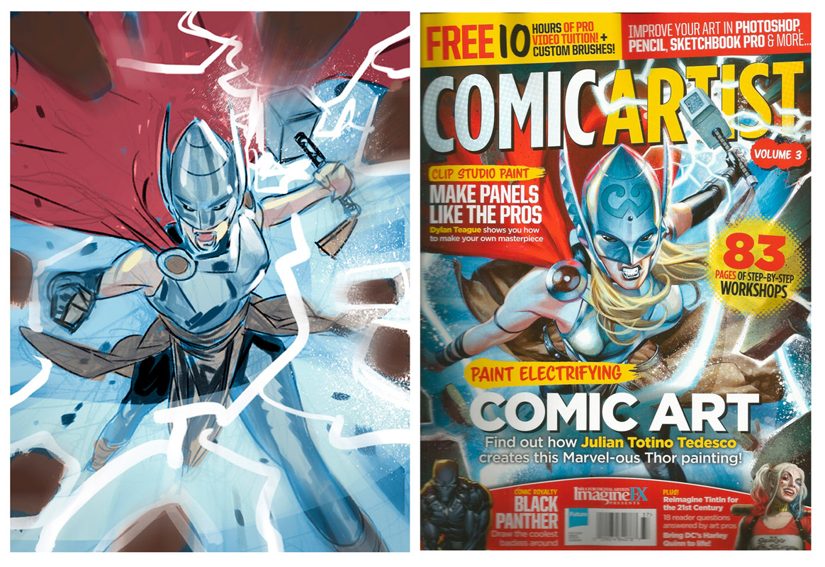
These are a few sketches I did for the cover of “Comic Artist” Magazine. I really liked them, and the editor too, but still, they were rejected. Why?
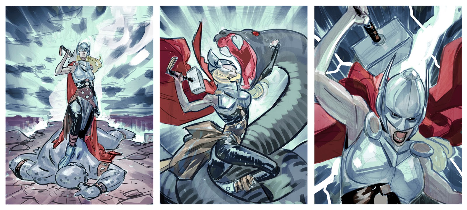 |
| Cover Sketches for “Comic Artist” Magazine #3. |
Here’s why: Being used to doing comic book covers, my main concern was to leave space enough at the top of the image. I knew there were going to be some texts on the sides, but nothing too big, I thought. I was dead wrong. The editor sent me the trade dress and it was way more information that I was hoping, so we had to go with a new sketch, according to it.
Every item in the cover ( Title, credits, bar code, etc) is a compositional element that will generate a weight in the image’s balance, so one have to have that in mind when working on a sketch.
As fun as it is to sit down and throw ideas on paper, things don’t always go so smoothly, and sometimes it’s hard to find an idea that’s appealing to us, or to get hooked with our theme or character. When that’s the case, I try to balance things my way.
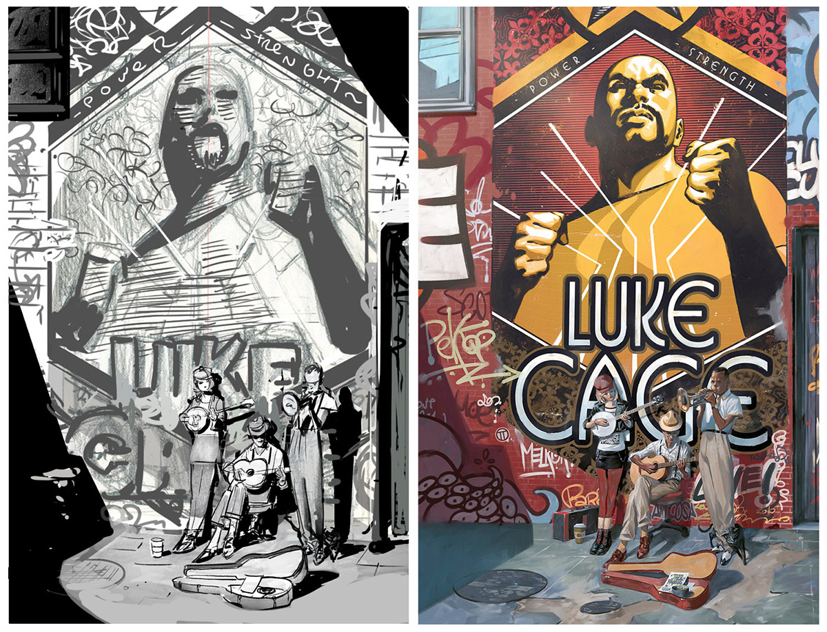
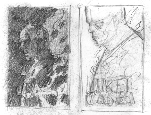
I remember being very dry of ideas with this Luke Cage cover. All I knew about the story was that it took place in New Orleans…
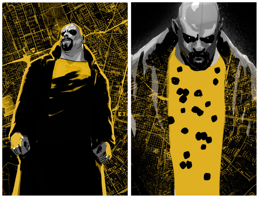 |
| Cover Sketches for “Luke Cage” #3. |
…so used the excuse to drawing something that I always enjoy, which is people playing music. It’s not every day that you can put that on a superheroe cover, but it worked out this time. The editor chose the sketch and I got to draw what I wanted, while still making sense with the story.
 |
| Cover sketch and final version. |
 |
| Cover for “Web Warriors” #6 |
 |
| Cover for “Agents of S.H.I.E.L.D” #11 |
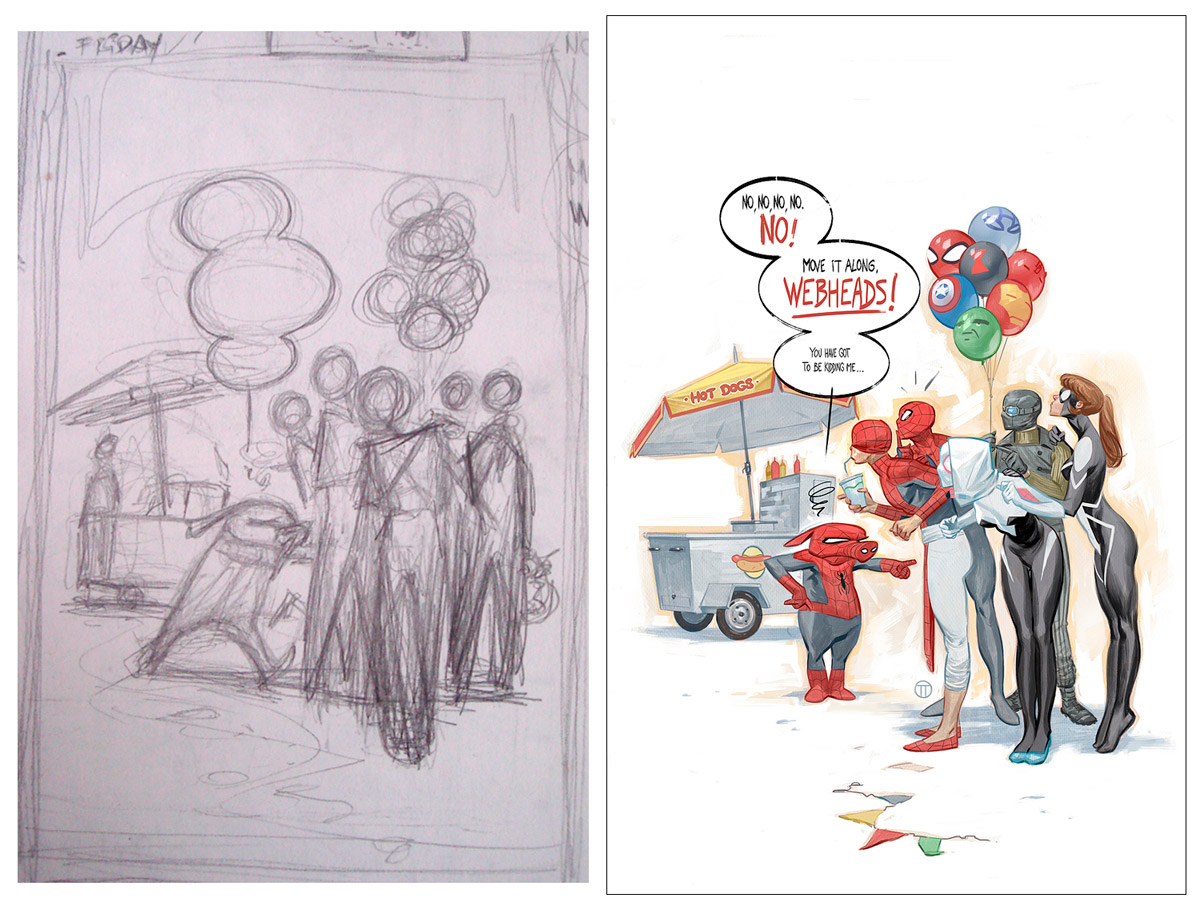
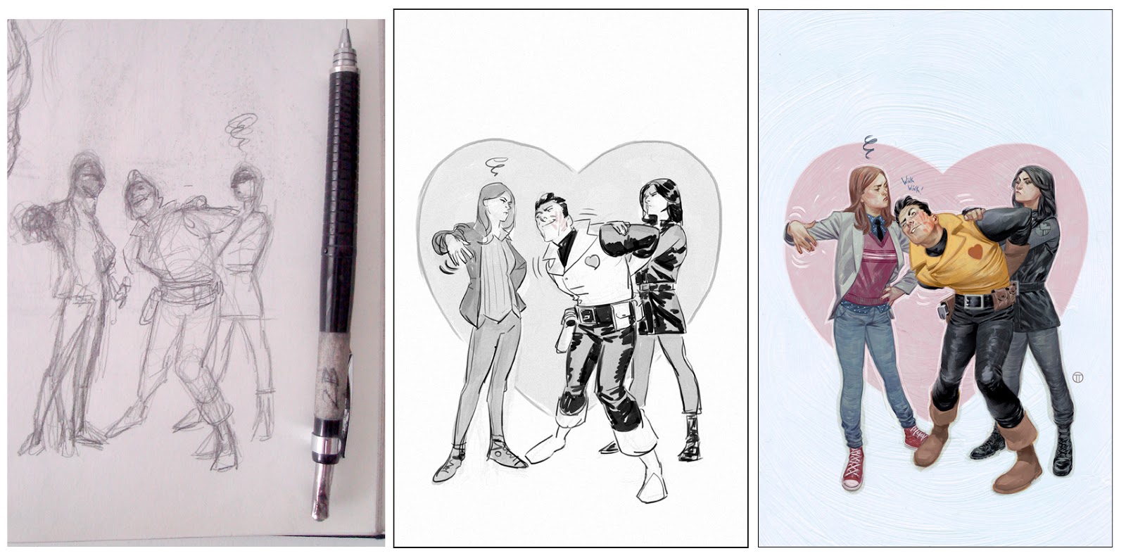
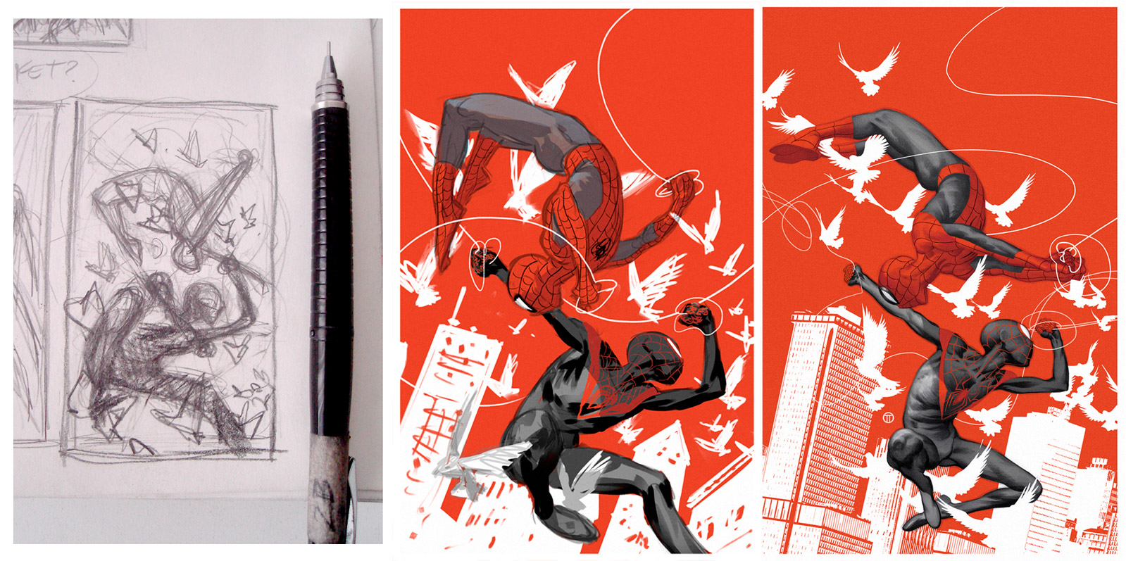
If you can’t come up with a new idea, try to come up with an interesting way to portray an old idea. Try to have fun with the “How” instead of the “What”.
 |
| “Spider-Men”. Doodle, Photoshop sketch and final cover. |
To me, this cover wasn’t about the idea of the Spider-Men, jumping mid-air, but about playing with a graphic element and a limited color scheme.
Ideally, you’ll want to come up with something that’s sensible with what the cover needs, but also, enjoyable for you and representative of who you are and the things you like. To me, the best place to find that out, it’s my sketchbook.
As always, feel free to share your creative methods and tips in the comment sections, or to ask anything you want about mine.
Thanks for reading!



Thank you, Julian, for showing these thumbnails! You mentioned seeing other artist's thumbnails in your post but I rarely have ever seen them compared to finished products so this was very enlightening!
Glad that you enjoyed them, Michael! I've used to share a studio with two other artists (twins Max and Sebastiàn Fiumara) a few years back, and I learned a lot by watching their processes.
I have a studio of my own now, but I love visiting colleagues to their studios whenever I can, and take a peek at their sketchbooks.
Very cool!
Muy bueno Julián, gracias por compartir!! saludos!!
Muy buen artículo, muy útil. Felicitaciones.
Maravilloso el articulo!
Excellent article! Would you like to know how and when to search for more refined references? In the case of the Doodles for the final cover, there is a very good refinement of anatomy, at what point do you seek these references? Depending on the possession and or the photo you think can change the composition?
What a wonderful article! , thank you very much for share.
I love seeing sketches! It’s like seeing the soul of the drawing.
Hi Julian, can I ask you which type of pencil are you using for sketching? I mean you start to draw with 2H or HB and you going to refin with 2B or xB or something different? Thank you in advance. Lorenzo