In a recent post I was asked if I’d go into more detail about how I apply and saturate color when I work digitally. Today, I’ll be giving a brief overview of this.
Please note that this post is geared toward people who are familiar with Photoshop, but still searching for how to best use it to colorize their illustrations. Photoshop Geniuses may find the following a little basic. (Digital ninjas, yetis, warriors, and Kevin Sorbos will find this utterly beneath them)
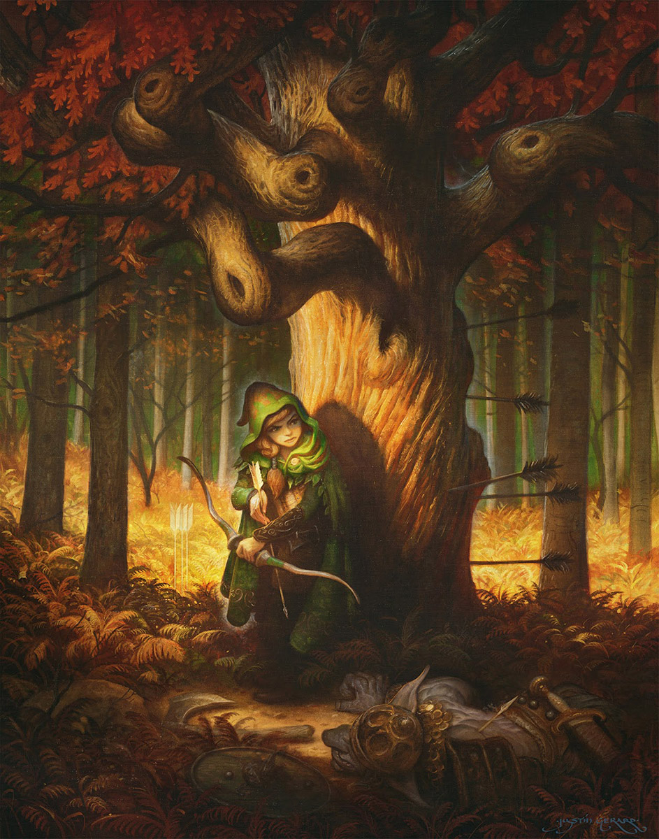
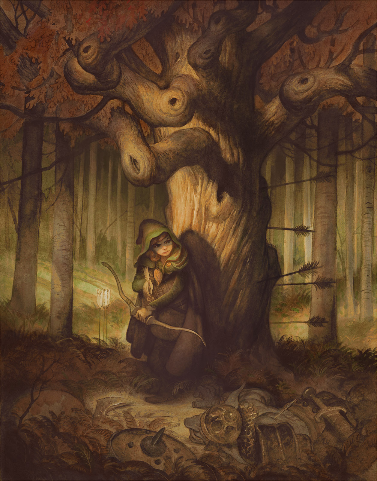
For the purposes of this post, I created the above monochrome watercolor to colorize. I usually work over full color watercolors, but this should help keep things a bit simpler. (Just know that you can use all these same principles when working over full color work!)
NOW, FIRST OF ALL:
Painting digitally over drawing or a monochrome painting has 2 major pitfalls to avoid:
#1 The Pernicious Photo-tint Look. (Think: old colozied photographs) We don’t want this.
#2 The Vile Plastic Over-painted Look. (Think: purple wolf baying the moon airbrushed onto the side of a mobile home) We don’t want this either.
The first pitfall suffers from too much information from the original image, while the second suffers from not enough. We want somewhere in between. And thankfully, Photoshop has been built specifically for this. All we have to do is use the right combination of tools within it.
SO LET’S GET STARTED WITH THE BASICS:
As you can see, most of these when used alone, will leave our image looking photo-tinted. (Pitfall #1)
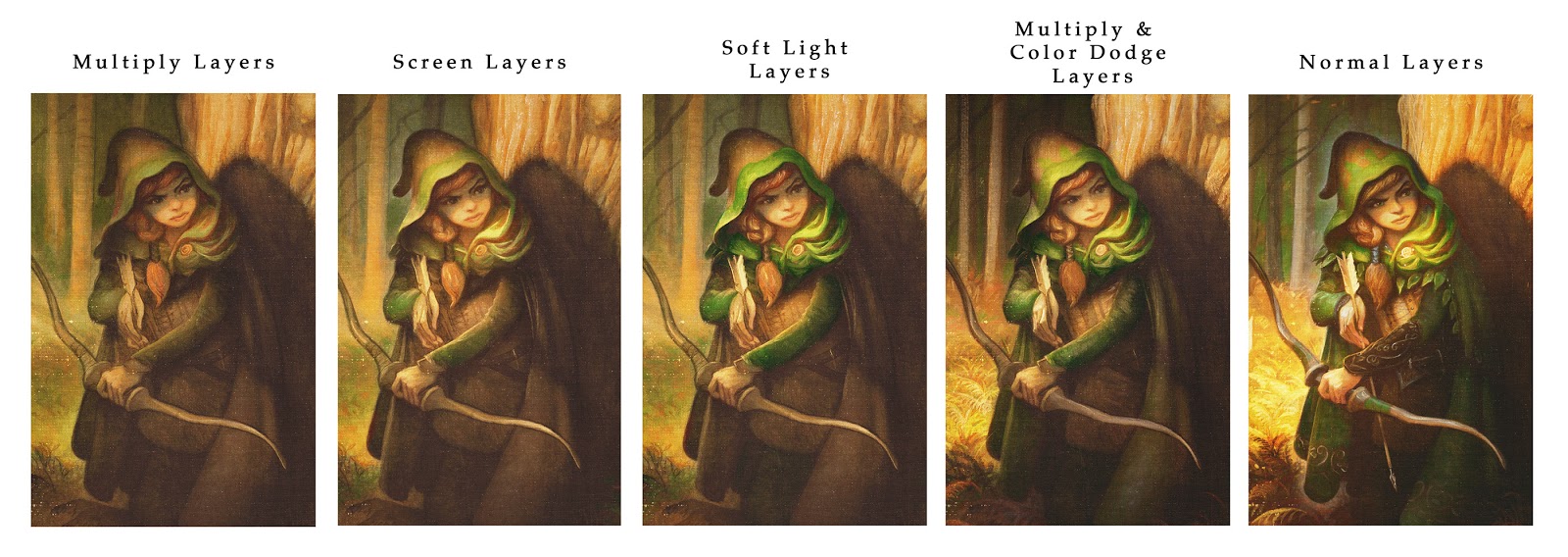
That is where a process of applying a combination of several different layer modes in sequence can be extremely helpful. Consider the following combinations:
Notice how the final effect in all of these offers a more natural looking saturation of colors. Here’s why this works:
For this reason, we are only used to seeing “true” red in limited areas. When we see an object painted in a single shade of red, it looks wrong and somehow flattened. This is because where the object receives direct light, the red will take on the color cast of that light, and where it is in shadow, it will take on the color cast of the environment’s ambient light. Furthermore as objects recede from the viewer the color is further altered by atmospheric perspective.
Certain layer modes saturate more heavily than others. Some darken as they saturate, others lighten.
OKAY JUSTIN, THIS IS STUPID AND YOU’RE STUPID. WHY NOT JUST PAINT WITH NORMAL LAYERS?
Normal layers are great! If you are just getting started, you should work with just these until you feel you understand them. They behave the most predictably and are extremely versatile if you are using brushes with low flow or opacity.
However, if you are adding digital layers over top of a traditionally painted image you will find that eventually you obliterate portions of your original, and the that the final effect is plastic and uneven. (Pitfall #2) To truly take advantage of Photoshop’s power, you need to use transparent layer modes.
Photoshop has a dizzying array of options for colorization. What is important is finding what works for you. There is no real right or wrong. It is just whatever you can use to get what’s in your head onto the screen.
For me, the majority of my transparent layers are made up of Multiply, Color, Soft Light and Screen. You can do essentially anything with just these four and end up with a solid image.
Multiply Layers tend to darken and add chroma in a very dull application. This is great for slowly building up colors and adding texture and tone to your image. It is very much like working with traditional watercolor. Great for building shadows and toning your image.
Screen layers are essentially the opposite of multiply, these also add color slowly, but they lighten instead of darken. I use these to add direct lighting over the dark layers below. By picking a warm yellow color here I am able to slowly work up a nice natural looking lighting effect to my figure.
Soft Light Layers are bonkers. They have no master, and obey no man. The math that governs them is not fully known to science. What I do know is that when a bright color is used on a soft light layer, it will allow for a very bright saturation of color which does not affect the details beneath it. For instance, I used a bright green color on a soft light layer to really pop the bright greens out from the rest of the image.
Color Dodge Layers scorch out highlights. They are extremely brutal and should be used VERY sparingly. Too much and you are lighting your birthday cake candles with a flamethrower. But when used sparingly, they can help to intensify your brightly lit areas as well as any glints of detail light. I use Color Dodge layers to sharpen highlight areas, add rimlights, and sharpen object profiles against their backgrounds. When alternated with multiply layers it will help push the value range of the image.
Color Layers. Not shown here because I use them so sparingly, but I do use basic color layers to push and pull color in limited areas. The Color layer mode is the classic means of photo-tinting, (and I need not badger you any further with warnings there). Just know that you shouldn’t overuse them, but that in limited doses they are excellent. For instance, killing chroma: If an area is too red, I can select a blue color and lightly apply it on a Color Layer and it will pull the red back into check.
Normal Layers. Finally, there is just no escaping at least some opaque work for me when I work like this. But now that we have already established our value range and our colors are fully laid out, we can add details and opaque work that blends rather seamlessly with the rest of our image. I also use it very transparently and often set the layer opacity to less than 50%.
This general sequence offers me solutions to the problems I generally face as I work through an image. Everyone’s artistic temperament is a little different, so play around with the different modes in different sequences and see what works best for you.
I hope this was helpful! As always, I take post requests, so if there is something you’d like me to cover please let me know in the comments!





I've been interested in trying something like this given that I hate digital but it's a necessity, and I'm not too skilled yet to make the full transition to oils, so a combo of pencils, ink, watercolor, gouache and digital may help.
What I want to know is if while working with each layer you check to see which one fits what you want to do next or if you know before hand what you're gonna throw on there. Also, do you color a whole area, say a patch of green, using one layer and then paint over smaller patches of green on the planes that will be a different green using a different layer, or do you just handle the planes that would benefit from each layer type and have little overlap?
Very nice post! Guess another pitfall is thinking that the digital colorisation / painting process should be quick, since all that work has already gone into the traditional painting step. It should be done with the same amount of care, attention and patience. Thanks for sharing your method!
And what a beautiful painting!!!
Hi Michael,
Great question! The short answer is yes, I will use both large fills on a layer and then several smaller patches on other layers to get the exact hue and saturation I am looking for.
I probably should be keeping my layers more tidy, but no matter what I tend to use several hundred layers for an image.
In your example of the patch of green, I tend to use several different ones depending on how intense the color needs to be, and how transparent it needs to be applied.
At this point I've become pretty familiar with the layer types and I know pretty well which ones I want to use next for a given task. (Which is probably just proof that I have wasted waaaay too much time in Photoshop) There is always a lot of overlap in the layers, because that is the best way to avoid the photo-tint look.
I typically start tinting in multiply mode with a very faint layer of color. And then I take this tinted image and run it through a lot of different filters. The filters will bring out the tinted colors in various ways. The point of that step is to see different possibilities for color and palette. I have the colors I want already in my head, and usually one of the filtered results will confirm the direction I want to go in. After that, I take the filtered version and start painting in the color/palette direction that I want to go. Certain types of corrections are always necessary, such as paying attention to facial skin tones, shadow temperatures, etc. An important part of this process is having the original black and white image to refer to at all times, because the process of adding color (as you know) can mess up your original values that you worked so hard to create.
I know you were joking… But here's the formula for soft light 😛
template
inline T cfSoftLightSvg(T src, T dst) {
using namespace Arithmetic;
qreal fsrc = scale(src);
qreal fdst = scale(dst);
if(fsrc > 0.5f) {
qreal D = (fdst > 0.25f) ? sqrt(fdst) : ((16.0f*fdst – 12.0)*fdst + 4.0f)*fdst;
return scale(fdst + (2.0f*fsrc – 1.0f) * (D – fdst));
}
return scale(fdst – (1.0f – 2.0f * fsrc) * fdst * (1.0f – fdst));
}
(From https://phabricator.kde.org/source/krita/)
Thanks so much for unveiling your process for us Justin. Like most things, it is quite simple and abundantly complicated, the trick is balance. You have given us a lot of information and I look forward to applying it to my next piece. It is clear your have put a lot of thought and time into your craft. Keep on being rad!
Incredible post, and extremely helpful. Thanks!
I think you neglected to mention a pitfall when it comes to multiple blending modes, which is that they don't always look the same flattened versus unflattened. If you don't think this sounds like a problem, try getting 30 hours into a project only to realize you have to screenshot and patch together sections of the completed piece to get the effects you wanted at full resolution.
Man, this is a great article! And your artwork is amazing too!
I should offer kudos though for putting this much time and effort into the article. Great work!
This was an awesome article, thank you so much for posting. Annoyingly the subtlety with which you are able to apply the theory makes even the obvious seem magical.
Could I ask you to explain your process for grey scale values. The piece beneath the colours in this post seems to include a lot of tonal value and range but isn't overtly contrasted or completely shaded to the point of uniform grey. Could you shed some light (gah, there was a terrible pun) into your choice of value, making sure you don't overwork areas or how to push the depth of shadows?
I'm sure you will have answered them all previously but I thought it might be interesting to here it within the context of using the above method for colouring a value piece.
Thanks for sharing your expertise!
Hi g10tto,
I have never run into this problem, and it sounds terrible! I am not sure what the exact cause of it is and you might have to dig through the adobe forums for a specific solution.
One other thing I should have mentioned is that photoshop has a hard time working with files once they become larger than 2gb, (which of course when you are using several hundred blending layers this can happen pretty quick). Sometimes Photoshop will even just refuse to save a file until you have flattened it. To avoid this I save and then flatten the file every time I get to this 2gb limit. Once it is flattened I save it as a new file and repeat the process. I sometimes repeat this as often as 10 times. (So now you've got 20gigs of PSD info, but no trouble with Photoshop's limits) It's definitely a little cumbersome but it keeps me from running into the problems like the one you've described.
One further note: Always work in RGB with CMYK preview ticked on. You can convert to CMYK when you finished and the file and it is ready for print. It is helpful to do this because some blending and layer effects cannot be done while in CMYK mode.
Good luck!
Hi Chris,
For underpaintings the 2 major things I was taught were:
1) Make sure you work lighter than what you want it to ultimately be colored. (As adding color will darken the image, so you have to account for this effect).
2) Keep your shadows vague and your highlight areas sharp with detail. (As this most accurately reflects how we actually perceive the world around us)
Other than observing those 2 rules, I am just working up from a drawing by filling in midtones, then shadows, and then highlights. The very end is just a quick dark pass for recapturing any lost details.
I also have a general value comp next to me and sometimes some photo reference to help as guides. I also convert my references to grayscale at the earlier stages as it is easier for me to understanding the tones without all the extraneous info of the color.
I hope that helps!
g10tt0 I've encountered what you're referring to but it's not that they look different, they are rather reset to 'Normal' blending mode for some reason. Also this tends to happen not when you Flatten the image but when you Merge Down one or more layers, at least that's my experience of this.
I'm not sure it had anything to do with the file size, but actually Justin, now that you mention color modes, it may have had something to do with the fact that I was working entirely in CMYK at the time. I hadn't thought that would cause an issue, but it makes sense now knowing that some layer effects are prohibited.
Michael Syrigos also made a good point that they most often occur when you Merge Down one at a time, since the Blending Mode layers operate on all layers below them. Thus combining them individually has the potential to negate the actual effect of the Blending Mode.
Great article! Nice to see the blend modes explained. This might be helpful; instead of merging down and losing the blend effects, create a composite layer. Make sure all the layers you want to be contained in the merged image are visible, then on the top most visble layer press ctrl+alt+shift+e. This will collect everything that you see, as you see it, into a merged layer and it won't 'normalise' your blending effects.
Great stuff! You can also set your brush to a blend mode if you want to paint directly on your image. I always just keep a duplicate of the original underneath the layer I'm working on (since technically this is working destructively) and then make more duplicates as I work, sometimes erasing back to previous iterations and merging down.
excelent article
@Noely
Thanks for this shortcut!
For some horrible reason, I never knew about this. I can't even begin to tell you how many times I've just flattened everything and broken it but soldiered through because I didn't ever consider there was a solution. Sheesh!
Hey Justin! Someone might have mentioned this already in comments elsewhere, but I haven't seen it addressed here – as far as the 2GB file size limit goes, that's just a function of the PSD format. Once it hits that size, you can save it as a .psb, which is basically PSD scaled to work with huge files (the description of it is literally “Photoshop large file format,” if I recall correctly). They operate exactly the same, so far as I'm aware.
-Priscilla
Thanks for sharing that Priscilla!
This was great. Do a gum road video of a piece and I will buy it… as will many many people. This was a fantastic article but there is just something to seeing a process video.
Noely Ryan,
I didn't know about ctrl+alt+shift+e, but what accomplishes the same result with two extra steps is first ctr+a to select all, then ctrl+shift+c to copy all layers, then ctrl+v. Your shortcut is quicker, but ctrl+shift+c can also be used to copy all visible layers in any selection, not just the whole canvas.
Don't screenshot your entire canvas in sections folks!
Thank you for sharing! This is going to help me a lot. I was struggling with this for a long time since I learned to work with photoshop just by trial and error. I am struggling with a lot of things in my artwork so if you don't mind I am going to make a list in the process of a new piece and I will ask you questions in the near future.
Again thank you for this article.
kind regards,
CAVUM
Unfortunately, I read somewhere that this has to do with how the programming behind Photoshop works: your layer blend modes is like giving glasses to a certain type of book you read. Each layer being a separate book. The moment you merge them down – or 'paste two books together to create one book', Photoshop wants to know which glasses you need: he can only use one because you have only one pair of eyes. You now have merged a book with another book and want both pairs of glasses to read them – but you ave one set of eyes so you can only use one! (Half a pair of each doesn't work, either!)
There's no better analogy I can use than this, but unfortunately there's no workaround unless we can start applying blend modes to pixels/areas instead of full layers.
The shortcut Noely gave is actually the only viable workaround, I will probably use that in the future instead of masking everything…
The way to deal with the flattened layers looking different is to just create a new layer and select the whole image and do a copy merged command into it….
Justin, you could write about expert techniques in sitting on the floor and watching paint dry, and I'd still enjoy reading it. You're a great writer- humor everywhere, and still crystal clear.
I keep meaning to do a series of gum road shorts on illustrating in PS! I've got it all more or less written out, I just haven't gotten around to recording it yet.
Haha! Thanks for the kind words! Next post: “Classical methods of dealing with the intense, soul-crushing boredom of sitting on the floor watching paint to dry.”
Awesome! I'm glad to hear this post helped. I'm happy to answer any questions you've got!
Thanks Nicolay! Absolutely true. Digital is great, but there really aren't too many real shortcuts. You still just gotta put the time in if you want it to have that classically painted look.
Haha thanks! So there IS science behind it after all!
Can confirm. This is how Annie and I work.
The method you describe here definitely saves you on your file size and keeps things wonderfully simple and straight-forward. But it doesn't let me adjust the opacity after I paint a layer! (which I am sadly addicted to) I love painting a layer at full strength and then dragging the transparency down until it looks *just* right. It's one of those digital things that I really wish I could better simulate with traditional media.
I'd like to add that for grayscale images such as this one, you can also quickly colorize an image (or masked-off parts) using a Gradient Map Adjustment Layer. (It's the second-to-last option in the New Adjustment Layer menu).
Basically, you apply a color gradient to the grayscale values, and can customize the colors and where in the gray values they appear. It might save you on the file size, since it's just an Adjustment Layer, and gives you the option of playing with colors non-destructively.
Great call Drashi!
I actually did apply a layer of this at the beginning, and then also used a noise layer to add variety to pixel hues. But left all of these steps out as possibly being too advanced for a entry-level Photoshop post. Will have to remember to cover these tricks in a more in-depth post at some point.
Anyway, this is a great suggestion for anyone wanting to colorize from grayscale!
Thanks! I have a question already. At this moment I am working on a drawing where a pharaoh is sailing the fires of Duat. The fire is a light source in this case. But how do you make this look natural following this method? I hope I am not asking anything stupid at this point. If so, I am terribly sorry.
Kind regards,
C
Fantastic post and it meets perfectly my needs. I never understood the possibilities of transparent layers and it’s clear now for me. I will try to adapt this on Clip Studio Paint. Thanks a lot.
There are tons of ways of going about this, but for me, I always end up using Screen Layers. Typically I will use a sharp-edged chalk brush with a warm white to block in the flame. Then I will erase out the edges of the flame (also with a sharp chalk eraser) to give it a nice fire shape. I may also use a softer eraser to lift out certain parts of the flame to give it a more natural feel. After this I will use a soft light layer with an intense orange around the edges to give color to the flame.
Also, if one pass doesn't suffice I will repeat this step until I arrive at something I am pleased with.
You can also use color dodge instead of screen, but I find that it gets too hot too quick, so I prefer Screen.
Wow, I've been painting B&W images with only Color Mode for a very long time, thinking the image looked dead and boring because of bad values, this article opened my eyes, even though I knew about these types of layers, I never realized their true potential, its time to experiment a little.
Thank you very much
Where did you find this and can I see the algorithm for the others???
Awesome stuff for us pen and ink dinosaurs who are trying to learn things like photoshop. Thank you for this post.
I keep using digital as a means of enhancing my oil paintings. As it looks like I'll be doing that more this is a really informative post.
No problem guys.Glad you find it useful.
Thank you Justin! This article makes painting from grayscale to color much clearer!
Although, I have a dumb question if you don't mind;
In the examples of the red hood, did you simply copied the same layer multiple times but changed the layer mode or did you paint different areas of the hood with many layers that has different modes?
Hi J.L.,
For the first example of the red hood, I simply copied the layer and changed the mode for each square. (no repainting) I was hoping that would make the different effects more clear.
However, for the second example of the red hood, (the one where I showed the red hood under several different layers of blending modes) I did repaint each layer slightly to better take advantage of each layer modes strengths.
Is there a course (either online or in-person) that you can recommend for someone to learn these techniques? Would be grateful.
Is there a course (either online or in-person) that you can recommend for novices to learn this Photoshop technique? Would be vey grateful for your suggestions.
Good question! I do tend to color a whole area all at once, usually with a soft brush. I then erase out what doesn't belong using a sharp brush. Sometimes this overlaps other areas a bit and I think this looseness is okay. It gives the painting a little personality.
I will sometimes try different layer types after doing this, but usually there is something specific I am after, so I will have intentionally used a Multiply layer for shadows, or a Screen layer for light, or something like that. It's always better to know ahead of time which you need to use. (And in time you just develop a sense about which ones will help you where. You just have to keep playing around with everything.)
I detailed a lot of this in a course I did for the LampPost Guild, which you can find by googling my name and Lamppost Guild. Other than that, I haven't come across anything else out there. (I really need to start making Youtube videos of these…)
Yeahhhh,,,, new inspirationnnn !! hehehe…..
for me,, Multply lyeer is the best choice
Good ideas and well explained, thank you for taking time to record and share!
your artwork is too attractive and creative. The idea of using transparent color in photoshop is unique and looks like different and marvelous.
This photoshop resource is really excellent, thanks for this good idea
Awesome post, Justin! Thank you very much for compiling this.
So awesome to see into the process. I’ve been guilty of both of the pitfalls, since I tend to feel more comfortable in pencil, and then when I attempt to add color digitally, find myself wrecking everything! So helpful! Thanks for posting!