Welcome back! In Part 1 of Painting Tasha, the Witch Queen we went over everything that preceded the actual painting of Tasha.
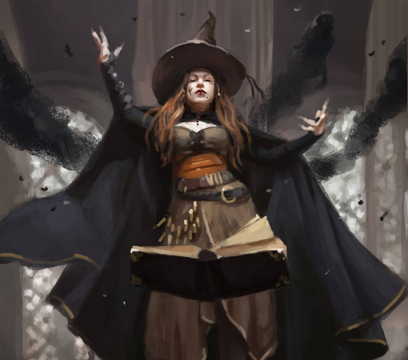
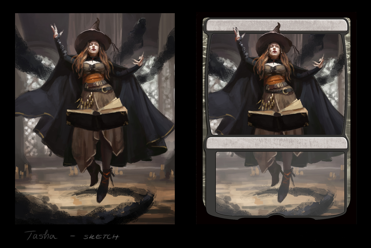
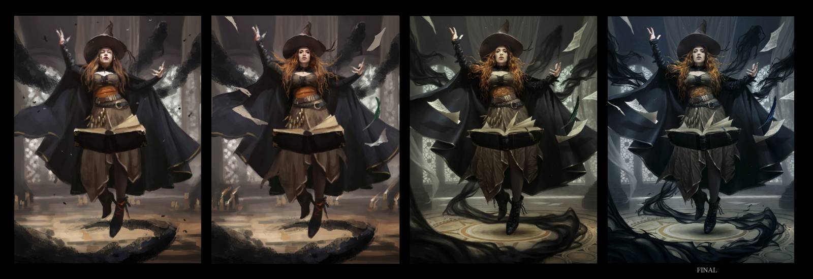
After all that research and reference gathering I started putting down some brushstrokes. I remembered one of the Art Directors saying in an interview once that they would much rather see one great sketch than 2 mediocre ones, and since so much work already went into building this concept I decided that I would just focus on making it as cool as I possible. Here´s what I sketched:
I was quite happy with the overall mood and read, and also with how the composition looked in template card frame. With Planeswalker pieces there´s always an emphasis on having everything important in the top half, so that the text box wouldn´t cover any essential information.
I sent in this sketch and got some great feedback. The AD loved it overall, especially Tasha’s pose and confidence, which made me quite happy (no need for second sketch!). There were also some notes.
It happens from time to time after receiving feedback that asks for changes, I start to worry that even the slightest adjustment would make the piece “fall apart”. All the elements of a painting have to play together to create harmony and since that´s so difficult to achieve, sometimes I really I don´t wanna hassle with it. But usually I shake these thoughts as quick as I can and decide to trust the AD´s ideas and also trust my ability to find ways to make any adjustments look good
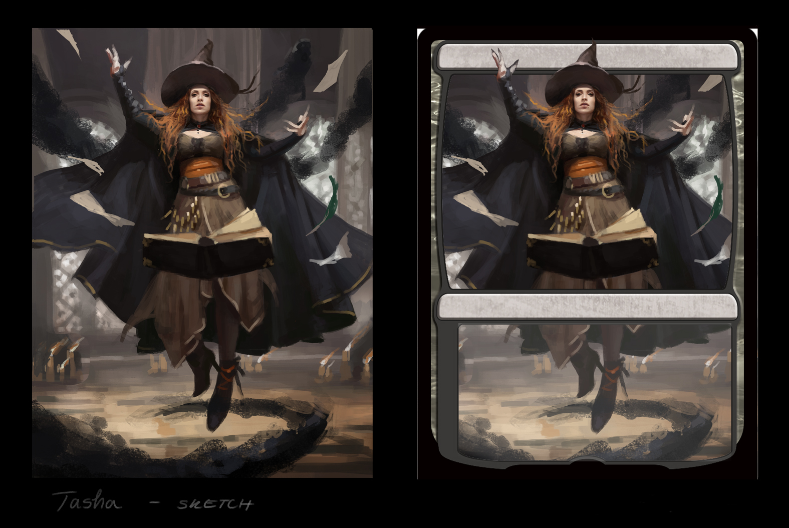
What was requested here was to add more movement. The character needed to look more like she was flying, even without seeing her feet, since on the card they were going to be covered. AD suggested having her hair move, and maybe have some flying objects around her. After actually seeing how the changes looked I thought those were great ideas.
Now the sketch got approved and I got the go-ahead to finishing it.
As you probably noticed, Tasha´s face changed as the piece progressed. It was me who posed for the first concept and so Tasha´s face was definitely too round and generally not how I pictured this evil witch. Also the flying hair idea made me wanna make it spectacular. And I knew just the person with the most spectacular hair.
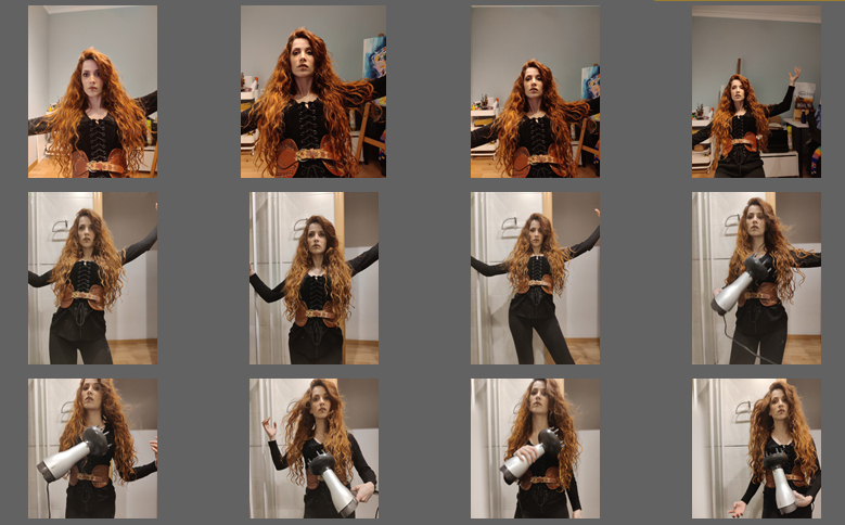
As all of this was happening during the highest peak of a Covid-19 pandemic, I wasn´t able to meet with any models in person. At first I thought this was terrible, especially for an artist like me who spends a lot of time getting the perfect shot, but then I figured I could try working with someone at distance!
This idea opened up a pool of various possibilities, different face types, skin tones, hair styles, since I could approach anyone I knew online. What was needed was a good sketch that communicated the pose and angle of the face well, not too demanding lighting scenario and some direction on how to position the camera. I approached my friend Marta Nael and she was so kind to agree and pose for Tasha´s likeness. Since she happens too be an artist as well, she was very skillful an considerate in taking many photos from which I could get all the information I needed. Quantity is important, not one photo will ever have everything but collectively they do.
As I continued rendering out the piece I kept adding more and more detail to the whole scene. It´s very important to keep the quality consistent in all parts of the image, which I sometimes need to be reminded by my mentor, especially as I come closer to the finish and my eyes are tired.
Somewhere in the process there was color change requested as well and the illustration went from the original warm palette to colder blue which was more reminiscent of necrotic energy being summoned. I was again a little hesitant about this but after I actually tried the shift and saw how it made Tasha´s wild hair and the leather belt pop, I ended up loving the change.
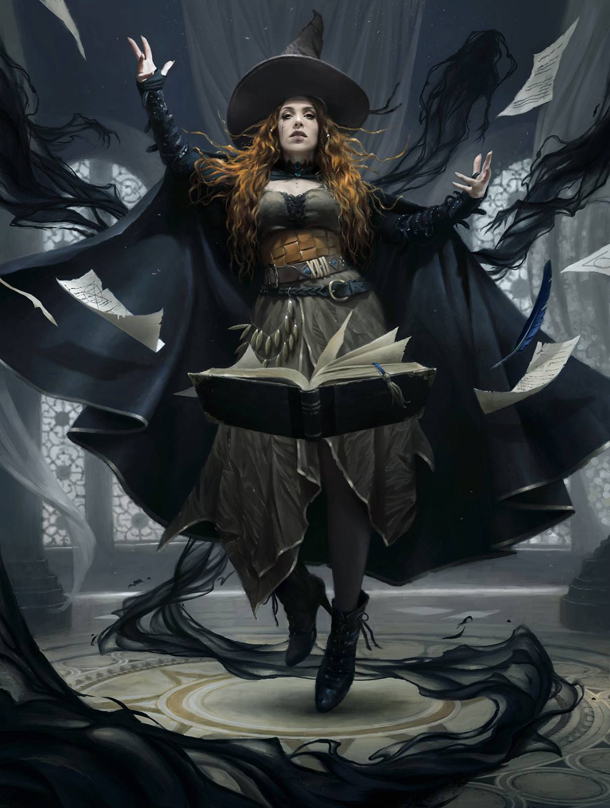
And after all of this, the final! Hope you liked this article and found it informative!




It’s very cool seeing how you got the reference for such a cool piece and how it evolved. That gives me a lot of inspiration for my own pieces.
Hi, I’m a junior artist,
fresh out of school. I just wanted to tell you that your work is literally mind-blowing to me, and I definitely would love to read another article like this. Keep up the great work! 💪🏻💪🏻