I moved across the country last year. The preparation and execution of the move—not to mention the process of settling into our new home—was protracted and I ended up taking several months off from work. On the upside, I had one less thing on my plate to deal with. The downsides, however, were many. First, art is kind of therapy for me. It turns out that I really need those snippets of time where I get lost in painting. In fact, the meditative aspects of doing this for a living are something I’d been taking for granted. Second, it really dinged me in the wallet. I didn’t earn money from commissions because I was forced to turn them down and that in turn meant fewer paintings to sell.
Because of the logistics of the move, the amount of time we spent between homes, taking that hit was necessary. But I was itching to get back inf front of an easel the entire time. Happily, when I finally could commit to taking work again, Zack Stella handed me a dream piece.
Completely understanding the description of the piece requires some knowledge of Magic: the Gathering lore that I’ll do my best to explain. I was asked to paint a “Phyrexianized” kavu attacking a part of the Mana Rig amidst an epic battle. Yeah…there’s a lot there. First off, the Phyrexians are sort of a bio-mechanical race. Some of them can infect living beings and turn them into fellow Phyrexians…I guess. Kavu are kind of giant reptiles. They’re somewhat diverse aesthetically, but generally they have a bulky, powerful build with giant heads and big mouths. Here’s a link to a Google search showing various Kavu cards: link. The Mana Rig…well, it’s kind of a giant walking building. Sort of….for our purposes, “walking building” is close enough.
Point is, it’s all a bunch of made up stuff from the universe of Magic: the Gathering—most of which ties directly to pre-existing designs. My job was to apply the appropriate design sensibilities and then mash all those disparate ideas and designs together into one image.
To start with, I focused on the design of the kavu since it was the focus.
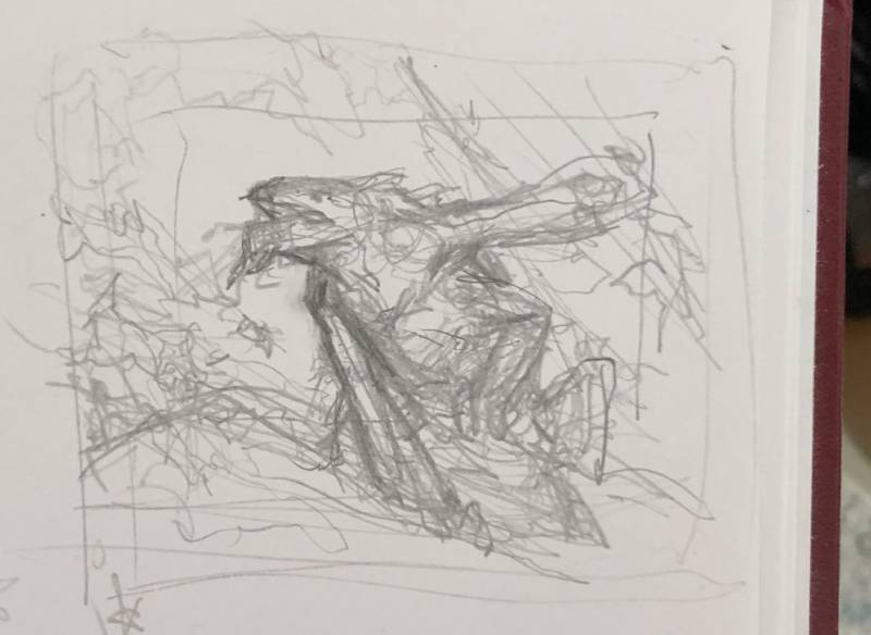
Normally I do these little doodles, take a quick cellphone shot of them, and then start drawing on top of them digitally.

Despite a more robust body of concept art and direction to take into consideration, there remains a through-line that has been consistent with Phyrexian design. At its heart Phyrexian design is anatomical, but not necessarily anatomically accurate. Inorganic parts often retain organic shapes and often there’s goo. Lots and lots of goo.
Long story short, I’ve always taken to this kind of thing fairly easily and so creating Phyrexians continues to feel more like play than work.
With the above sketch, this is as far as I got before I kind of lost faith in it. But, I did carry some of the elements I doodled here forward into the second iteration.
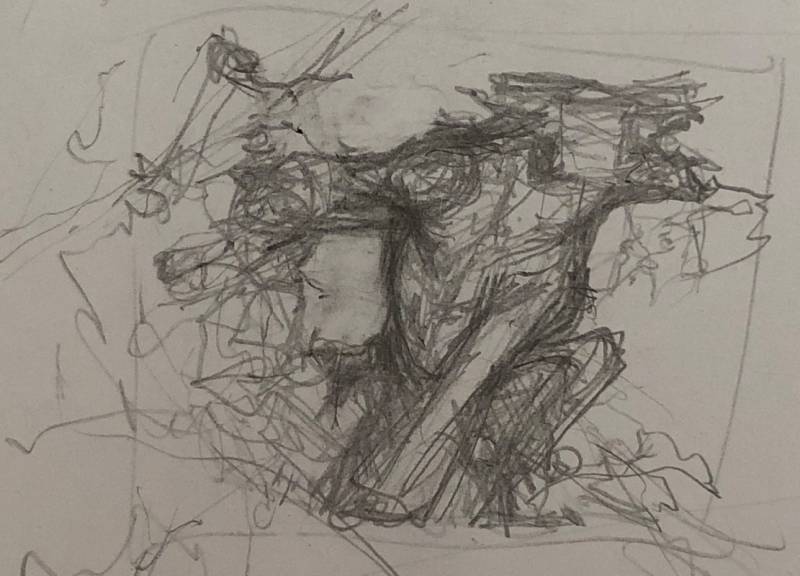

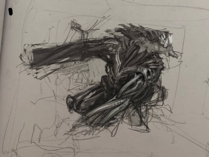
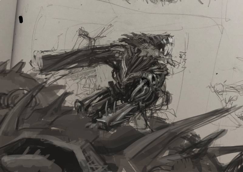
At this point, I was having a hard time with the notion of the kavu hanging onto the walking building. I was having a hard time figuring out how much of the city we’d see, the scale of the scene…and pretty much everything that wasn’t the kavu itself. My primary issue with the building was that it was nigh impossible to make it clear what the kavu was attacking. For it to clearly be the Mana Rig (walking building) I’d have to pull back far enough to show something of its iconic design, which would ultimately undermine the focus, which should be on the kavu itself. So, I began pondering versions of the piece that included fewer factors than were listed in the art brief.
Side note: Generally speaking I find it valuable to assume that everything in a given art brief needs to be in the picture and try to incorporate it all whenever I can. Magic descriptions often build in wiggle room with liberal use of the word “maybe” in listing things, so liberties are not unheard of and generally if you can give them something cooler that doesn’t incorporate everything in the brief, they’re very much open to it. Other clients, however, are less so.
Still, I wanted to try to make it work as I felt the version above wasn’t really working either. So…
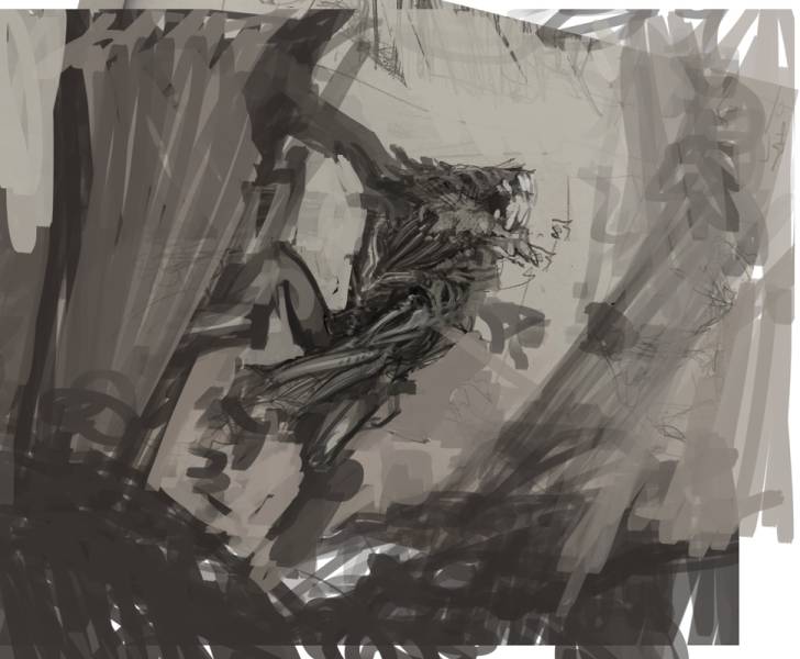
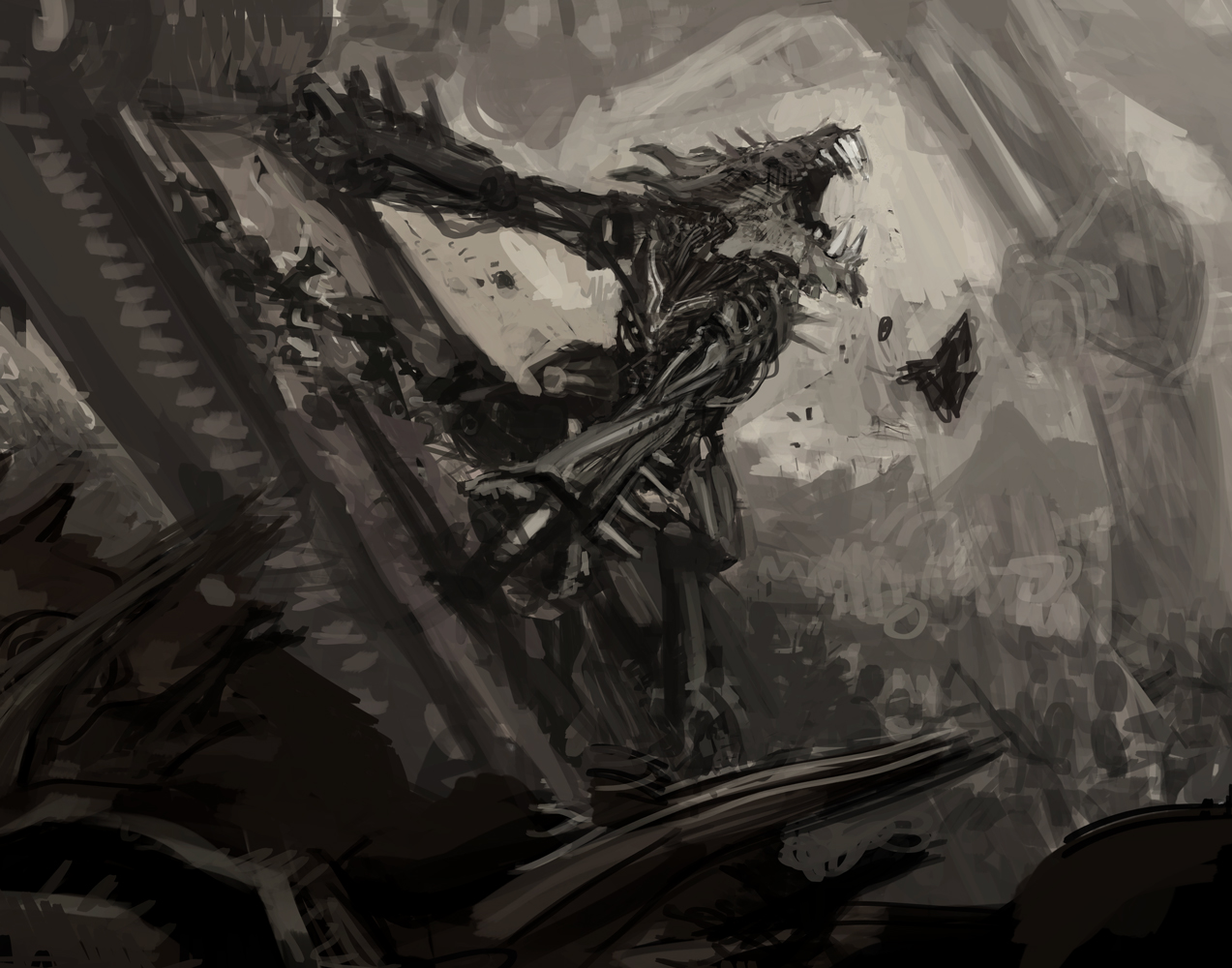
The result was a mess, but there was something about it that I liked enough to keep the layer. All I needed was to find a way to build on it.
Also of note, I returned the forearm of the kavu to a previous iteration as I felt it had more of a bio-mechanical vibe to it, whereas the other version felt more like a car part.
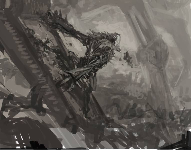
Compositionally, I realized that angling the “foot” of the city in juxtaposition to the kavu’s pose solved a lot of issues for me and also kind of gave me a nice little story beat where at the extreme left I could show a torn hunk of metal that we’d see being spat out as we scanned our eyes to the right. Also, framing the kavu with more of the building’s “legs” helped reinforce the focal point. Still…it wasn’t quite there.
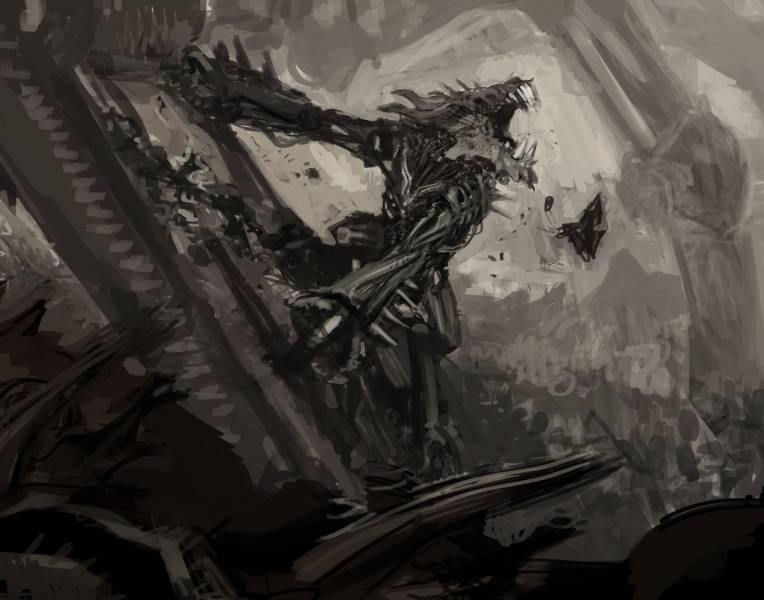
Also, those changes also allowed me to turn a certain layer off and on in order to amuse myself.
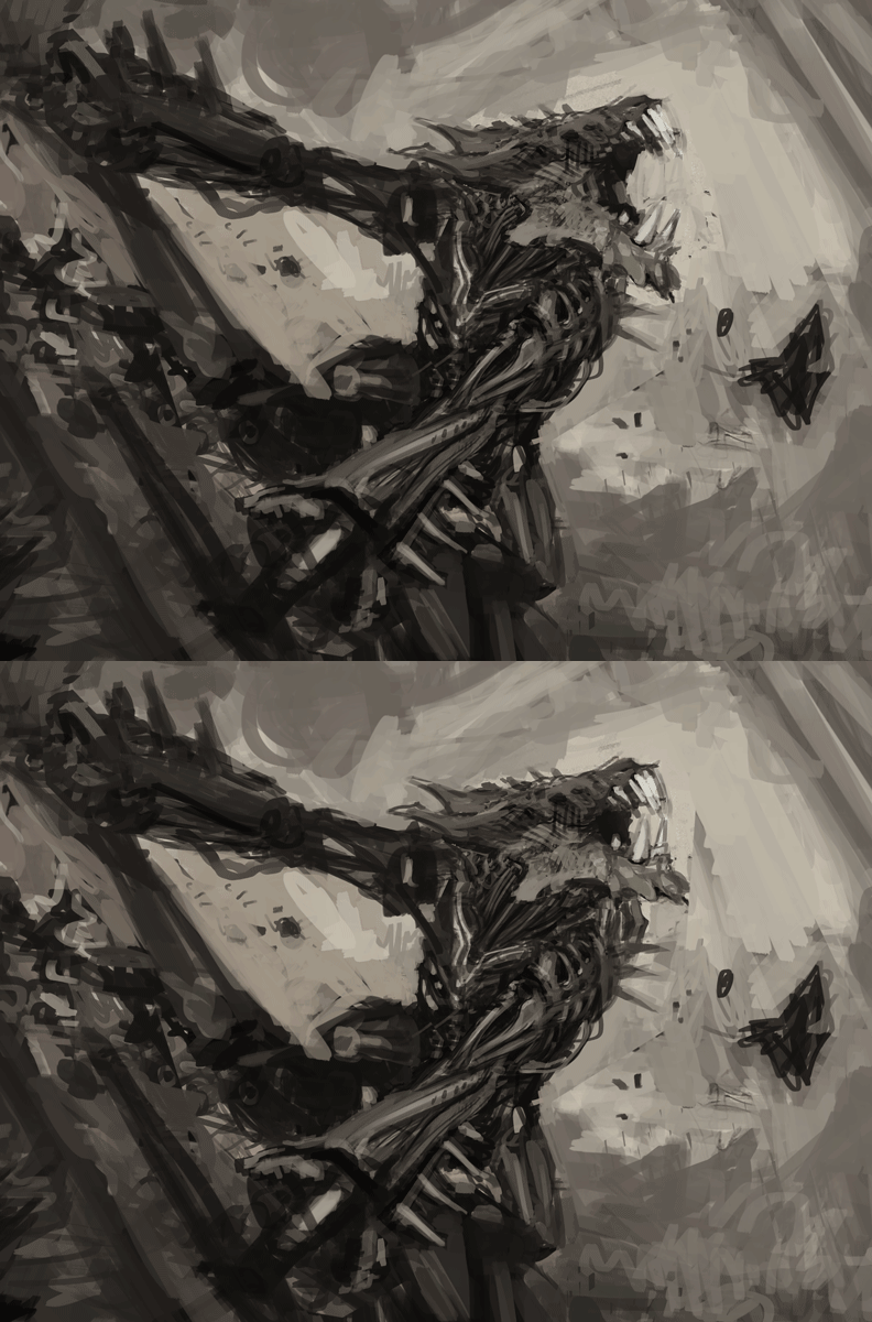
Anyway, I handed the above sketch in to Zack Stella, my AD for this piece, and he stamped it with his approval asking only that I add some hoses or cables coming out of it the kavu’s back. This, of course, was not a problem and so off I went to transfer my drawing.
Next month I’ll delve into the painting process, which was surprisingly quick and involved some supplies I’d never used before.




Rad! Some serious mean looking energy comin outta this piece. Extremely metal. Plus, always stoked when the Phyrexians make an appearance. Great stuff and excited for round two! New supplies eh…?