As a Magic artist (but not a Magic player), I’m sometimes unsure of how the images I’m painting will fit into the gameplay mechanics… and, more importantly, how I can tease out the common thread that will tie an illustration to my own intentions as an artist – creating a painting that will have resonance beyond its function in the game.
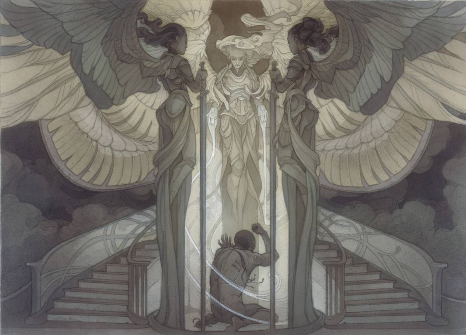
In this case, though, these dual purposes aligned perfectly: for both the game and for myself, this was an image about the banishment of all that drains, corrupts, or otherwise interferes with a desired peace; the refusal to allow unwelcome forces to derail one’s higher purpose, or detract from the beauty we look for in the world.
We should all be so fortunate as to have such angels on our side 🙂
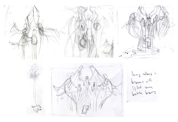
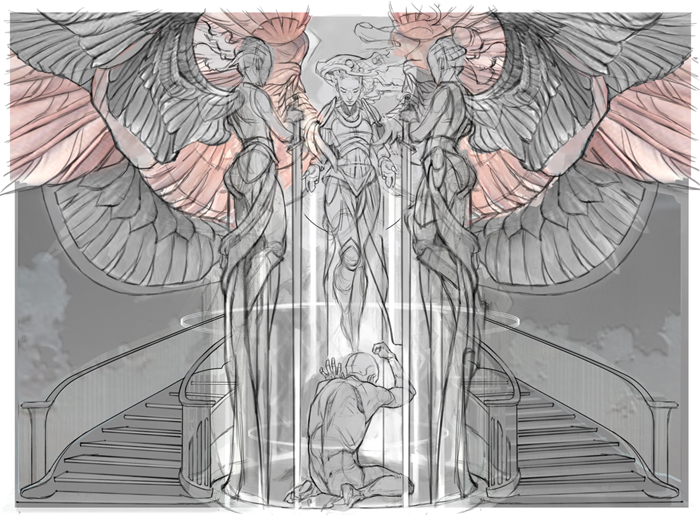
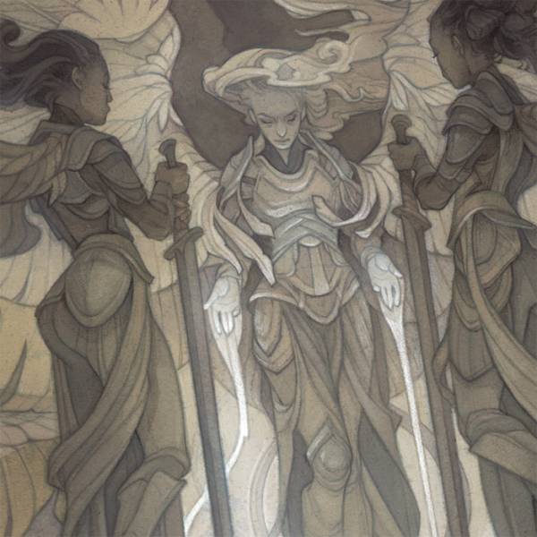
Art briefs for Magic are usually fairly specific on subject matter (in this case, three angels containing their victim in a force field of light) so my initial sketches are mostly just about figuring out how I’m going to position all those things. In this case, I have a rough idea of the composition in mind, but it still needs some hammering-out in pencil. The resulting napkin sketch isn’t pretty, but it’s useful.
It’s not unusual for me to go through multiple rounds of sketches, each just a little bit more developed than the last. The next stage, below, is more polished than my napkin sketches, but just barely – I’m zeroing in on the poses and designing the shapes of the figures.
Lately, I’ve abandoned trying to make a single, cohesive thumbnail sketch for a painting – even though it’s messier, I prefer handling each element of the piece individually, then tiling together and adapting as needed to harmonize with the whole.
Looking back on my process, I often realize that I’ve corrected the stylized anatomy from my thumbnail sketches, when perhaps it would have been more intersting not to do so. I feel like anatomy that’s “broken” by choice (rather than by ignorance) is one of the things that sets illustration apart from stock photography, and gives some soul to a piece. In retrospect, I wish I’d found a way to incorporate the leaner, more hunched figure of the kneeling man from my rough sketches.
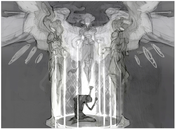
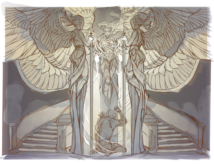
Above, my assemblage of all those disparate elements, with some consideration given to the eventual value structure. It will serve as the base for my final round of sketching below.
Thanks to my extra-rough rough sketch, there’s plenty of room for big changes at this point: a new pose for the kneeling figure, a reimagining of the stained-glass elements of the prison, and some added hints of the surrounding environment to better fill the space.
This stage is also where most of the real drawing happens. While I’ll happily trace photo reference for whichever elements I’ve deemed too tedious to freehand (in this case, wings and stairs), I’ve been finding that figures tend to turn out better when constructed from scratch – again, allowing some natural stylization to creep in where ever I can.
While the final painting will be in ink wash (making the final color scheme subject to the whims of traditional media and/or fate) a fairly developed digital color rough (above) takes away some of the guesswork, and help guide the painting process.
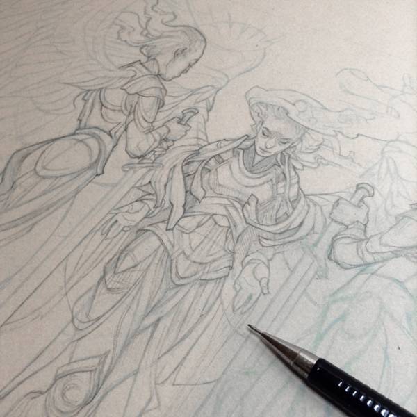
Above, starting in on the underdrawing for the final painting. I’m working over a low-opacity printout of my lineart sketch; the challenge here is to fill in the blanks when it comes to detail, without losing the energy of the sketch or the three-dimensional feel of the forms from which it was built.
Starting to paint (finally!)
I’ve tried to design this piece in just two values, dark and light. Using frisket film to mask off the light areas, I build up an allover wash of ink to only the dark-value areas using an airbrush. This saves me a lot of tedious brushwork, but is not without its costs – you can see in the snapshot above that a frisket failure has allowed some of the ink to seep underneath it and feather into the light areas.
Luckily, once I start laying in more layers of ink wash (both with airbrush and by hand) and building up the lineart in Col-Erase pencil, the little ink bleeds become a less prominent feature. I decide that leaning into the traditional-media charm is preferable to starting over from scratch.
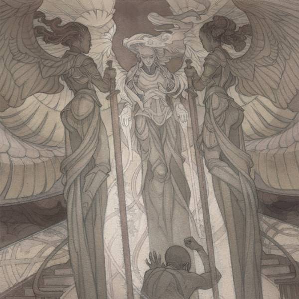
Above, finishing the piece out with some subtle washes of cooler tones to flesh out the color scheme, and adding a few highlights in white charcoal.
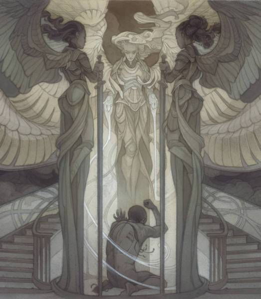
While the painting itself feels “finished” as a standalone object, I almost always like to give my card art a little bit of a digital push to harmonize with the stronger values of the frame layout – in this case, deepening the values of the background, and knocking back the value and color of the main figure ever so slightly to enhance the glowy effect.
Prints of this piece are available for a limited time, and the original painting will be going up for auction later this week – links to both can be found at https://wyliebeckert.com/live.






Awesome as always!
I am never not inspired to get to work when I see your art and your process!