 |
|
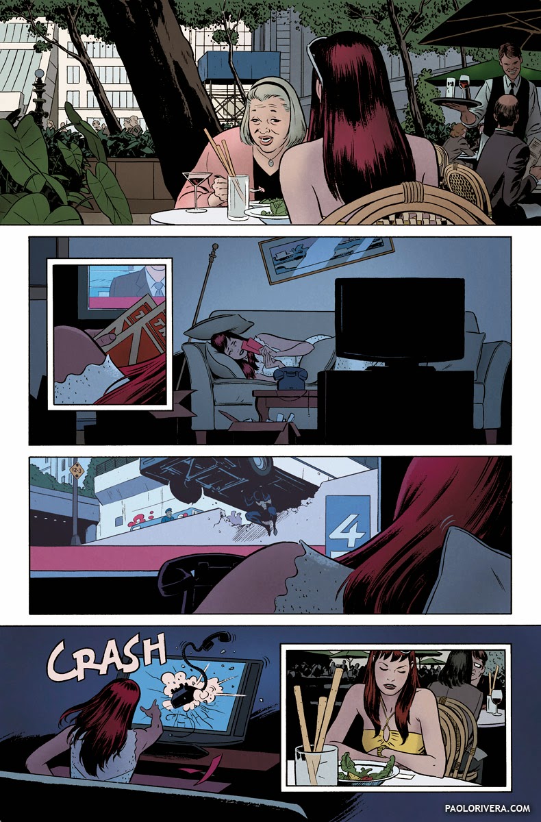
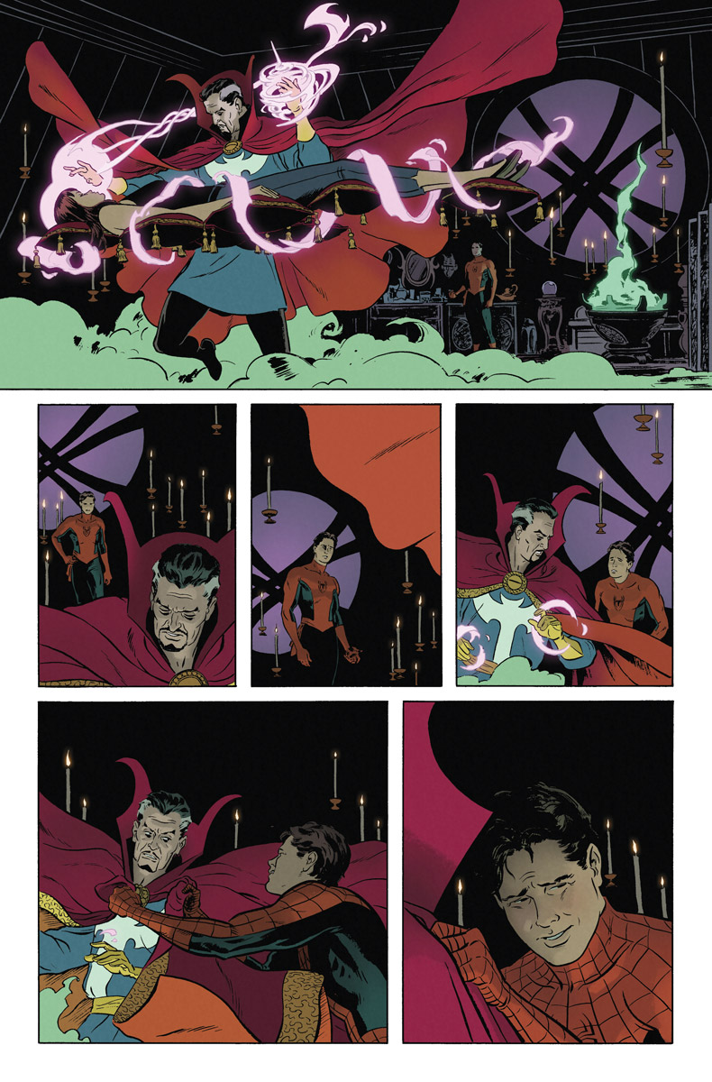
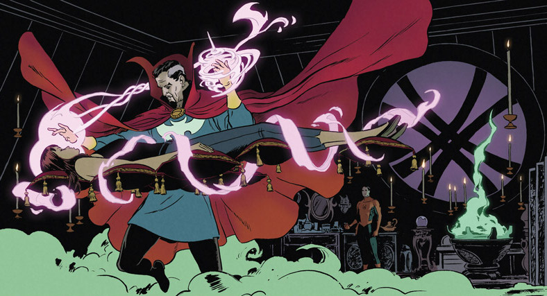
AMAZING SPIDER-MAN 639, PAGE 12. 2010.
Ink on bristol board with digital color, 11 × 17″.
|
For my next 3 posts, I’m going to focus on the art of digital comic book coloring. Although a rather narrow subject, I hope to address some broader concepts that apply to color in general. Today’s post, however, will be a bit of a primer since many of the topics will be on the technical side.
I almost always color myself, but that’s not the case with most comics, especially those produced by the major publishers. More often than not, the tight deadlines necessitate a division of labor in which the colorist and letterer are the last people on the assembly line. For our purposes, we’ll begin with an inked page.
The process starts with a good scan. The typical comic book page is drawn on 11 × 17″ bristol board, on which a template has been printed. I scan pages at 400 pixels per inch (ppi). Since my inks usually have blue-line pencils underneath, I scan in full color, which means they can easily be filtered out. (I have a Photoshop action to automate this process, which I hope to make available soon.)
 |
|
Daredevil #10, Page 15. 2012.
Ink(ed by Joe Rivera) on Marvel board, 11 × 17.25″. |
Cropping, although fairly simple in concept, can streamline the overall process if done consistently. I have a crop tool set to the desired dimensions, 4125 x 6262 pixels, with the “Perspective” option checked. Since this allows the corners to be dragged independently, I can match them precisely to the corners of the printed border. Aside from keeping all your page files consistent, it keeps everything perfectly aligned — this is especially helpful when matching up digital elements with analog artwork, i.e. panel borders, logos, or 3D models. You can read more about the cropping process here.
 |
|
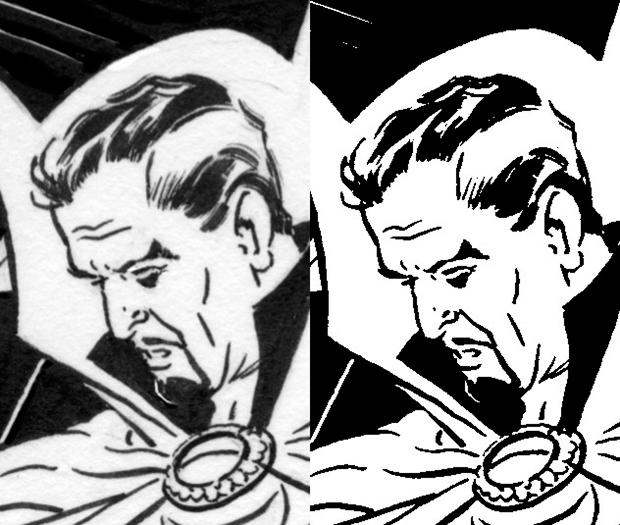
raw scan vs. bitmap TIFF, 200% zoom
|
Although our original scan is 4125 x 6262 px, the final color output will eventually be 2/3 that. That’s because inks are saved in a different file format, a bitmap TIFF, which reduces the colors in the image to just 2, black and white. (You can control the specifics of this transformation under Image > Adjustments >Threshold.) While this saves a ton of memory (a typical page is under 500 KB) it requires a higher resolution to avoid a pixelated look.
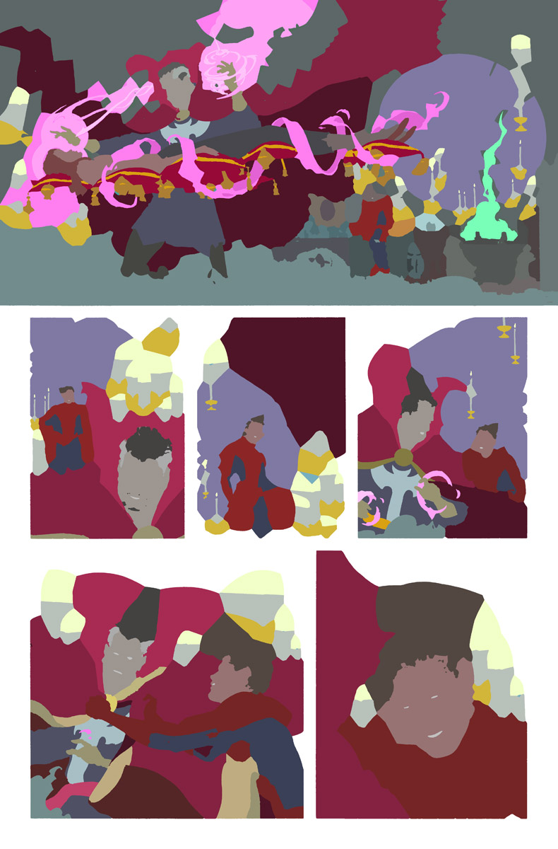 |
| Flats without inks |
I then send the file to my assistant, Orpheus Collar, who colors the image on a separate layer. This process is called flatting, its purpose being to break up the the image into shapes, rather than to produce a finalized color scheme. Flatting makes it easy to select and alter patches of color. What he returns to me is an RGB file with at least 2 layers, more if there are “special effects,” pictured below.
 |
| Elements that will “glow” can be isolated on a separate layer. |
There are plenty of tutorials on-line, and even some automated plug-ins, but I’d like to go over the basic concepts. The inked page goes on the top layer, the mode set to “Multiply,” which makes all the white pixels transparent. The “flats” layer goes below that. The key to easy selection is making sure the flats aren’t anti-aliased, meaning that no 2 colors are blended at the edges.
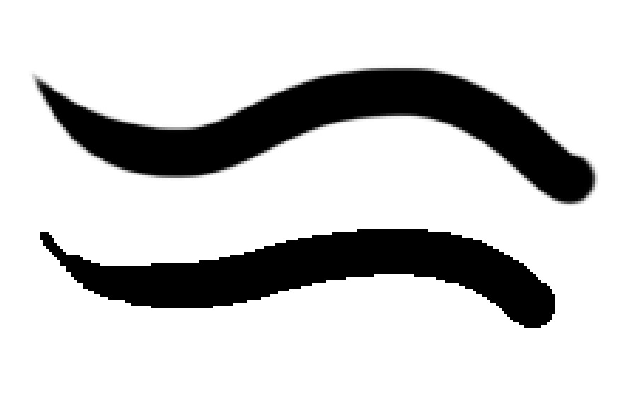 |
| Brush vs. Pencil |
In order to preserve those hard edges, I use the Pencil tool when editing the flats (as opposed to the Brush tool). If I use the Magic Wand to select pixels or the Bucket to fill them, the tolerance must be set to “0” to avoid blending colors.
 |
|
AMAZING SPIDER-MAN #640, PAGE 22. 2010.
Ink on bristol board with digital color, 11 × 17″. |
Lastly, I color every page at full resolution, just in case I ever need a bigger version. It’s also to avoid a mistake I sometimes see colorists make. If you downsize your inks in their native, 2-color format, the inks will look pixelated when printed. Also, if you downsize your flats before coloring, it may not preserve the hard edges you worked so hard to create. While there are a few ways to avoid those issues, saving reduction until the last step makes everything easier.


So informative! Can't wait to see the next posts. Thanks!
Thanks, Jamie! If all goes as planned, I'll have a video completed for each of the next 2 posts.
That's awesome! Thanks for sharing and already looking forward to parts Two and Three!
Here isa question from a student Paolo: How are the shapes made in the flatting step? Magic wand? Drawn?
Thanks for another great and informative post.
To tell you the truth, my assistant takes care of it most of the time. I think he uses the plug-in linked above. The few times I've done it myself, I'll copy the inks onto the flat layer and use the bucket for as long as it works. The cleaner the inking style, the easier this will be. The more hatching or dry-brush in the inks, the harder. No matter what, every piece requires some level of hand-drawn shapes.
Great article Paolo. You mention scanning an 11 x 17 page. Do you have a large format scanner? I'm interesting in getting one that is larger than the normal size.
I do: the Epson GT-20000 (about $1000). It's just big enough for this sort of thing. My Dad uses a Brother printer/scanner, which is fine for inks, but not great for painted work (but it's a whole lot cheaper). A blog reader also told me about another combo printer/scanner, the Epson 7510. He seemed to like it, and it was relatively cheap.
I have an epson 7510 and am very happy with it. it works just fine for painted art as long as it is pretty flat. Those cheaper scanners don't have a big depth of field. The real trick though is to scan the art at a higher res. While 300 dpi is good for a photo scanner these all in ones you need to scan at more like 800-900dpi to get the same results. But you can get them and save a lot of money. For under $200 the epson 7510 is a no brainer. Great post Paolo can't wait for the other parts!
Yeah, I think that's what I would get if I were in the market again. Hopefully that won't be any time soon.
I see all of these replies from 2014 — is this a repeat article?
Love to know the process for dropping the blue-line pencils in Photoshop — I can never seem to get a clean drop.