 |
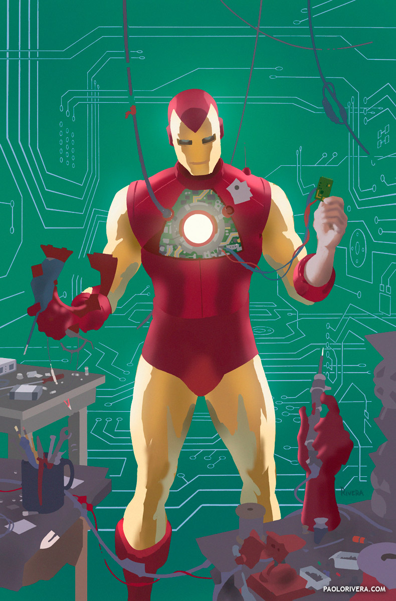
| IRON MAN VARIANT COVER (sans inks). 2012. Ink(ed by Joe Rivera) on Marvel board, digital color. 11 × 17.25″. Step-by-Step post |
Apologies for having posted this art previously, but it’s the subject of today’s video (I figure that’s a good enough excuse). Now that we have the technical info out of the way, I want to get to the heart of the matter: how to choose color. I’ve written about color many times before, but as always, there’s a world of difference between theory and practice. This post is all about the latter.
Put simply, it’s trial and error. Starting with artwork that’s been flatted, I use the Magic Wand (tolerance set to 0) to select each patch of color that I want to modify. I then use the Hue/Saturation/Brightness command (under Image > Adjustments, or Command-U) to modify those parameters individually.
That’s it. Really. Here’s a video of the process in action.
Since I do this quite a bit, I’m always looking for ways to speed things up. I often use the Tab key to jump from one dialog box to another, and the Up/Down arrows to change the quantities. Holding down Shift with the arrows raises the increments to 10. If I use the cursor, I grab the name, “Hue,” as opposed to the slider — it’s a bigger target and shifts the color more quickly. (I have more time-saving tricks in my Cintiq post.)
 |
| The “Colorize” option |
Sometimes the results of the Hue dimension can be tough to predict. When that’s the case, check the “Colorize” option — it resets the all the variables so that you can achieve any color in the gamut in a predictable way. One caveat, though: if multiple patches of different colors are selected, it will unify their Hue and Saturation, leaving only Brightness to differentiate them. (Sometimes that’s what you want.)
There are, of course, many other principles to keep in mind. Having a familiarity with color will help immensely, but if often shocks me how simple the process is, especially remembering how much I used to struggle with color. (The digital aspect of color alteration is so easy, I use it to plan all my traditional work as well.)
Hopefully, seeing the process in action will help to show how decisions actually get made. The first step is pretty straightforward: Iron Man is red and yellow. My assistant usually does a fine job of assigning the correct colors to each character and element, but there’s always some fine-tuning to do, or certain ideas I need to get across. You have to start somewhere, and this is always easiest for me (because I already know what the goal is).
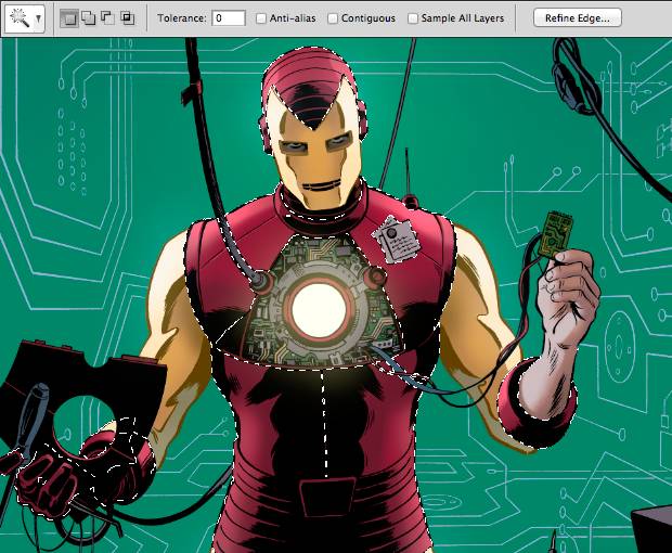 |
| Make sure the Tolerance is “0” and all options are unchecked. |
When selecting color with the magic wand, I usually leave the Contiguous option unchecked, so that it will select anything in the entire piece that’s the same color. I do the opposite with the Bucket (tolerance set to “0” as well) since I usually want to color just one patch at a time. I use the bucket primarily at the outset — it’s quick and easy, and best for bold moves with clear goals.
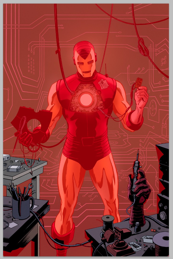 |
| A Quick Mask to show the foreground group. |
But elements don’t have to be the same color to be treated as a group. I use the Channels palette to save selections that include different patches of color. These are called Alpha Channels, and they are useful for backgrounds, characters, groups of figures — anything you would like treated as a single element. If you’re not familiar with Channels, it’s worth your time to learn (you can start here). Once an alpha channel is saved, you can Command-click on its icon (in the Channels palette) to automatically make the selection again.
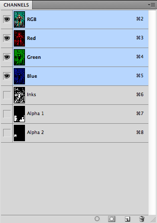 |
| RGB Channels and saved masks |
Once the easy decisions have been made, I begin to think more about mood, atmosphere, and environment. If there’s an art to it, this is where it’s at — give 10 colorists the same piece, and this is most likely where they will begin to diverge.
While I’ll occasionally go off-model for characters, I tend to wait until I have their official color schemes in place. That way, global changes in color will retain the same relationships between isolated areas. The same goes for skin tones.
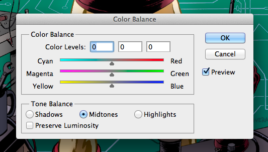 |
| Color Balance is best for subtle shifts. |
I also use Color Balance (Command-B) for adjustments, typically for less dramatic changes — a bit more cyan, slightly less green. When I’m more concerned about overall mood or lighting, I’ll create a Photo Filter adjustment layer that will give a color cast to the entire piece. Be sure to check the Preserve Luminosity option if you want to retain your brightest areas. I like keeping it on a separate layer because I can tweak it as I make progress. Once I’m satisfied, I combine it with the main coloring layer. You can also mask this and other adjustment layers using your saved selections in the Channels palette.
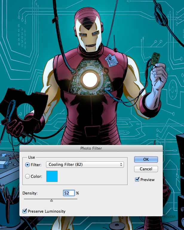 |
| The Photo Filter is great for getting colors in the same “key.” |
I wanted to make special note of color modes. I work in RGB, Photoshop’s native method for calculating color. Although print is almost always my ultimate goal, I don’t convert to CMYK until the very end. I’ll cover the details of the conversion process in the next post, but you can find my reasoning here. The next and final installment will cover rendering and special effects.
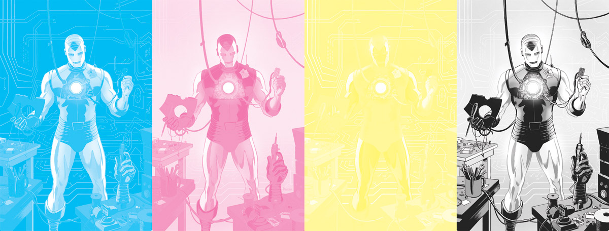 |
| The CMYK channels of the final, flattened artwork. |
Finally, my Digital Tool Shop is up and running — as of now, it has 3 products to help streamline comic production (with more to come). My blue-line conversion template is free to download.



Always love your tuts. Def. will try coloring this way next time. Thanks
Great stuff. I really struggle picking the right colours and your 'trial and error' method makes a lot of sense.
Thanks, guys! Color is relative, so it always helps to make those decisions in context.
Do you ever farm out any of these stages? I worked for a guy doing flatting briefly and was wondering how common it is to do that. The other flatters and I basically just divided up the pages into cells the the colorist could quick select on top of.
I sure do. Be sure to check out Part 1 for all the details: http://muddycolors.blogspot.com/2014/04/comic-book-coloring-part-1-of-3.html
I want to tell you how really helpful your posts have been. Maybe I'll just stop teaching and send people here.
Awesome, I must've missed part 1 when it came out. I actually went to school with Orpheus, small world, haha
Small, indeed — Orpheus was my summer intern just before his junior year. Jose Villarrubia put us in touch.
Don't stop! Thanks for the kind words, though.