Last week I had the chance to see a rather unique exhibition, so I thought I’d write a bit about it here.
Rone is a Melbourne based street artist who creates site-specific work in the form of murals and installations, often transforming abandoned buildings into immersive works of art that visitors can walk through and explore. His latest exhibition – TIME – takes over a disused space in Flinders Street Station, one of Melbourne’s main train stations.
There are a series of abandoned rooms on the third floor of the train station, which over the years has been used as offices, classrooms, and there’s even a ballroom. The station was built in 1910, and these rooms were in use until the mid 80s. The space has become somewhat of a local legend; almost every Melbournian knows about the hidden derelict ballroom above the train tracks at Flinders Street. Though the station is very much still in use, its upper level had remained closed to the public until being reopened as an arts space last year.
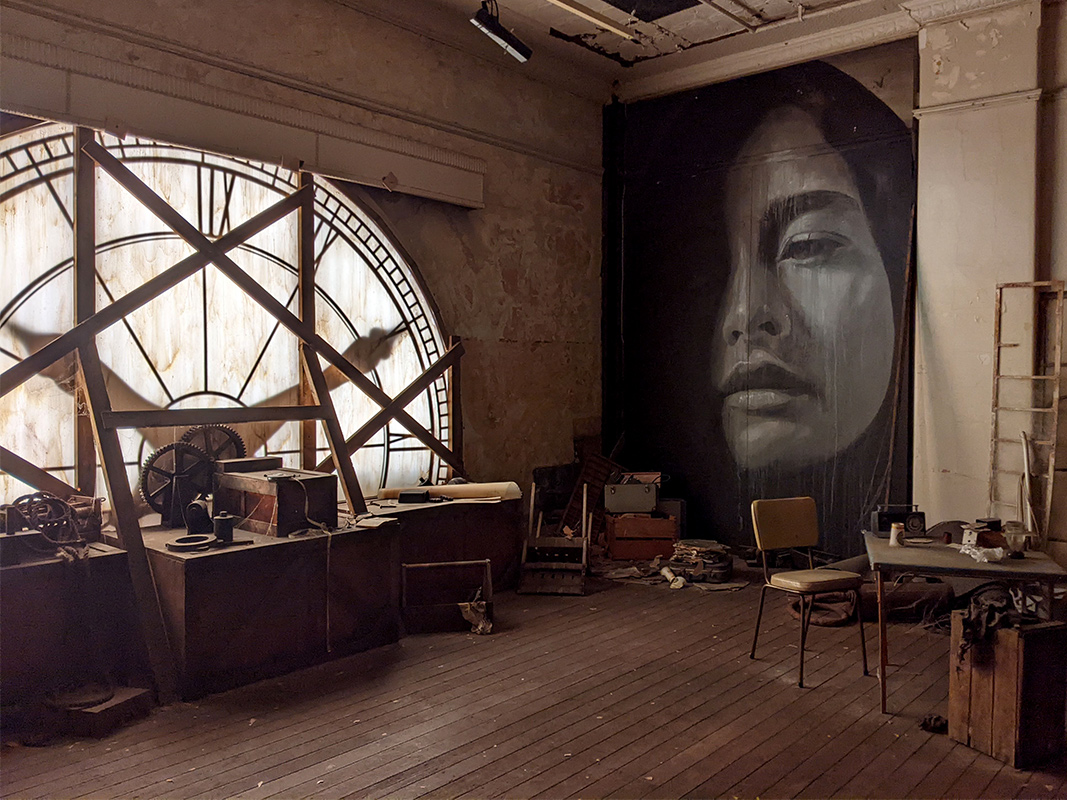
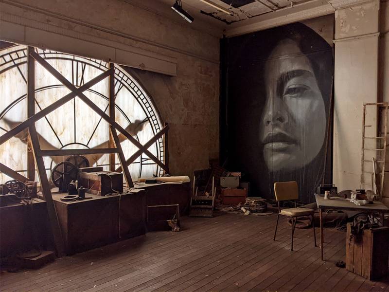
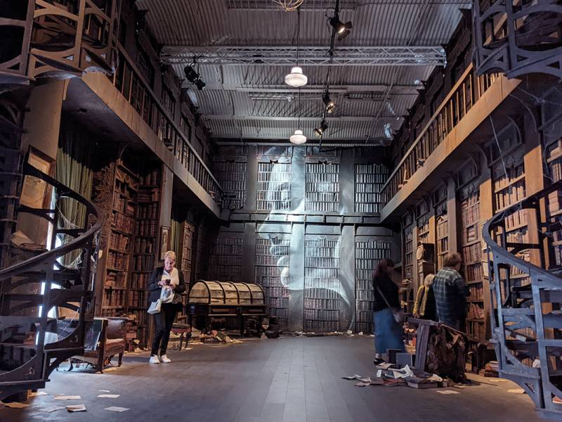
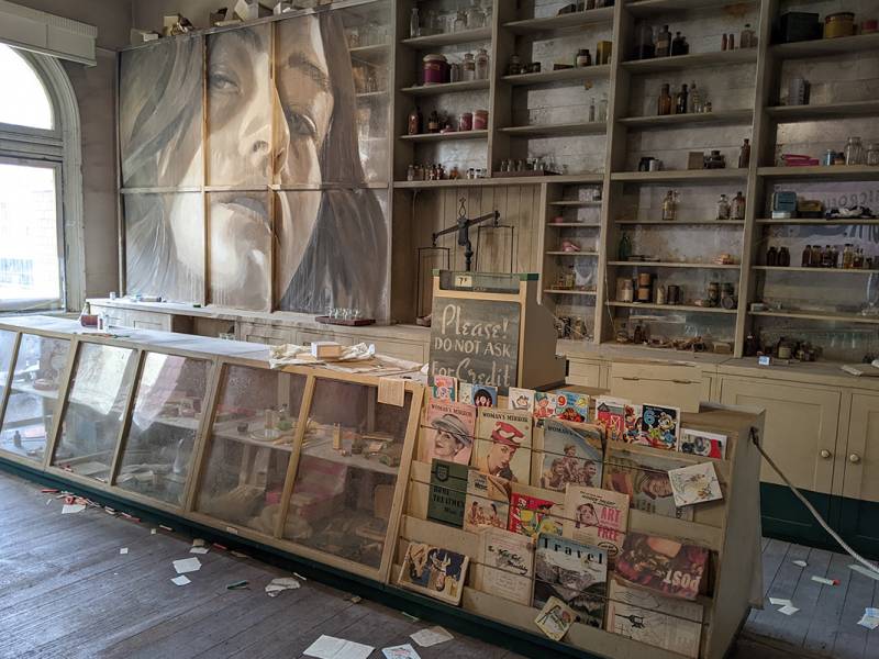
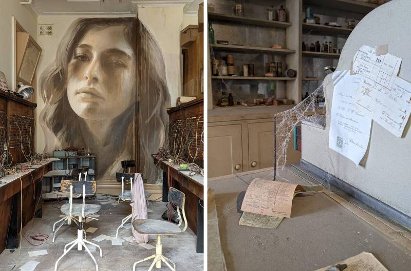
The exhibition takes place across these rooms, connected by a long hallway. Each room has been curated with some sort of theme or concept. There is a room that looks like a pharmacy, a sewing workshop, a whole multi-level library (!), etc. All the rooms appear frozen in time, with a layer of dust and cobwebs covering objects seemingly haphazardly scattered, but actually carefully arranged. Through the use of props, soundscapes and light – and in other exhibitions, scents! – Rone creates these haunting immersive spaces that make you feel like you’ve travelled to a different time or imaginary place.
The artist says of this exhibition that it is a “nostalgic love letter to mid-century Melbourne”, and also “a response to both the grand scale and character of the site and the minute detail of a period of Melbourne’s history long lost to progress”.
Just to reiterate, what you see here is entirely created by the artist – not just the murals, but the bits of debris, furniture, and ephemera are all carefully curated. Rone has taken the blank canvas of these disused rooms and added to them, creating essentially an imagined version of what you might find in an abandoned space.
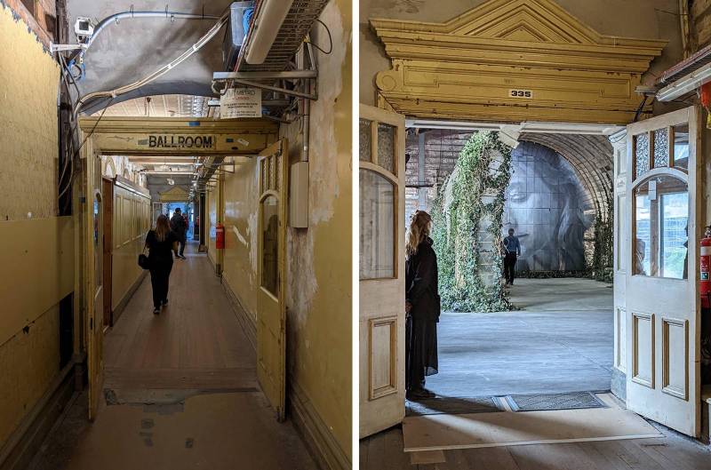
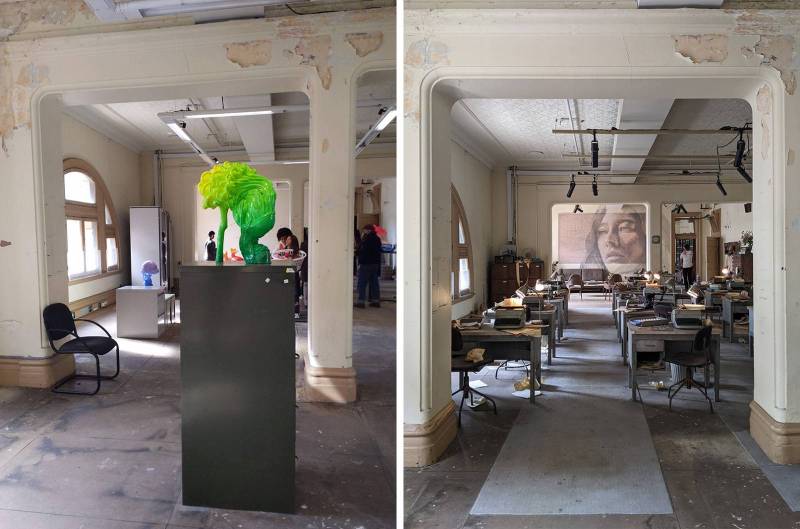
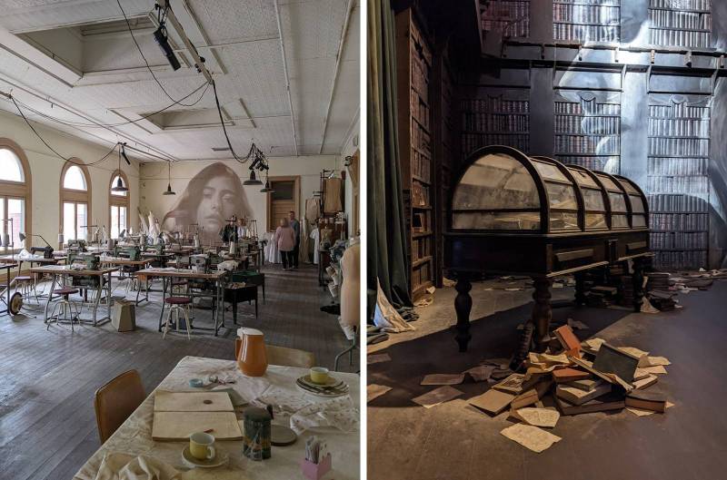
Here you can see how one of the rooms would normally look (left, taken during a different exhibition), compared to how it has been transformed (right):
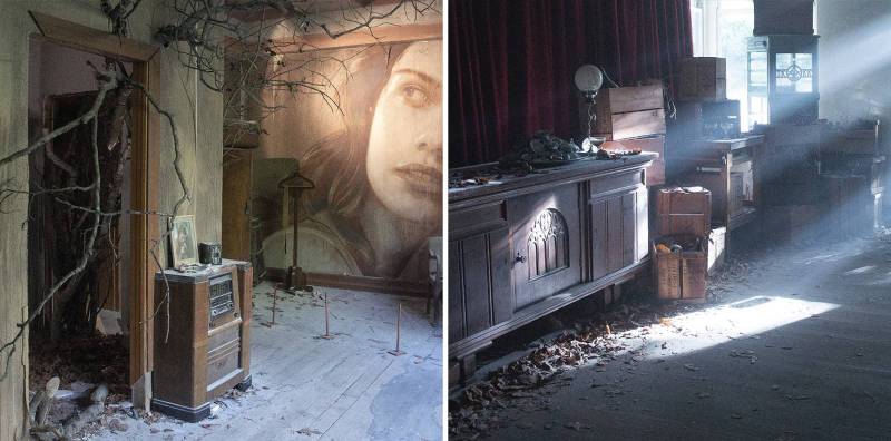
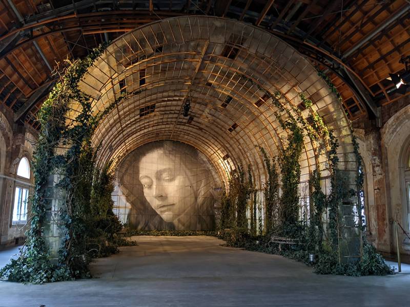
This is not the first Rone exhibition I’ve seen. A previous show in 2019, titled EMPIRE, was held in an old mansion which was soon to be turned into a hotel. That show leaned into Art Deco aesthetics, which suited the space, and the theme was more centred around faded opulence and decay, in a very Great Gatsby meets Lana Del Rey sort of way. I brought along my camera with a toy lens to that show, and I wanted to include some of those photos here. Though they are from a different exhibition, I feel the photos capture the atmosphere and feeling of walking through a Rone exhibit much better than my quick phone snapshots from this latest exhibition:
Back to the more recent show; one thing that I found particularly thought-provoking was the way in which the viewer responds to, or interacts with the work. Wandering through each room, it’s easy to imagine what they once might have been used for (in reality), and wonder why the (fictional) space was abandoned. The murals themselves appear large and ghostly on the walls, and as you explore, stories about the people who might have occupied these spaces emerge, prompted by the things you encounter.
For example, in the typewriter room, I noticed a pamphlet placed on one of the tables titled ‘Prospectus – School of Applied Art’, later on there is a room set up like an art classroom, and I immediately thought there could be a link there – perhaps some imaginary character was a typist, dreaming about being an artist? Of course, creating narratives inspired by art is not unique to Rone, but getting to actually walk through the art and notice tiny details introduces an interactive element, reminiscent of a treasure hunt.
There is no actual prescribed narrative in the exhibition, and the rooms created by the artist do not match what they were used for historically – but what’s interesting is that the show allows the viewer a chance to create their own stories, by selectively curating some things and leaving other details vague. This is true in illustration too; when I illustrate books, I prefer to leave things implied rather than shown literally, because it allows a reader’s own imagination to fill in the gaps – and I loved seeing this concept in practice within this exhibition.
For a space itself to tell a story and evoke a sense of wonder in the audience is so thrilling. I connected with this show in particular because capturing that feeling of awe and wonder drives much of my illustration work. This exhibition has been an excellent prompt to think about ‘breaking the fourth wall’, and how audiences interact with art. Though an immersive site-specific work of fine art is very different from book illustration, I think there are similar concepts and gems of inspiration that an illustrator could take away from an exhibition like this. Questions of how we can make 2D imagery seem more engaging or immersive, and how 2D art functions within a 3D object like a book, are all topics on my mind lately. And so maybe there will be a part 2 of this post, where I explore how illustration can take on immersive or interactive elements. Stay tuned!





Great article!