Last the summer had the pleasure of creating some artwork for “Pumpkin Seeds,” a music project created in effort to raise funds and awareness for two DIY skateparks in Dayton, Ohio.
My rapper friend Aesop Rock made this song with frequent collaborator Blockhead and featuring rapper Lupe fiasco.
I like all those guys’ work quite a bit, and while I was never like hard-core skateboarder, I definitely grew up around that scene, and then went on to work on like 5 tony hawk games, so the subject matter was near and dear as well. Was pretty excited to help out on it.
We wanted the artwork to be sort of a stylistic extension to the garbology album art created last year, but centered around the concept of a golden hour urban skateboard sesh. it was cool opportunity to explore different but familiar subject matter in the flatter, graphic style of Garbology.
Made a jacket art for a 7 inch, a skateboard (!), and t-shirt. Hadn’t done a skateboard since art school! Had ton of fun with it this stuff.
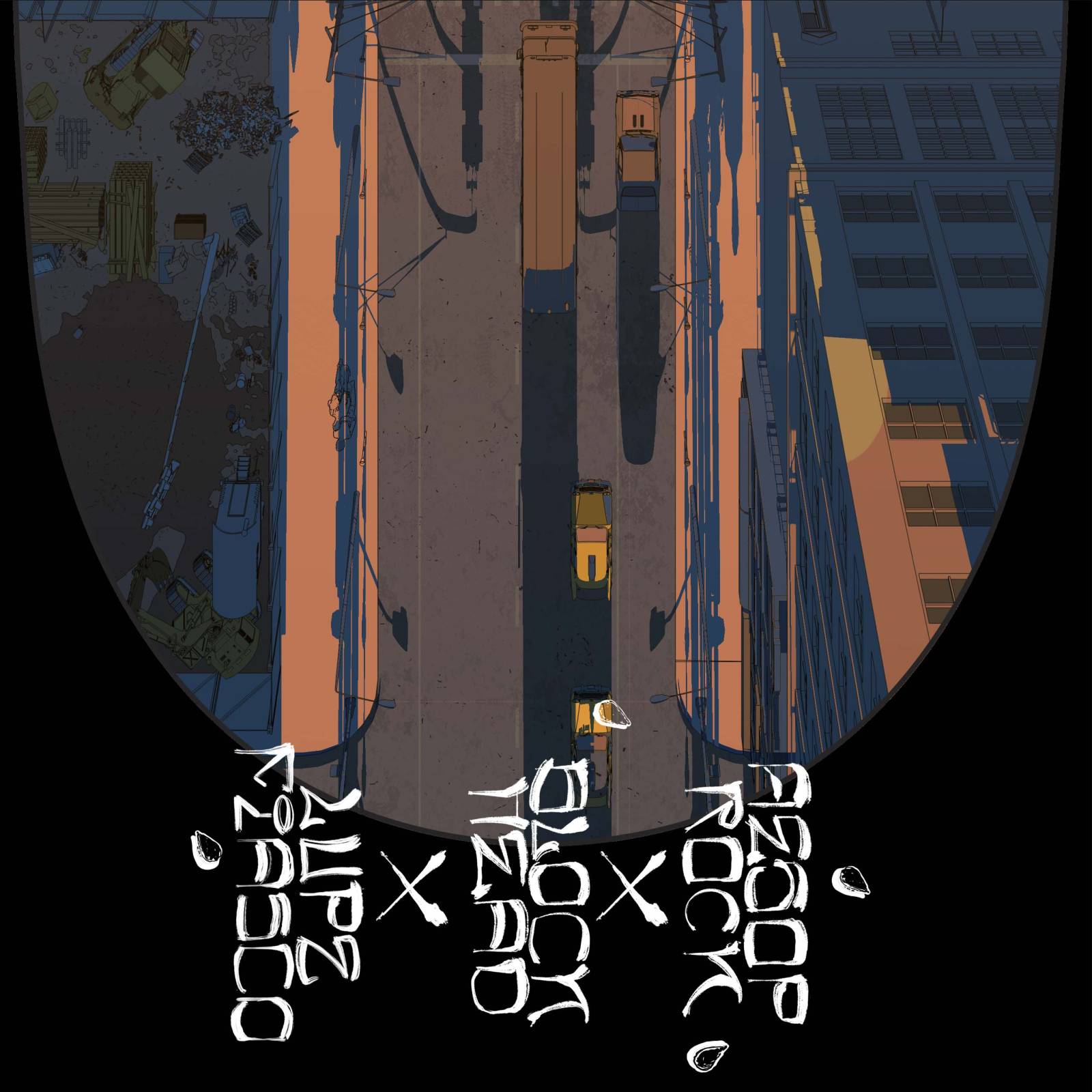
For the cover art, I wanted to try something sort of unconventional, and thought a low angle shot focusing on the sidewalk would be a cool visual intro into this urban skating theme. City sidewalks can be super gross, but also visually interesting, with a lot going on. I felt like focusing in on the detritus was a great way to root it with the Garbology stuff. Tried to fight the instinct to detail and render everything and instead keep things simple and graphic as possible.
Composition-wise I tried to get the bottom to read first, with necessary text scraped into the concrete with trash and pumpkin seeds scattered around it. The perspective is meant to lead the eye up to the sliver of detail along the top of the image, sort of completing the story.
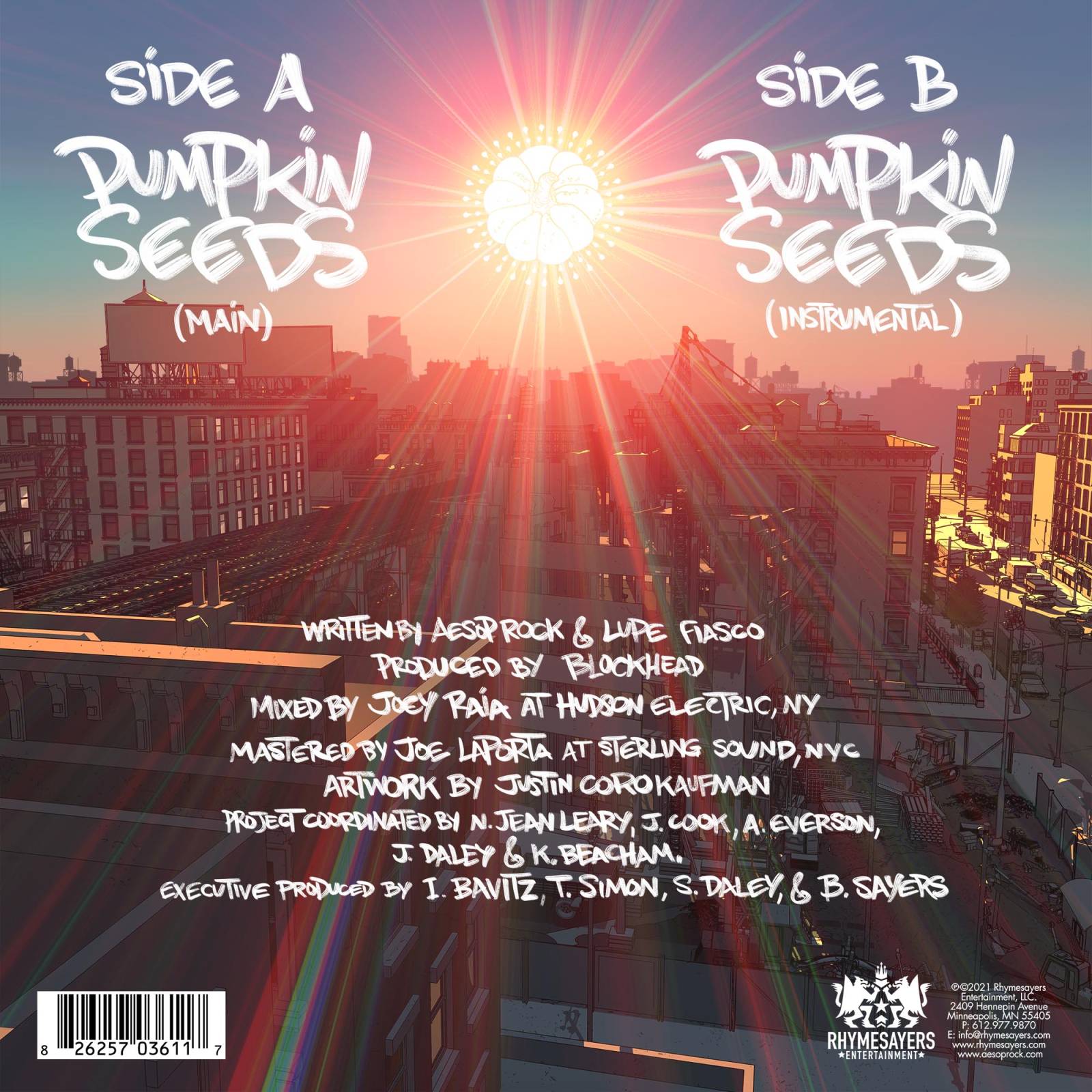
For the back cover I used a 3d city model I’ve been adding to for years now that ill use as a “digital set” lit and rendered in v-ray, composited in PS, it was really about finding an interesting angle with a good amount of depth to it. Wanted to do kind of a medium “rooftop” level shot for this one. Added a pumpkin sun with seed rays in the sky to carry the theme to the back.
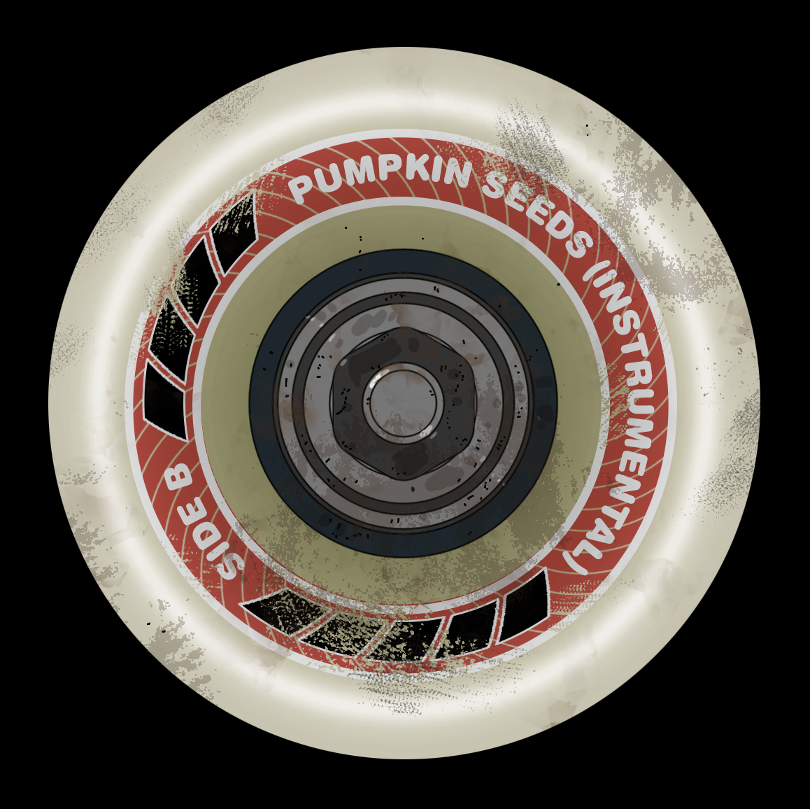
For the vinyl labels we thought it would be neat to make it a skateboard wheel, which I have to admit I kind of had more fun than I thought I would on it.
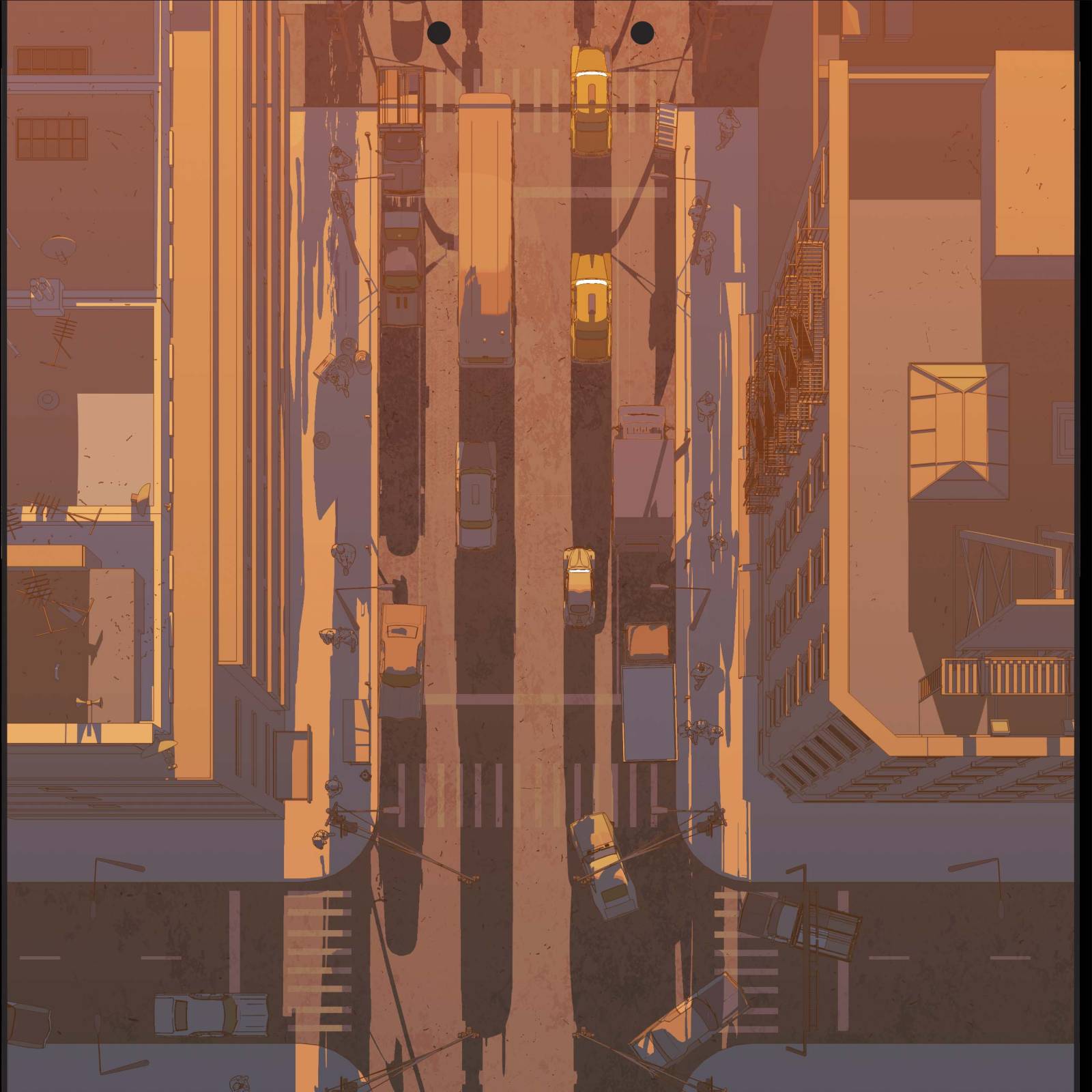
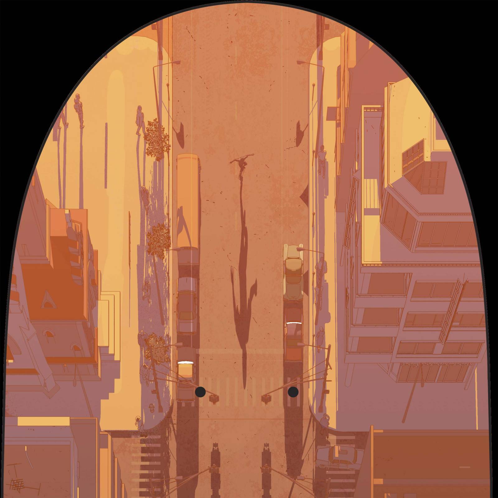
Also got to do a skateboard! Hadn’t designed a board since I was in art school back in the late 90’s when I had to draw it all full sized with sharpie markers. For the bottom of the deck, I wanted it to still focus on a skateboarder riding along the street and sidewalk theme, but opposite of the cover angle-wise with an aerial straight down shot of the city. Used a 3d base rendered in v-ray and painted in ps. it’s a pretty intricate image that should hopefully look kind of cool up close. Tons of little details, cars, people walking and even our skateboarding friend!
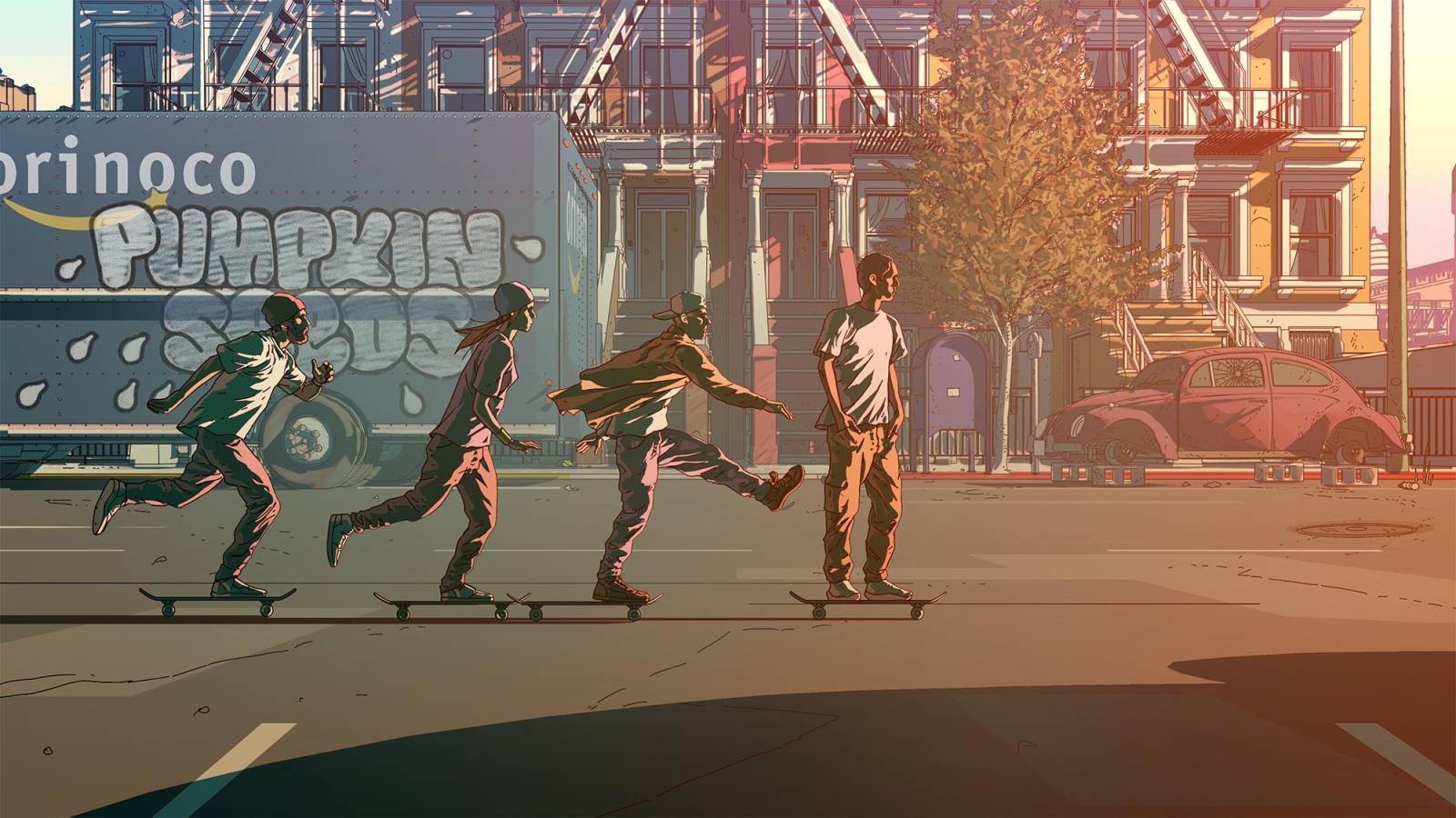
Also got to create an image for a t-shirt. Since I already did a low angle, a rooftop view, an aerial shot, I thought it would be cool to round it out with just like a straight profile shot of some people skateboarding. Used the old 3d digital backdrop and drew this motley crew into the scene. Had fun on the figures, trying to keep them graphic but still individualize them and give them some character. The delivery truck says Orinoco, which is a second longest river in South America, second to the Amazon. Get it? Dad jokes!
These types of projects are a lot of fun because I’m given a decent amount of freedom and get to try stuff out that I might not get to do in more production related efforts. Really grateful to get a few of these types of gigs throughout the year.
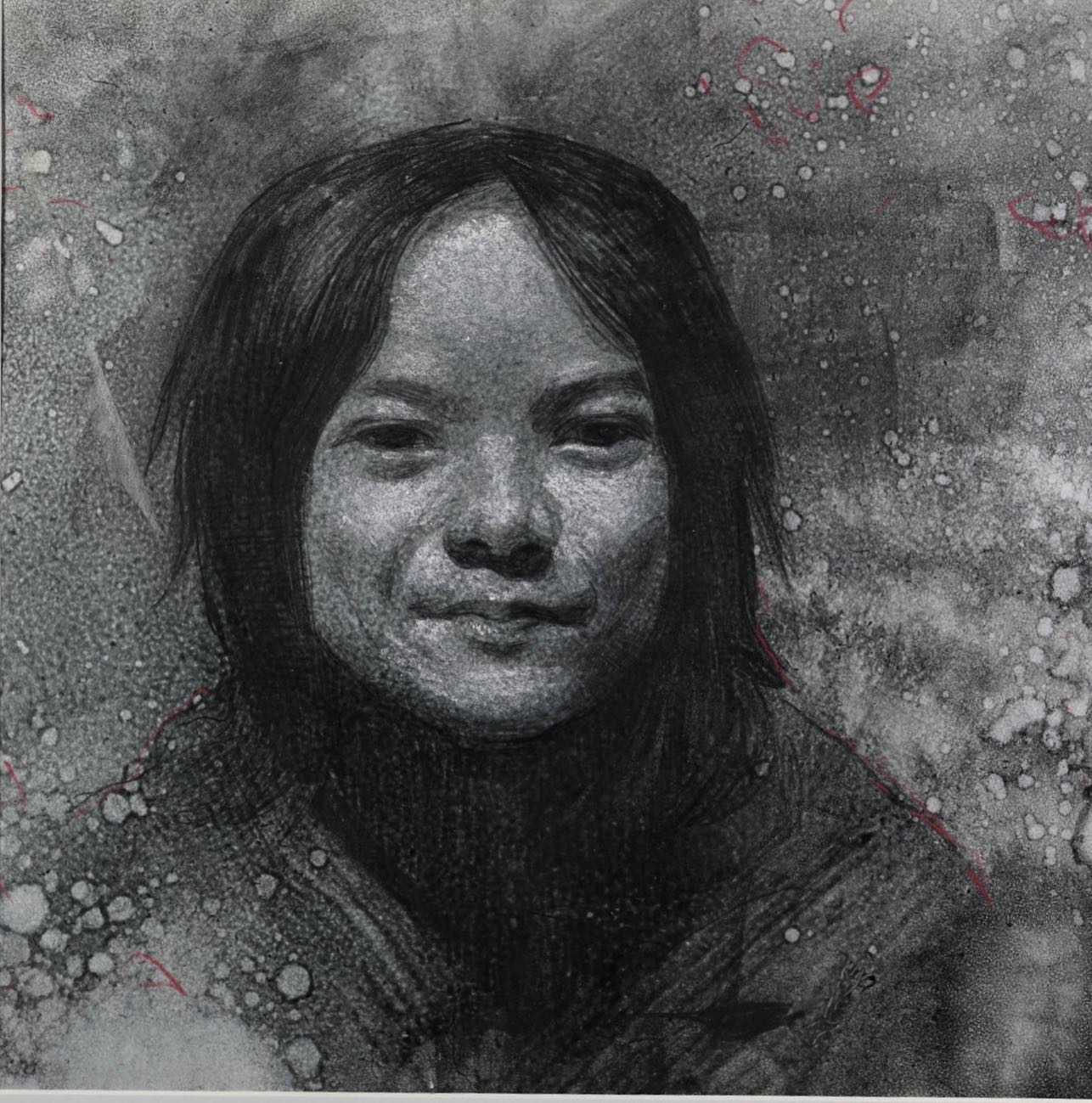
Also figured I’d post up these sketches of the kids made over the past week. Drew them on that yupo paper, colored them with alcohol based inks, and rendered them with nupastel and colored pencils. Kind fo a fun media test. Had a pad of this paper for like 10 years and had never really found a use for it..OR maybe I just wasn’t ready yet??







Recent Comments