 |
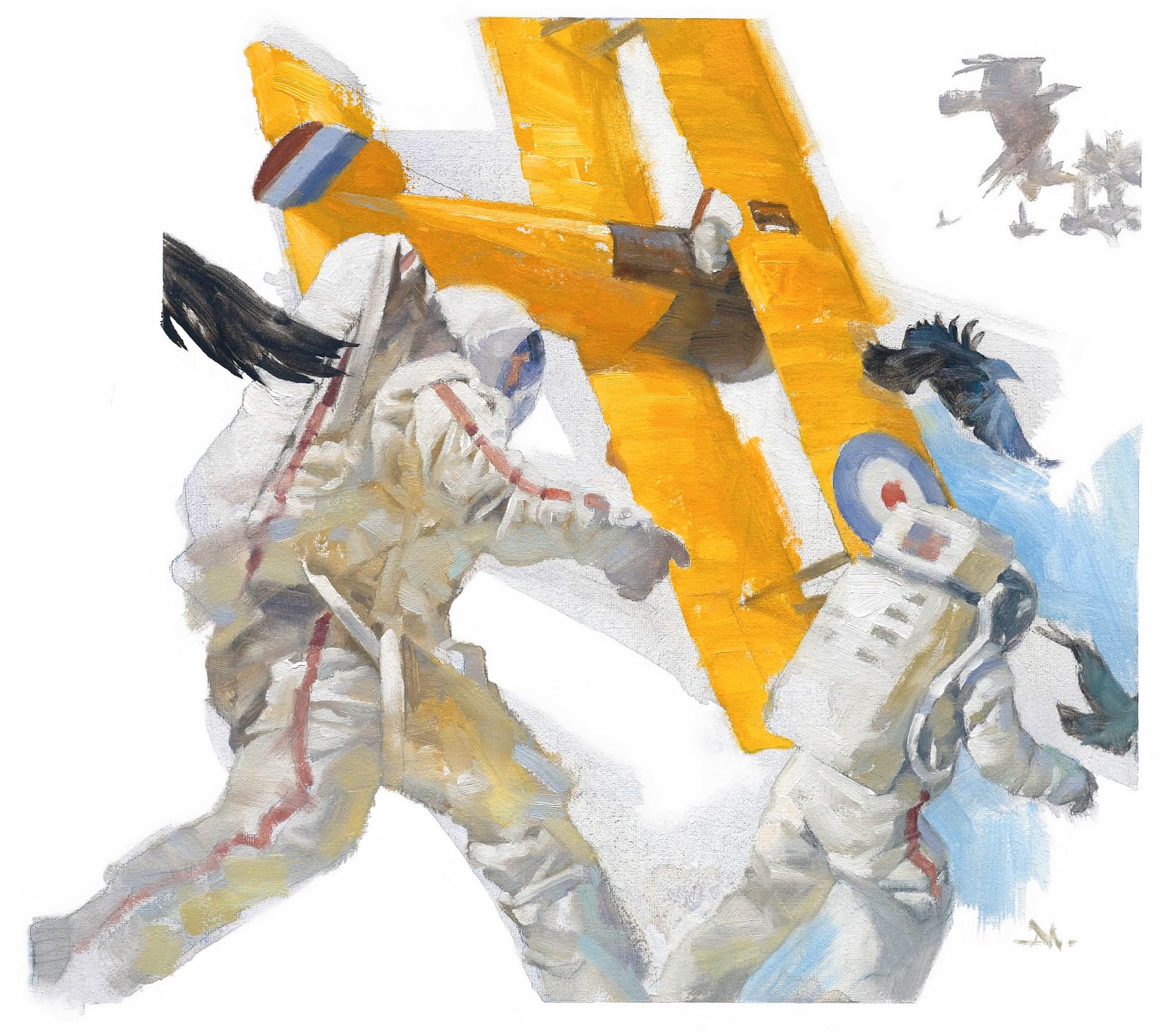
| Flow…one of my stream-of-consciousness pieces…but even when the elements barely relate, it still has to work compositionally |
Creative picture making is like creative writing. While studying books about writing, when an author describes how to construct compelling sentences, I hear it as if they are talking about building a picture. I often replace the word ‘writer’ with ‘artist’ and find new clues for simplifying an image to get to the point.
The creative process is universal. Studying other creative fields helps me learn better picture design. This opens me up, and allows me to understand painting from a writer’s perspective.
The list below comes from Roy Peter Clark’s excellent book about writing, “How To Write Short.” Roy explains how CBS Radio correspondent, Peter King, uses a set of strategies for getting straight to the point on air. King’s list gives advice about composition. Only, for me it was visual composition.
Here’s King’s list compared with my strategies for good picture design, with visual examples.
Writing:
Ask for help in identifying long, complicated material. Look for the expert who can take material like science from complicated to comprehensible.
Painting:
Research subject matter. Read-up on your subject and rely on authorities that have worked with it longer than you have. Act like a reporter observing details to describe to a reader…in this case, a viewer. Study other artists’ work who’ve tackled the same subject, and be aware of their working methods.
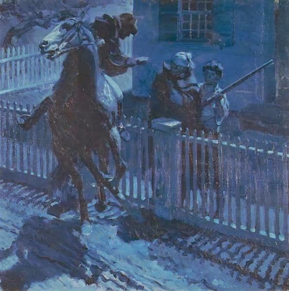 |
| Harold Von Schmidt…a great moment of Revere’s Ride, researched right down to the length of the musket, and the motion of the horse. |
Writing:
Select the most important piece of information. Like an archeologist, a good writer can find the hunk of gold hidden beneath the surface.
Painting:
Identify the one thing you must get across. Show the point that describes the most. Don’t be distracted by luscious storytelling from the text. It’s all communication, but painters do it differently. You don’t have to tell the full story in the painting. It is not required. Let go of the rest and let the visual instill curiosity in the viewer, to keep them coming back.
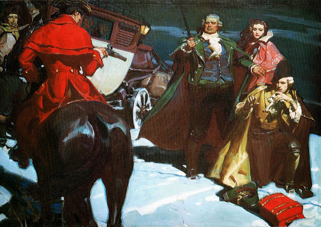 |
| Mead Schaeffer captures the spirit of 18th c. highway robbery, explains nothing and captures everything |
Writing:
Decide what can be left out. Even famous musicians must learn what notes to leave out.
Painting:
Edit extraneous details. Don’t explain too many details of the character or their clothes, or their attitude, or their family history, or the food they like, or the landscape, or their weapons, or how they raise their children, etc. Less is more.
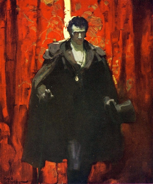 |
| In this case, lots less…but, in Mead Schaeffer’s portrait of the Count of Monte Christo he barely gave us facial details, yet it’s plenty. |
Writing:
Zero in. Tight writing demands focus. Writers are encouraged to think of picture postcards, to look for the single image to imprint on the reader.
Painting:
Be direct. Sound familiar? I’ll tell you flat out: composition. Use cropping to create depth. Unless you’re telling something about a character involved in their landscape, get in close to the subject. Allow the viewer to be a part of the composition. If your p.o.v. is too far back, the viewer is merely an offstage observer. And no, you don’t have to push in so close we’re staring them in the eye.
 |
| Dead-on compositional skills from Herbert Paus…I can feel the pilot about to be ripped off the edge of the wing in the next half second… and I can’t stop looking at it. |
Writing:
Excerpt the most telling quote. Writing teacher Donald Murray’s famous dictum: “brevity comes from selection, not compression.”
Painting:
Find the moment that communicates the story. Melodrama oversells the point. Find a nuance, or even a bold, exciting moment, but don’t paint it like you think it actually feels. Go a step farther. Realize that anyone can paint up a sneaky killer, or the oversexed vixen, or the growling monster. To be truly scary, for example, macabre goes a long way. However, don’t be subtle about your composition. Keep it striking, even when expressing a softer passage.
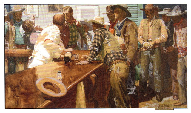 |
| Donald Teague…we don’t even get to see the fist, but the guy is down…strong composition and perfect story-telling. |
Writing:
Translate jargon into common English. Think NASA abbreviations: EMU (extravehicular mobility unit) = spacesuit. Cut to the chase.
Painting:
Keep it simple. Allow the viewer to get involved by simplifying complex images. You can easily overwhelm with elements, too many lighting angles, or complicated perspective. Simplify. Simplify. Simplify. Even in a battle scene, the viewer must be able to find their way through the activity.
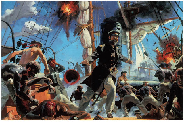 |
| One of mine: Last Battle of the CSS Alabama…think rhythmically when composing…allow the figures to move in and out of the space, which allows the viewer’s eye to flow through the picture. |
Writing:
Search for and destroy redundant elements. Adverbs are a good target, especially those that reinforce instead of modify, as in ‘totally severed’ or ‘deeply rooted.’
Painting:
Vary elements. Repetitious passages dull the senses. So vary color, value, shape. Give the painting a balanced rhythm of elements. This is especially true for repetitive shapes in the landscape, particularly trees in a forest, or cloud shapes. And this includes repetitive folds in clothing. Use a playful, lyrical sense in designing objects.
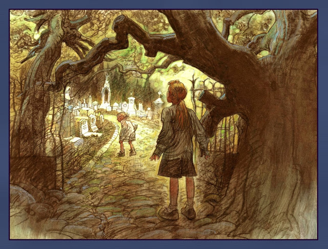 |
| Sergio Martinez wouldn’t dare repeat forms, even with forms that do repeat…look at that tree….his drawing is consistently rhythmic, and that adds interest. |
Writing:
Play the role of the common reader. Would your writing make sense to your family or the mailman? Plumber? Rocket scientist?
Painting:
Become the viewer. What would you want to see if you were looking for the right cover of a book or painting to enjoy? We know what strikes us, intrigues us. We see it everyday. Especially as artists. Learn to give your work a fresh eye. Pretend you haven’t seen it, or look at it without preconceived ideas of what you will see. You are already an informed viewer. Create from that point of view.
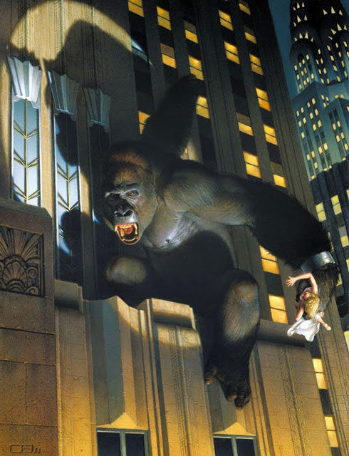 |
| Wham!…Thomas Blackshear hits you right between the eyes….and holds you there. |



Great ideas. That Blackshear has always been one of my favourites.
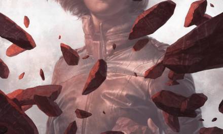
Another great list with some great examples. What was the top image for Mr. Manchess?
As if my day job wasn’t tough enough…Now all I can think of is the painting I plan on doing the moment I get home. Great lesson! Wonderful inspiration!
Nice post Greg. It’s fascinating how “universal” these 10 things are in all of the various creative fields, whether it be illustration, music, writing, film, etc. And also how easy we are to forget to apply them.
The top image was for a self promotion piece for my agent, called “Flow.” All of his artists did a painting and each piece had to flow into the next person’s. That’s why the one raven wing is hanging out there. It actually got cropped to fit.
As always Greg you point out the things we ALL need to remember if we want to turn out great work in any medium!!! Thanks!!!
Just saw the Zorn exhibit and this could have been the script …tell the story, leave out all the extraneous B.S. and own the brushwork;) Timely post- thanks Greg!
Great post Greg. I agree with you 100%. I have always felt that all forms of creative expression are more or less interchangeable. I’ll hazard that I have learned more about picture making from musicians than anyone else. My last big “Aha!” creative moment certainly came at their hands. If I can share, I can’t tell you how many valuable lessons I got from reading “This is your Brain on Music” by Daniel Levitin. It covers everything. Not just music and it’s structure. But also it’s impact and how it works on the brain. Astounding stuff that has totally changed the way I make pictures.
Great ideas! Battery Led Picture Light
This is great! Thanks for posting. Immediately useful, I’ll read this over again an think about how to apply it to my current projects.
Great list, thanks so much for sharing.
Great post Greg… I love your work and the way you teach us . Thank you very much.
Thanks for this post, your “10 things…” lists are always really interesting (even when the 10 things are 8! ah ah! ) , since you manage to simplify the subjects in a very clear and direct way. Talking about being direct, the “Be direct” thing is the one that ringed a bell for me. While i think i’m beginning to understand all the complexity of composition in theory, finding the right way to use it an entire different problem. I realized that sometimes i need to enlarge the background area to avoid the image feel too claustrophobic, sometimes i do the opposite error and relegate the focus of the image in too small a space, losing myself in unnecessary details. And sometimes i completely miss the original point on the image in the work in progress. Thumbnails help a lot, but “Be direct!” should become my mantra, ah ah!
Wonderful art. Brilliant work done. Fabulous ideas shared. I love your work. Hats of to you
Amazing!
This is wonderful! (As always) I’ve often thought about the crossover between music and art, at least in how it feels and effects us, I’d love to be able to capture that intensity, the rhythm, the unexpected. But I’d never really considered the writing side (despite my sister being a writer).
I wonder if some of that crossover is why certain artists are so wonderfully suited to certain authors, is there a kinship in the style of a Tolkien that is also present in Alan Lee’s work for instance?
Wonderful analysis and great insights, which also sent me back to googling Mead Schaeffer because, wow. His simplicity is inspiring. He has one called “Forbidden Lover” that is astounding in its use of color and value.
Thanks for another great post,
Sarah