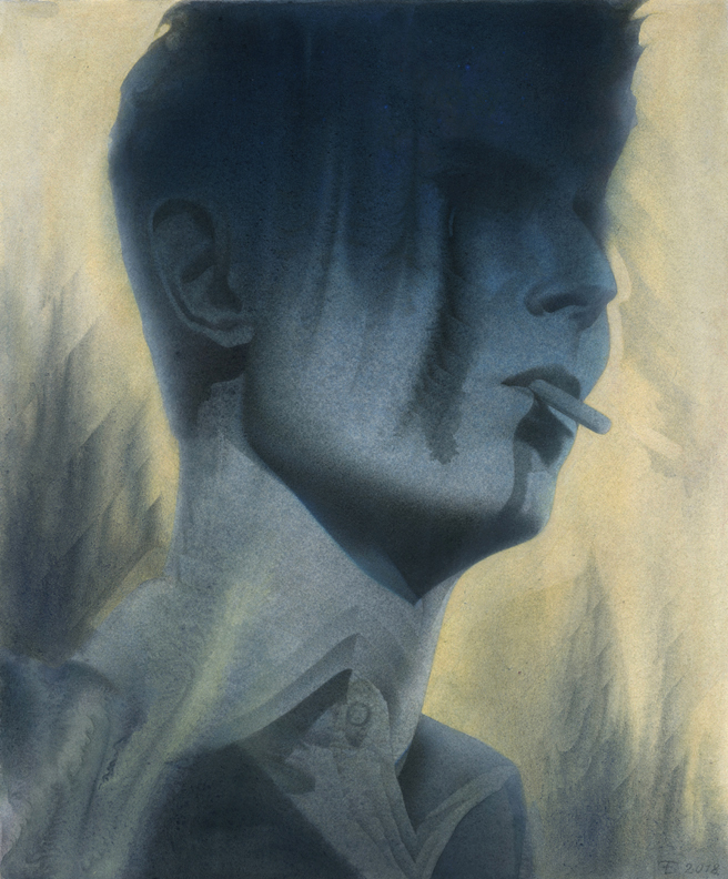
When David Bowie passed away I was inspired by a lot of art based on the singer-songwriter that flooded social media. It started off as a warm up exercise in preparation to produce some more paintings after giving myself a bit of a break from art making. Eventually, I ended up really getting into the piece and decided to take it to a more finished level.
Since I was in the mood to experiment a little I went with Strathmore illustration board instead of my usual watercolor paper. The main difference I noticed when applying paint is that if I wanted to have some watercolor like bleeding it required a lot more water to saturate the board. If you’re not ready for how quickly the board sucks in the paint it can catch you off guard and leave more apparent strokes and hard paint edges than you might’ve planned for. Just as a reminder I’m painting in watered down acrylic. So if you’re painting more opaquely this may not be an issue for you. The piece is only 10″ x 12″ which made this new surface issue not too serious. Although, I can imagine how trying this technique on a larger scale might be more challenging and way more time consuming if you’re going for a softer watercolor look.
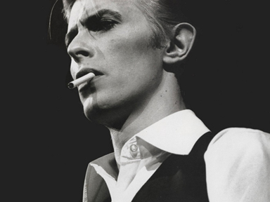
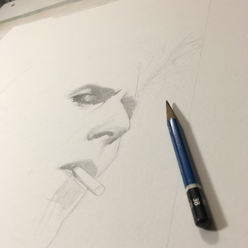
I ended up loosely drawing from the reference directly onto the board instead of transferring in a more traditional way because the composition of the photo is fairly simple and because transferring drawings often sucks the soul right out of you. Unfortunately, having your soul sucked out via transferring is often necessary. I did however, try to plan ahead and leave some extra room outside of the frame of reference in case the entire composition needed to shift one way or another.
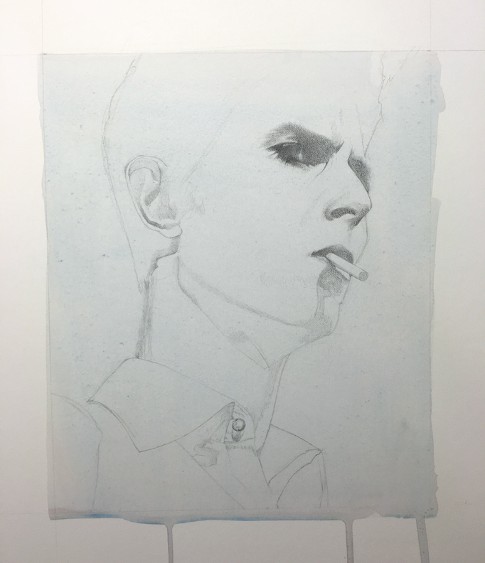
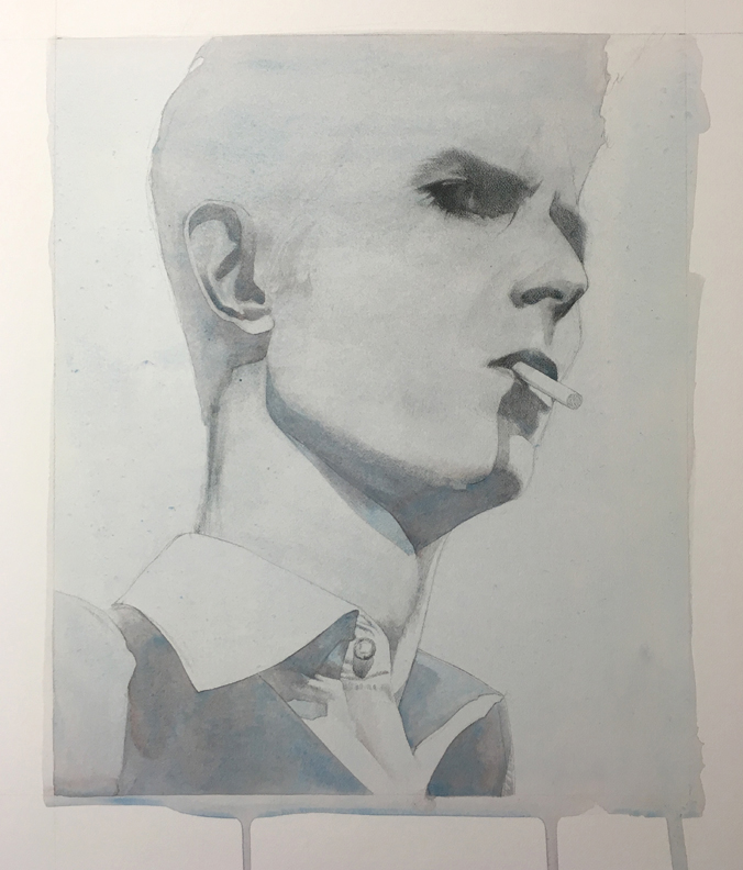
One of the first things I usually do in a painting is lay down a fairly light wash of acrylic. This serves two purposes for me. It seals in the graphite and it gets rid of all the perfect whiteness of the board which can be intimidating. Having a toned surface, even if it’s subtle, also helps me to evaluate values and colors better.
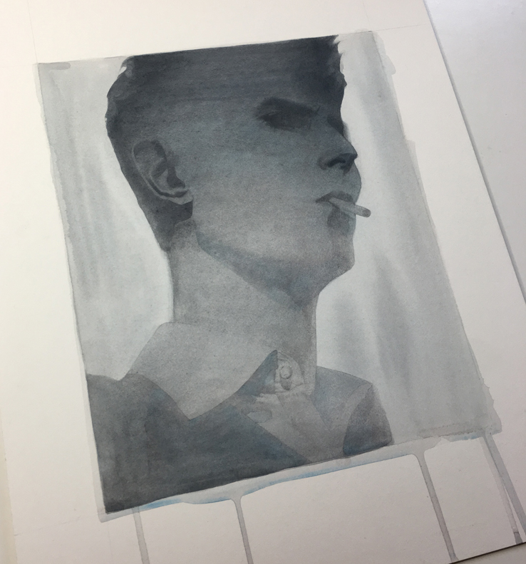
The next thing I do is try to find what I think will end up being a fairly dark part of the piece and block in some heavier value early on. This also helps me to judge values a little better by having a bolder dark area as a reference point. Previously, I would slowly build towards a darker value throughout a painting but I realized that it saved me a lot of work and time if I try to jump in and lay down some bolder darks in the beginning. “Bold” is a relative term here. I’m not exactly the most aggressive painter.
I didn’t do a lot of preliminary studies for this piece (this will bite me in the ass later) but I had a general sense of how I wanted light and shadow to shift down the face. I also knew that I didn’t want to just reproduce the photo.
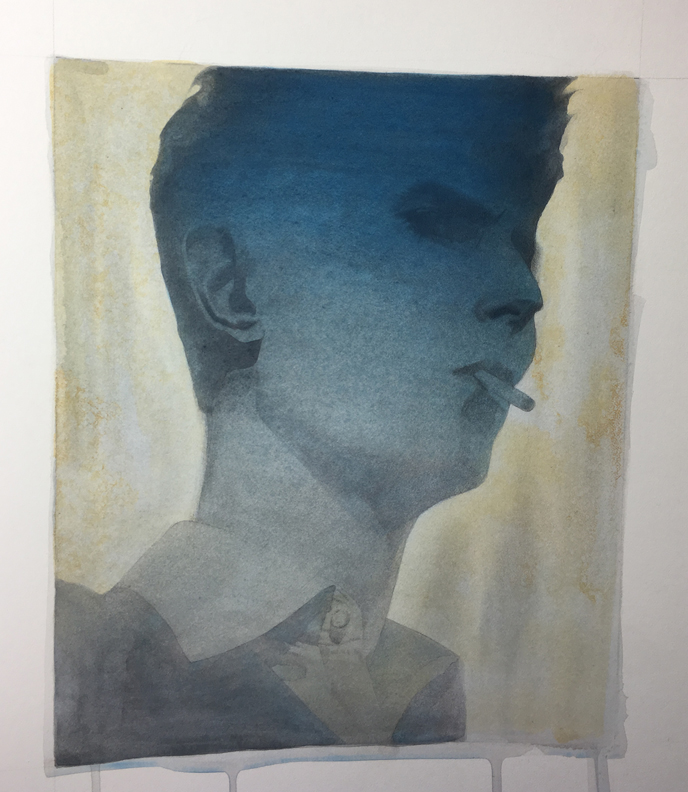
I was aiming for a more limited palette. I was thinking a simple warm/cool color scheme to help separate the foreground figure from the background field. I got a little carried away with the blue in the middle of the face above and ended up going back in to tone it down. While the basic warm/cool palette is readily apparent here I did want to have some variation in the cooler areas of the figure. There are more chromatic areas of cobalt blue, cerulean, prussian blue etc. and more neutral cools with Payne’s gray as a foundation.
After getting in some general value structure I used a wet on wet technique to allow for some spontaneity. Letting the paint run and do it’s own thing to an extent is a great way to achieve this. Gravity is your friend here. You can hold your painting more or less vertical to try and manipulate how the paint will run and bleed. Doing wet on wet isn’t all about adding pigment. While the paint is wet it’s also an opportunity to grab a clean brush or paper towel to lift out any unwanted paint. This can give you a little more control of the chaos. After doing another wet on wet application in the background with an ochre color I sprinkled a little salt on the wet paint to add some subtle texture. It’s an old watercolor trick but sometimes it’s exactly what I’m looking for.
For me it’s not just about letting the paint run and bleed then calling it a day. These initial controlled bleeds offer me something of a foundation. From this foundation I can begin to pick and choose areas to enhance or to tone down. Part of my goal is to have the end product of these bleeds appear as if they might’ve happened on their own. In reality I’m putting in some extra work to refine them, and it can be a lot of work. I just don’t want it to appear as if it were a lot of work. Of course, it can be a struggle to find this balance. But to be honest I rather enjoy this part of painting.
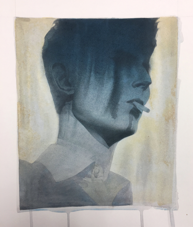
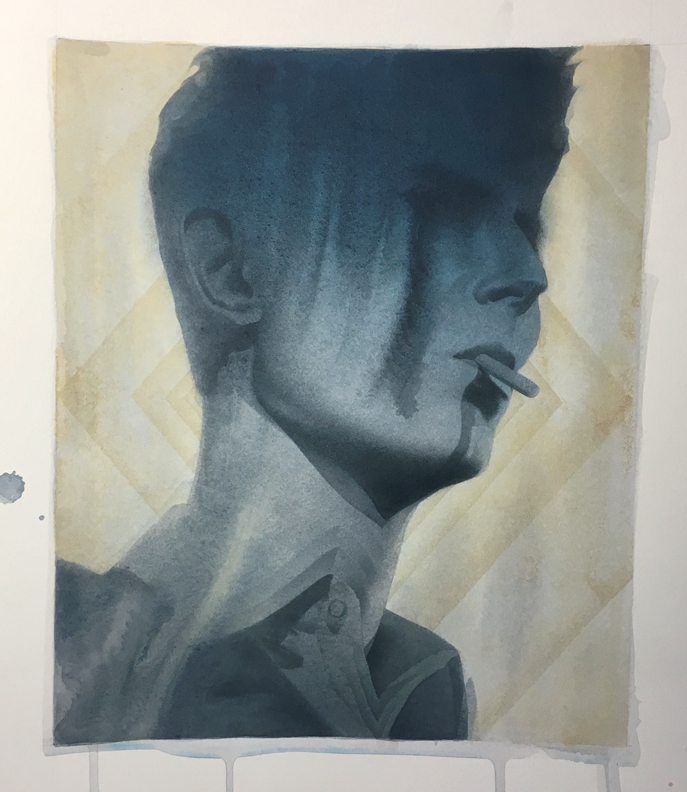
There are pros and cons to working with minimal preparation in the form of value/color studies and working out compositional elements of one’s art. You’ll only see a suggestion of the above background design in the final image. I thought I wanted something more graphic and designy. I was pretty sure that I’d like it. I was wrong. In order to correct this I ended up softening the edges of the diamond shaped lines and once those hard edges were diffused enough I painted a few lighter semi-opaque layers over top to make it less noticeable.
After painting out most of the lines it’s back to square one. Though, perhaps it’s more like square 18 at this point.
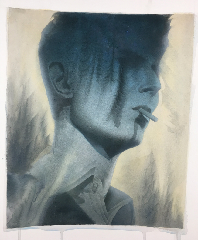
While refining some of the wet on wet bleeds in the face I created a little too much value contrast for my taste. In my mind the contrast was a little too distracting so I darkened some parts and lightened others to reduce the contrast and tried to recreate what was happening before crossing over to the dark side. I ended up with the final image below.
Throughout this process some of the running paint in the face reminded me of pine tree silhouettes against a night sky. In an effort to make these tree-like marks more prominent I ended up with too much contrast. However, what I thought looked like a treeline led to some other solutions in the piece. I took the pine tree shapes and mimicked them in the background while also using the previous diamond design to add some subtle interest and direction in these shapes. And although I decided to tone down the contrast within the pine tree silhouettes in the face, I decided that I wanted to reinforce the feel of the night sky by setting the Milky Way in the background. After adding in billions and billions of stars “Waiting in the sky”, a line from Bowie’s song “Starman”, felt like the perfect title for this piece.
I’ll end with a quote from one of my favoritest humans ever.
“The cosmos is also within us. We’re made of star stuff. We are a way for the cosmos to know itself.”
~Carl Sagan
If you’d like a print of this piece you can get one here:
https://www.inprnt.com/gallery/ericfortune/waiting-in-the-sky/










Great Piece! love the colors and the rich depth the layers of paint give. I was curious what do you do to lighten a ton you glazed in too dark? Do you ever use white or is is just scrubbed out. Wasn’t sure you could do that with acrylic.
I tend to paint in very thin, watered down washes for exactly this reason. So that it’s a slow slow build up and I catch things before they go too far in a direction. That being said, you can paint opaquely over an area if you’re very careful. However, the layers and layers of transparent washes give a very different look than a solid application of opaque paint. It misses the variety of different colors and tones that all the layers of washes have. So after painting over an area it’s probably worth glazing some washes over top of the opaque paint to try and make it more consistent with the rest of the painting. I also know other painters like John Palencar have been known to sand an area down to the board in order to correct something. Hope that’s helpful.
Ohh god your art is so fucking haunting and beautiful. Will you ever release a book collecting your artwork?
Thank BEaver! That’s so nice to hear. Admittedly, It’s not high on my list of things to do at the moment.
Marvellous, Your Art are much admiring. Your fingers have just glazed into this art…