A more clickbait title for this post would be “the ONE TRICK artists use to make things look more polished!”. Luckily, I’m not here to write clickbait, but this post actually is about a trick I use to give my illustrations the finishing touch, so let me introduce you to the concept of… “floaty compositional bits”!
Essentially, these are abstract graphical elements added to an image to create visual interest or noise. If an image feels incomplete, as though it is missing that last 10%, I often find that adding said bits will tie everything together. I know this concept is not unique to me, as I’ve heard other artists describe them as compositional sprinkles or confetti – which sound much more fun – but in my head I’ve always just called them “those floaty compositional bits”.
These bits could appear as actual confetti-like shapes scattered throughout an image, or they could be any form of visual noise, including but not limited to swishy lines, splatters, and even more literal shapes like leaves, birds etc.
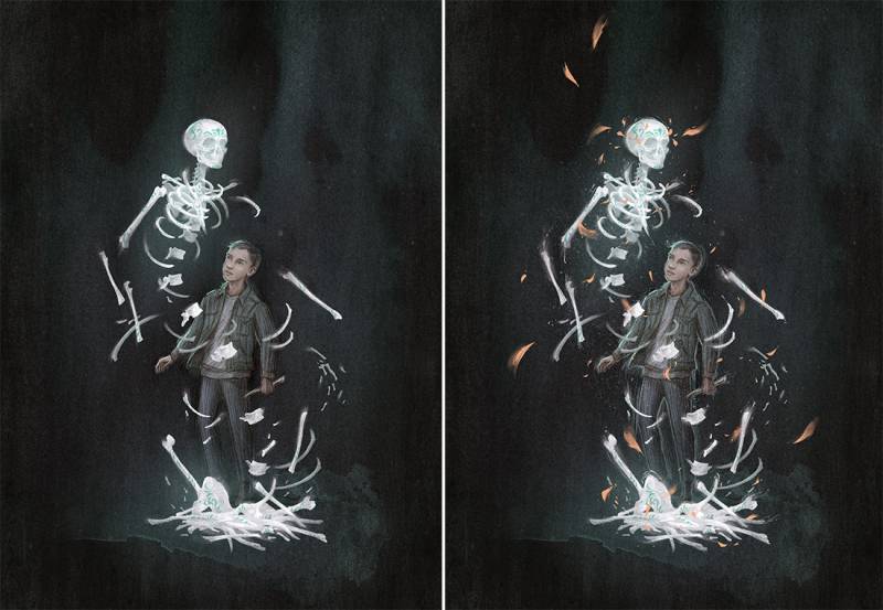
Sometimes an illustration naturally calls for such elements, so they are integrated into the narrative of the image. For example, If there is a scene involving falling leaves or floating embers, it is obvious and easy to include the compositional bits in the image.
Where things get more interesting is when they are not necessarily expected. In these types of images, compositional bits add a secondary element to the illustration, implying a sense of wind, atmosphere, or magic. They can be used to create movement and drama in an otherwise static image.
They can also be used to abstractly convey emotion or mood – think of an abstract expressionist painting, which is all shapes and mark-making. Compositional bits function in the same way, essentially giving your image a second layer of reading; there is the literal narrative image, and then the abstract emotion-based impression created by the visual noise.
I find this concept of visual noise to be especially useful when working in a style that is not aiming for realism or tight rendering. Often viewers tend to understand “finished” as rendered or accurate, and so in an image that doesn’t rely on those markers, the extra layer of interest can be what pulls the image together, making it feel more substantial and therefore polished.
In all of these examples thus far, I have shared images where the compositional bits are a key part of the image, but it is worth mentioning that visual noise can also be utilised in a much more subtle way. Sometimes just a little bit of splatter or scribble is sufficient. In these cases, the noise becomes part of the overall pattern or texture of the image, providing the same feeling of complexity to the viewer, but in a way they may not even notice at first glance.
So next time you’re struggling with the last 10% of an image, consider garnishing with some floaty compositional bits. They may be just the finishing touch your image needs.









Recent Comments