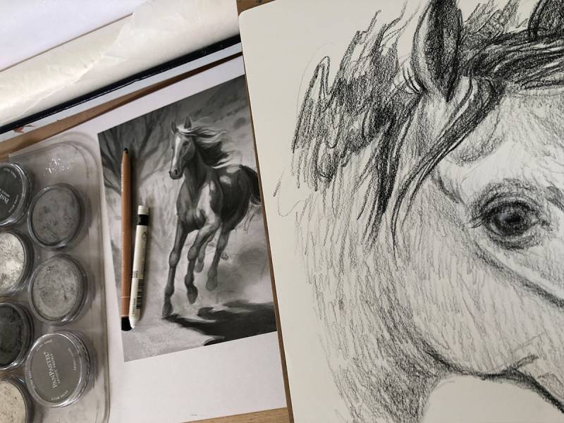
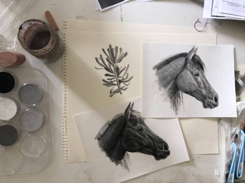
It’s about a month now before A Horse Named Sky hits bookstores. This book has my inner tween-ager feeling completely giddy. When I approached illustrating this nearly 300-page book, it was not lost on me the challenge of drawing horses (a topic many artists grumble about.) I’m writing today to share with you some of the takeaways from my deep dive into drawing these incredible animals.
Highlights
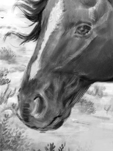
Many great horse paintings or illustrations showcase specular highlights with idealized, glossy coats. More often we see horses dusty, and a little dull. In the wild, winter coats are shaggy and unkempt. Usually, I might idealize a character with a bit of a gloss, but there is a place and time for everything. Idealizing can, in this case, flatten the rich, layered story Rosanne Parry writes.
In a HNS, not only was it crucial that the horses were recognizable from page to page, but they also needed to “fit in,” in every environment they set their hoof in. So when it rains in the book… The horses appear darker and shiny. What’s happening here is that the water smooths the surface (on a molecular level) which creates the ideal situation for bright, specular highlights. Highlights may be easier to see on very dark coats, very light coats, or wet coats. On these types of coats, the edges of the highlight may be harder or have specular characteristics. These ways light changes on the surface of the horse is a tool to tell our story. Sometimes we must hold back on the glossy stuff and wait for our moment.
Shadows and More on Highlights
In my studies and throughout illustrating HNS, I’ve noticed a pattern of landmarks where light and shadow seem to show up consistently. While this is great info to keep in my head, I’d never rely on it solely. You’d never, ever, ever see all these shapes in the same setting at the same time. As you witness the range of shapes in your studies you’ll too see how they will fall within the boundaries of these locations (roughly.)
Please notice the pink square here, as many horses’ bodies do fit neatly in a square. Keep this in mind when drawing horses with different poses and eye levels. It’s a great way to quickly find the “center” of a horse’s body.
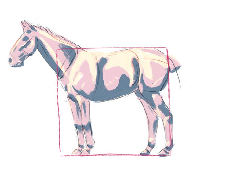
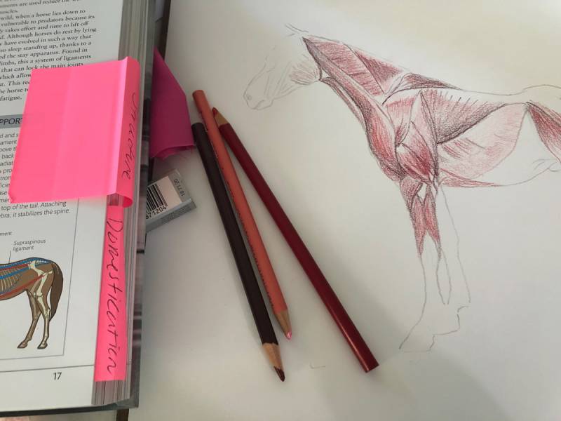
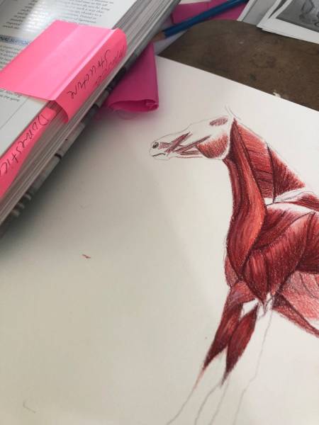
In this in-progress snapshot below you start to see how even without the outer layer or skin, why the shadows and highlights show up when they do.
Muscular and Bony Landmarks
People discuss all the time, do I really need to know the muscles? While it’s not important to know their names, it’s a huge leg up to understand the landscape of the muscles. And I mean the word “landscape” as the planes and valleys of the figure and flesh. Even more important to know, is how the muscle works. How it contracts and extends. With the figure (though we all get it wrong from time to time) we do naturally get the limits of our joints. When we witness a shadow or highlight, we can often connect it to a muscle system.
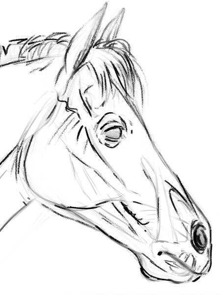
This head sketch below shows a little bit of muscle and a little bit of bone and teeth I think shows on the surface of a horse’s head. While I am thinking about the whole head when I draw, these come forward the most. In the drawing, the horse has three veins visible on the jaw. In most cases, if a vein is showing in this area, it will usually be one of these three veins or a combo of sorts. They can wiggle and wave in unique ways just like our own veins do as we age.
An Easy Tip for the Nose
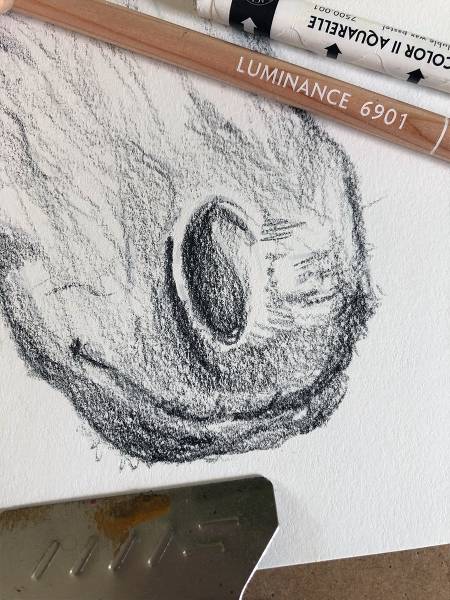
The way the skin folds work around the nose of a horse, has two C’s facing each other rhythm or some teachers say two 6’s. Easy to remember and makes approaching the nose a little less daunting when you know the “flow” of this area. Feel the 6, and observe how it elongates and widens with breath and expression. Be flexible. That became a great shorthand for me while sketching compositions for this book.
Space for Creative License
Horses can see almost 360 around themselves, with a blind spot in front of their face and tail. Their vision in front can see great distances. Their eyes are some of the largest on our planet. They have long eyelashes, that frame out these endearing eyes. The eyes are placed on the sides of the head, but we tend to draw them more forward. Depending on the eye color, the oval shape of their pupil may or may not be easily seen. Overdrawing this area can look off-putting, so it’s best to take special care, especially when done in color or dealing with light-colored eyes. Use your creative license and do what feels right.
Some horses have more thickness to their mane than others, “hairlines” vary drastically from horse to horse and some horses have curly hair. To me, each horse has a range of hairstyles that work as an extension of expression and a place you can exaggerate or play with. Like people, horses have great variety in their bodies and expressions. As an artist, this brings me much comfort. I hope it gives you some relief too and perhaps the freedom to try out these areas of flexibility.
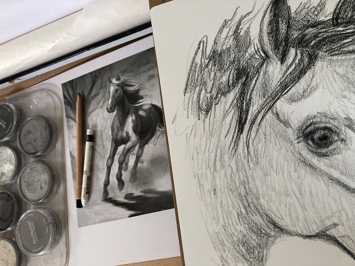
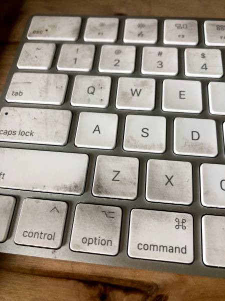
Hope there was something here that helps you in the studio. Listen, I can’t wait to share my pastel drawing with you when A Horse Named Sky comes out. Let me leave you with this, I thought Muddy Colors would especially appreciate my dirty keyboard, evidence of a “tra-digital” artist at work.



Recent Comments