*** This post will contain some spoilers for the book Tress of the Emerald Sea by Brandon Sanderson, published by Dragonsteel Books
If you don’t want to read this post just yet to avoid spoilers and want to purchase the version of the book I am writing about, you can here
Sometimes you just feel like the luckiest person alive.
About a year and a half ago I received a call from Isaac Stweart that Brandon Sanderson would like to chat and could I come to meet with him. By fortune or fate, I live about 2 minutes away (remember the lucky part?). When the time came, I drove to his “Cosmere House” where he explained that over the course of the Covid pandemic, with the extra time in his schedule that would have otherwise been dedicated to book tour promotion, he managed to write five books. In secret. Five books. No one but his wife had known of them until just a few weeks before this meeting. He wrote them as a gift to his lovely wife, Emily.
He decided that he would release them to the public as part of a Kickstarter (which broke all the records) and asked if I would be interested in illustrating the first book, Tress of the Emerald Sea. Yes. Yes, I would. Always yes.
The next week I was given a manuscript to read and the planning began. Initially, the idea was to do the cover and 4 interior illustrations. But when the chance like this comes along, you go as extra as you can, so I asked if I could do the cover, the end pages, 4 color, and 6 black and white interiors, the chapter headers, design flourishes for the page headers as well as some spot illustrations. Isaac Stewart is the excellent Art Director at Dragonsteel and he agreed to let me go for it!
Brandon announced the Secret Projects with a really fun Youtube video:
For me the first step was to come up with a small sketch for the Kickstarter so that there was something to represent the book. Here is a little time-lapse of that process
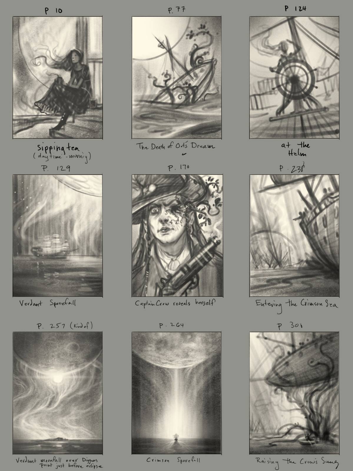
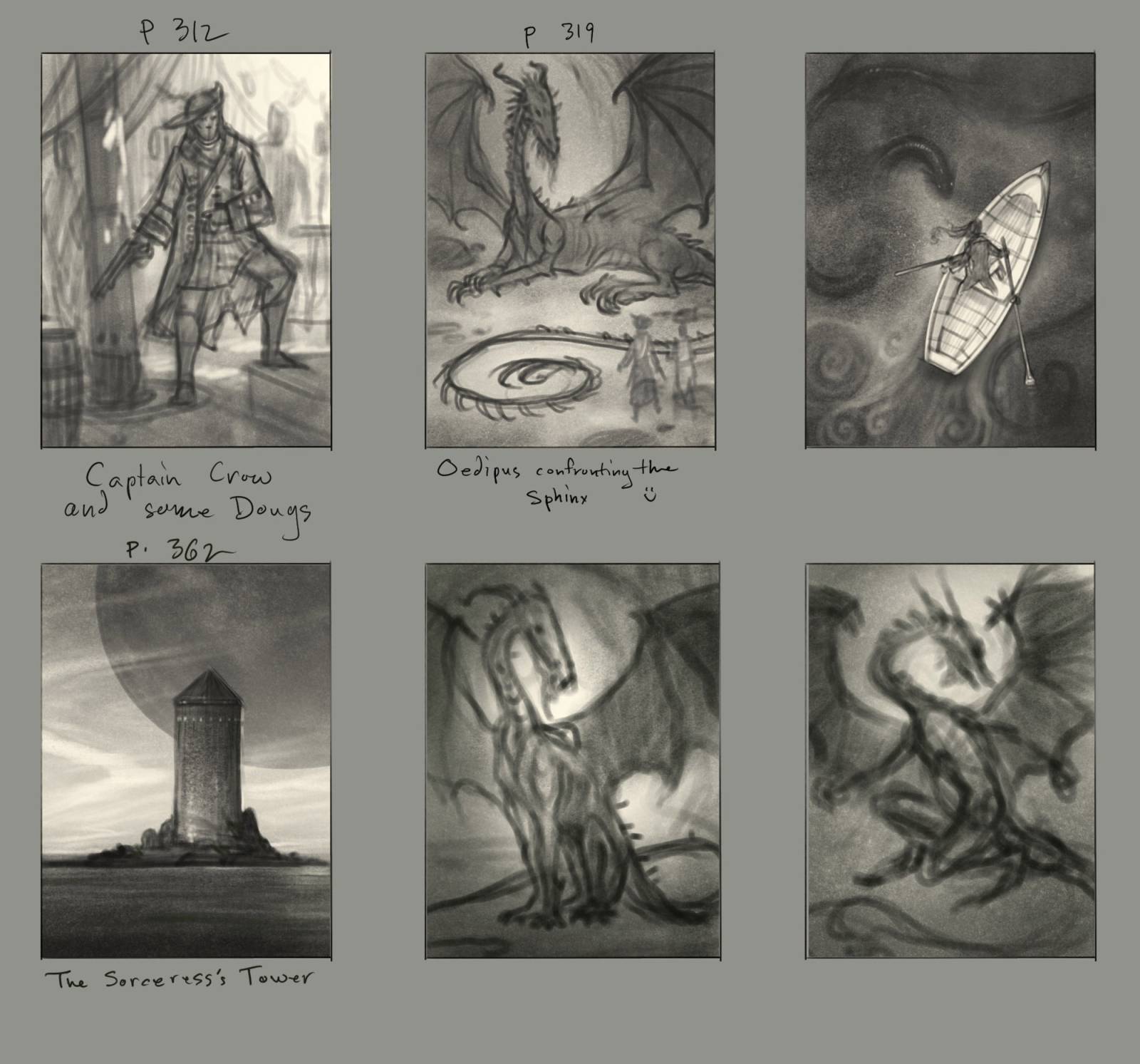
Once that was done my attention turned to coming up with lots of ideas for the interior illustrations. Here are some of the sketches for those:
I did these sketches in Procreate and did several pages of the ideas that I thought would be relevant. Once I had a good selection and had discussed them with Isaac Stewart, we narrowed down the ideas to the strongest ones, but also paced them throughout the book and gave consideration to what characters would be shown.
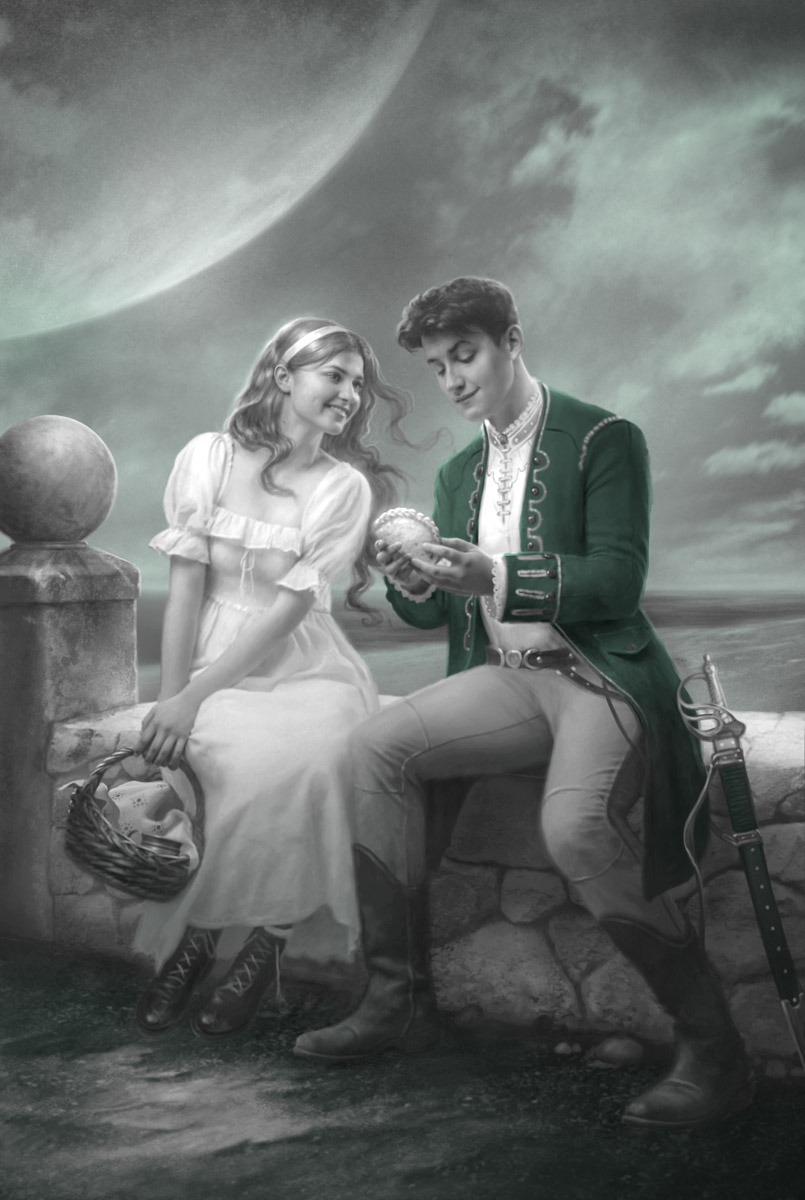
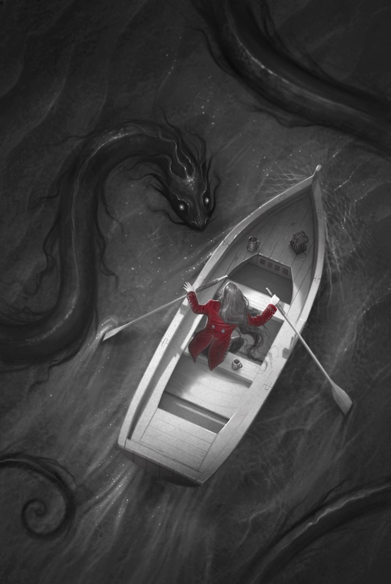
From there I started to turn them into black-and-white illustrations with one spot color. My goal was to capture the feel of some of the old classic story books like Ivanhoe, Treasure Island and Robin Hood that contained black and white illustrations with a spot color here and there.
The first of these was such a fun piece to create. My model for Tress is Sarah Snow, who captured her so well. In this scene, we see the seeds of the source of many inspired tales being planted. What is that you ask? Love, of course!
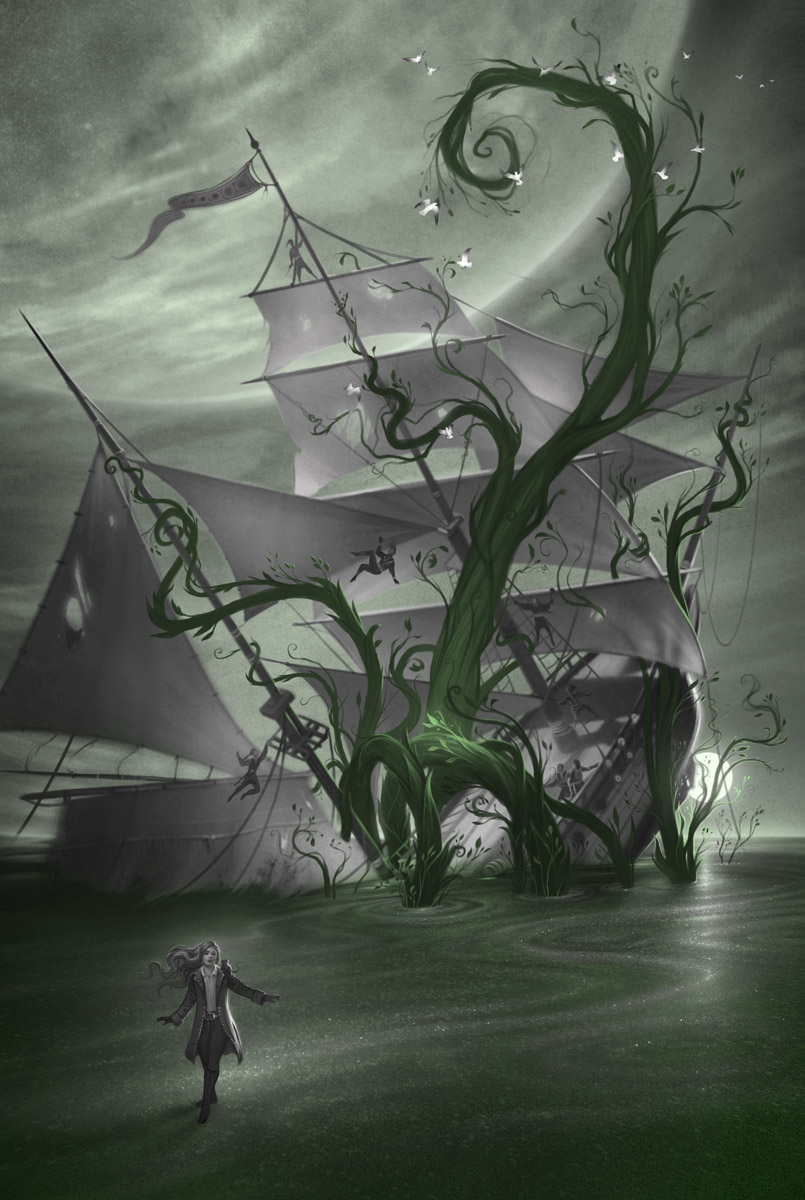
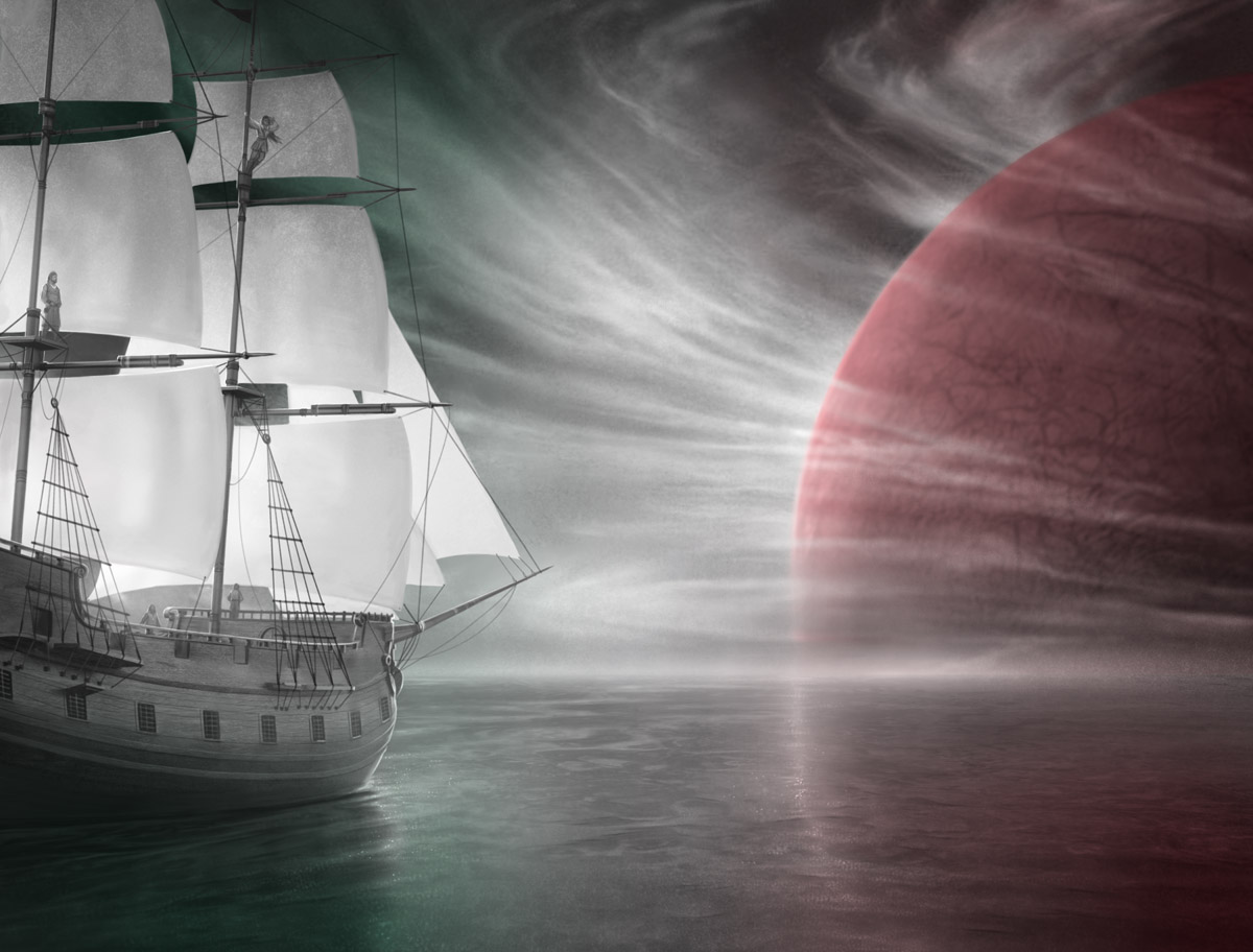
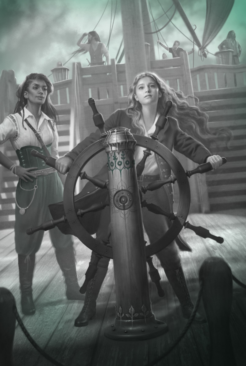
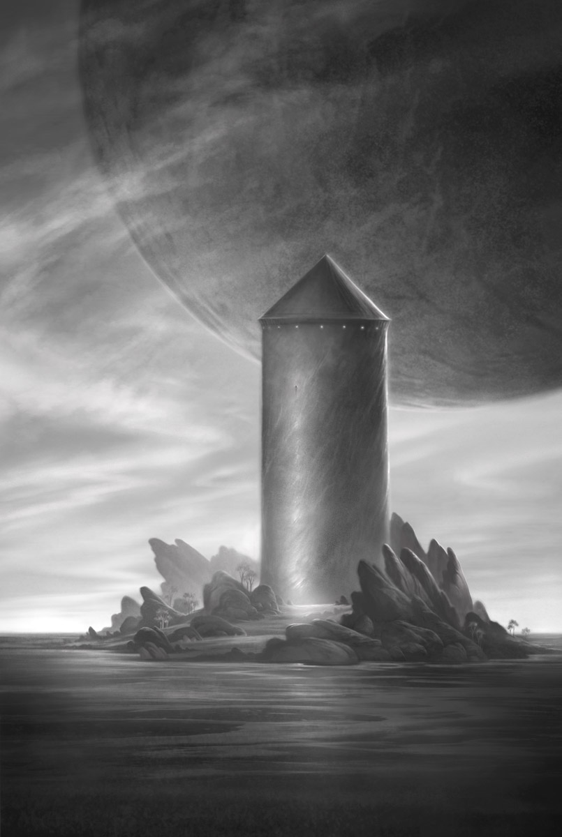
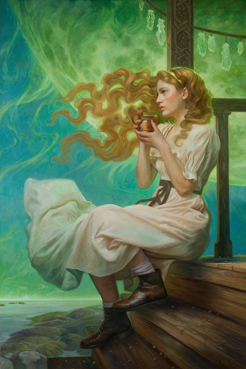
The illustration below was for me the iconic image of the book. Tress is a wonderfully strong character, not content to let the story happen to her, but must set out to make her own story happen. She is a character that I would have loved to read about with my own kids when they were little. In this painting, you get to see a little of her determination, her predicament, and also a glimpse of the world she inhabits with its giant moons filling up the oceans of her planet with colorful spores that drift down and accumulate like vast oceans of bubbling sand.

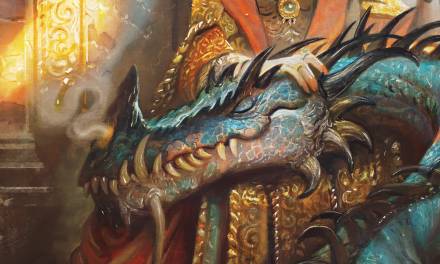
If you are fan of Sanderson’s Cosmere, then you’ll be aware that there are dragons, but one hasn’t been depicted… until Tress!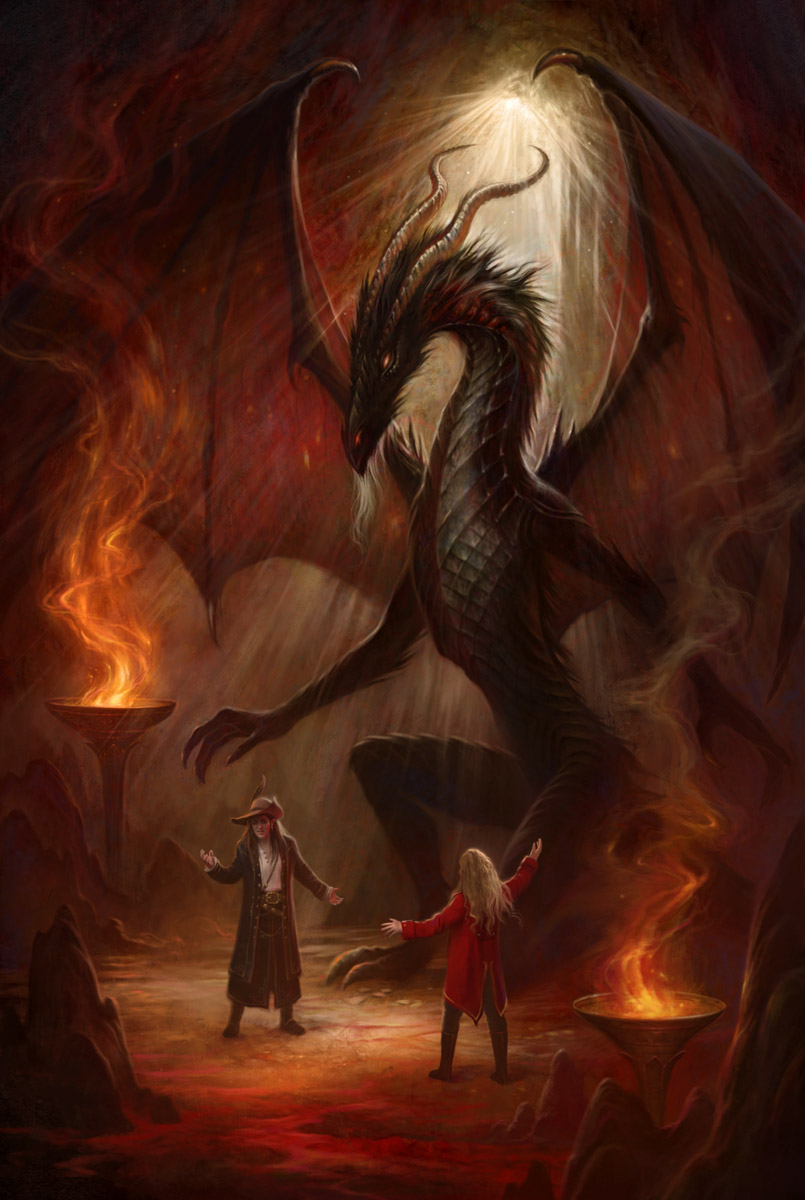
With that task done, I could move onto addressing some of the smaller touches in the book, like the chapter headers, the flourishes and the endpages.
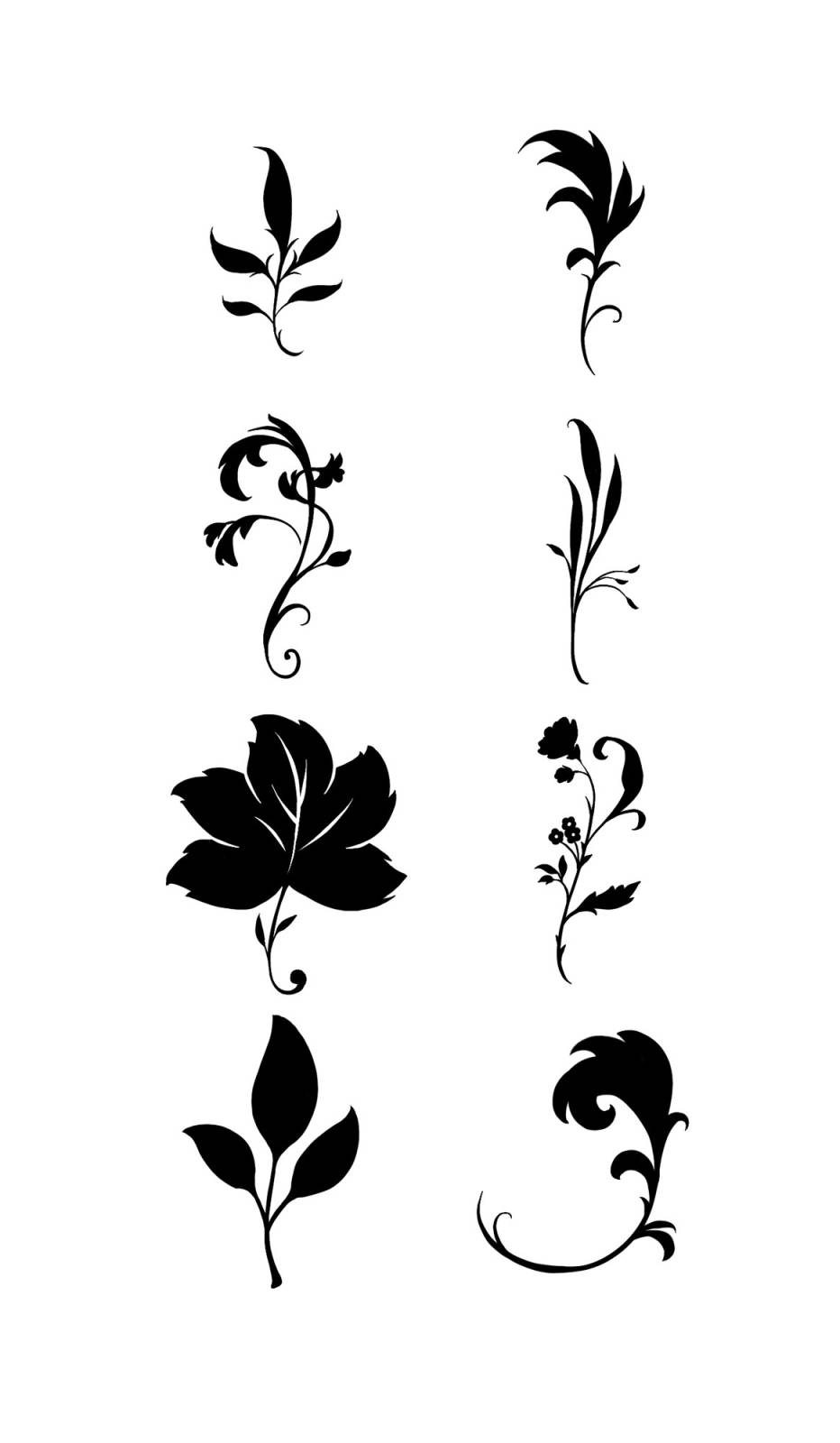
I started be trying to work out some of the shape language I wanted to include. The vines and leaves are important to the story, so I built my first ideas around those
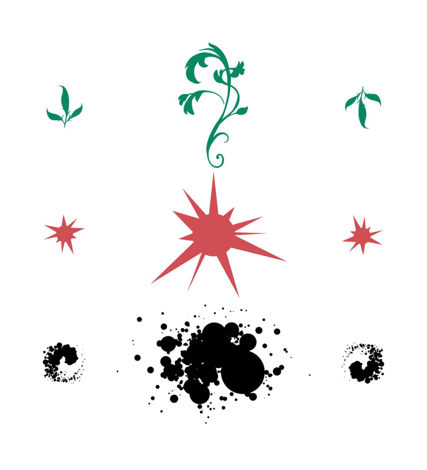
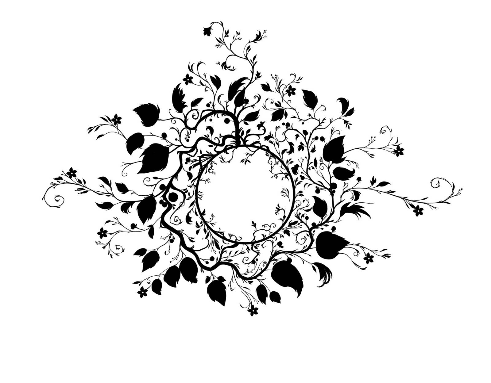

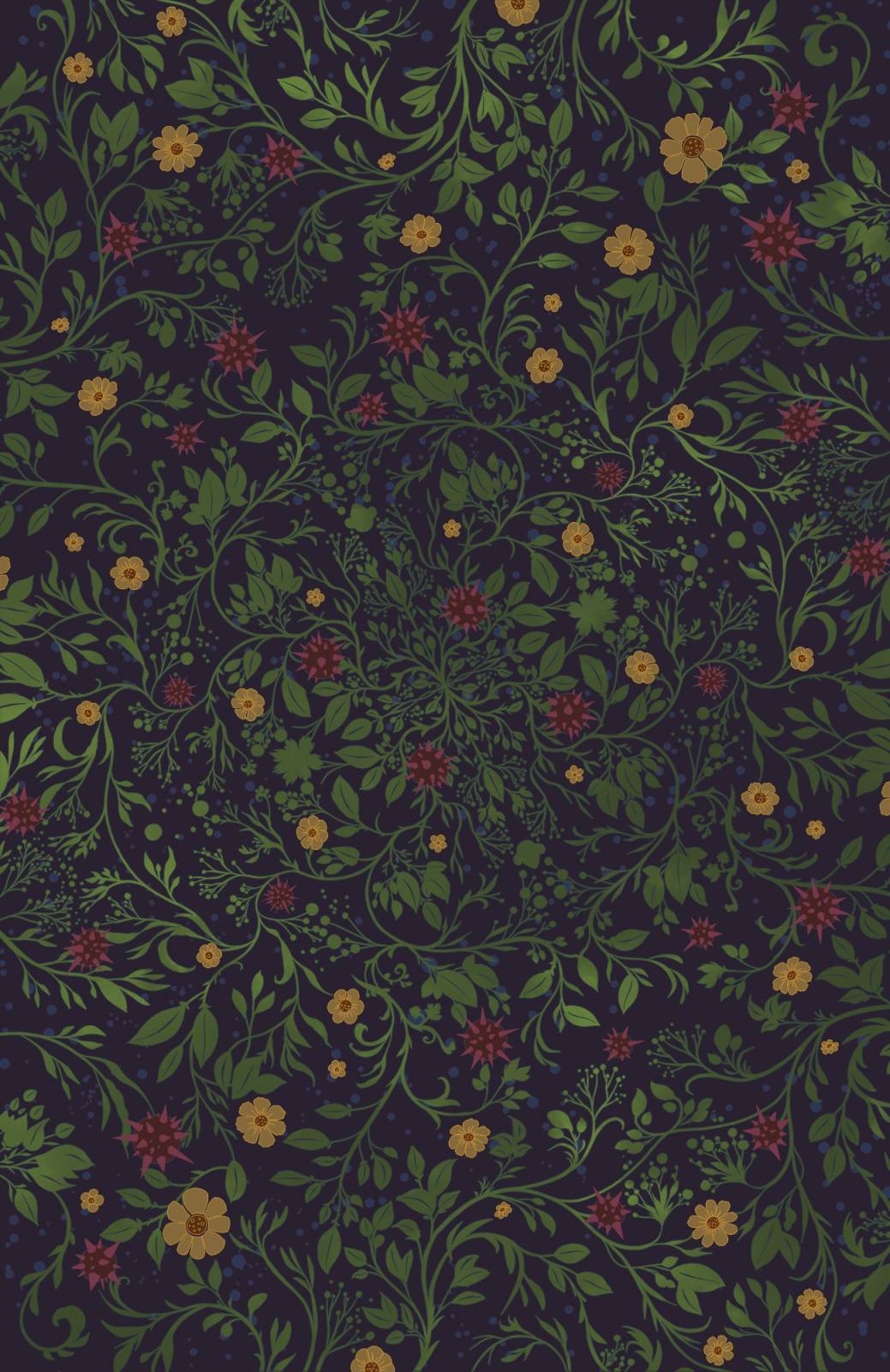
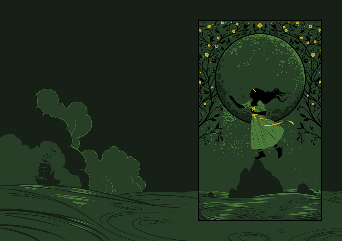
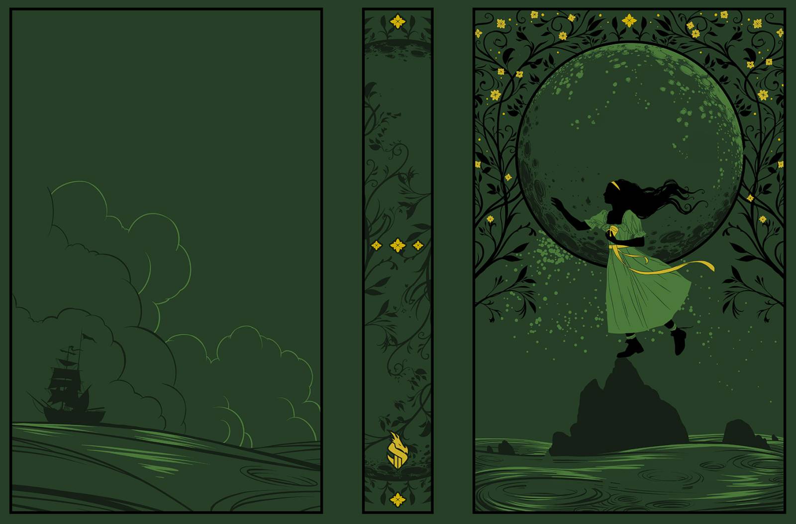
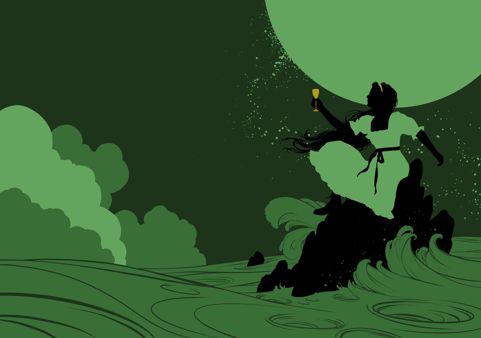
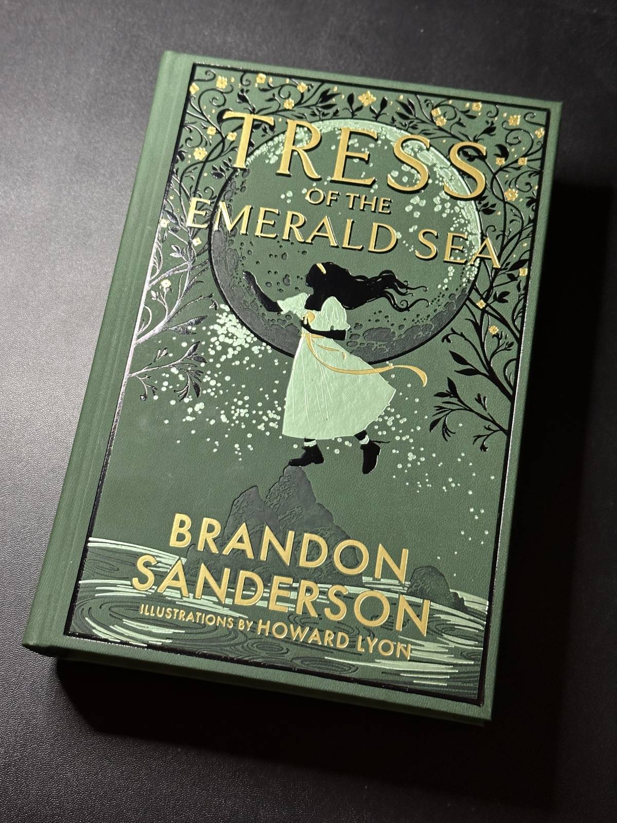
I could now return to where things started, the cover! For this book, the cover was going to be dark green leather with foiling and debossing and no dust jacket. I was given the green light to use three foils as well as a debossing that would darken the leather. So, I effectively had 5 colors to work with, two of which would be values of the same hue. The idea was to create something that felt special and premium both in design and materials. I had the full support and help of Isaac Stewart who helped me navigate the rather technical give and take of printing small details with foil dies and a debossing die. Thank you, Isaac!
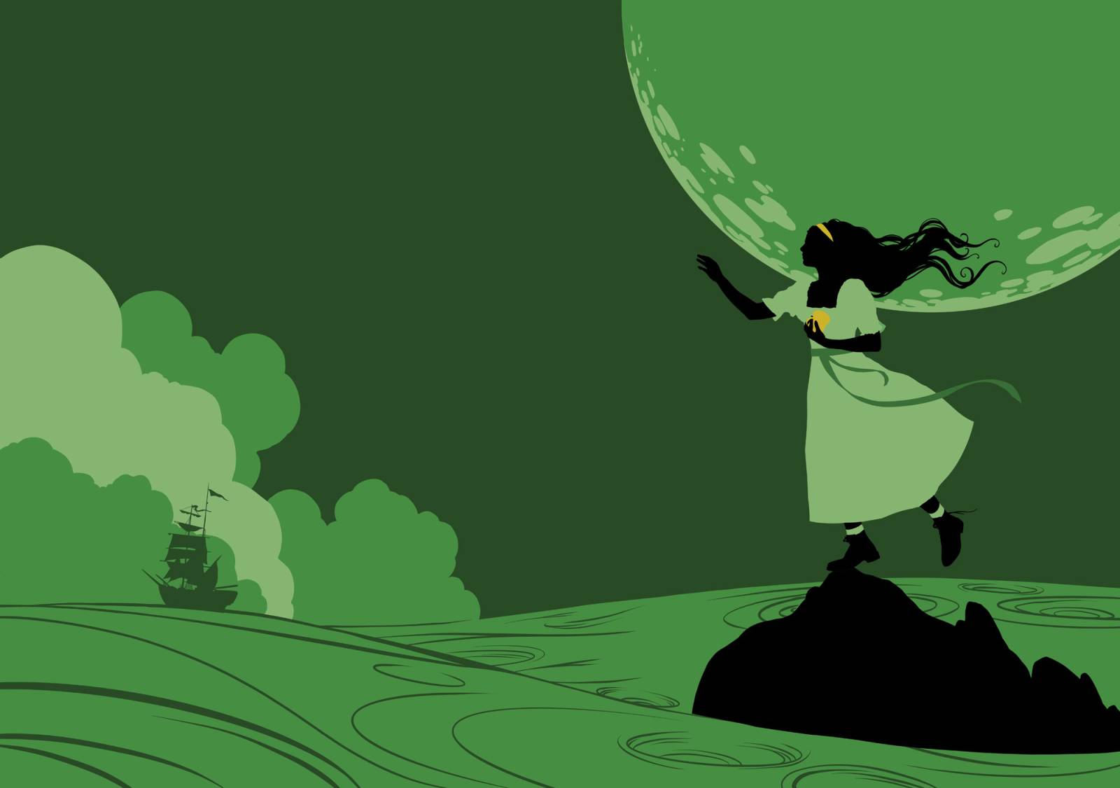
I started out working with a similar pose that I had done for the initial sketch, but it felt too passive and didn’t have the tension that was hoping to capture. Tress is effectively trapped on her home island. I wanted it to feel small, claustrophobic almost, but also put her in a precarious setting where it appears that a slip or misstep might lead to disaster. So, I worked on some more ideas.
By having her standing I could make it as though she was balanced on a small group of rocks, moving forward, about to leap into the unknown. She sees the ship leaving in front of her, headed on an adventure. Something she has had very little of in her life, but to her credit she longs for, even though that adventure will surely come with unknown risks. It has more tension and drama and for me sparks a little more curiosity.
So, there you have it. 5 months of my life, working as many hours as I could squeeze in each day. Isaac and Brandon extended me a huge amount of trust, support and belief that I could bring something to Brandon’s wonderful story. I get to have my name on the cover (which is more exciting than just about any other project I have been associated with) and I also get to be a part of the kind and very enthusiastic community of fans that Brandon’s books have created. Again, you can get the book here if you’d like to have a copy. You can also get a bundle with the audio too!
If you are interested, you should check out the Dragonsteel Convention. It’s honestly one of the best events I have attended just based on how nice the attendees are! Here is a link!
Thank you for giving this post a read!
Sincerely,
Howard





I was so excited when I saw that you would be illustrating this book. I’ve always loved your work, and seeing you and Brando Sando teaming up to illustrate a novel had me over the moon. I was not disappointed when my Kickstarter hardcover finally arrived. Absolutely splendid work! Thank you for sharing about it here.
Jacob – Thank you for your response and the kind words! This was a chance of a lifetime project. I am so happy that you loved the final book!
It’s really cool seeing the process for this, and how the style of the illustrations fit the tone of the story so well.