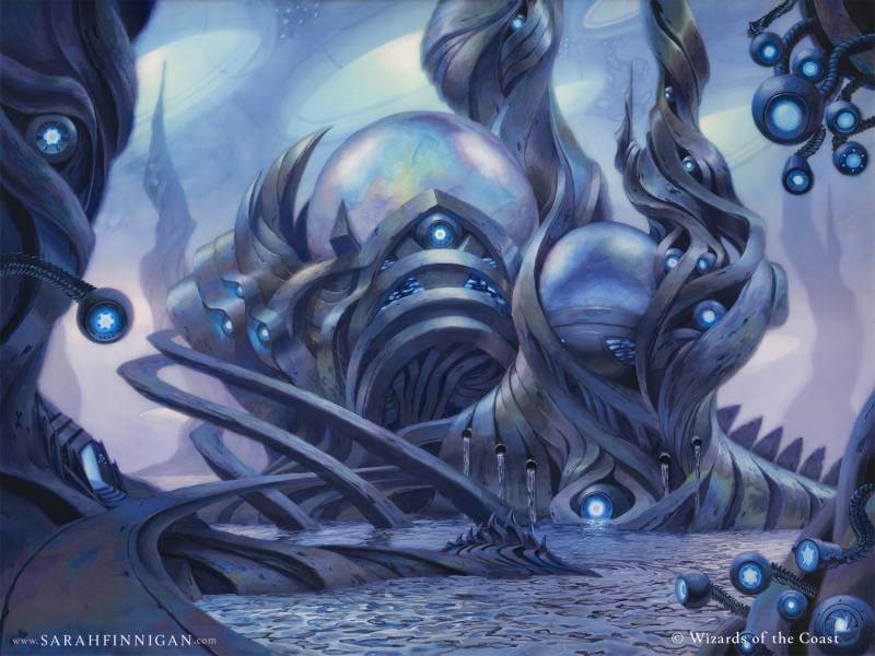
The Surgical Bay – 18″ x 24″ acrylic on wood
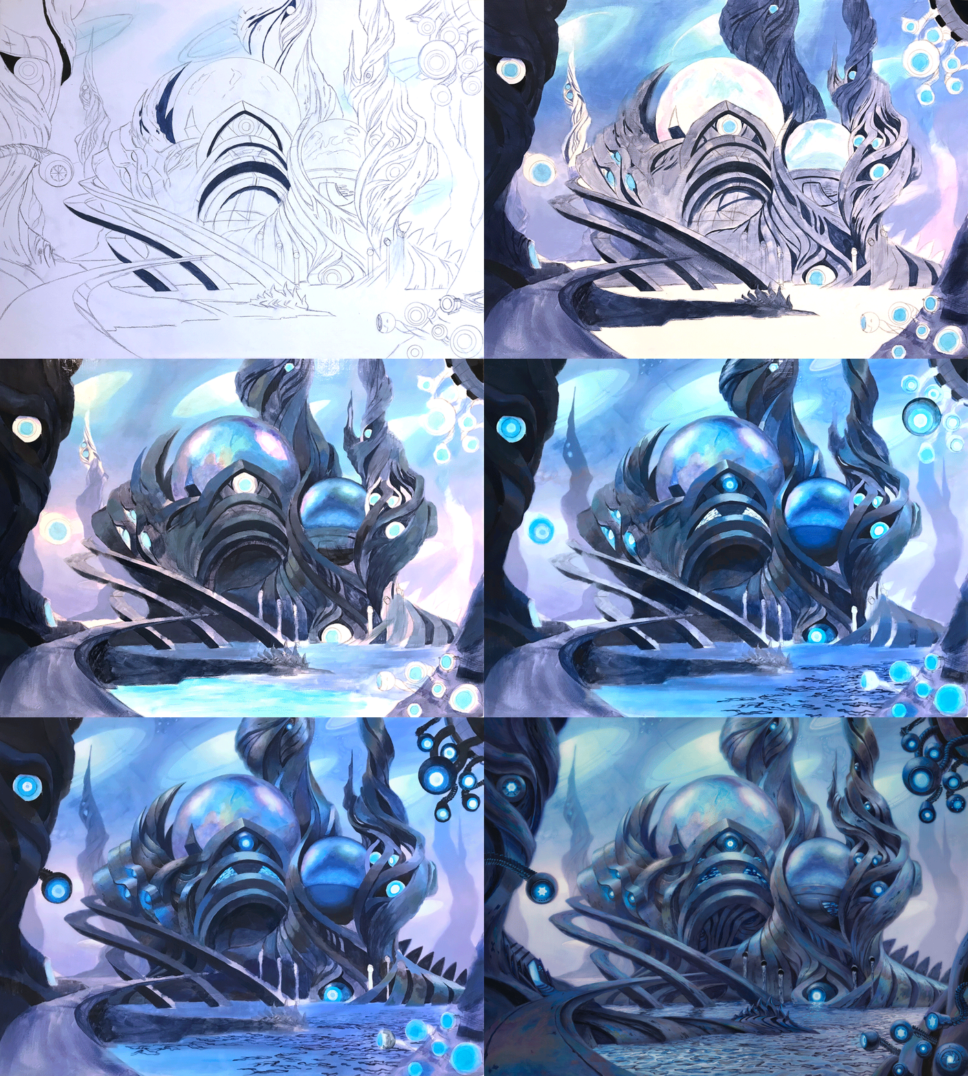
A bit less than two years ago I had the pleasure to paint The Surgical Bay for Magic: The Gathering. I’m really quite terrible at capturing my process, but luckily on this one I committed to taking frequent photographs!
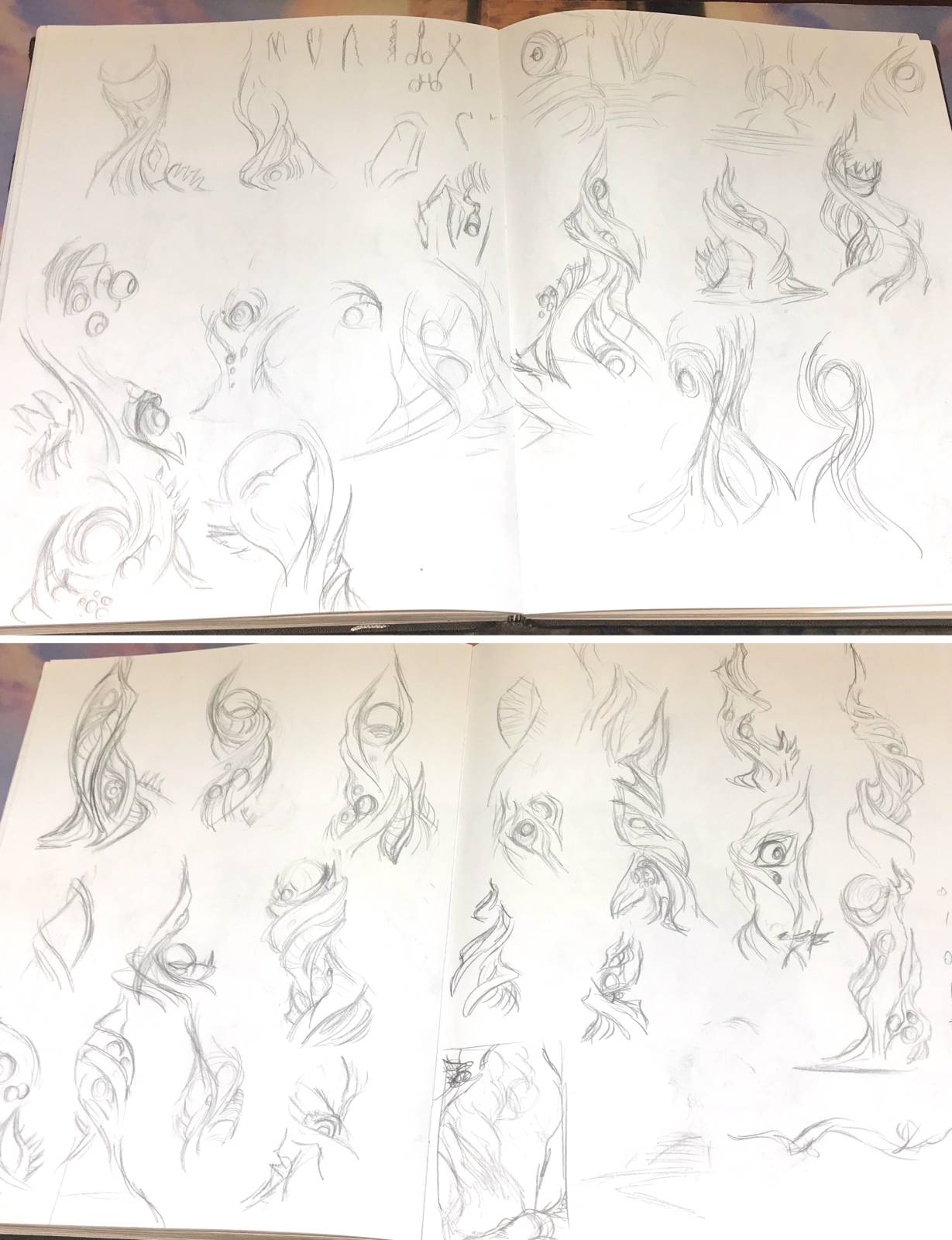
Playing with shapes twisted around orbs and spherical camera-eyes.
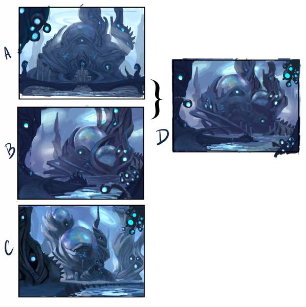
Often, when I get a client assignment, the first thing I do is play around with shapes with no regard for composition or function. I can’t visualize in my imagination (you might have heard it called aphantasia) so this step has two purposes: I get a tactile sense for the gestures and shapes , and in the process create a little library on paper to pull from in the next step. To that end, I draw out surgical implements, which I would like to work into the shape language of the landscape, and I copy parts of the art that were included in the world guide, as a way of internalizing it. When finished, I have a number of rough sketches I like that I can integrate into the actual thumbnails.
Since this was to be Jin Gitaxias’ lab and seat of power (a MTG villain who embodies surgical horror), I knew I wanted the building to have some heft or presence to it, with a clear focal point, so I worked a large glass orb into it and imagined that that might be his primary surgical theater. (A) felt imposing and important, and I was sure that would be the one we went with, but it wasn’t! My Art Director, Ovidio Cartagena, asked for (B).
To make up for my inexperience with the long history and lore of the game (I hadn’t started playing yet when I painted this), I usually try to read as much as I can into the history of a place, and consult my friend and agent Phil Li for anything I missed. He brought to my attention that Lumengrid, a large mushroom-like structure, was in this place previously before Jin Gitaxias and the Phyrexians took over. I had liked (A) best and wanted to retain the visual call-back to the history of this place, so I put together a new thumbnail that combined the best of (B) with the more dramatic and flaring shape of (A), hoping to win my AD over with it. It worked!
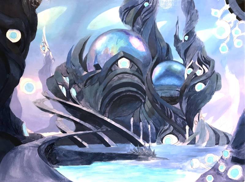
The specifics of the design were worked through a small color study, where I nailed down details which had been glossed over in the thumbnail, and then I got to work. The blues on my palette (ultramarine and manganese) are particularly transparent, so I defined the sketch through the shadows first, and then brushed blue over most of the image, letting those shadows show through.
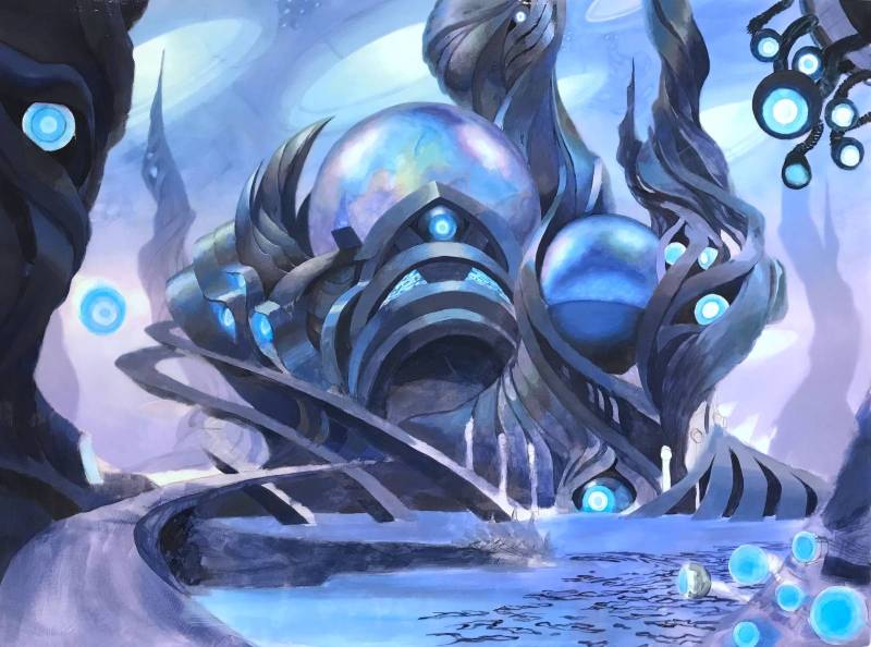
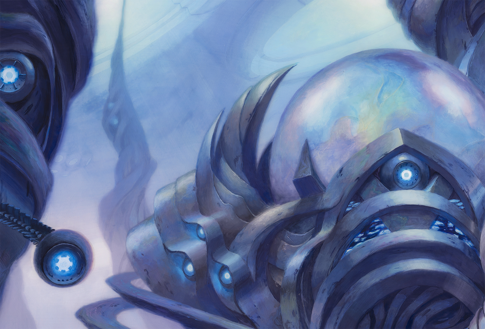
I had thought that if I completed the dome, the iridescent effect would be easy to apply everywhere else. I was wrong. This was the only piece I’ve been more than 3 days late on (always send a heads-up email, of course), because I kept reiterating the same areas trying to avoid reasonless-rainbow and achieve oil-slick iridescence. I wasted at least a week re-attempting the same areas over and over, but it felt crucial to get this feature right. New Phyrexia was distinguished in this set from past ones by being eerie, creepy, but also beautiful.
It was very important to keep the glowing eyes as bright as possible, so they had to be painted early on as manganese glazed over the white of the canvas. Attempting to opaquely paint that color would result in something desaturated and dull.
Here are a few close-ups of the finished product!

The liquid mercury pouring from spouts are a favorite detail of mine!
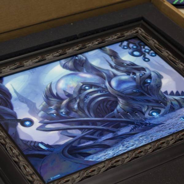
The final painting, just before it made its way to Gen Con!


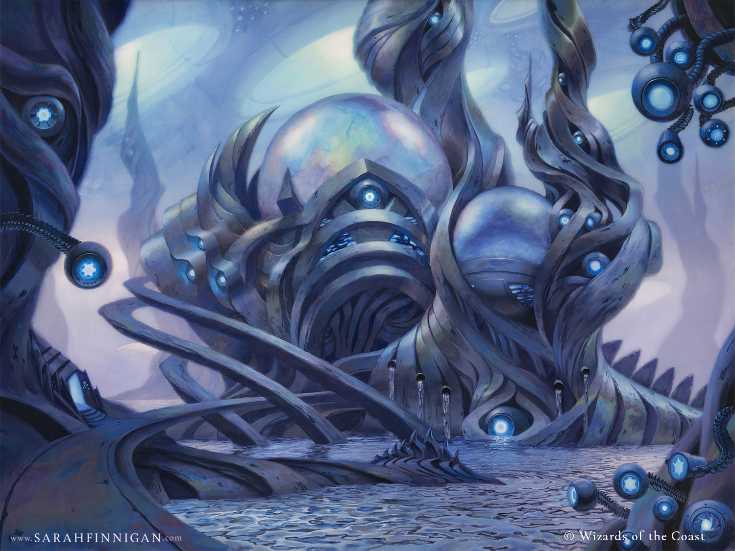




Thank you for sharing your process Sarah! The way you capture iridescence and glow is stunning. It was a pleasure to meet you at Gen Con and see your lovely paintings in person!
Thank you Simon. It was great to meet you too!
Nice process description and wonderful final piece! Thanks for writing this up.