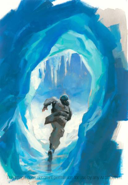
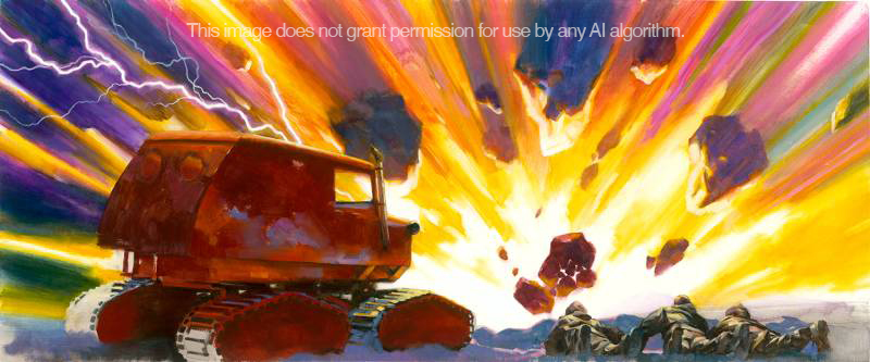
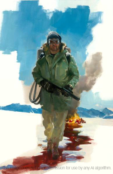
These are the final paintings for the special edition of Frozen Hell, the short story originally entitled, Who Goes There? by John W. Campbell, later known as The Thing. (The first set can be seen here.)
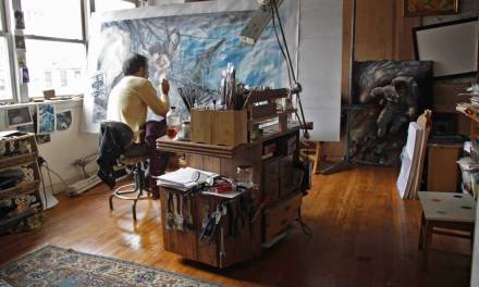
I had several paintings going at one time, which allowed me to pin one up on the wall and study it while I worked on another. Soon there were quite a few on the wall and I could slow down and study each one, shift colors, modify values, or correct drawing. It’s luxurious to have the time to revise multiple pieces for a project like this, instead of having to finish one painting on a tight deadline without the ability to linger with it.
The effect will be as if the viewer is standing quite close to the art.
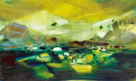
Some of the wider paintings are for double-page spreads, and some are for gatefolds. I usually make the original paintings larger than the actual print size of an image. But one of the editions will be close to 18” high, so most of the paintings are only slightly larger than that. The effect will be as if the viewer is standing quite close to the art. Just like the way you might see me in a museum, my nose as close to the canvas as possible, until I’m chased away and chastised by the guards.
What I enjoyed most about painting these pieces is how they blended with the story elements. The thing morphs into and out of all the creatures it’s ever assimilated across the galaxy. The shapes and forms, values and brushwork bleed into and out of each other in the paintings, creating a push-pull affect which the viewer’s eye can grasp and let go, moving in and out of focus and information.

All of these pieces started out as thumbnail sketches. I enlarged and projected them once I was satisfied with the compositions. Then I finished the drawings directly, on the canvas. This is the same process my students and I will be studying this semester in my class, Composition As Story, with SmArt School. (If interested, email me to see if there’s space left, manchess@mac.com)
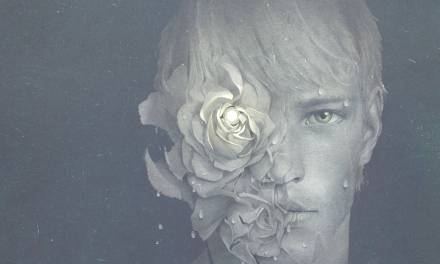
Working with the art director and publisher, Marcelo Anciano, we discussed what kind of themes would work well for the edition’s b/w chapter headings.

But technical problems can arise when working with letterpress pages for different size editions. With the pandemic affecting publishing operations, like paper availability and other physical problems, I had to stay flexible in case measurements changed.
The selection of images you see here were all created using Procreate. This allowed Marcelo to make changes to page layouts and I could easily modify the digital inks to accommodate.
The special edition of Frozen Hell is now available at Arete Editions.


I love all the paintings but the one with the explosion is…explosive, reminds me of Jack Kirby’s wild colors. Your rendition of the Thing with it’s tenticles is just as creepy as the movie version!
Awesome art as always Greg! 🙂