I’ve been wanting to show this stuff for a while now! Yet and other collaboration with my dear rapper friend Aesop Rock, but this time I feel like we’re really able to take the concept further than we have previously.
Was involved pretty early in on, and was able to have a hand in developing the concept of this fake technology company, and just generally the flavor we were going to go for. I’ve worked in the “tech” industry for years, which made it really fun to come up with phrases and silly stuff. Most of this came from late night spitballing ideas and it’s honestly pretty hilarious now knowing this thing exists.
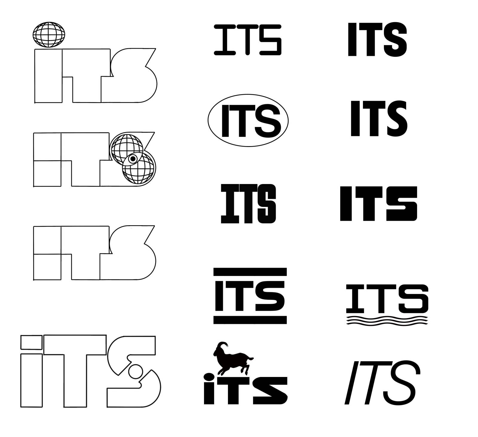
Started both with some sketches and logo designs. Wanted everything to feel really authentic, so I looked at lots of defense contractor and manufacturing logos and tried to channel some of that into the ITS logo. We honed in on this blocky orange and white one that just felt “on brand”. Not flashy, not trying to be too hokey or dorky. just straightforward. Like, exactly what you’d expect.

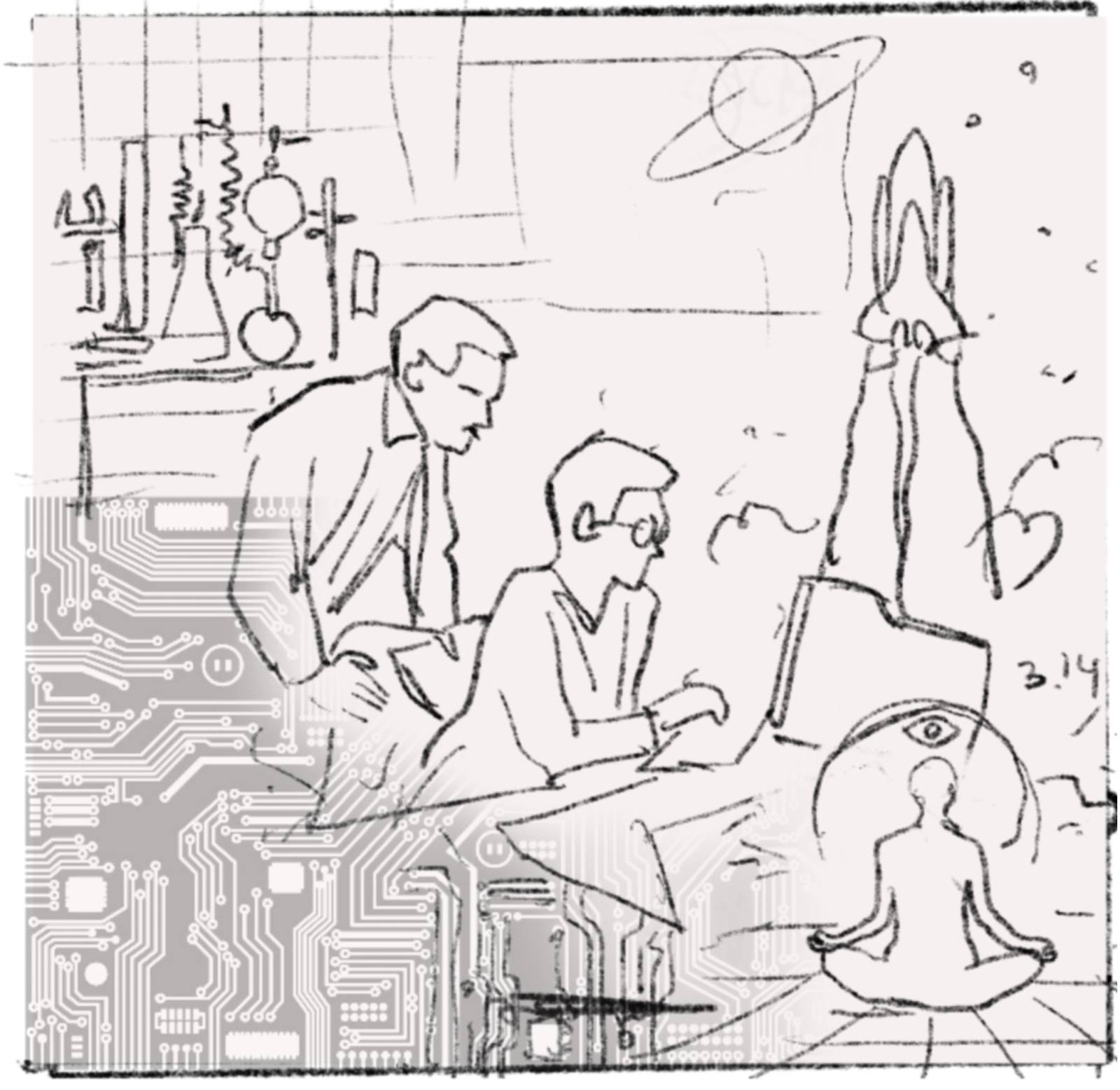
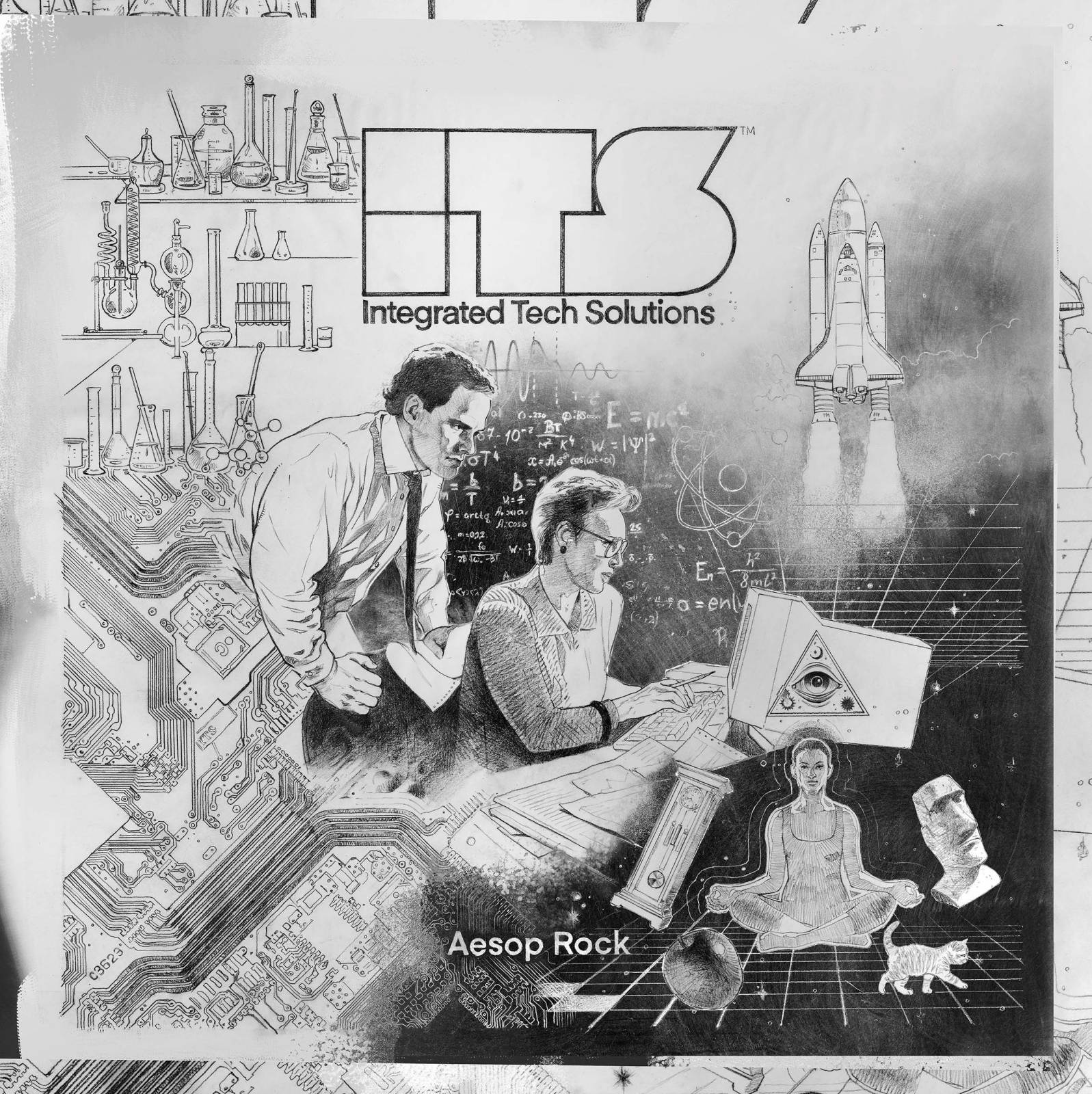
It was important to me that the execution would look legit as possible, so I took my time on the pencil drawing, really paying attention to the line work, trying to really channel the period. Once it was drawn in, I shot a nice photo of it and then rendered it out digitally. I used procreate on my iPad to do most of the rendering because they have some really nice looking natural media brushes that worked well for the hand drawn look I was going for. In the end I used photoshop for the final color corrections and touch ups. The whole image probably took about 2.5 weeks of work from sketch to finish, spaced out over the course of about a month and a half. I got a lot of creative freedom on this, which made it really fun to work on. It’s the best when a client trusts you and lets you do your thing.
The deluxe edition of this album is a technical achievement in and of itself. It plays an array of light patterns and a special ITS jingle when the contact points are engaged. The ITS logo is laser cut with a frosted translucent overlay so the ENTIRE logo lights up! It’s rare you get to make a piece of art for art’s sake, and I believe this is about as close as I’ve gotten to being able to make a piece that speaks beyond just the promotion of an awesome product. Its like this absurdist living commentary on technology AND the possibly the most technologically advanced cover art ever produced. It took months of back and forth prototyping, drawing little diagrams to figure out the lighting pattern and light-boxing. I think the manufacturer probably thinks were all nuts. But it’s so over the top. It has a usb-c charging port so you can get years of use out of it.
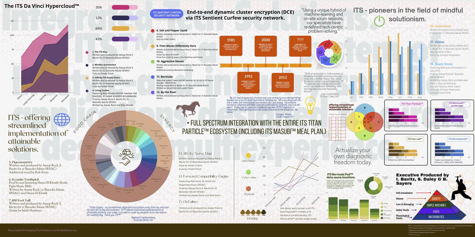
For the interior, I wanted to dig into the corporate identity stuff more and make it like this crazy montage of graphs and charts about ITS. Used a lot of canva templates as bases and tweaked things to feel more “of the period”. Aesop wrote up a ton of technical copy that I laid into the charts and graphs, along with the actual album track listing and album credits. There’s so much weird hidden shit and jokes in here. Even though it’s light on the actual drawing and painting, it’s probably one of my favorite album interiors I’ve made because it’s so weird and on brand with the album concept.
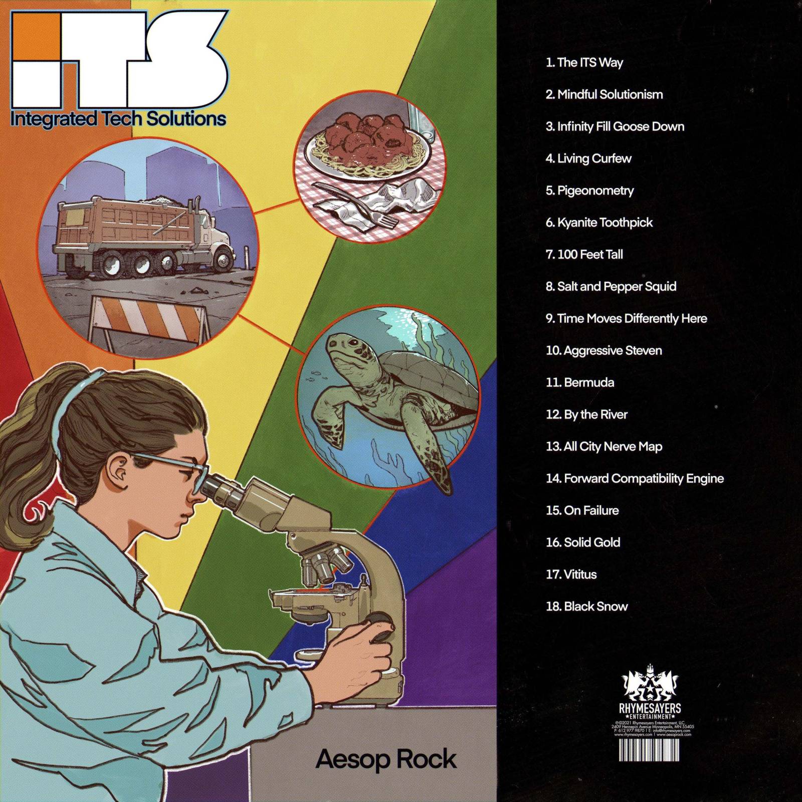
The back cover was pretty straightforward, wanted it to feel like a table of contents in like an old science textbook or something. The image again, I tried to be earnest in the execution while being absurd, with the dump truck, plate of spaghetti and sea turtle somehow tying into this scientist looking through a microscope.
Making album packaging has become sort of a routine, predictable process. What made this one different was that I also signed on to tackle the first music video as well! I have a general working understanding of video compositing and animation, but have never done a lot of it in a professional capacity. So I decided to make this as hard as possible on myself by making the entire thing animated.
Actually, it wasn’t that bad. I wanted it to feel like some weird retro schoolhouse rock fever dream, which kept the bar achievable quality-wise. I haven’t really animated much 2d animation, so I started by filming myself or my kids, and drawing from video frames for reference. Eventually I figured out a decent workflow, again in procreate on my iPad, where I’d animate out short loops and sequences, output them as GIF’s and then cut/composite them together in aftereffects. heres a link to the actual video:
Once again I got a lot of freedom to develop the idea, then storyboard it out. Once I got sign off on the boards, I animated them to the song, then used that animatic as the template I would drop finished animations into. It ended up being I think 80 something shots. I outsourced 5 of the cg shots to my friends over at heroic pictures, but was able to do the rest myself.
I used some aftereffects templates as the bases for the motion graphic sections and in the hook sections which saved a lot of time, but all in all it probably took about 3.5 months total from start to finish. This was about as far out to sea as I’ve ever been on a gig, animating to music working in a completely different medium and in an unfamiliar style…there was a learning curve for sure. Was a ton of work and sort of stressful at times, but I love jobs like this that push you completely out of your comfort zone because you learn the most from them.





Well done! Reminscient of 70’s Atari VCS covers or techy brochures from the 80s! I love that art
My vinyl came in today and that interior art was so fun to look at. Really some next level work overall!