I love stamps! The incredible effort that goes into each one is fascinating. Whether with graphic design or paint, they’re the smallest piece of Fine Art out there.
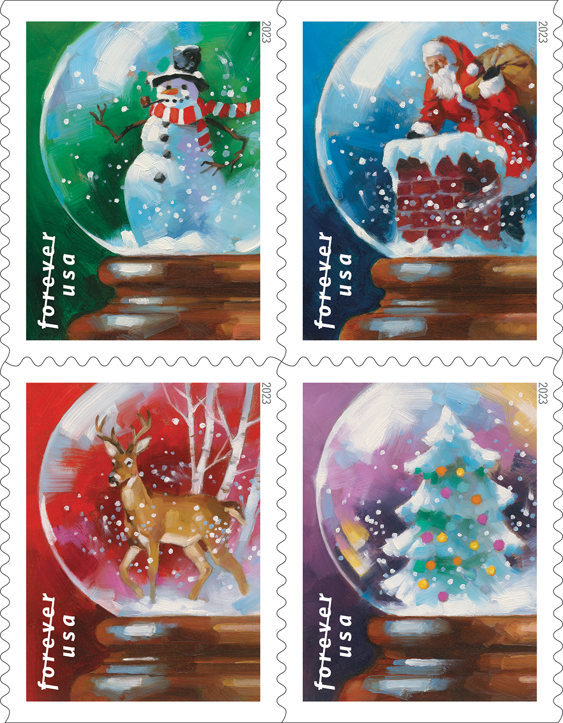
To get to work with the United States Postal Service has brought me honor and joy for many years now. So you can imagine my excitement at getting to create the images for the 2023 Christmas Stamp.
But it didn’t start so clearly. The art director, Derry Noyes, and I began working together on it when I sent her a number of sketched ideas I had for doing seasonal stamps. She and I have worked together in recent years, so instead of waiting to be asked to come up with ideas for a Christmas theme, I took the advantage and drew a bunch of thumbnail sketches, then presented the ideas to her.

This isn’t so easy when you’re starting a career. Showing an AD your sketched ideas for something when they haven’t worked with you yet is rather a waste of time. I had to be patient, over many years, while slowly developing a working relationship with a designer I admired like Derry. I had to wait for the right timing.

While that may sound manipulative, it’s simply allowing a working relationship to grow by giving it the space it needs to feel natural. It had always been my intention to show the USPS ideas for stamps I wanted to paint, since the first time I got to work with them. Yet, I had to prove myself through multiple assignments to show that they could rely on my work. Patience.
Derry and I studied over three dozen designs that I’d worked up. She was excited about the range of ideas and mentioned that they’d been thinking seriously about a Christmas snow globe for awhile, but they’d struggled a bit with how it would work in a vertical format. I grabbed the idea and told her, ‘I’ll be back.’
My designs were solid, but Derry made the very subtle yet distinctive move to slide the globes to the right. This not only kept the focus of the globe to the center, but allowed the very circular glass globe to fit vertically in the stamp format. Subtle and elegant.

It was the perfect touch for the stamp design. Working with professionals with real experience keeps me in a state of learning. Half of graphic design skill is in knowing how small composition moves can create strength in an image. This is constantly reinforced when I teach a full semester on Composition with SmArt School.
Stamps have such a huge following that when they’re initially released, the USPS has special “First Day of Issue Cover” events in different cities and towns across America. On September 19th this year the ceremony was set up in a local ice skating rink in Breckinridge, Colorado, and was attended by town dignitaries, stamp collectors, postal workers, myself, and local grade schoolers.
I made a 3-minute speech about how art is so pervasive, all around us in many aspects, and mostly created by illustrators. I had to get my shots in for illustration and discovered that many of the kids there were budding artists just like I had been. They loved stamps, too.
We are not so far from the cave painters.
I have broad interests, stretching across different genres and themes, like history and science, travel, science fiction, literature, etc. I developed my work over many years to get it to reach and appeal to a distinguished clientele. I took risks to approach them with ideas and used the process to stretch the work.
What I found was two-fold. Not only was the technique able to spread out into many areas of the field and keep me surviving as a freelancer and growing as a painter, but the audience of clients grew as well. I found that painting is still driving a narrative that viewers find intriguing, beguiling, and enriching.
We are not so far from the cave painters.
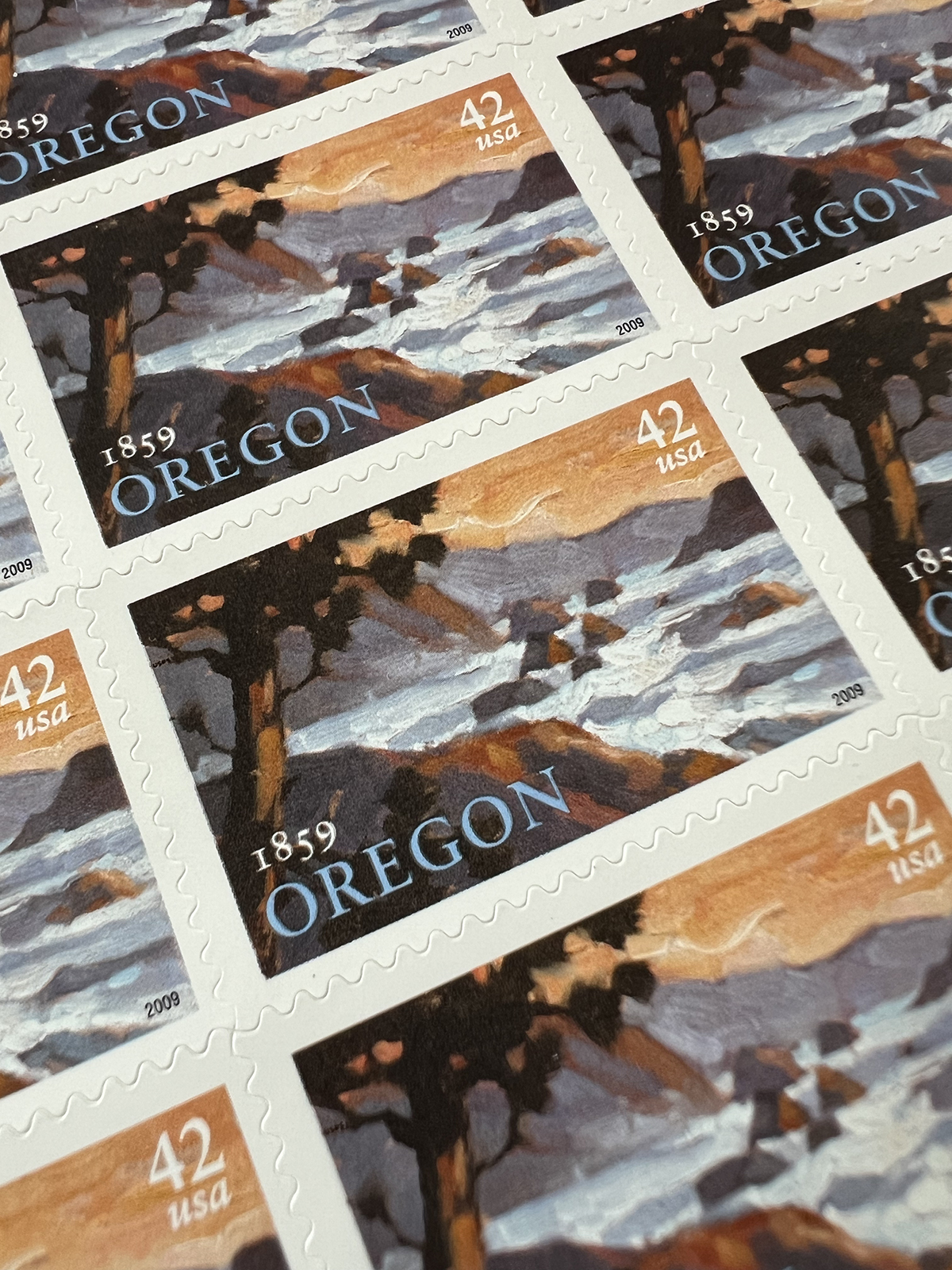
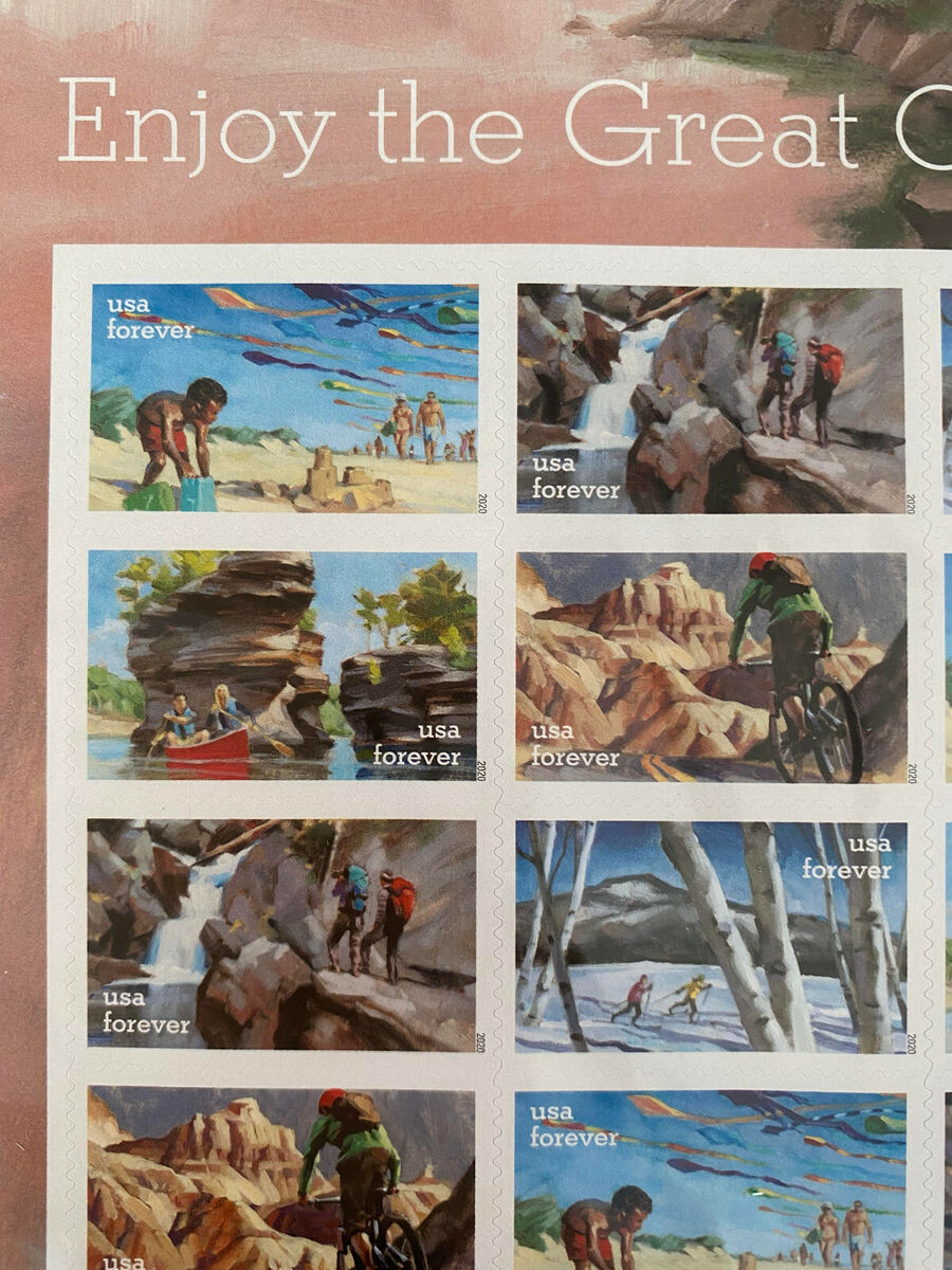
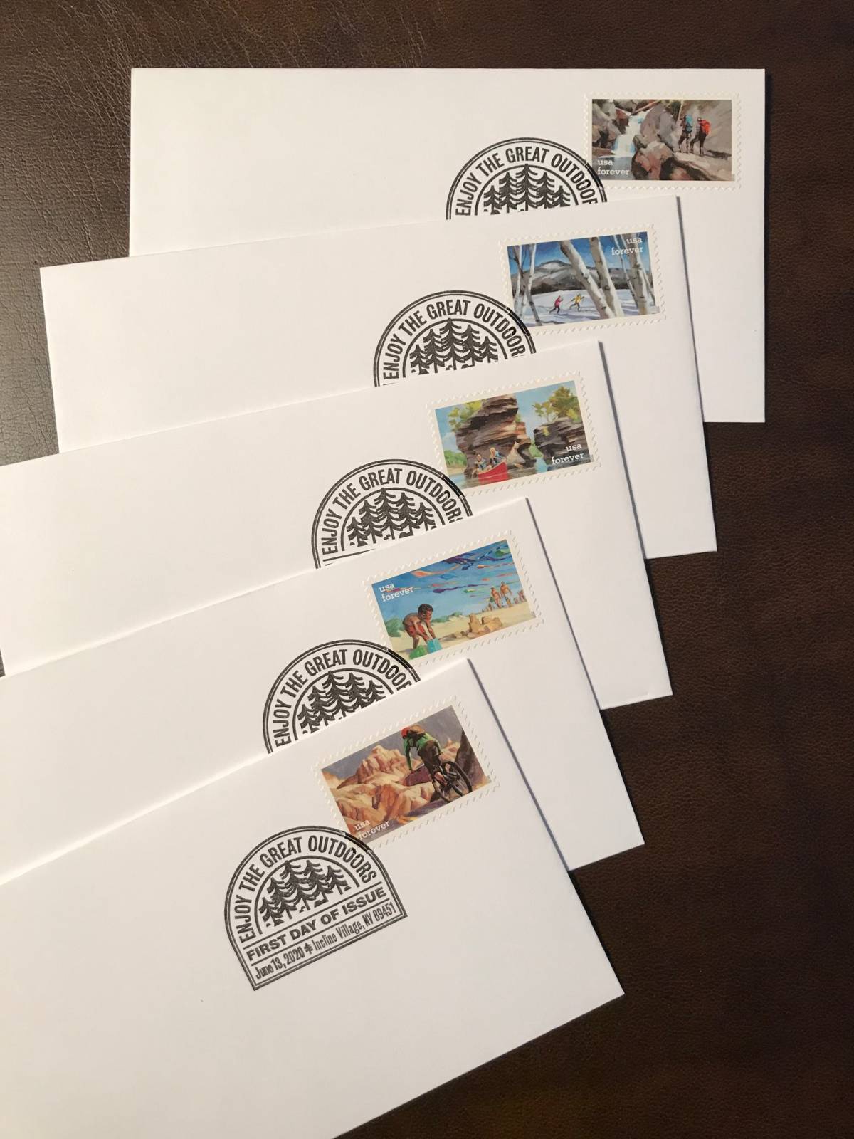
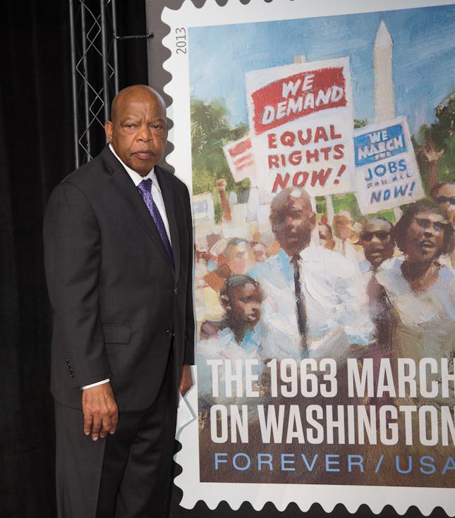
Below are some of the various assignments I’ve worked on for the USPS over the years. All of them started after the first stamp I worked on, the Oregon Sesquicentennial Stamp (one of the last classic stamps before Forever Stamps were released).
All I had to do was ask, “hey, do you all ever need …” (fill-in your own theme).


Such beautiful little gems. What scale do you work at for these pieces? How much larger is your painting than the final stamp size? Greg, thanks for all that you share here.
We did a stamp show at the college I used to work at. Some of the absolute best illustration and design ever goes into them. These are beautiful!
Thanks, Erich! I painted these on a piece of 8×10 Gessobord…just about that size. So I guess they were enlarged quite a bit. It’s always a little dicey figuring out what size to paint at when it comes to the stamps. I try to predict how big the strokes will be when the original is reduced. And sharing with Muddy fans is the best…you all are my people. : )
Thanks, too, Zac! Wish the USPS did more national shows of their art. I think people would adore it. I try to remind the audience that stamps are still created by humans, not machines.
Good thinking on getting the ball rolling on creating the Christmas stamps with your thumbnail sketches Greg. I can remember how popular stamp collecting was when I was younger and it’s great to see you’re still passionate about them as an art form! 🙂
Ah yes, I saw these at the PO last week and was so excited, I knew it was your work!
Lovely! As always Greg, you make it look effortless – despite the ton of work that goes into each piece.
Thanks for sharing the background on how the Christmas stamps came to be, too. Lots to learn there.
Keep ’em coming!